Radial Chart SVG Stroke 속성 만으로 만들기
Radial (Progress) Chart 만들기
프로젝트에서 차트를 그려야하는 경우가 종종 있는데, 우리 프로젝트에서는 현재 recharts 라는 라이브러리를 사용하고 있다.
하지만, 라이브러리의 pie, Radial 차트들은 두 가지 이상의 data의 비율을 그려주기에 적절하다고 판단했다.
현재 만들어볼 차트는 total 값에 대한 하나의 data를 가지고 progress를 나타내주어야하기 때문에 svg의 path 속성을 사용해서 만들어보았다.
SVG stroke 속성 사용하기
svg를 figma에서 받으면,
- 도형 그대로 export :
circle태그가 살아있고stroke로 구성되어있다.
<circle cx="41" cy="41" r="37" stroke="#af91e7" stroke-width="7" stroke-linecap="round" fill="red" stroke-dasharray="232.4778563656447"></circle>- 그룹화하여 export :
path태그로 변환되어d속성으로 구성되어있다.
<path fill-rule="evenodd" clip-rule="evenodd" d="M40.5 7C21.9985 7 7 21.9985 7 40.5C7 59.0015 21.9985 74 40.5 74C59.0015 74 74 59.0015 74 40.5C74 21.9985 59.0015 7 40.5 7ZM0 40.5C0 18.1325 18.1325 0 40.5 0C62.8675 0 81 18.1325 81 40.5C81 62.8675 62.8675 81 40.5 81C18.1325 81 0 62.8675 0 40.5Z" fill="#re"/>이번 SVG 애니메이션은 stroke 의 stroke-dasharray 와 stroke-dashoffset 속성을 조정하여 만들어볼 예정이므로 1번째 파일로 받아야 사용할 수 있다.
(그렇지 않으면 직접 d부분을 조정하여 애니메이션을 만들어야하는데 복잡도가 높아진다…)
1. SVG 요소 그리기
<svg width="82" height="82">
  {/* 기본 원 (배경) */}
  <circle cx="41" cy="41" r="37" stroke={'#fdfbff'} strokeWidth={7} fill="transparent" />

  {/* 진행도를 나타내는 원 */}
  <circle
    className="progress"
    cx="41"
    cy="41"
    r="37"
    stroke={'#af91e7'}
    strokeWidth="7"
    strokeLinecap="round"
    fill="transparent"
  />
</svg>- 기본 배경이 되는 circle 태그를 복사해서 진행도를 나타내는 circle 태그를 하나 더 만들고 class를 “progress” 라고 주어 스타일을 변경해줄 예정이다.
stroke는 테두리의 색,fill은 원 자체의 색을 나타낸다.strokeWidth는 테두리의 두께,strokeLinecap는 테두리의 모서리 모양을 나타낸다.
2. stroke-dasharray 값 설정
stroke-dasharray 속성은 전체 선을 지정한 값에 따라 길이가 다른 점선의 형태로 나타낸다.
숫자가 클수록 획의 대시 사이에 넓은 공간을 만든다.
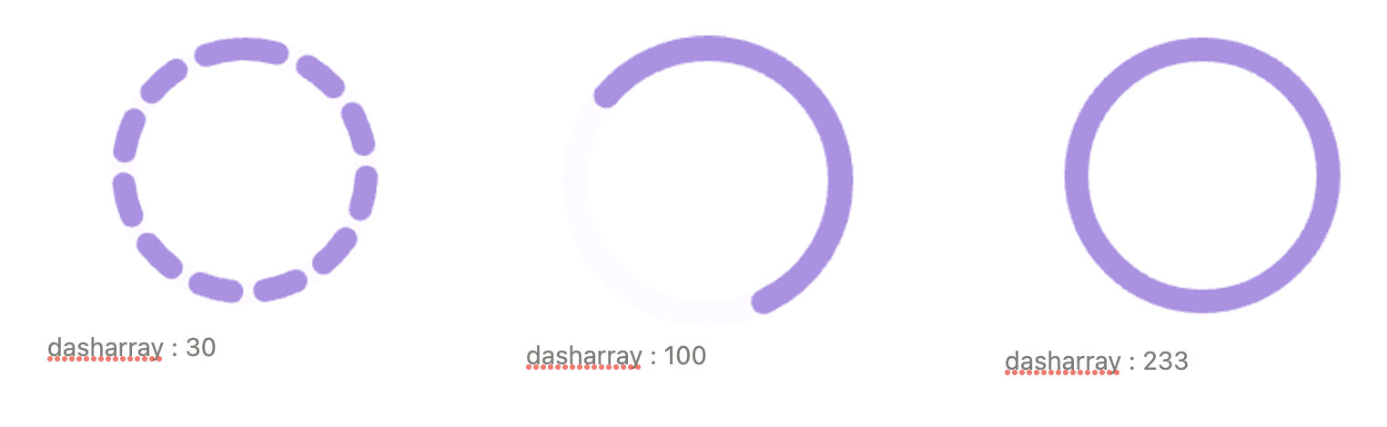
그렇기 때문에 stroke-dasharray를 꽉 채우려면 원 둘레를 구해야한다.
원둘레를 구하는 공식은 2r* π 이기 때문에 svg의 반지름 길이를 r에 대입하여 원 둘레를 구하면 된다!
현재 원 svg의 반지름(radius)은 37이기 때문에 아래와 같이 원 둘레를 구할 수 있다.
const RADIUS = 37; // 반지름
const CIRCUMFERENCE = 2 * Math.PI * RADIUS; // 원 둘레
3. stroke-dashoffset 값 설정
stroke-dashoffset은 값에 따라 원형의 stroke가 시작되는 위치를 변경하는데 사용한다.
숫자가 클수록 시작점으로부터 더 많이 띄워준 다음 시작하며, 이때 시작점은 원형의 가장 오른쪽부터 시작된다.
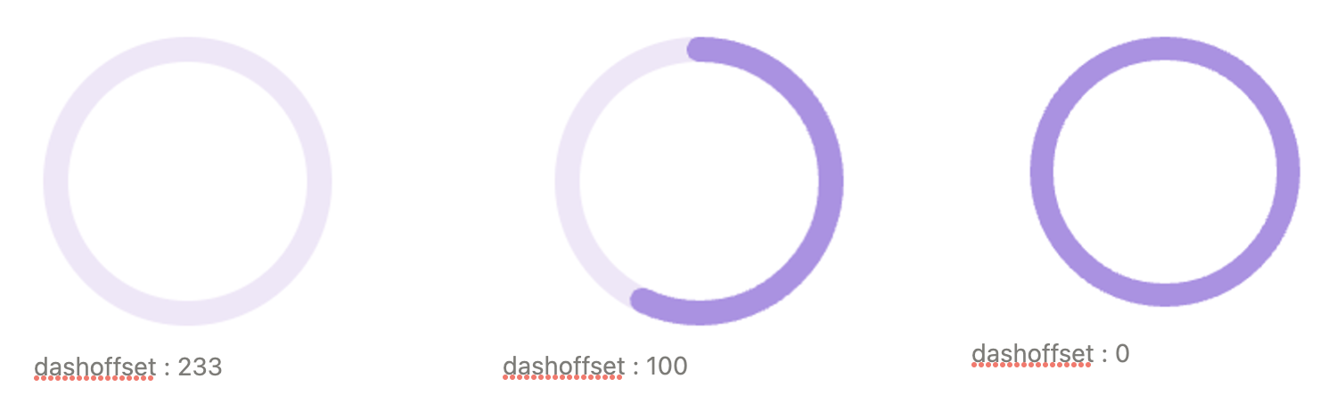
위와 같이 dashoffset에 의해 진행정도가 나타낼 수 있기때문에
total 과 progress 값을 사용하여 비율만큼 dashoffset값을 조절해주며 애니메이션을 그려주면 된다!
// 초과시, 그래프 전부 채워야하기 때문에 dashoffset = 0
// 이외는 total 대비 progress의 비율을 1에서 빼준다.
const isExceed = total < progress;
const progressRatio = isExceed ? 0 : 1 - progress / total;

// 원둘레 대비 progress 비율을 dashoffset 변수로 지정
const dashOffset = CIRCUMFERENCE * progressRatio;
3. Animation & Transform
- Transform
위에서 작성해두었듯, dashoffset은 원형의 가장 오른쪽(90도)부터 시작되기 때문에 0도 위치부터 시작하고 싶다면, transform을 통해 변경해주어야한다.transform: rotate(-90deg); - Animation
animation이 시작할 때, dashoffset을 원둘레와 같이 주고(빈 progress), 끝날 때, progress 값에 따라 정의된 dashoffest 변수 값을 주면 끝!!!.progress { animation: ${(props) => progress(props.dashOffset, props.circumference)} 1.5s ease-in-out forwards; } const progress = (dashOffset: number, circumference: number) => keyframes` 0% { stroke-dashoffset: ${circumference}; } 100% { stroke-dashoffset: ${dashOffset}; } `;
추가 : stroke gradient 주기!

stroke style 커스텀을 할 때, gradient svg와 stroke={'url(#gradient)'} 를 사용해서 그라데이션을 줄 수 있다!
<svg width="82" height="82">
    <circle
      cx="41"
      cy="41"
      r={RADIUS}
      stroke={'url(#gradient)'}
      strokeWidth={7}
      fill="transparent"
    />
		 {/* gradient */}
    <defs>
      <linearGradient
        id="gradient"
        x1="0"
        y1="0"
        x2="100"
        y2="81"
        gradientUnits="userSpaceOnUse"
      >
        <stop stopColor={'#9b71e9'} />
        <stop offset="1" stopColor={'#9b71e9'} stopOpacity="0.1" />
      </linearGradient>
    </defs>
</svg>svg태그 안에defs태그로 감싼 linearGradient 정보를 넣어준다! 이때, 90도 변경 또는 좌우 변경으로 svg를 transform했을 경우, gradient도 함께 바뀌게된다.stop태그 및x,y태그를 조절해주면 된다!
(애초에 반대로된 gradient 파일을 받으면 좋겠지만…!)
linearGradient의id(나의 경우, gradient)를 지정한다- 적용할
circle의 stroke 색상을 담당하는 stroke에 상위에서 지정해준id를 선택자로 지정한다.stroke={'url(#gradient)'}