
Position
더욱 다양한 레이아웃을 만들때에 사용
# static
모든 태그들의 default값 position:static;
# relative
기존의 static default 위치를 기준으로 top, right, bottom, left 방향으로 이동이 가능하다.
<!DOCTYPE html>
<html>
<head>
<style>
.relative{display:inline-block; position:relative; width:100px; height:100px; background-color:#009ec3; top:60px; left:60px; color:#fff;}
.boxTest{display:inline-block; width:100px; height:100px; background-color:skyblue;}
</style>
</head>
<body>
  <h1>relative Test</h1>
  <div class="boxTest">1</div>
  <div class="boxTest">2</div>
  <div class="relative">안녕 나는 relative!</div>
  <div class="boxTest">3</div>
</body>
</html>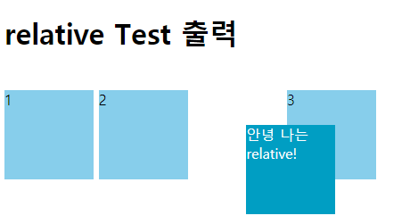
# absolute
relative가 static default 위치를 기준으로 움직였다면, absolute는 부모의 포지션을 기준으로 움직인다. 예를 들어 부모 태그 중 relative, absolute, fixed인 태그가 없다면 body를 기준으로 움직인다.
# body가 부모인 경우
<!DOCTYPE html>
<html>
<head>
<style>
.relative{display:inline-block; position:relative; width:100px; height:100px; background-color:#009ec3; top:60px; left:60px; color:#fff;}

.body_absolute{display:inline-block; position:absolute; top:150px; left:50px; width:200px; height:200px; background-color:pink; }

.boxTest{display:inline-block; width:100px; height:100px; background-color:skyblue;}

</style>
</head>
<body>
  <h1>body가 부모인 absolute Test 출력</h1>
  <div class="boxTest">1</div>
  <div class="boxTest">2</div>
  <div class="relative">안녕 나는 relative!</div>
  <div class="body_absolute">안녕 나는 body가 부모인 absolute!</div>
</body>
</html>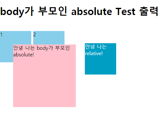
# 부모 포지션의 태그가 있는 경우
<!DOCTYPE html>
<html>
<head>
<style>
.boxTest{display:inline-block; width:100px; height:100px; background-color:skyblue;}

.relative{position:relative; width: 400px; height:300px;background-color:#eee;}

.absolute{position:absolute; top:200px; right:0; display:inline-block; width:100px; height:100px; background-color:pink;}

</style>
</head>
<body>
  <h1>태그가 부모인 absolute Test 출력</h1>
  <section class="relative">
    <div class="boxTest">1</div>
    <div class="boxTest">2</div>
    <div class="absolute">안녕 나는 태그 기준 absolute!</div>
    <div class="boxTest">4</div>
  </section>
</body>
</html>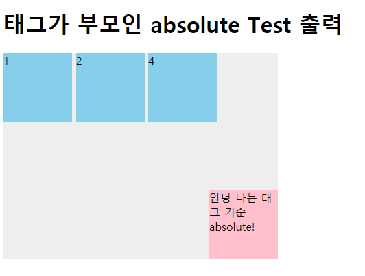
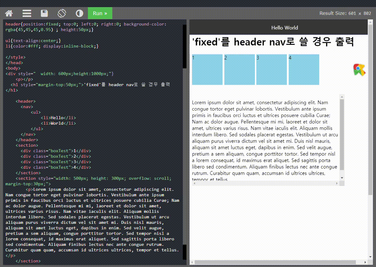
# fixed
고정 navigation에 많이 쓰이는 속성이다. fixed를 쓸 경우 헤더가 메인 컨텐츠를 가려버리는 경우가 발생하는데, header의 부모인 body 엘리먼트로 부터 독립 되면서 body 엘리먼트에서 점유되고 있던 header의 공간이 사라져 버렸기 때문, 이런 경우 header의 height값 만큼 body에 paddding-top 값을 주면 쉽게 해결된다.
# fixed를 header nav로 쓸 경우
<!DOCTYPE html>
<html>
<head>

<style>
*{box-sizing:border-box; list-style:none;}
.boxTest{display:inline-block; width:100px; height:100px; background-color:skyblue;}
header{position:fixed; top:0; left:0; right:0; background-color: rgba(45,45,45,0.95) ; height:50px;}
ul{text-align:center;}
li{color:#fff; display:inline-block;}
</style>

</head>
<body>
<div style="width: 600px;height:1000px;">
	<h1 style="margin-top:50px;">'fixed'를 header nav로 쓸 경우 출력</h1>
	<header>
        <nav>
            <ul>
                <li>Hello</li>
                <li>World</li>
            </ul>
        </nav>
      </header>

      <section>
        <div class="boxTest">1</div>
        <div class="boxTest">2</div>
        <div class="boxTest">3</div>
        <div class="boxTest">4</div>
      </section>

      <section style="width: 500px; height: 300px; overflow: scroll; margin-top:30px;">
          <p>Lorem ipsum dolor sit amet, consectetur adipiscing elit. Nam congue tortor eget pulvinar lobortis. ...</p>
      </section>
</div>
</body>
</html>
# fixed로 따라다니는 버튼 만들기
쇼핑몰, 웹서비스 모든 곳에서 꼭 사용하는 fixed 혹은 sticky 속성의 기능이 있는데,
바로 Top Button이다.
웹 서비스가 주를 이루고 있는 사이트라면 못 본 적이 없는 거 같다.
한참 스크롤을 내리다보면 다시 다른 카테고리 혹은 뒤로가기를 하고싶은데, header가 fixed되어 있지 않을 경우 스크롤을 다시 처음으로 올려야 됨에 사용자는 불편함을 느낀다.
내가 그렇다.
Top button나 add to cart를 이미지로 사용하여 fixed 하는 것도 많이 봤다.
<!DOCTYPE html>
<html lang="en">
<head>
  <meta charset="UTF-8">
  <meta http-equiv="X-UA-Compatible" content="IE=edge">
  <meta name="viewport" content="width=device-width, initial-scale=1.0">
  <link href="style.css" rel="stylesheet" type="text/css">
  <link rel="stylesheet"  href="https://cdnjs.cloudflare.com/ajax/libs/font-awesome/5.8.2/css/all.min.css"/>
  <title>Document</title>

<style>
*{box-sizing:border-box; list-style:none;}
h1{text-align:center;}

div{
  height:1000px;
}
.fas{
  color:pink;
  font-size:55px;
  position: fixed;
  right:30px;
  bottom:30px;
}

.fa-shopping-cart{
  bottom:110px;
  color:skyblue;
}
</style>
</head>
<body>
    <h1>fixed cart, top button 출력</h1>
    <!--  <header>
        <nav>
            <ul>
                <li>Hello</li>
                <li>World</li>
            </ul>
        </nav>
      </header> -->

  <div>
    <img src="https://p0.pikrepo.com/preview/902/207/blue-sky.jpg" alt="sky_img" width="100%">
    <ul>
        <li><i class="fas fa-arrow-circle-up"></i></li>
        <li><i class="fas fa-shopping-cart"></i></li>
      </ul>
  </div>


  </div>
</body>
</html>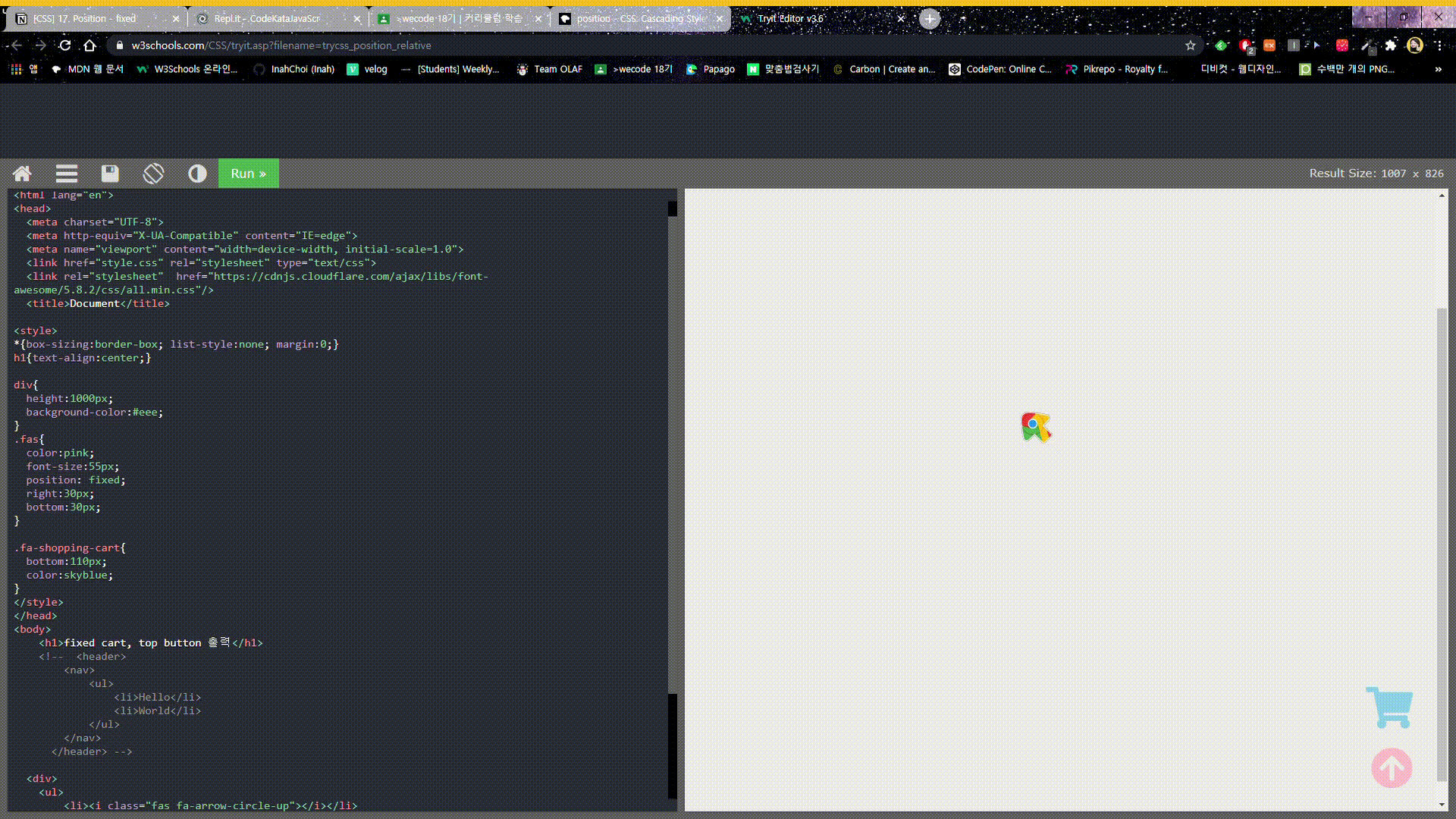
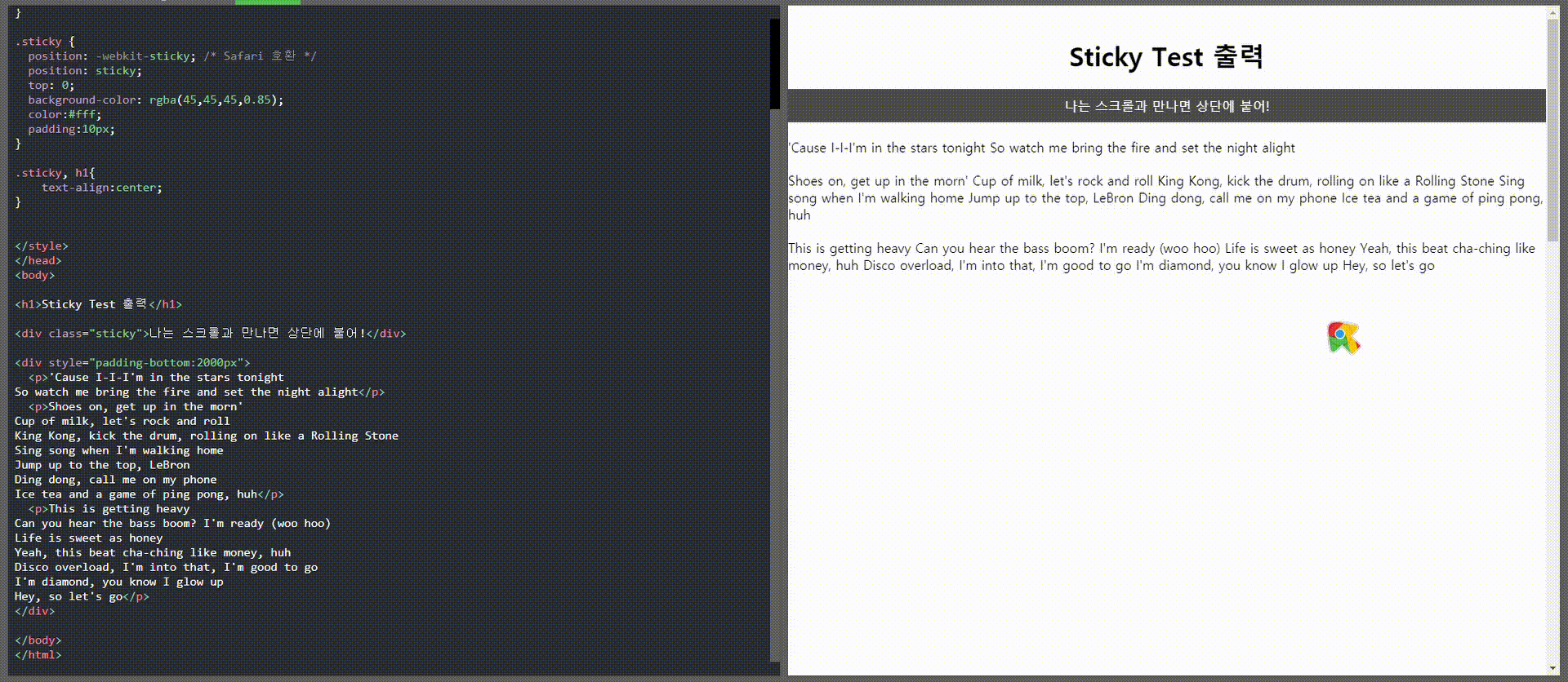
# sticky
sticky의 엘리먼트는 사용자의 스크롤 위치에 따라 relative와 fixed를 오가는 position 속성이다.
쉽게 말해 fixed가 브라우저 화면의 절대 위치를 사용하는 반면 sticky는 부모 태그의 절대 위치값을 사용한다.
자바스크립트 없이 순수 CSS로 구현할 수 있어 편리하지만 IE, 엣지 15 및 이하 버전에서는 sticky를 지원하지 않는다.
Safari에서는 -webkit-을 같이 지정해주어야 한다.
<!DOCTYPE html>
<html>
<head>
<style>
*{
  margin:20px 0;
}

.sticky {
  position: -webkit-sticky; /* Safari 호환 */
  position: sticky;
  top: 0;
  background-color: rgba(45,45,45,0.85);
  color:#fff;
  padding:10px;
}

.sticky, h1{
  text-align:center;
}
</style>
</head>
<body>

<h1>Sticky Test 출력</h1>

<div class="sticky">나는 스크롤과 만나면 상단에 붙어!</div>

  <div style="padding-bottom:2000px">
    <p>'Cause I-I-I'm in the stars tonight
  So watch me bring the fire and set the night alight</p>
    <p>Shoes on, get up in the morn'
  Cup of milk, let's rock and roll
  King Kong, kick the drum, rolling on like a Rolling Stone
  Sing song when I'm walking home
  Jump up to the top, LeBron
  Ding dong, call me on my phone
  Ice tea and a game of ping pong, huh...</p>
  </div>
</body>
</html>
* 레이아웃 이해에 많은 도움이 된 영상
* 레이아웃 이해에 많은 도움이 된 사이트
깨닫고 후회하는 점
- 처음 HTML/CSS를 공부할 때 레이아웃에 대해
더 파고들어 공부하지 않은 점 - HTML/CSS로 자기소개 구현했던 페이지를 다시 돌이켜보니
position을 엉망진창으로 사용하고 있던 거 같음
결론
HTML/CSS 블로그 정리 후
자기소개 페이지를 똑같은 디자인으로 다시
만들어서 전후비교를 해봐야겠다.