해당 포스팅은 시각화 라이브러리의 몇 가지 대표적인 그래프들을 담고있습니다.
seaborn 그래프들은 대부분 titanic 데이터셋을 사용하였습니다.
Matplotlib
막대그래프 (plt.bar())
x = [1, 2, 3]
years = ['2020', '2021', '2022']
values = [400, 100, 600]

plt.bar(x, values, color=['r', 'g', 'b'], width=0.8)
plt.xticks(x, years)
plt.show()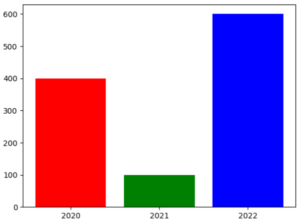
파이차트 (plt.pie())
# Disney 데이터셋 활용
plt.figure(figsize=(5, 5))

plt.pie(ratio.loc['type'], labels=ratio.columns, autopct='%0.f%%', startangle=100, explode=[0.05, 0.05], shadow=True, colors=['#b20710', '#221f1f'])

plt.suptitle('Movie & TV Show Distribution', fontfamily='serif', fontsize=15, fontweight='bold')
plt.title("We see movies than TV shows on Netflix",fontfamily='serif', fontsize=12)

plt.show()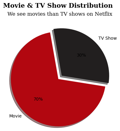
산점도 (plt.scatter())
import numpy as np
np.random.seed(99)

n = 50
x = np.random.rand(n)
y = np.random.rand(n)
size = (np.random.rand(n) * 20) ** 2
colors = np.random.rand(n)

plt.scatter(x, y, s=size, c=colors)
plt.show()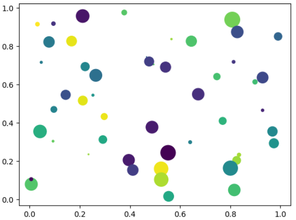
Seaborn
선형 회귀선 있는 산점도 (sns.regplot())
# titanic 데이터 셋으로 제작
fig = plt.figure(figsize=(15, 5))
ax1 = fig.add_subplot(1, 2, 1)
ax2 = fig.add_subplot(1, 2, 2)

sns.regplot(x="age", y="fare", data=titanic, ax=ax1)
sns.regplot(x="age", y='fare', data=titanic, ax=ax2, fit_reg=False)

plt.show()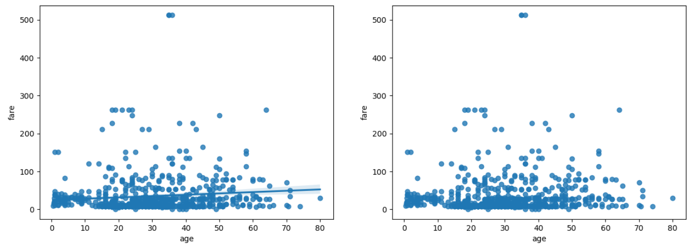
히스토그램과 커널 밀도 그래프 (sns.distplot()/ sns.histplot() / sns.kdeplot())
fig = plt.figure(figsize=(15,5))
ax1 = fig.add_subplot(1, 3, 1)
ax2 = fig.add_subplot(1, 3, 2)
ax3 = fig.add_subplot(1, 3, 3)

# distplot
sns.distplot(titanic['fare'], ax=ax1)

# histplot
#sns.histplot(x='fare', data=titanic,  ax=ax2)
sns.distplot(titanic['fare'], kde=False, ax=ax2)

# kdeplot
#sns.kdeplot(x='fare', data=titanic, ax=ax3)
sns.distplot(titanic['fare'], hist=False, ax=ax3)

ax1.set_title('titanic fare - distplot')
ax2.set_title('titanic fare - histplot')
ax3.set_title('titanic fare - kdeplot')

plt.show()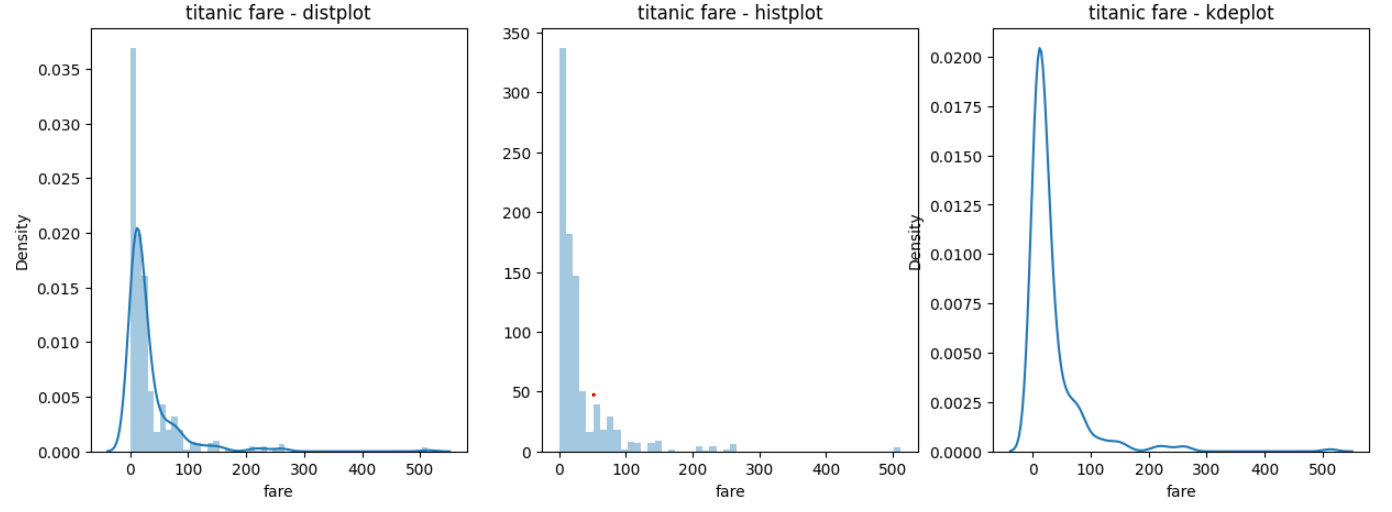
범주형 데이터의 산점도 (sns.stripplot() / sns.swarmplot())
fig = plt.figure(figsize=(15, 5))
ax1 = fig.add_subplot(1, 2, 1)
ax2 = fig.add_subplot(1, 2, 2)

sns.stripplot(x='class', y='age', data=titanic, ax=ax1)
sns.swarmplot(x='class', y='age', data=titanic, ax=ax2, hue='sex')

ax1.set_title('Strip Plot')
ax2.set_title('Swarm Plot')

plt.show()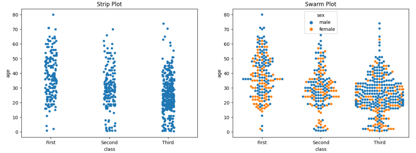
빈도그래프 (sns.countplot())
fig = plt.figure(figsize=(15, 5))
ax1 = fig.add_subplot(1, 3, 1)
ax2 = fig.add_subplot(1, 3, 2)
ax3 = fig.add_subplot(1, 3, 3)

sns.countplot(x='class', palette='Set1', data=titanic, ax=ax1)
sns.countplot(x='class', hue='who', palette='Set2', data=titanic, ax=ax2)
sns.countplot(x='class', hue='who', palette='Set3', data=titanic, ax=ax3, dodge=False)

ax1.set_title('titanic class')
ax2.set_title('titanic class - who')
ax3.set_title('titanic class - who(stacked)')

plt.show()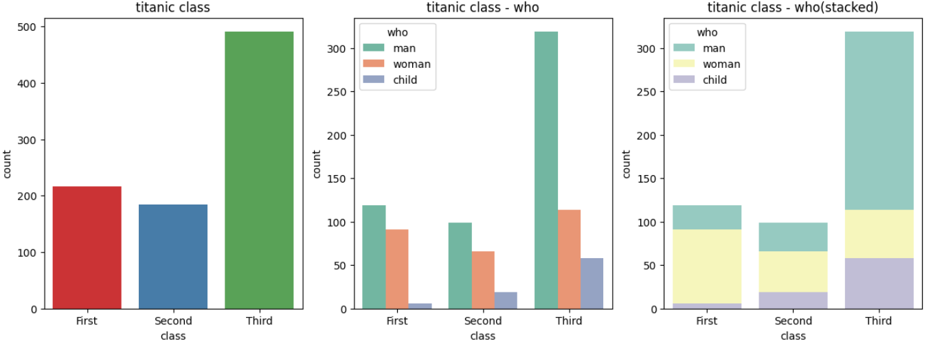
조인트그래프 (sns.jointplot())
j1 = sns.jointplot(x='fare', y='age', data=titanic)
j1.fig.suptitle('titanic fare - scatter', size=15)

plt.show()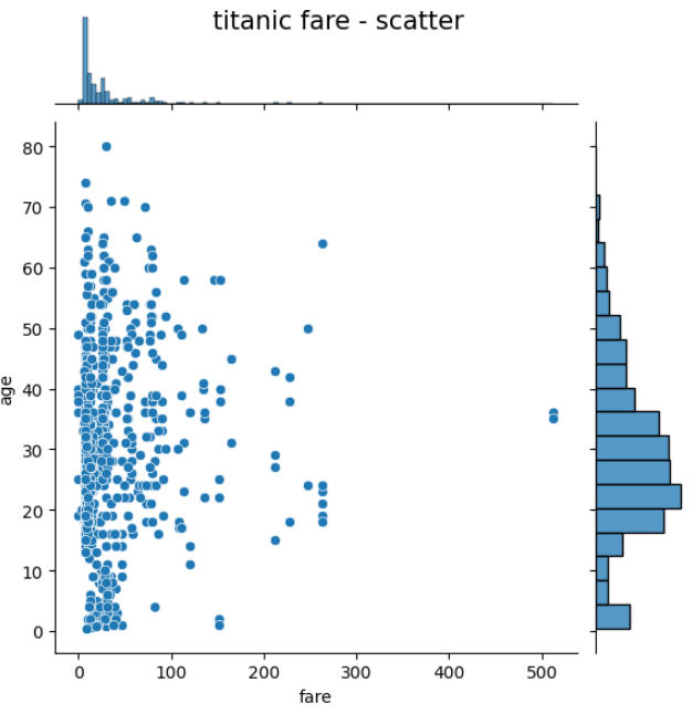
관계그래프 (sns.pairplot())
titanic_pair = titanic[['age', 'pclass', 'fare']]
sns.pairplot(titanic_pair)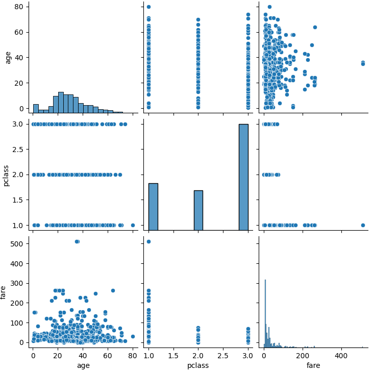
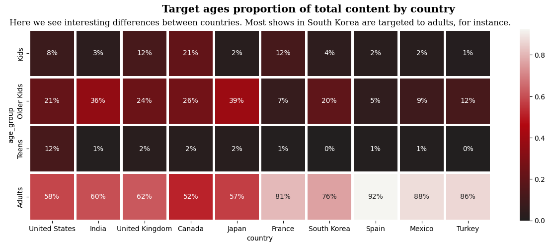
히트맵 (plt.heatmap())
# netflix 데이터 활용
plt.figure(figsize=(15, 5))

cmap = plt.matplotlib.colors.LinearSegmentedColormap.from_list("", ['#221f1f', '#b20710','#f5f5f1'])

sns.heatmap(netflix_age_country, cmap=cmap, linewidth=2.5, annot=True, fmt='.0%')

plt.suptitle('Target ages proportion of total content by country', fontweight='bold', fontfamily='serif', fontsize=15)
plt.title('Here we see interesting differences between countries. Most shows in South Korea are targeted to adults, for instance.',fontsize=12,fontfamily='serif')

plt.show()