
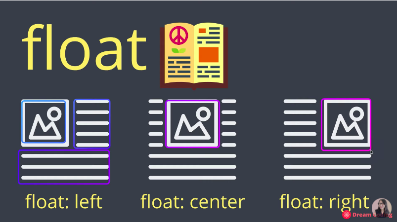
Float
Flexbox
주축과 교차축으로 이루어져 있는 정렬을 위한 컨테이너. 컨테이너에 담긴 아이템들은 main axis 축으로 담겨진다.
justify-content:
flex-start(default)
flex-end
center
space-between
space-around
space-evenly
align-items :
stretch(default)
flex-start
flex-end
center
baseline
flex-direction
row(default)
row-reverse
column
column-reverse
contaner가 아닌 개별 item에게 주는 속성
-
.item:nth-child(2){
flex:basis:200px}
특정 몇 번 째 div class="item" 값만 따로 속성을 부여할 수도 있다 -
flex-grow
기본값 0. container의 여백을 없애고 싶을 때
flex-grow : 1; item위에 container 속성 때문에 생긴 여백 전체를 item element가 1/n씩해서 나눠가질 수 있다. -
flex-shrink;
특정한 아이템이 basis값을 가지고 있을 때 그 값에서 줄이는 것을 통해 일어난다. -
justify-self, align-self
부모노드에 display:flex가 설정되었다면 개별적으로 값을 줘서 변경이 가능하다.
Space distributed outside the items
요소들 사이에 간격을 주는 건 justify-content 프로퍼티로 변경가능하다.
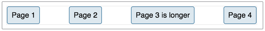
justify-content : space-between;justify-content : space-between; 을 주었을 때 적용된 모습이다.
Space distributed within the items
아이템 내 사용 공간을 이용하여 요소들 사이에 간격을 주는 방법은, 아이템 자체에 값을 주게 되는데 이 때 shrink 와 grow 값을 이용하여 값을 변경할 수 있다. 만약 똑같은 값으로 적용시키고 싶다면
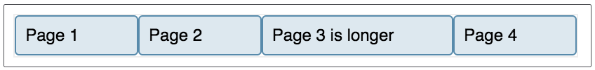
flex : auto;flex: auto;를 이용하면 되는데, flex : 1 1 auto 와 같은 말로 모든 아이템에 grow와 shrink값을 적용시킨 것이다. 이 뜻은 더 긴 콘텐츠를 담은 요소가 더 많은 공간을 갖게 된 다는 뜻이다.
Split
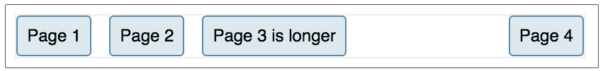
auto margin을 이용해서 부모 요소 안에 있는 특정 자식 요소의 위치만 변경시킬 수 있다.
<nav>
    <ul>
        <li><a href="#">Page 1</a></li>
        <li><a href="#">Page 2</a></li>
        <li><a href="#">Page 3 is longer</a></li>
        <li class="push-right"><a href="#">Page 4</a></li>
    </ul>
</nav>
nav ul {
  display: flex;
  margin: 0 -10px;
}
nav li {
    margin: 0 10px;
}
.push-right {
  margin-left: auto;
}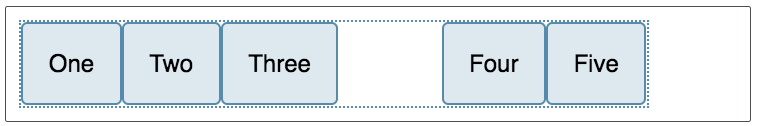
<div class="box">
  <div>One</div>
  <div>Two</div>
  <div>Three</div>
  <div class="push">Four</div>
  <div>Five</div>
</div>
.box {
display: flex;
}
.push {
margin-left: auto;
}