
🌼 echarts
-
차트 라이브러리
npm i echartsnpm i echarts-for-react- https://echarts.apache.org/en/index.html
-
import
import ECharts from "echarts-for-react";
📕 Line chart (필터적용)
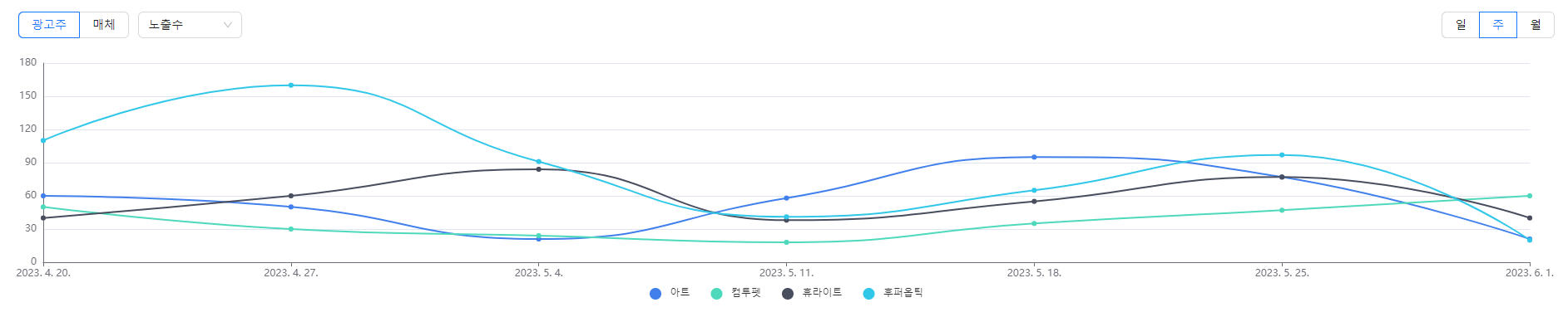
const LineChart = ({ colors }) => {
//선택된 기간에 대한 x축 data값 생성(일, 주, 월)
const generateDates = (start, end, interval) => {
const dates = [];
const current = new Date(start);
while (current < end) {
dates.push(current.toLocaleDateString());
if (interval === "day") {
current.setDate(current.getDate() + 1);
} else if (interval === "week") {
current.setDate(current.getDate() + 7);
} else if (interval === "month") {
current.setMonth(current.getMonth() + 1);
}
}
dates.push(end.toLocaleDateString()); // 마지막 날짜 포함
return dates;
};
const [startDate, setStartDate] = useState(new Date("2023/04/20"));
const [endDate, setEndDate] = useState(new Date("2023/06/01"));
const [xdata, setXData] = useState(generateDates(startDate, endDate, "day"));
//실제 데이터 (이름, 값)
const defaultData = [
{
group: "광고주",
groupname: "아트",
name: "노출수",
value: [60, 50, 21, 58, 95, 77, 21],
},
{
group: "광고주",
groupname: "아트",
name: "클릭수",
value: [10, 20, 81, 38, 95, 17, 81],
},
{
group: "광고주",
groupname: "아트",
name: "CTR",
value: [40, 60, 84, 38, 55, 77, 40],
},
{
group: "광고주",
groupname: "컴투펫",
name: "노출수",
value: [50, 30, 24, 18, 35, 47, 60],
},
{
group: "광고주",
groupname: "컴투펫",
name: "클릭수",
value: [60, 50, 21, 58, 95, 77, 21],
},
{
group: "광고주",
groupname: "컴투펫",
name: "CTR",
value: [10, 20, 81, 38, 95, 17, 81],
},
{
group: "광고주",
groupname: "휴라이트",
name: "노출수",
value: [40, 60, 84, 38, 55, 77, 40],
},
{
group: "광고주",
groupname: "휴라이트",
name: "클릭수",
value: [20, 40, 71, 68, 55, 17, 41],
},
{
group: "광고주",
groupname: "휴라이트",
name: "CTR",
value: [30, 50, 41, 58, 65, 77, 91],
},
{
group: "광고주",
groupname: "후퍼옵틱",
name: "노출수",
value: [110, 160, 91, 41, 65, 97, 20],
},
{
group: "광고주",
groupname: "후퍼옵틱",
name: "클릭수",
value: [160, 250, 21, 318, 95, 77, 21],
},
{
group: "광고주",
groupname: "후퍼옵틱",
name: "CTR",
value: [150, 20, 224, 218, 135, 47, 26],
},
{
group: "매체",
groupname: "검샷",
name: "노출수",
value: [110, 160, 91, 41, 65, 97, 20],
},
{
group: "매체",
groupname: "검샷",
name: "클릭수",
value: [160, 250, 21, 318, 95, 77, 21],
},
{
group: "매체",
groupname: "검샷",
name: "CTR",
value: [150, 20, 224, 218, 135, 47, 26],
},
{
group: "매체",
groupname: "컴샷",
name: "노출수",
value: [30, 50, 41, 58, 65, 77, 91],
},
{
group: "매체",
groupname: "컴샷",
name: "클릭수",
value: [110, 160, 91, 41, 65, 97, 20],
},
{
group: "매체",
groupname: "컴샷",
name: "CTR",
value: [160, 250, 21, 318, 95, 77, 21],
},
];
const [data, setData] = useState(defaultData);
const [filteredData, setFilteredData] = useState(
defaultData.filter(
(item) =>
item.group === defaultData[0].group && item.name === defaultData[0].name
)
);
const [selectedGroup, setSelectedGroup] = useState(defaultData[0].group);
const [selectedName, setSelectedName] = useState(defaultData[0].name);
const handlexDataChange = (e) => {
const value = e.target.value;
if (value === "day") {
const dates = generateDates(startDate, endDate, "day");
setXData(dates);
} else if (value === "week") {
const dates = generateDates(startDate, endDate, "week");
setXData(dates);
} else if (value === "month") {
const dates = generateDates(startDate, endDate, "month");
setXData(dates);
}
};
//group별 필터링
const handleGroupChange = (e) => {
setSelectedGroup(e.target.value);
};
//name별 필터링
const handleChange = (value) => {
setSelectedName(value);
};
const [options, setOptions] = useState({});
useEffect(() => {
const filteredData = defaultData.filter(
(item) => item.group === selectedGroup && item.name === selectedName
);
setFilteredData(filteredData);
}, [selectedGroup, selectedName]);
useEffect(() => {
const updateOptions = {
tooltip: {
trigger: "axis",
axisPointer: {
type: "cross",
},
},
grid: {
left: 50,
right: 50,
top: 10,
bottom: 50,
},
color: colors,
legend: {
data: filteredData.map((item) => item.groupname),
bottom: "bottom",
icon: "circle",
itemGap: 25,
},
xAxis: {
type: "category",
data: xdata,
boundaryGap: false,
},
yAxis: {
type: "value",
axisLine: {
show: true,
},
},
series: dataSeries(filteredData),
};
setOptions(updateOptions);
}, [xdata, filteredData, data]);
//차트에 데이터값 출력
const dataSeries = (filteredData) => {
return filteredData.map((item) => ({
name: item.groupname,
type: "line",
smooth: true,
data: item.value,
symbol: "circle",
symbolSize: 6,
}));
};
return (
<div>
<div
style={{
display: "flex",
justifyContent: "space-between",
margin: 20,
}}
>
<div>
<Radio.Group value={selectedGroup} onChange={handleGroupChange}>
<Radio.Button value="광고주">광고주</Radio.Button>
<Radio.Button value="매체">매체</Radio.Button>
</Radio.Group>
<Select
value={selectedName}
className="selectBox"
options={[
{ value: "노출수", label: "노출수" },
{ value: "클릭수", label: "클릭수" },
{ value: "CTR", label: "CTR" },
]}
onChange={handleChange}
/>
</div>
<div>
<Radio.Group defaultValue="day" onChange={handlexDataChange}>
<Radio.Button value="day">일</Radio.Button>
<Radio.Button value="week">주</Radio.Button>
<Radio.Button value="month">월</Radio.Button>
</Radio.Group>
</div>
</div>
<ECharts
option={options}
notMerge={true}
// opts={{ renderer: "svg", width: "auto", height: "auto" }}
/>
</div>
);
};
📙 pie chart
-
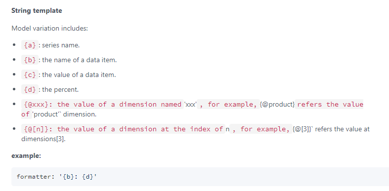
약속된 formatter 값 참고!!
-
기타일 경우 동일 색 지정
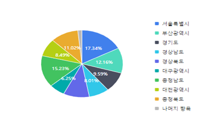
const PieChart = ({ colors }) => {
  //실제 데이터 (이름, 값)
  const data = [
    { value: 1048, name: "서울특별시" },
    { value: 735, name: "부산광역시" },
    { value: 580, name: "경기도" },
    { value: 484, name: "경상남도" },
    { value: 620, name: "경상북도" },
    { value: 378, name: "대구광역시" },
    { value: 921, name: "충청남도" },
    { value: 513, name: "대전광역시" },
    { value: 666, name: "충청북도" },
    { value: 100, name: "기타" },
  ];

  //data이름이 기타일 경우 지정색 고정
  const ColoredData = data.map((item) => ({
    ...item,
    itemStyle: {
      color:
        item.name === "기타"
          ? "#bababa"
          : colors[data.findIndex((d) => d.name === item.name)],
    },
  }));

  const [options] = useState({
    tooltip: {
      trigger: "item",
      formatter: "{c}",
      textStyle: {
        fontSize: 14,
        color: "#000000",
      },
    },

    legend: {
      orient: "vertical",
      right: "15%",
      bottom: "40",
      itemWidth: 9,
      itemHeight: 9,
      textStyle: {
        fontSize: 10,
      },
    },
    series: [
      {
        name: "Access From",
        type: "pie",
        radius: "50%",
        label: {
          show: true,
          color: "#ffffff",
          align: "center",
          position: "inside",
          formatter: "{d}%",
          fontSize: 9,
        },
        labelLine: { show: false },
        data: ColoredData,
        emphasis: {
          itemStyle: {
            shadowBlur: 10,
            shadowOffsetX: 0,
            shadowColor: "rgba(0, 0, 0, 0.5)",
          },
        },
        itemStyle: {
          borderWidth: "1",
          borderColor: "#ffffff",
        },
      },
    ],
  });

  return (
    <div className="pieChartDiv">
      <div className="pieChart">
        <ECharts
          option={options}
          opts={{ renderer: "svg", width: "auto", height: "auto" }}
        />
      </div>
    </div>
  );
};
📒 Bar Chart
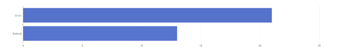
const BarChart = ({ colors }) => {
  //실제 데이터 (이름, 값)
  const data = [
    { value: 21, name: "Direct" },
    { value: 13, name: "Referral" },
  ];

  const [options] = useState({
    yAxis: {
      type: "category",
      data: data.map((item) => item.name).reverse(),
    },
    xAxis: {
      type: "value",
      splitNumber: 5,
      interval: 5,
    },
    series: [
      {
        data: data.map((item) => item.value).reverse(),
        type: "bar",
        itemStyle: {
          color: colors,
        },
        barWidth: "80%",
      },
    ],
  });

  return (
    <div className="BarChartDiv">
      <ECharts
        option={options}
        opts={{ renderer: "svg", width: "auto", height: "auto" }}
      />
    </div>
  );
};
📗 Multi Chart
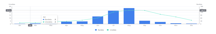
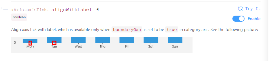
- xAxis > axisTick > alignWithLabel :
const DynamicChart = ({ colors }) => {
  //범례
  const category = ["Bardata", "Linedata"];

  //x축 데이터
  const data = [
    "Jan",
    "Feb",
    "Mar",
    "Apr",
    "May",
    "Jun",
    "Jul",
    "Aug",
    "Sep",
    "Oct",
    "Nov",
    "Dec",
  ];

  //barchart로 출력될 데이터
  const bardata = [
    2.0, 4.9, 7.0, 23.2, 25.6, 76.7, 135.6, 162.2, 32.6, 20.0, 6.4, 3.3,
  ];

  //linechart로 출력될 데이터
  const linedata = [
    2.0, 2.2, 3.3, 4.5, 6.3, 10.2, 20.3, 23.4, 23.0, 16.5, 12.0, 6.2,
  ];

  const [options] = useState({
    color: colors,
    tooltip: {
      trigger: "axis",
      axisPointer: {
        type: "cross",
      },
    },
    legend: {
      data: category,
      bottom: "bottom",
      icon: "circle",
      itemGap: 25,
    },
    xAxis: [
      {
        type: "category",
        axisTick: {
          alignWithLabel: true,
        },
        data: data,
      },
    ],
    yAxis: [
      {
        type: "value",
        name: category[0],
        position: "right",
        alignTicks: true,
        axisLine: {
          show: true,
        },
      },
      {
        type: "value",
        name: category[1],
        position: "left",
        alignTicks: true,
        axisLine: {
          show: true,
        },
      },
    ],
    series: [
      {
        name: category[0],
        type: "bar",
        data: bardata,
        smooth: true,
      },

      {
        name: category[1],
        type: "line",
        yAxisIndex: 1,
        data: linedata,
        symbol: "circle",
        symbolSize: 6,
      },
    ],
  });
📘 Area Chart

const AreaChart = ({data}) => {
  //chartscorecard에 있는 data를 사용하지 않을 경우 데이터를 직접 입력해 줘야함
  // const data = [0, 175, 211, 270, 234, 280, 130, 100, 0];

  //chartscorecard에서 가져오는 data가 undefined인 경우 빈 배열로 처리
  if (!data) {
    data = [];
  }

  const minValues = [];
  const minValue = Math.min(...data);

  const maxValues = [];
  const maxValue = Math.max(...data);

  data.forEach((value, index) => {
    if (value === minValue) {
      minValues.push(index);
    }
    if (value === maxValue) {
      maxValues.push(index);
    }
  });

  const [options] = useState({
    tooltip: {
      backgroundColor: "#636465",
      textStyle: {
        color: "white",
      },
      trigger: "axis",
      formatter: function (params) {
        var tooltipContent = "";
        params.forEach(function (item) {
          var color = "#30c7e9";
          var value = item.data;
          tooltipContent +=
            '<span style="display:inline-block;margin-right:5px;border-radius:10px;width:8px;height:8px;background-color:' +
            color +
            ';"></span>';

          tooltipContent += value;
        });
        return tooltipContent;
      },
    },

    grid: {
      left: 0,
      right: 0,
      top: 0,
      bottom: 0,
    },
    xAxis: {
      type: "category",
      boundaryGap: false,
      show: false,
    },
    yAxis: {
      type: "value",
      show: false,
    },
    series: [
      {
        data: data,
        type: "line",
        areaStyle: {
          color: "rgba(65,128,236,0.2)",
        },
        color: "rgba(65,128,236,0.5)",
        symbol: "circle",
        symbolSize: 3,
        markPoint: {
          symbol: "circle",
          symbolSize: 3.5,
          label: {
            show: false,
          },
          data: [
            ...maxValues.map((index) => ({
              type: "max",
              name: "max",
              itemStyle: { color: "green" },
              coord: [index, maxValue],
            })),
            ...minValues.map((index) => ({
              type: "min",
              name: "min",
              itemStyle: { color: "orange" },
              symbolSize: 6,
              coord: [index, minValue],
            })),
          ],
        },
      },
    ],
  });

  return (
    <div className="AreaChart">
      <ECharts
        option={options}
        style={{ height: "30px" }}
        // opts={{ renderer: "svg", width: "auto", height: "auto" }}
      />
    </div>
  );
};

//원하는 차트컴포넌트 출력
//차트 컬러(순서고정, max 10)
const ChartComponent = () => {
  const colors = [
    "#4180ec",
    "#4fd9bc",
    "#494e5f",
    "#30c7e9",
    "#6269e9",
    "#00aaaa",
    "#42c360",
    "#b5cf14",
    "#eaab2f",
    "#bababa",
  ].slice(0,10);

  return (
    <div>
      <LineChart colors={colors} />
      <PieChart colors={colors} />
      <BarChart color={colors} />
      <DynamicChart colors={colors} />
      <AreaChart />
    </div>
  );
};
📜 숫자형 스코어카드

const NumberScoreCard = () => {
  const data = [
    { id: 1, name: "페이지뷰", value: 32 },
    { id: 2, name: "전체 방문수", value: 27 },
    { id: 3, name: "북마크/직접입력 방문수", value: 17 },
    { id: 4, name: "외부유입 방문 랜딩페이지 통과율", value: "44.44%" },
    { id: 5, name: "전체 반송수", value: 22 },
  ];

  return (
    <table className="scorecard">
      <tbody>
        <tr>
          {data.map((item) => (
            <td key={item.id} className="cardName">
              {item.name}
              <br /> <strong className="emphasis">{item.value}</strong>
            </td>
          ))}
        </tr>
      </tbody>
    </table>
  );
};
📃 차트형 스코어카드
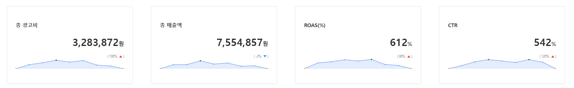
const ChartScoreCard = () => {
const chartData = [
{
title: "총 광고비",
value: "3,283,872",
unit: "원",
percent: 100,
data: [0, 145, 211, 301, 234, 290, 130, 100, 0],
},
{
title: "총 매출액",
value: "7,554,857",
unit: "원",
percent: -2,
data: [0, 205, 211, 401, 234, 290, 130, 150, 0],
},
{
title: "ROAS(%)",
value: "612",
unit: "%",
percent: 80,
data: [0, 175, 211, 270, 234, 280, 130, 100, 0],
},
{
title: "CTR",
value: "542",
unit: "%",
percent: 120,
data: [0, 95, 211, 275, 234, 190, 275, 200, 0],
},
];
return (
<div style={{ display: "flex" }}>
{chartData.map((data, index) => (
<ChartScoreCardData key={index} data={data} />
))}
</div>
);
};
const ChartScoreCardData = ({ data }) => {
const { title, value, unit, percent, data: chartData } = data;
const upAnddown = percent > 0 ? "▲" : "▼";
const upAnddownColor = percent > 0 ? "#de481f" : "#4993e4";
return (
<div className="chartScoreCardDiv" style={{ width: "25%" }}>
<div className="chartScoreCard">
<h3 className="CardTitle">{title}</h3>
<div className="CardValueDiv">
<h1 className="CardValue">
{value}
<span className="won">{unit}</span>
</h1>
<span className="percent">
( {percent}%{" "}
<span className="upAnddown" style={{ color: upAnddownColor }}>
{upAnddown}
</span>{" "}
)
</span>
</div>
<div className="areaChartCard">
<AreaChart data={chartData} />
</div>
</div>
</div>
);
};🌼 highchart
-
차트 라이브러리
npm install highcharts --savenpm install highcharts-react-official --save- https://www.highcharts.com/demo
-
import
import Highcharts from "highcharts";import HighchartsReact from "highcharts-react-official";
📚 양방향 bar 차트
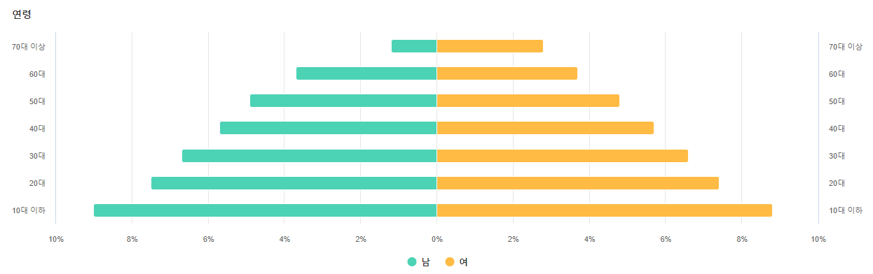
const TwoWayBarChart = () => {
  //연령
  const categories = [
    "10대 이하",
    "20대",
    "30대",
    "40대",
    "50대",
    "60대",
    "70대 이상",
  ];

  //왼쪽 bar data
  const Ldata = [-9.0, -7.5, -6.7, -5.7, -4.9, -3.7, -1.2];

  //오른쪽 bar data
  const Rdata = [8.8, 7.4, 6.6, 5.7, 4.8, 3.7, 2.8];

  const options = {
    chart: {
      type: "bar",
      // height: 350,
    },
    title: {
      text: "연령",
      align: "left",
      style: {
        color: "#313131",
        fontSize: "14px",
        fontWeight: "600",
      },
    },
    xAxis: [
      //왼쪽 bar
      {
        categories: categories,
        reversed: false,
        labels: {
          style: {
            color: "#666",
            fontSize: "11px",
          },
        },
        lineColor: "#CCD6EB",
      },
      //오른쪽 bar(opposite: true)
      {
        categories: categories,
        reversed: false,
        opposite: true,
        linkedTo: 0, //x축 동일하게 오른쪽에도 적용
        labels: {
          style: {
            color: "#666",
            fontSize: "11px",
          },
        },
        lineColor: "#CCD6EB",
      },
    ],
    yAxis: {
      title: false,
      labels: {
        formatter: function () {
          return Math.abs(this.value) + "%";
        },
        style: {
          color: "#666",
          fontSize: "11px",
        },
      },
      tickInterval: 2,
    },
    colors: ["#4CD2B5", "#FFBB44"],
    plotOptions: {
      series: {
        stacking: "normal",
      },
    },

    tooltip: {
      formatter: function () {
        return (
          "<b>" +
          this.series.name +
          ", age " +
          this.point.category +
          "</b><br/>" +
          "Population: " +
          Math.abs(this.point.y) +
          "%"
        );
      },
      borderWidth: 1,
    },

    series: [
      {
        name: "남",
        data: Ldata,
      },
      {
        name: "여",
        data: Rdata,
      },
    ],
    legend: {
      itemStyle: {
        color: "#313131",
        fontSize: "13px",
        fontWeight: "600",
      },
    },
  };
  return (
    <>
      <HighchartsReact highcharts={Highcharts} options={options} />
    </>
  );
};

Study Log 📂