📖 Making charts in Tableau
- to compare data across categories
- Drag a dimension to color on the marks card
- To be able to visualize complex information with fewer bars/marks
- To visualize parts of a whole
Date Parts and Date Values
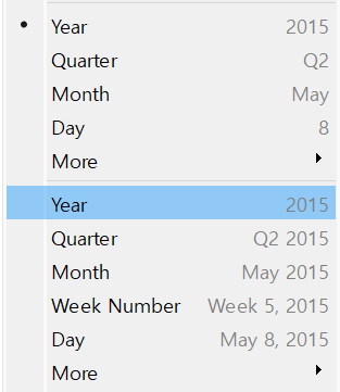
- Discrete → Date Part
- Continuous → Date Value
- connect individual data points in a view
- The default chart that gets created when using dates(a date demension followed by a continuous measure on one shelf)
- we cannot create line chart without date field
Area charts
- A line chart where the area between the line and the axis are shaded with a color.
- used to represent accumulated totals over time
- the conventional way to display stacked lines
side-by-side bars / side-by-side circles
- Requires at least 3 fields
- The shape option is available for side-by-side circles
- to visualize the relationships between numerical variables(at least 2 measures)
- add one measre to Rows and the other to Colums
- analogous to a Cartesian chart, with x and y coordinates
- to best improve the display of a scatter plot that has overlapping shapes, you should adjust the mark size of the marks.
- for analyzing two measures with different scales
- Combo chart: when customizing the mark type for each distinct measure
- Combined Axis Chart: 2 axis can cause a confusion and difference in scale can lead to misunderstandings → synchronize axis
- with using Marks(Color, Size)
Filled Maps
- adding geographic data to the view → Detail on the Marks Card
- No Symbol(ex.circle)
- You can use Color Marks but cannot use Size Marks
- You can color by one measure and use another measure as the label
to build the map
- drag latitude to the Rows shelf and Longitude to the Columns shelf
- one of the slowest visualization types
- also called Pivot Tables or Text Tables
1) Drag the measure to 'Abc' in the view
2) Drag the measure to Text on the Marks card
3) Just double click on the measure
- Adding Totals to the view
1) Analysis(상단 메뉴) → Totals
2) Analytics(분석 패널) → Totals → Subtotals, Column grand totals, Row grand totals
Pie chart
- As a general best practice, pie chart should contain 2 to 5 categories.
Bullet Graphs
- at least 2 measures
- A variation of a bar graph developed to replace dashboard gauges and meters.
It is useful for comparing the performance of a primary measure to one or more other measures.
Gantt chart
- shows the duration of events or activities
- to track time durations
Tree maps
- The size begins with the largest rectangle on the top left and the smallest rectangle on the botton right.
- Size option on the Marks dose not work.
Pareto chart
- A type of chart that contains both bars and a line graph, where individual values are represented in desending order by bars, and the ascending cumulative total is represented by the line.
Box plot
- to analyze the distribution of data within individual categories
Packed bubble chart
- to illustrate volume differences
To show Mark Labels in the visualization
- Drag the measure to the Text label in the Marks Card
- Click on Analysis in the Menu bar and choose Show Mark Labels
- Click on the Show mark labels icon in the Toolbar
To Bold the Tooltip content in Tableau
- Click on Tooltip in the Marks card, and select bold
- Click on Worksheet in the Menu bar, followed by Tooltip and select the bold option
- Right click, click format and then under the default worksheet formatting, choose Tooltip and make it bold.
- Select Format on the menu, and then select Font
To make either of Rows or Columns Bold without affecting the other
- Right click on Rows or Columns, and choose format. In the Font option click on Bold
- Choose Format from the Menu bar, select Row or Column, and then select Bold under the header option
To italicize Tooltip content in Tableau
- Format(Menu bar) → Font → edit the Tooltip options
- Worksheet(Menu bar) → Tooltip → use the italics option
- Tooltip(Marks card) → select the text → use the Italics option
Highlighters
- To focus on specific data without removing data in the visualization
how to show summary of a view
- Click on Worksheet menu → Show Summary
the purpose of the marks card in Tableau
- To define the visual encoding of a chart or graph
to change the font of a worksheet title
- Select Format on the menu, and then select Font
- Double click the title in a particular view and use the dialog box
- Right click the title in a view, and then select edit title
- Format on the menu, and then select Title and Caption (X)
(Right click the title in a view, and then select format title)
→ Shading, Border만 수정 가능
- Quick table calculations
- Running Total
- Difference
- Percent Difference
- Percent of Total
- Rank
- Percentile
- Moving Average
- YTD Total
- Compound Growth Rate
- Year Over Year Growth
- YTD Growth
- Compute Using Table(across) / Table(down) / Pane(down)
- Highlight Tables
only using Color Marks
- Heat Maps(default shape: square)
using both Color and Size Marks
