import matplotlib.pyplot as plt
# %matplotlib inline
plt.figure
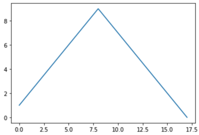
plt.plot([1,2,3,4,5,6,7,8,9,8,7,6,5,4,3,2,1,0])
plt.show()
import numpy as np
t = np.arange(0, 12, 0.01)
y = np.sin(t)
t → 0 ~ 12 까지 0.01씩 증가
y → sin 함수
plt.figure(figsize = (10, 6))
plt.plot(t, y)
plt.grid()
plt.xlabel('time')
plt.ylabel('Amplitude')
plt.title('Example of sinewave')
plt.show()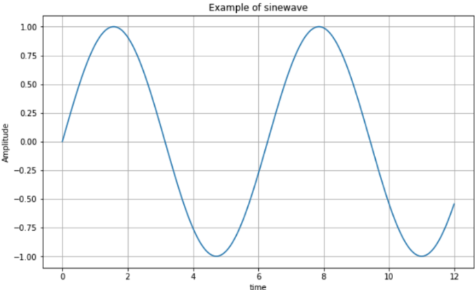
plt.figure(figsize=(10,6))
plt.plot(t, np.sin(t))
plt.plot(t, np.cos(t))
plt.grid() plt.xlabel('time')
plt.ylabel('Amplitude')
plt.title('Example of sinewave')
plt.show()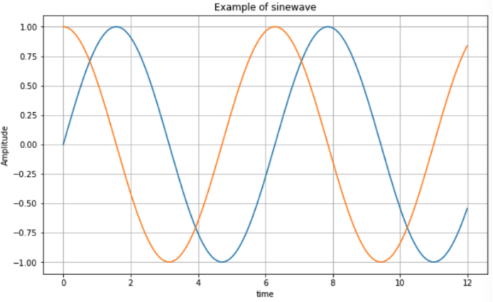
plt.figure(figsize=(10,6))
plt.plot(t, np.sin(t), label = 'sin')
plt.plot(t, np.cos(t), label = 'cos')
plt.grid()
plt.legend()
plt.xlabel('time')
plt.ylabel('amplitude')
plt.title('Example of sinewave')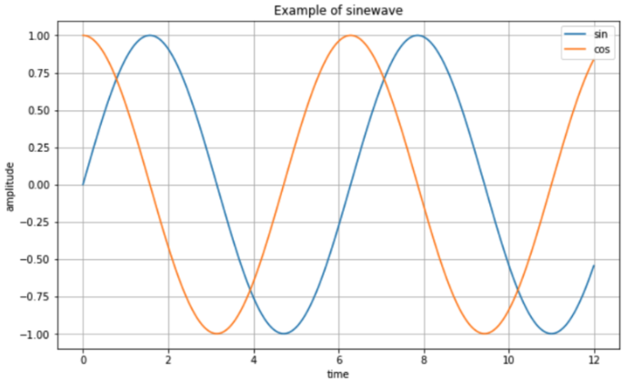
plt.figure(figsize = (10,6))
plt.plot(t, np.sin(t), lw=3, label = 'sin')
plt.plot(t, np.cos(t), 'r', label = 'cos')
plt.grid()
plt.legend()
plt.xlabel('time')
plt.ylabel('Amplitude')
plt.title('Example of sinewave')
plt.show()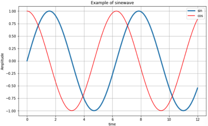
t = [0,1,2,3,4,5,6]
y = [1,4,5,8,9,5,3]
plt.figure(figsize = (10,6))
plt.plot(t, y, color = 'green')
plt.show()
plt.figure(figsize = (10, 6))
plt.plot(t, y, color = 'green', linestyle = 'dashed')
plt.show()
plt.figure(figsize = (10, 6))
plt.plot(t, y, color = 'green', linestyle = 'dashed', marker = 'o') plt.show()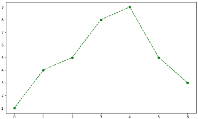
# 다른 방법.
plt.figure(figsize = (10,6))
plt.plot(t, y, 'go--')
plt.show()plt.figure(figsize = (10, 6))
plt.plot(t, y,'go--', markerfacecolor = 'blue', markersize = 12) plt.xlim([-0.5, 6.5])
plt.ylim([0.5, 9.5])
plt.show()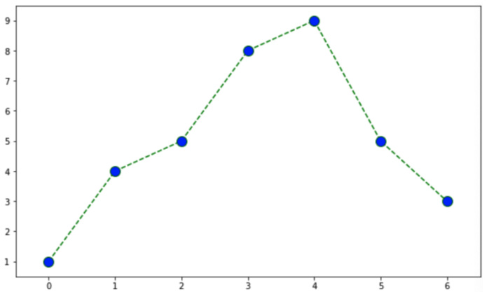
scatter 그래프
t = np.array([0,1,2,3,4,5,6,7,8,9])
y = np.array([9,8,7,9,8,3,2,4,3,4])
plt.figure(figsize=(10,6))
plt.scatter(t, y)
plt.show()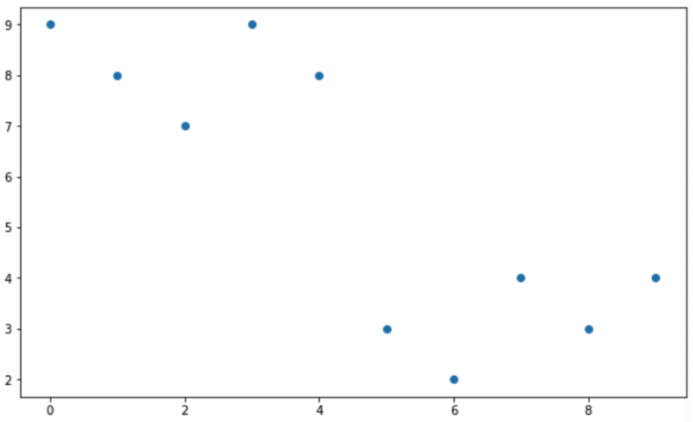
plt.figure(figsize = (10,6))
plt.scatter(t, y, marker='>')
plt.show()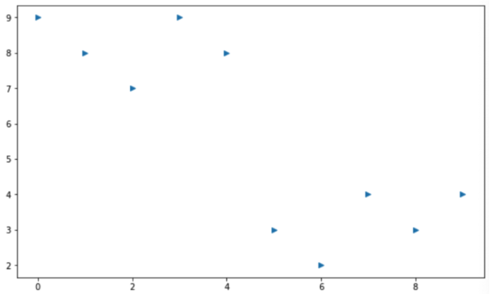
colormap = t
plt.figure(figsize=(10, 6))
plt.scatter(t, y, s = 50, c = colormap, marker = '>')
plt.colorbar()
plt.show()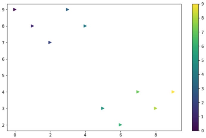
s1 = np.random.normal(loc = 0 ,scale = 1, size = 1000)
s2 = np.random.normal(loc = 5, scale = 0.5, size = 1000)
s3 = np.random.normal(loc = 10, scale = 2, size = 1000)plt.figure(figsize = (10, 6))
plt.plot(s1, label = 'loc = 0, scale = 1')
t.plot(s2, label = 'loc = 5, scale = 0.5')
plt.plot(s3, label = 'loc = 10, scale = 2')
plt.legend()
plt.show()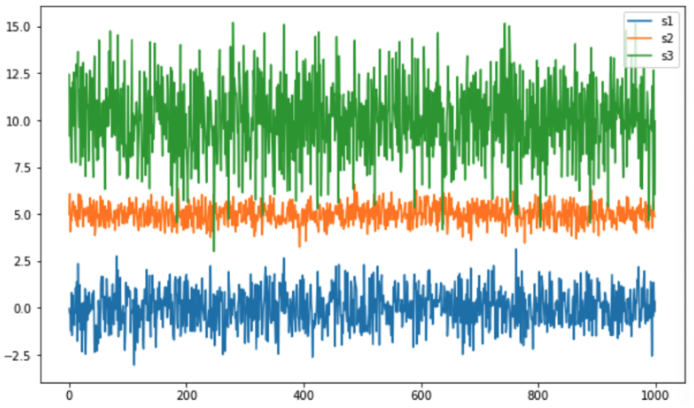
boxplot.
plt.figure(figsize = (10, 6))
plt.boxplot((s1, s2, s3))
plt.grid()
plt.show()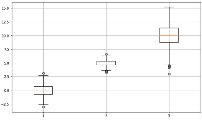

Data Science. DevOps.