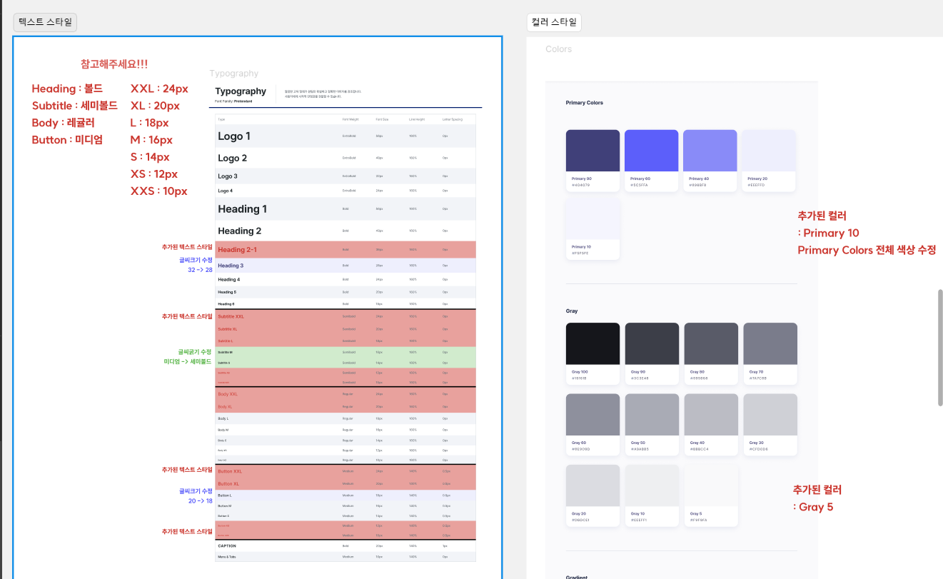
현재 진행하는 프로젝트에서 디자이너분께서 텍스트스타일과 컬러스타일을 테이블로 만들어서 주었다.
이전에 진행한 프로젝트에서 font-size, font-weight, 배경이나 색상을 컴포넌트마다 일일이 설정했던 게 생각이 났고, 이것을 깔끔하게 사용하고 싶었다.
디자이너가 피그마에서 정해진 색상의 종류, 폰트의 종류를 고려하여 디자인한다. 다만 나는 그 값을 일일이 하드코딩 하였고, styled-components에서 제공하는 ThemeProvider를 사용하여 깔끔하게 사용해보자
1. theme.ts 생성하기
이번 프로젝트에서 스타일과 관련된 파일은 src/styles에 모아두었다.
theme.ts란, 자주 사용되거나 공통으로 사용되는 스타일(폰트, 색상 등)을 모아두고, 각 컴포넌트에서 theme.ts에 선언한 상수값을 사용하는 것이다.
일일이 색상값이나 폰트크기를 여러개 설정하지 않아도 되고 오탈자의 위험도 방지하는 좋은 수단이다.
1-1. 색상 설정하기
디자인 시스템에서 설정한 색상들을 다음처럼 선언한다.
const colors = {
  primary90: '#404079',
  gray100: '#15161B',
  gray90: '#3C3E48',
  white: '#FFFFFF',
  ...
} as const;
1-2. 폰트 설정하기
자주 사용하는 폰트와 스타일을 설정한다.
font-family에 사용하는 폰트는 꼭 다른곳에서 선언을 하고 사용해야 한다.
나는 globalFont.ts에서 @font-face로 선언하였다.
interface Font {
  font: string;
  weight: number;
  size: number;
  lineHeight: number;
}

const FONT = ({ font, weight, size, lineHeight }: Font): string => {
  return `
    font-family : "${font}";
    font-weight : ${weight};
    font-size : ${size}rem;
    line-height : ${lineHeight}%;
    `;
};

const fonts = {
  //logo
  logo1: FONT({ font: 'Suit', weight: 800, size: 5.6, lineHeight: 160 }),
  logo2: FONT({ font: 'Suit', weight: 800, size: 4.8, lineHeight: 160 }),
  logo3: FONT({ font: 'Suit', weight: 800, size: 3.2, lineHeight: 160 }),
  logo4: FONT({ font: 'Suit', weight: 800, size: 2.4, lineHeight: 160 }),

  //heading
  heading1: FONT({
    font: 'Pretendard',
    weight: 700,
    size: 5.6,
    lineHeight: 160,
  }),
  ...
1-3. 반응형 웹 브레이크포인트 설정하기
하는김에 반응형 브레이크포인트도 설정하였다.
const deviceSizes = {
  mobile: '390px',
  tablet: '768px',
  desktop: '1536px',
};

const devices = {
  mobile: `screen and (min-width: ${deviceSizes.mobile})`,
  tablet: `screen and (min-width: ${deviceSizes.tablet})`,
  desktop: `screen and (min-width: ${deviceSizes.desktop})`,
};
1-4. theme이라는 하나의 객체로 export하기
ThemeProvider에서 theme이라는 객체를 통해 우리가 선언한 상수값을 사용할 수 있도록 export하였다.
import { DefaultTheme } from 'styled-components';


...


export type ColorsTypes = typeof colors;
export type FontsTypes = typeof fonts;
export type DevicesTypes = typeof devices;

export const theme: DefaultTheme = {
  colors,
  fonts,
  devices,
};
2. styled.d.ts 생성하기
DefaultTheme에는 우리가 만든 theme이라는 객체의 타입이 존재하지 않으므로, 인터페이스를 확장하여야 한다.
//styled.d.ts
import 'styled-components';
import { ColorsTypes, DevicesTypes, FontsTypes } from './theme';

declare module 'styled-components' {
  export interface DefaultTheme {
    colors: ColorsTypes;
    fonts: FontsTypes;
    devices: DevicesTypes;
  }
}
3. ThemeProvider로 theme.ts 사용하기
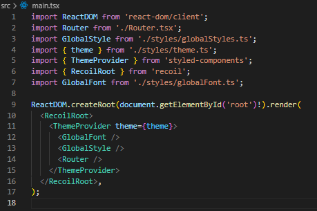
이번 프로젝트의 경우 App.tsx를 없애고 main.tsx에서 바로 Router.tsx를 사용했다.
저렇게 ThemeProvider theme={theme}을 사용하면, 하위 컴포넌트에서 theme.ts에 지정한 상수값을 사용할 수 있다.
//Footer.tsx : 임의의 컴포넌트
import styled from 'styled-components';
const Footer = () => {
return (
<Test>테스트</Test>
);
};
export default Footer;
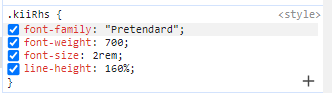
const Test = styled.div`
${(props) => props.theme.fonts.heading5}
`;
위의 결과처럼, 단 한줄로 원하는 스타일을 묶어서 사용할 수 있게 되었다!