GlassMorphism Tutorial
구현 목표
- 글래스모피즘 구현
구현 태스크
- 백그라운드 컬러 구현
- 백그라운드 도형 구현: 백그라운드 이미지에 대비해 블러링 처리된 도형
- 프론트 반투명 카드 뷰: 백그라운드 컬러 및 도형 색깔이 비춰보이는 블러링 이펙트
핵심 코드
import SwiftUI
struct GlassmorphismTutorialBootCamp: View {
var body: some View {
ZStack {
LinearGradient(gradient: Gradient(colors: [Color.white, Color.white.opacity(0.0)]), startPoint: .top, endPoint: .bottom)
LinearGradient(gradient: Gradient(colors: [Color.blue.opacity(0.6), Color.purple.opacity(0.3)]), startPoint: .topLeading, endPoint: .bottomTrailing)
// Bottom Layer View -> Opacity
// Background -> Make CardView popable
popUpView
}
}
}
}
extension ContentView {
private var popUpView: some View {
ZStack(alignment: .topLeading) {
Color.white.opacity(0.5)
.frame(width: 300, height: 400)
.clipShape(RoundedRectangle(cornerRadius: 30, style: .continuous))
.blur(radius: 1)
.shadow(color: Color.black.opacity(0.2), radius: 10, x: 0, y: 10)
// opacity + blur -> background color
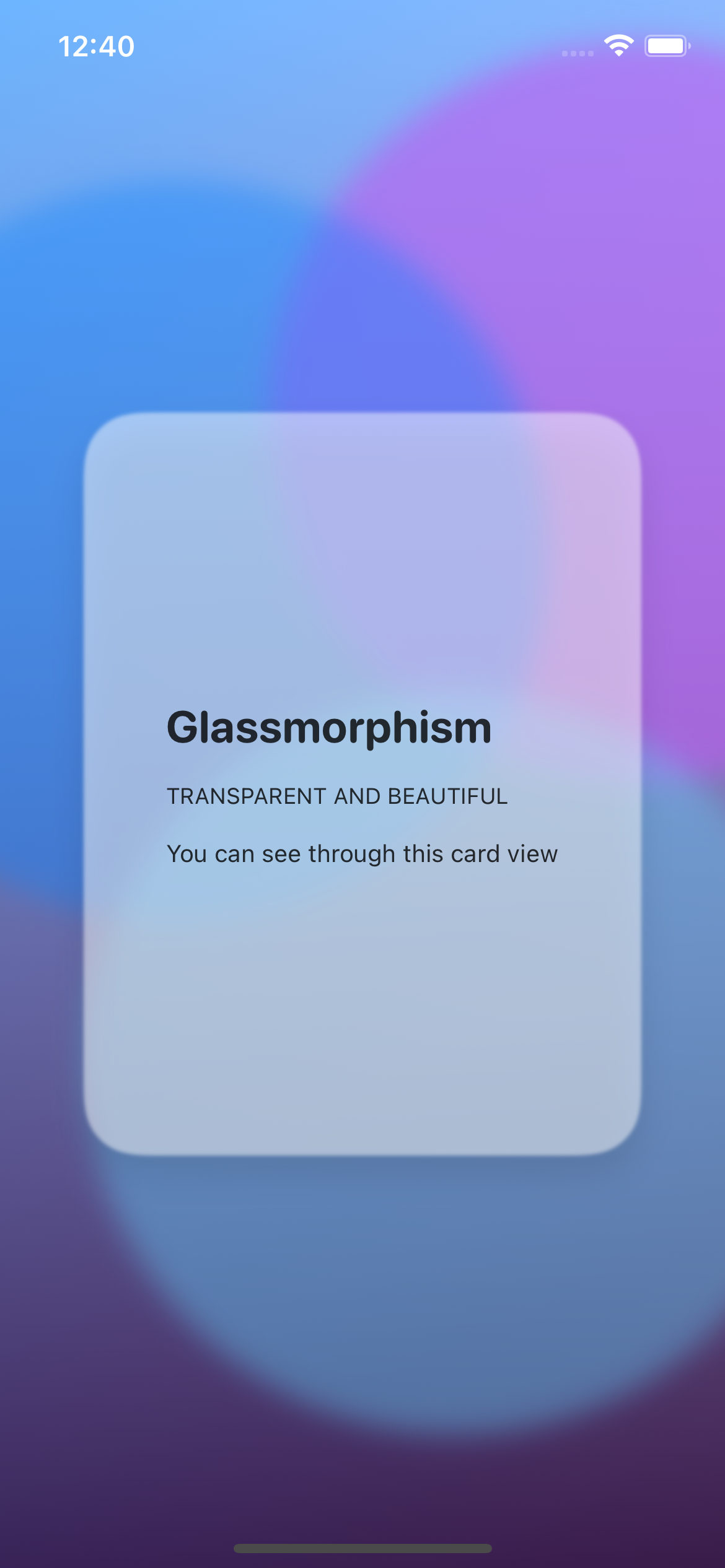
VStack(alignment: .leading, spacing: 16) {
Text("Glassmorphism")
.font(.system(size: 24, weight: .bold, design: .rounded))
Text("Transparent and Beautiful".uppercased())
.font(.caption)
Text("You can see through this card view")
.font(.footnote)
}
.padding()
.frame(width: 300, height: 400)
.foregroundColor(Color.black.opacity(0.8))
}
}
}- 글래스모피즘의 핵심은 유리창 같은 프론트 상단의 반투명 뷰에
opacity를 통해 백그라운드를 비춰보이는 것 - SwiftUI의 ZStack을 활용한 백그라운드 + 반투명 뷰 + 블러링 이펙트를 통해 유리창에 비춰보이는 효과를 상대적으로 쉽게 구현 가능
소스 코드
import SwiftUI

struct GlassmorphismTutorialBootCamp: View {
    @State private var isAnimating: Bool = false
    let timer = Timer.publish(every: 1, on: .main, in: .common).autoconnect()
    var body: some View {
        ZStack {
            LinearGradient(gradient: Gradient(colors: [Color.white, Color.white.opacity(0.0)]), startPoint: .top, endPoint: .bottom)
            LinearGradient(gradient: Gradient(colors: [Color.blue.opacity(0.6), Color.purple.opacity(0.3)]), startPoint: .topLeading, endPoint: .bottomTrailing)
            // Background -> Make CardView popable
            ZStack {
                Circle()
                    .frame(width: 400, height: 400)
                    .offset(x: 150, y: -200)
                    .foregroundColor(Color.purple.opacity(0.6))
                    .blur(radius: 8)
                    .scaleEffect(isAnimating ? 0.8 : 1)
                Circle()
                    .frame(width: 400, height: 400)
                    .offset(x: -100, y: -125)
                    .foregroundColor(Color.blue.opacity(0.4))
                    .blur(radius: 8)
                    .scaleEffect(isAnimating ? 0.8 : 1)
                Circle()
                    .frame(width: 400, height: 400)
                    .offset(x: 50, y: 150)
                    .foregroundColor(Color.cyan.opacity(0.4))
                    .blur(radius: 8)
                    .scaleEffect(isAnimating ? 0.8 : 1)
                popUpView
            }
        }
        .onReceive(timer, perform: { _ in
            withAnimation(.default) {
                isAnimating.toggle()
            }
        })
        .ignoresSafeArea()
    }
}

extension ContentView {
    private var popUpView: some View {
        ZStack(alignment: .topLeading) {
            Color.white.opacity(0.5)
                .frame(width: 300, height: 400)
                .clipShape(RoundedRectangle(cornerRadius: 30, style: .continuous))
                .blur(radius: 1)
            .shadow(color: Color.black.opacity(0.2), radius: 10, x: 0, y: 10)
            VStack(alignment: .leading, spacing: 16) {
                Text("Glassmorphism")
                    .font(.system(size: 24, weight: .bold, design: .rounded))
                Text("Transparent and Beautiful".uppercased())
                    .font(.caption)
                Text("You can see through this card view")
                    .font(.footnote)
            }
            .padding()
            .frame(width: 300, height: 400)
            .foregroundColor(Color.black.opacity(0.8))
        }
    }
}
구현 화면
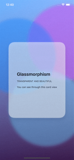
튜토리얼 난이도의 글래스모피즘에 관해 공부해 보았다. SwiftUI가 제공하는 매우 간단한 ZStack, 도형 및 색깔 함수를 통해 쉽게 구현할 수 있다는 게 장점.
- 최근 나온 디자인 트렌드...인 까닭에 UIKit으로 구현된 튜토리얼 영상은 아직 찾지 못했다. ZStack, blurring 등 도형을 다루는 게 보다 익숙해지면 UIKit으로도 작성해보고 싶다.
- 글래스모피즘 이외에도 클레이모피즘, 큐비즘 등 매우 다양한 디자인 트렌트가 존재하고 있는데, 심플하고 간단한 UI를 구현하는 데 SwiftUI를 사용한 영상이 매우 많은 것 같다는 게 소감
- 다음에는 보다 복잡하지만 보다 더 아름다운 UI를 그리는 방법을 공부해보자.

JUST DO IT