TabView
구현 목표
- 커스텀 탭바 컴포넌트 구현
- 디폴트 탭바와 같은 동작을 하는, 하지만 탭바 이동에서
MatchedGeometryEffect애니메이션 효과가 적용된 보다 세련된 커스텀 탭바
구현 태스크
Generic타입ViewBuilder,View ModifierPreferenceKeyMatchedGeometryEffectenum사용
핵심 코드
private func tabView(tab: TabBarItem) -> some View {
        VStack {
            Image(systemName: tab.iconName)
                .font(.subheadline)
            Text(tab.title)
                .font(.system(size: 10, weight: .semibold, design: .rounded))
        }
        .foregroundColor(localSelection == tab ? tab.color : Color.gray)
        .padding(.vertical, 8)
        .frame(maxWidth: .infinity)
        .background(localSelection == tab ? tab.color.opacity(0.2) : .clear)
        .cornerRadius(10)
}- 탭 뷰를 그리는 함수
selection상태에 따라서 텍스트 컬러, 백그라운드 컬러 변경된 뷰를 렌더링
struct CustomTabBarContainerView<Content: View>: View {
    let content: Content
    @Binding var selection: TabBarItem
    @State private var tabs: [TabBarItem] = [.home, .favorites, .profile]
    init(selection: Binding<TabBarItem>, @ViewBuilder content: () -> Content) {
        self._selection = selection
        self.content = content()
    }
    var body: some View {
        ZStack(alignment: .bottom) {
            content.ignoresSafeArea()
            CustomTabBarView(tabs: tabs, localSelection: selection, selection: $selection)
        }
        .onPreferenceChange(TabBarItemPreferenceKey.self) { value in
            self.tabs = value
        }
    }
}- 선택한 탭에 따른 컨테이너 서브 뷰
View프로토콜을 준수하는Content, 즉 서브 뷰를 클로저 형태로 받기 위해@ViewBuilder를 받음selection을 부모 탭뷰의selection과 바인딩- 부모 탭 뷰에 대하여 자식 뷰인 현재 컨테이너 뷰 값 변동을 확인하기 위해
PreferenceKey의onPreferenceChange연결 - 부모 탭뷰의 특정 값이 선택되면 여러 개의 자식 뷰의 이동이 일어나는 게 아니라 한 개의 자식 뷰 컨텐츠가 변경되는 것 → 애니메이션, 값 변경 등을 통해
이동하는 것처럼보이게 만들기
소스 코드
import SwiftUI

enum TabBarItem: Hashable {
    case home, favorites, profile, messages

    var iconName: String {
        switch self {
        case .home:
            return "house"
        case .favorites:
            return "heart"
        case .profile:
            return "person"
        case .messages:
            return "message"
        }
    }

    var title: String {
        switch self {
        case .home:
            return "HOME"
        case .favorites:
            return "FAVORITES"
        case .profile:
            return "PROFILE"
        case .messages:
            return "MESSAGES"
        }
    }

    var color: Color {
        switch self {
        case .home:
            return Color.red
        case .favorites:
            return Color.blue
        case .profile:
            return Color.green
        case .messages:
            return Color.orange
        }
    }
}- 하단 탭바의 각 탭 아이템
enum으로 선언, 고정되어 있는 형태이기 때문에 구조체보다 사용 효율적
import SwiftUI

struct CustomTabBarView: View {
    let tabs: [TabBarItem]
    @Namespace private var namespace
    @State var localSelection: TabBarItem
    @Binding var selection: TabBarItem

    var body: some View {
        tabBarVersion2
            .onChange(of: selection) { newValue in
                withAnimation(.easeInOut) {
                    localSelection = newValue
                }
            }
    }
}

extension CustomTabBarView {
    private func tabView(tab: TabBarItem) -> some View {
        VStack {
            Image(systemName: tab.iconName)
                .font(.subheadline)
            Text(tab.title)
                .font(.system(size: 10, weight: .semibold, design: .rounded))
        }
        .foregroundColor(localSelection == tab ? tab.color : Color.gray)
        .padding(.vertical, 8)
        .frame(maxWidth: .infinity)
        .background(localSelection == tab ? tab.color.opacity(0.2) : .clear)
        .cornerRadius(10)
    }

    private func switchToTab(tab: TabBarItem) {
        selection = tab
    }

    private func switchToTabWithAnimation(tab: TabBarItem) {
        withAnimation(.easeInOut) {
            selection = tab
        }
    }

    private var tabBarVersion1: some View {
        HStack {
            ForEach(tabs, id:\.self) { tab in
                tabView(tab: tab)
                    .onTapGesture {
                        switchToTab(tab: tab)
                    }
            }
        }
        .padding(6)
        .background(
            Color.white.ignoresSafeArea(edges: .bottom)
        )
    }
}

extension CustomTabBarView {
    private func tabView2(tab: TabBarItem) -> some View {
        VStack {
            Image(systemName: tab.iconName)
                .font(.subheadline)
            Text(tab.title)
                .font(.system(size: 10, weight: .semibold, design: .rounded))
        }
        .foregroundColor(localSelection == tab ? tab.color : Color.gray)
        .padding(.vertical, 8)
        .frame(maxWidth: .infinity)
        .background(
            ZStack {
                if localSelection == tab {
                    RoundedRectangle(cornerRadius: 10)
                        .fill(tab.color.opacity(0.2))
                        .matchedGeometryEffect(id: "background_rectangle", in: namespace)
                }
            }
        )
    }

    private var tabBarVersion2: some View {
        HStack {
            ForEach(tabs, id:\.self) { tab in
                tabView2(tab: tab)
                    .onTapGesture {
                        switchToTab(tab: tab)
                    }
            }
        }
        .padding(6)
        .background(
            Color.white.ignoresSafeArea(edges: .bottom)
        )
        .cornerRadius(10)
        .shadow(color: Color.black.opacity(0.3), radius: 10, x: 0, y: 5)
        .padding(.horizontal)
    }
}- 탭바를 그리는 컴포넌트 뷰
selection을 상위 부모 탭뷰의selection과 바인딩 → 현재 선택된 탭 아이템을 알아낼 수 있음MatchedGeometryEffect→namespace을 통해 각 탭을 구성하는 서로 다른 직사각형을 하나의 직사각형으로 인식.localSelection과selection을 분리,selection은 컨테이너 뷰의 즉각적 변화(switchToTab함수에서 애니메이션이 아닌 곧바로 값을 주고 있음)를 위해,localSelection은 탭뷰의 애니메이션 변화(onChange부분에서 애니메이션으로 값을 줌)를 위해 별도로 선언tabBarVersion1은 SwiftUI 기본 탭뷰와 동일,tabBarVersion2는 커스텀 플로팅 탭뷰
import SwiftUI

struct CustomTabBarContainerView<Content: View>: View {
    let content: Content
    @Binding var selection: TabBarItem
    @State private var tabs: [TabBarItem] = [.home, .favorites, .profile]
    init(selection: Binding<TabBarItem>, @ViewBuilder content: () -> Content) {
        self._selection = selection
        self.content = content()
    }
    var body: some View {
        ZStack(alignment: .bottom) {
            content.ignoresSafeArea()
            CustomTabBarView(tabs: tabs, localSelection: selection, selection: $selection)
        }
        .onPreferenceChange(TabBarItemPreferenceKey.self) { value in
            self.tabs = value
        }
    }
}- 부모 탭뷰에서 자식 뷰로 가지고 있는 컨테이너 컴포넌트 뷰
- 컨테이너 컨텐츠를
@ViewBuilder프로토콜을 따르도록 선언, 클로저 자체를 받아 제네릭하게 그리도록 구현 onPreferenceChange를 통해 현재 어떤 값이 선택되었는지 전달
import SwiftUI

struct TabBarItemPreferenceKey: PreferenceKey {
    static var defaultValue = [TabBarItem]()
    static func reduce(value: inout [TabBarItem], nextValue: () -> [TabBarItem]) {
        value += nextValue()
        // appending not change
    }
}

struct TabBarItemViewModifier: ViewModifier {
    let tab: TabBarItem
    @Binding var selection: TabBarItem
    func body(content: Content) -> some View {
        content
            .opacity(selection == tab ? 1.0 : 0.0)
            .preference(key: TabBarItemPreferenceKey.self, value: [tab])
    }
}

extension View {
    func tabBarItem(tab: TabBarItem, selection: Binding<TabBarItem>) -> some View {
        modifier(TabBarItemViewModifier(tab: tab, selection: selection))
    }
}TapBarItemPreferenceKey는 탭 바 아이템 이넘 배열을 기본 값으로 가지고, 새로운 값을 기존 값에 추가tabBarItem뷰 모디파이어는 부모 탭 뷰에서 컨테이너 바 클로저에 컨테이너 뷰에 대한 탭 바 아이템을 달기 위한 모디파이어
import SwiftUI

struct AppTabBarView: View {
    @State private var tabSelection: TabBarItem = .home
    var body: some View {
        CustomTabBarContainerView(selection: $tabSelection) {
            Color.red
                .tabBarItem(tab: .home, selection: $tabSelection)
            Color.blue
                .tabBarItem(tab: .favorites, selection: $tabSelection)
            Color.green
                .tabBarItem(tab: .profile, selection: $tabSelection)
            Color.orange
                .tabBarItem(tab: .messages, selection: $tabSelection)
        }
    }
}- 종합 탭뷰를 그리는 부모 뷰
tabSelection을 통해 현재 선택한 탭이 어떤 탭인지tabBarItem에게 전달, 매칭이 되지 않는다면 색을 주지 않고 회색을 주는 효과 적용CustomTabBarContainerView단일 자식 뷰만을 호출,content를 클로저 형태로 전달(@ViewBuilder준수)하기 때문에 여러 개의 뷰 전달 가능 → ZStack으로 쌓이고 현재 택한 탭에 따라 컨테이너 뷰, 탭 바 중 '선택'과 '비선택' 값이 구별tabBarItem은 컨테이너 뷰의 내용인 각 컬러 값의 뷰 모디파이어로 달려 있기 때문에opacity,preference줄 수 있음
extension AppTabBarView {
    private var defaultTabView: some View {
        TabView(selection: $tabSelection) {
            Color.red
                .tabItem {
                    Image(systemName: "house")
                    Text("HOME")
                }

            Color.blue
                .tabItem {
                    Image(systemName: "heart")
                    Text("FAVORITES")
                }

            Color.orange
                .tabItem {
                    Image(systemName: "person")
                    Text("PROFILE")
                }
        }
    }
}- 애플이 기본적으로 제공하는 기본 탭뷰 형태
CustomTabBarContainerView와 마찬가지로 단일 클로저 내에 탭뷰의 여러 개 컨텐츠가 전달 → 여러 개의 자식 뷰보다 선택한 탭 아이템에 따라서 해당 탭 뷰로 '이동하는' 듯한 효과를 줄 것이라 추측 가능
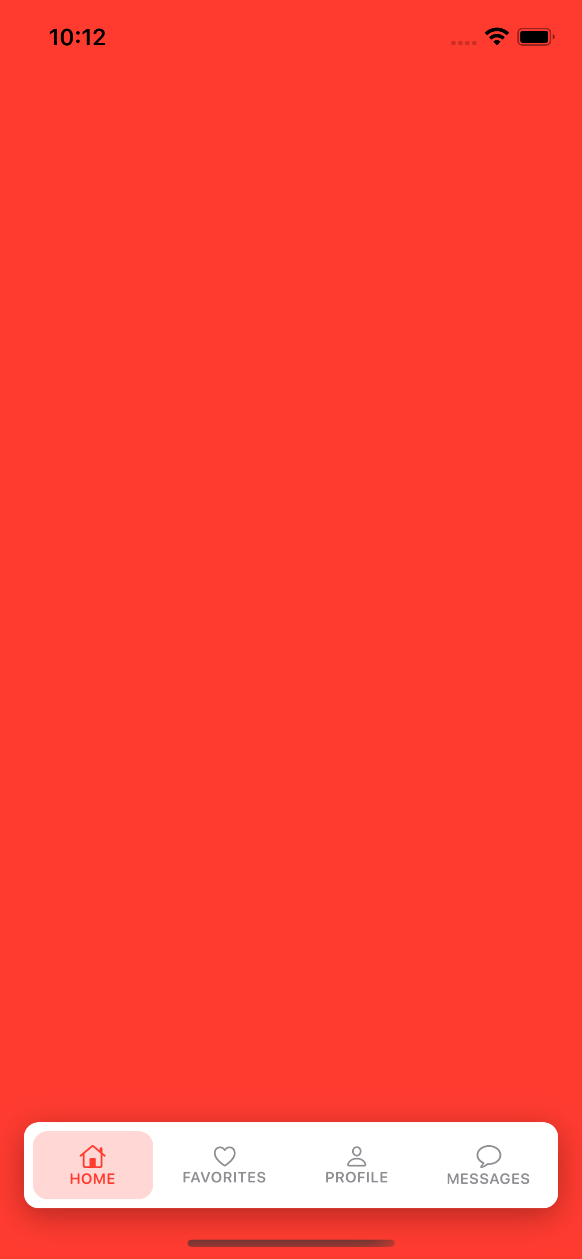
구현 화면
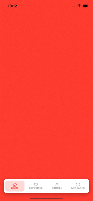
SwiftUI 부트 캠프 내용 중에 가장 어렵고 까다로웠던 파트.
PreferenceKey를 통해 부모-자식 뷰 간의 값이 이동, 변화하고ViewBuilder를 그리는 클로저 전달, 뷰를 쉽게 그리기 위한 뷰 모디파이어를 익스텐션으로 적용한 함수 사용 등 지금까지 배웠던 모든 내용을 종합적으로 적용하는 문제였다.- 아직까지
PreferenceKey의onPreferenceChange와 커스텀PreferenceKey의 내부 함수인reduce간의 상관관계를 파악하는 데 힘이 든다.

JUST DO IT