
📌 fbprophet → prophet
설치 & import 명령 모두 "prophet"으로 변경 됐다고 한다...
fbprophet으로 2시간 동안 설치-삭제 무한 반복하다가 알아냈다
삽질의 연속...🥲
📌 설치
[window]
- http://go.microsoft.com/fwlink/?Linkld=691126
- conda install pandas-datareader
- conda install -c conda-forge prophet
[mac]
- conda install pandas-datareader
- pip install prophet
📌 import 준비
from pandas_datareader import data
from prophet import Prophet
1. 함수(def) 기초
📌 가장 기초적인 모양의 def 정의
- 이름(test_df)과 입력인자(a, b)를 정해준다
- 출력(return)을 작성해 값을 저장
- c변수에 결과 값을 넣어주면 계속 c를 이용해 결과를 낼 수 있음
def test_def(a,b):
    return a+b
c = test_def(2,3)
c5
5 + c10
📌 global
- global 변수를 def 내에서 사용하고 싶다면 global로 선언
- 전역변수 / 지역변수 : 개별적임
- 즉, def 내외의 변수 이름이 같아도 다른 인자임..!
a = 1 #전역변수(global)

def edit_a(i):
a = i #지역변수(local)edit_a(2)a1
- global 선언 : 지역변수 안에, 전역변수(global) 넣어주면 값이 바뀜
a = 1 #전역변수(global)

def edit_a(i):
    global a
a = i #지역변수(local)edit_a(2)a2
📌 함수 만들기
$$ y = asin(2\pi ft + t_0) +b $$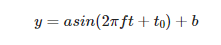
import matplotlib.pyplot as plt
import numpy as np
%matplotlib inline- 각각의 값을 모두 입력해 줘야 그래프가 실행 됨
- ▼ 아래 함수에는 return이 없음
- 따라서 값이 저장되지 않아, 일회성으로 보고 끝내는 함수/그래프 라고 할 수 있음
def plotSinWave(amp, freq, endTime, sampleTime, startTime, bias):
    """
    plot sine wave
    y = a sin(2 pi f t + t_0) +b
    """

    # (시작, 끝, 간격)
    time = np.arange(startTime, endTime, sampleTime)
    result = amp + np.sin(2 * np.pi * freq * time + startTime) + bias

    #그래프 그리는 코드
    plt.figure(figsize=(12,6))
    plt.plot(time, result)
    plt.grid(True)
    plt.xlabel('time')
    plt.ylabel('sin')
    plt.title(str(amp) + "*sin(2*pi" + str(freq) + "*t + " + str(startTime) + ")+" +str(bias))
    plt.show()
# 들어갈 인자 값 입력(설정)
plotSinWave(2, 1, 10, 0.01, 0.5, 0)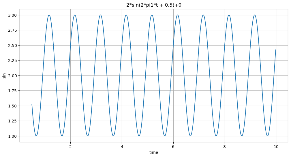
📌 값을 입력하지 않아도 실행되는 명령어 삽입
def plotSinWave(**kwargs):
    """
    plot sine wave
    y = a sin(2 pi f t + t_0) +b
    """

    # ▼ 삽입
    amp = kwargs.get('amp', 1)
    freq = kwargs.get('freq', 1)
    endTime = kwargs.get('endTime', 1)
    sampleTime = kwargs.get('sampleTime', 0.01)
    startTime = kwargs.get('startTime', 0)
    bias = kwargs.get('bias', 0)
    figsize = kwargs.get('figsize', (12, 6))

    # (시작, 끝, 간격)
    time = np.arange(startTime, endTime, sampleTime)
    result = amp + np.sin(2 * np.pi * freq * time + startTime) + bias

    #그래프 그리는 코드
    plt.figure(figsize=(12,6))
    plt.plot(time, result)
    plt.grid(True)
    plt.xlabel('time')
    plt.ylabel('sin')
    plt.title(str(amp) + "*sin(2*pi" + str(freq) + "*t + " + str(startTime) + ")+" +str(bias))
plt.show()plotSinWave()
📌 사용자가 값을 입력하면 기존값에서 수정되어 반영됨
def plotSinWave(**kwargs):
    """
    plot sine wave
    y = a sin(2 pi f t + t_0) +b
    """

    # ▼ 삽입
    amp = kwargs.get('amp', 1)
    freq = kwargs.get('freq', 1)
    endTime = kwargs.get('endTime', 1)
    sampleTime = kwargs.get('sampleTime', 0.01)
    startTime = kwargs.get('startTime', 0)
    bias = kwargs.get('bias', 0)
    figsize = kwargs.get('figsize', (12, 6))

    # (시작, 끝, 간격)
    time = np.arange(startTime, endTime, sampleTime)
    result = amp + np.sin(2 * np.pi * freq * time + startTime) + bias

    #그래프 그리는 코드
    plt.figure(figsize=(12,6))
    plt.plot(time, result)
    plt.grid(True)
    plt.xlabel('time')
    plt.ylabel('sin')
    plt.title(str(amp) + "*sin(2*pi" + str(freq) + "*t + " + str(startTime) + ")+" +str(bias))
plt.show()plotSinWave(amp=2, freq=0.5, endTime=10)
2. 함수 import 하기
- 모듈화 해주기
- drawSinWave.py
%%writefile ./drawSinWave.py

import numpy as np
import matplotlib.pyplot as plt

def plotSinWave(**kwargs):
    """
    plot sine wave
    y = a sin(2 pi f t + t_0) +b
    """

    # ▼ 삽입
    amp = kwargs.get('amp', 1)
    freq = kwargs.get('freq', 1)
    endTime = kwargs.get('endTime', 1)
    sampleTime = kwargs.get('sampleTime', 0.01)
    startTime = kwargs.get('startTime', 0)
    bias = kwargs.get('bias', 0)
    figsize = kwargs.get('figsize', (12, 6))

    # (시작, 끝, 간격)
    time = np.arange(startTime, endTime, sampleTime)
    result = amp + np.sin(2 * np.pi * freq * time + startTime) + bias

    #그래프 그리는 코드
    plt.figure(figsize=(12,6))
    plt.plot(time, result)
    plt.grid(True)
    plt.xlabel('time')
    plt.ylabel('sin')
    plt.title(str(amp) + "*sin(2*pi" + str(freq) + "*t + " + str(startTime) + ")+" +str(bias))
    plt.show()

if __name__ == "__main__":
    print('hello world~!!')
    print('this is test graph!!')
    plotSinWave(amp=1, endTime=2)
📌 ds 라는 이름으로 가져오겠다
import drawSinWave as dS📌 dS를 가져와서 plotSinWave의 기능을 사용하겠다
dS.plotSinWave()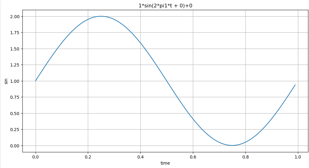
3. 그래프 한글 설정_import
%%writefile ./set_matplotlib_hangul.py

import platform
import matplotlib.pyplot as plt
from matplotlib import font_manager, rc

path = "c:/Windows/Fonts/malgun.ttf"

if platform.system() == "Darwin":
  print("Hangle OK in your MAC!!!")
  rc("font", family="AppleGothic")
elif platform.system() == "Windows":
  font_name = font_manager.FontProperties(fname=path).get_name()
  print("Hangle OK in your Windows!!!")
  rc("font", family=font_name)
else:
  print("Sorry, Unkwnown System")

plt.rcParams["axes.unicode_minus"] = False
import set_matplotlib_hangul
4. prophet 기초
A그래프
import pandas as pd
import numpy as np
import matplotlib.pyplot as plt
%matplotlib inline

from prophet import Prophet
📌 데이터 재료 준비
# 0 ~ 1 / 365*2
# 0 부터 1까지 365*2로 나
time = np.linspace(0, 1, 365*2)

result = np.sin(2+np.pi*12*time)
ds = pd.date_range('2018-01-01', periods=365*2, freq='D')
df = pd.DataFrame({'ds':ds, 'y':result})
df.head()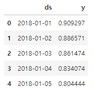
df['y'].plot(figsize=(5,3))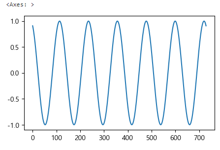
📌 값을 저장
# 연주기성, 일주기성 설정
m = Prophet(yearly_seasonality=True, daily_seasonality=True)

# m에 의해서 df 데이터를 fit(고정) 시킴
m.fit(df);
📌 저장한 값을 활용해 '예측'
# 30일간의 데이터 예측
future = m.make_future_dataframe(periods=30)
forecast = m.predict(future)
m.plot(forecast);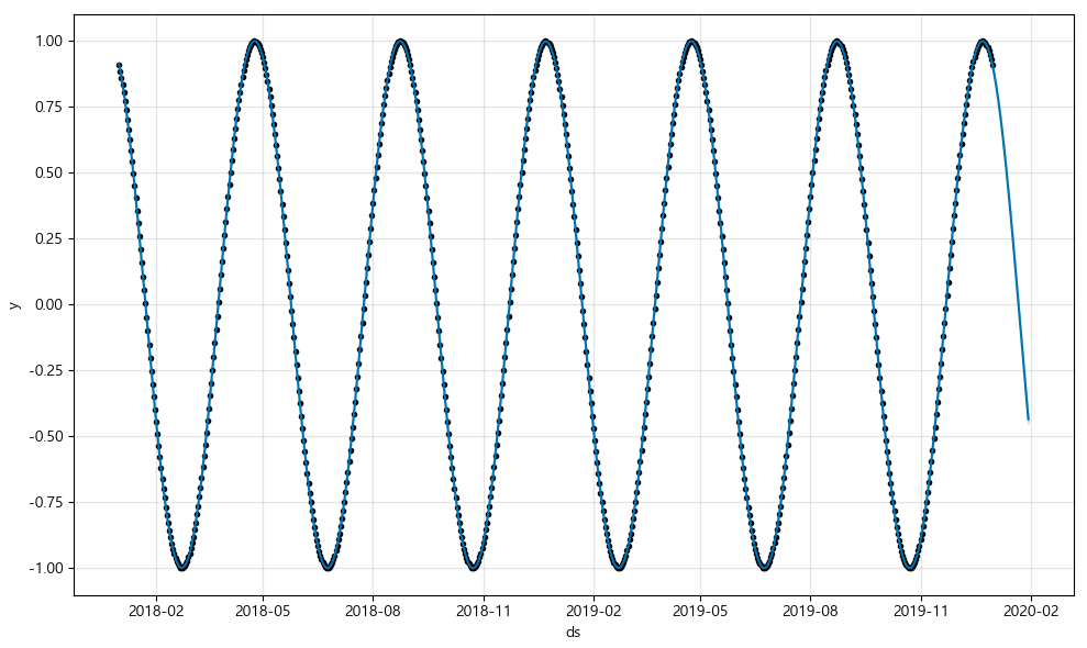
B그래프 (bias 추가)
time = np.linspace(0, 1, 365*2)
result = np.sin(2+np.pi*12*time) + time #◀추가
ds = pd.date_range('2018-01-01', periods=365*2, freq='D')
df = pd.DataFrame({'ds':ds, 'y':result})
df['y'].plot(figsize=(10,6)); #◀변경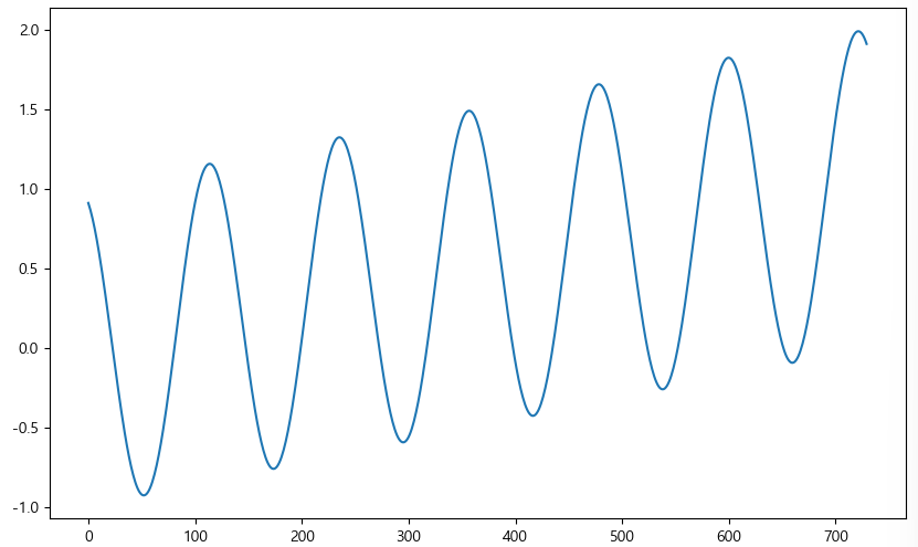
m = Prophet(yearly_seasonality=True, daily_seasonality=True)
m.fit(df)
future = m.make_future_dataframe(periods=30)
forecast = m.predict(future)
m.plot(forecast);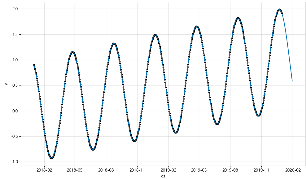
C그래프 (노이즈 설정)
time = np.linspace(0, 1, 365*2)
result = np.sin(2+np.pi*12*time) + time +np.random.randn(365*2)/4 #◀추가
ds = pd.date_range('2018-01-01', periods=365*2, freq='D')
df = pd.DataFrame({'ds':ds, 'y':result})
df['y'].plot(figsize=(10,6)); #◀변경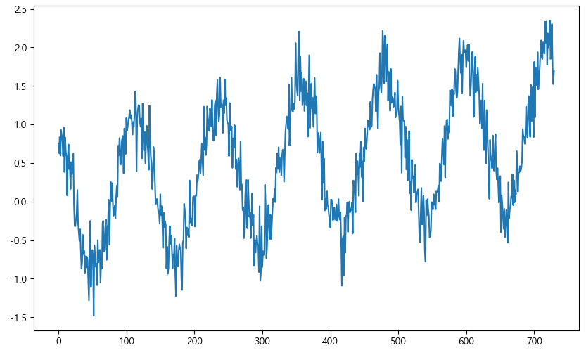
m = Prophet(yearly_seasonality=True, daily_seasonality=True)
m.fit(df)
future = m.make_future_dataframe(periods=30)
forecast = m.predict(future)
m.plot(forecast);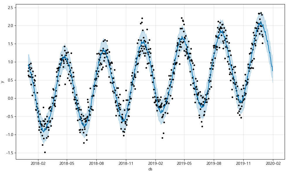
5. 시계열 데이터 실전
웹 유입량 데이터 분석
import pandas as pd
import pandas_datareader as web
import numpy as np
import matplotlib.pyplot as plt

from prophet import Prophet
from datetime import datetime

import set_matplotlib_hangul

%matplotlib inline
📌 데이터 불러오기
pinkwink_web = pd.read_csv(
    "../data/05_PinkWink_Web_Traffic.csv",
    encoding="utf-8",
    thousands=",",
    names=["date", "hit"],
    index_col=0
)

# index : 날짜 형식
# hit : 방문자수
# notnull 값을 pinkwink_web으로 재할당 해줌
pinkwink_web = pinkwink_web[pinkwink_web["hit"].notnull()]
pinkwink_web.head()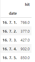
📌 데이터 그리기
- trend 분석을 시각화 하기위한 x축 값들을 만들어 두고
- 에러를 계산할 함수도 만들어 줘야 한다
- 에러 함수 : 트렌드를 만든 뒤 얼마나 원 데이터를 잘 반영하는지에 대한 정량적 평가 지표
pinkwink_web["hit"].plot(figsize=(7, 3), grid=True);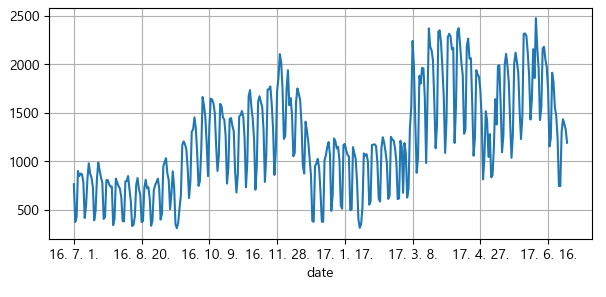
# 위 그래프(len(pinkwink_web))길이 만큼, arange명령으로 0부터 총길이를 time으로 정의 한다
time = np.arange(0, len(pinkwink_web)) # x축 값

# hit 값의 value만 꺼내서 traffic으로 정의 한
traffic = pinkwink_web["hit"].values

# time[-1] = 364
# 0부터 time의 마지막번(time[-1])을 1000 등분해서 fx에 저장
fx = np.linspace(0, time[-1], 1000)
# 에러 함수 : 트렌드를 만든 뒤 얼마나 원 데이터를 잘 반영하는지에 대한 정량적 평가 지표
# f,x : 예측
# y : 참
# (f(x) - y) : 에러
# 평균제곱근오차 (RMSE) = 루트(평균(에러 **제곱))
def error(f, x, y):
return np.sqrt(np.mean((f(x) - y) ** 2))# 1차원
# time과, traffic을 가지고, 1 차 함수를 만들어라
fp1 = np.polyfit(time, traffic, 1)
f1 = np.poly1d(fp1)
# 2차원
f2p = np.polyfit(time, traffic, 2)
f2 = np.poly1d(f2p)
# 3차원
f3p = np.polyfit(time, traffic, 3)
f3 = np.poly1d(f3p)
# 15차원
f15p = np.polyfit(time, traffic, 15)
f15 = np.poly1d(f15p)print(error(f1, time, traffic))
print(error(f2, time, traffic))
print(error(f3, time, traffic))
print(error(f15, time, traffic))📌 아래 출력된 에러 값들
- 서로 큰 차이가 없음
430.85973081109626
430.62841018946943
429.53280466762925
330.47773081609824
📌 numpy 그래프 _ 그려보기
plt.figure(figsize=(12, 4))
plt.scatter(time, traffic, s=10)
plt.plot(fx, f1(fx), lw=4, label="f1")
plt.plot(fx, f2(fx), lw=4, label="f2")
plt.plot(fx, f3(fx), lw=4, label="f3")
plt.plot(fx, f15(fx), lw=4, label="f15")
plt.grid(True, linestyle="-", color="0.75")
plt.legend(loc=2)
plt.show()


# 아래 그래프 처럼 출력됨
# 어떤 것을 트랜드라고 볼지 선택은 이 프로그램의 사용자(담당자) 나름 임
# 1,2,3 의 큰 차이가 없어서 1차로 해도 된다고 생각 함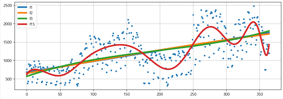
📌 prophet 그래프 _ 그려보기
# index : 날짜 형식 (위에 notnull 부분)
# hit : 방문자수
df = pd.DataFrame({"ds": pinkwink_web.index, "y": pinkwink_web["hit"]})
df.reset_index(inplace=True)
# 인덱스 재정렬

# 날짜 형식 맞추기
df["ds"] = pd.to_datetime(df["ds"], format="%y. %m. %d.")
del df["date"]
df.head()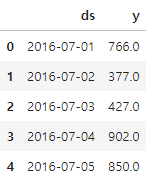
📌 학습시키기
# 학습시키기
m = Prophet(yearly_seasonality=True, daily_seasonality=True)
m.fit(df);

# 60일간의 데이터 예측, make_future_dataframe 으로 새롭게 만들어 줌
future = m.make_future_dataframe(periods=60)

# 예측 결과는 상한/하한 범위를 포함해서 얻어짐
forecast = m.predict(future)
forecast[['ds','yhat','yhat_lower','yhat_upper']].tail()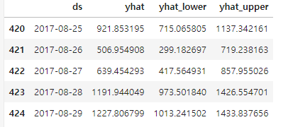
📌 m.plot(forecast);
m.plot(forecast);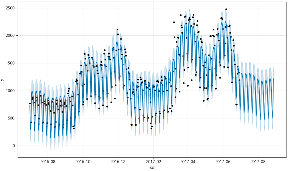
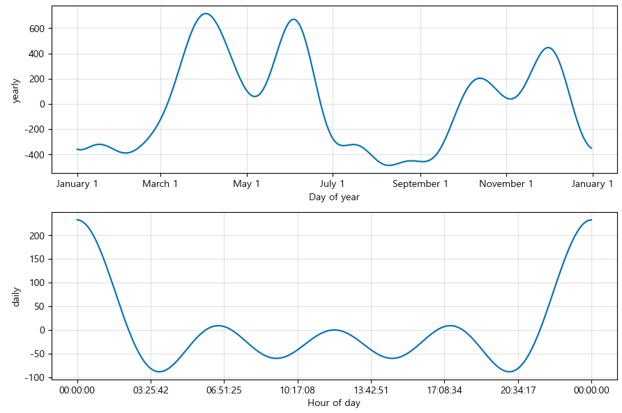
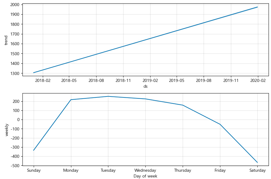
📌 m.plot_components(forecast)
m.plot_components(forecast)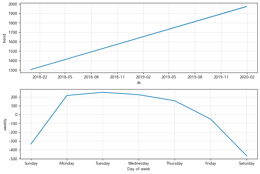
제로베이스 데이터 스쿨

비전공자의 데이터 공부법