flex container의 속성
display 속성
display:flex;
flex-direction
-플렉스 컨테이너 내의 아이템을 배치할 주축을 정함.
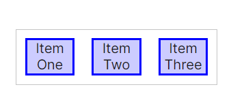
1) flex-direction: row;
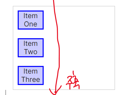
2) flex-direction: column;
flex-wrap
컨테이너가 아이템을 한줄로 담을 공간이 없을 때, 아이템 줄 바꿈 형식을 결정.
flex-wrap:wrap / nowrap (기본값)
justify & align
1) justify
- 주축 방향으로 아이템을 정렬
1-1) justify-content
container{
justify-content: flex-start;/
flex-end;/
center;/
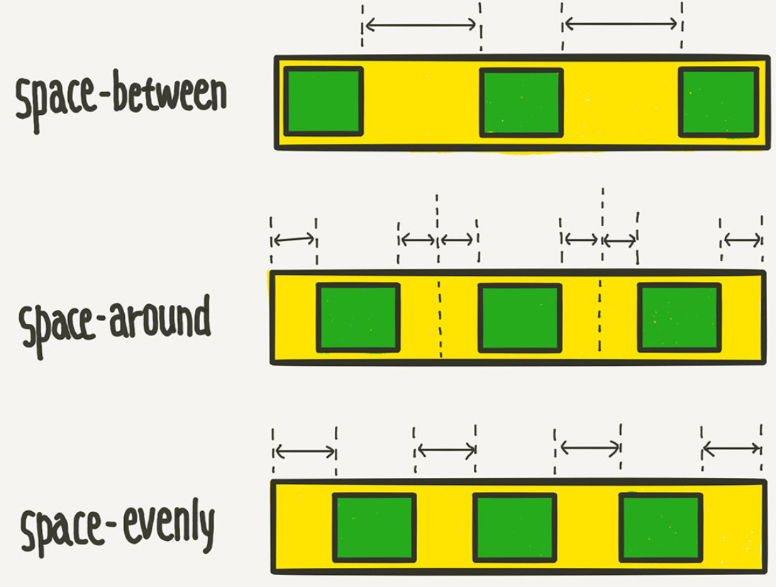
space-between;/
space-around;/
space-evenly;
}
2) align
- 수직축 방향으로 아이템을 정렬
2-1) align-items
- justify-content 의 수직방향 정렬.
.container{

align-items: stretch;/
			 flex-start;/
             flex-end;/
             center;/
             baseline/
             }
한가운데에 아이템 넣기
.container{
justify-content: center;
align-item: center;
}
2-2) align-content
- flex-wrap:wrap; 이 설정된 상태에서, 행이 2줄 이상 되었을 때 수직축 방향 정렬을 결정함.
flex-wrap: wrap;
align-content: stretch;/
			   flex-start;/
               flex-end;/
               center;/
               space-between;/
               space-around;/
               space-evenly;/
flex item 속성
flex-basis
- 메인 축상의 기본 길이를 나타낸다., 기본값: auto flex-direction이 row : 너비 flex-direction이 column : 높이
flex-grow
- 빈 공간을 채울지 여부, 기본값: 0 만약 item 들의 속성이 각각 1,2,3 이면, 그 비율만큼 남은 여백을 차지 한다.
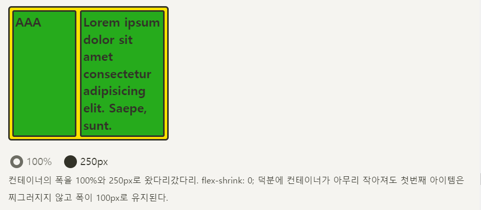
flex-shrink
- 전체 공간이 부족할 때, flex-basis로 설정한 값보다 작아질 수 있을 지를 지정, 기본값:1
align-items/content/self 차이점
"위의 align-items/content는 부모 요소의 자식들 전체를 묶어서 정렬을 해주는 반면,
부모 요소의 자식 아이템들을 각각 다른 방식으로 정렬하고 싶다면 (정렬을 개별(아이템별로)로 설정하고 싶다면)
align-self를 사용한다.
align-content 속성은 지워줘야 제대로 적용이 가능하다
