
22.12.15 새롭게 공부한 것
CSS(Flex+)
Flex는 Flexible Box, Flex box 라고 부르곤 한다.
Flex는 Layout 배치 전용으로 고안되었기 때문에 기존의 float, inline-block 와 같은 CSS스타일링보다 편리한 부분이 많다.
HTML구조
<div class="container">
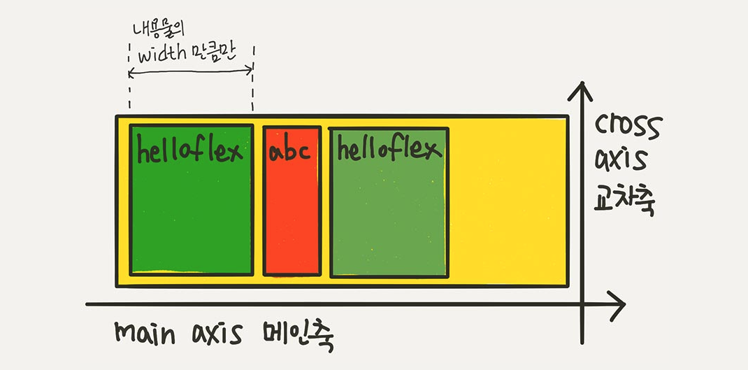
<div class="item">helloflex</div>
<div class="item">abc</div>
<div class="item">helloflex</div>
</div>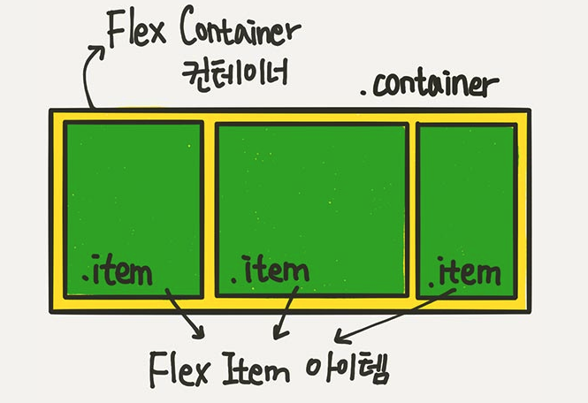
flex를 통해서, 아이템들은 가로 방향으로 배치되고 자신이 가진 내용물의 width값 만큼만 차지한다. height는 컨테이너의 높이만큼 늘어난다.
Flex의 속성은 컨테이너에 적용하는 속성/ 아이템에 적용하는 속성이 있다.
Flex Container에 적용하는 속성들
display:flex
.container {
	display: flex;

    /* display: inline-flex; */
}

inline -flex
inline-flex는 inline-block처럼 동작한다.

flex-direction
.container {
	flex-direction: row;
	/* flex-direction: column; */
	/* flex-direction: row-reverse; */
	/* flex-direction: column-reverse; */
}
- row: 아이템들을 행(가로) 방향으로 배치한다.
row-reverse: 아이템들을 행(가로) 역순으로 배치한다.
column: 아이템들을 열(세로) 방향으로 배치한다.
column-reverse: 아이템들을 열(세로) 역순으로 배치한다.
flex-wrap
.container {
	flex-wrap: nowrap; // 기본값
    /* flex-wrap: wrap; */
	/* flex-wrap: wrap-reverse; */
}

: Container가 더 이상 아이템들을 한 줄에 담을 여유 공간이 없을 때, 아이템 줄바꿈을 어떻게 할지 결정하는 속성이다.
- nowrap: 줄바꿈을 하지 않는다. 넘으면 삐져 나간다. (기본값)
- wrap: 줄바꿈을 한다.
- warp-reverse: 줄바꿈을 하는데, 아이템을 역순 배치한다.
flex-flow
flex-direction 과 flex-wrap 속성을 한번에 지정할 수 있는 단축 속성이다.
flex-direction flex-wrap 순으로 한칸 띄고 쓰면 된다
.container {
	flex-flow: row wrap;
    /* 아래의 두 줄을 줄여 쓴 것 */
	/* flex-direction: row; */
	/* flex-wrap: wrap; */
}
justify-content
.container {
	justify-content: flex-start;
	/* justify-content: flex-end; */
	/* justify-content: center; */
	/* justify-content: space-between; */
	/* justify-content: space-around; */
	/* justify-content: space-evenly; */
}


- flex-start: 아이템들을 시작점으로 정렬한다.
flex-direction이 row일땐 왼쪽, column일땐 위쪽 - flex-end: 아이템들을 끝점으로 정렬한다.
flex-direction이 row일땐 오른쪽, column일땐 아래쪽 - center: 아이템들을 가운데 정렬한다.
- space-between: 아이템들의 사이에 균일한 간격을 만들어준다.
- space-around: 아이템들의 "둘레"에 균일한 간격을 만들어준다.
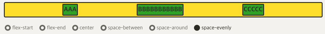
- space-evenly: 아이템들의 사이와 양끝에 균일한 간격을 만들어준다.

align-items
: justify-content와 수직방향으로 정렬하는 스타일 속성
.container {
	align-items: stretch;
	/* align-items: flex-start; */
	/* align-items: flex-end; */
	/* align-items: center; */
	/* align-items: baseline; */
}


- stretch: 아이템들이 수직축 방향으로 끝까지 늘어난다.(기본값)
- flex-start: 아이템들을 시작점으로 정렬한다.
flex-direction이 row일땐 위, column일땐 왼쪽 - flex-end: 아이템들을 끝점으로 정렬한다.
flex-direction이 row일땐 아래, column일땐 오른쪽 - center: 아이템들을 가운데로 정렬한다.
- baseline: 아이템들을 텍스트 베이스라인 기준으로 정렬한다.

align-content
:flex-wrap: wrap;이 설정된 상태에서, 아이템들의 행이 2줄 이상 되었을 때 수직축 방향 정렬을 결정하는 속성이다.
.container {
	flex-wrap: wrap;
	align-content: stretch;
	/* align-content: flex-start; */
	/* align-content: flex-end; */
	/* align-content: center; */
	/* align-content: space-between; */
	/* align-content: space-around; */
	/* align-content: space-evenly; */
}


flex 아이템에 적용되는 속성들
(* 좀 어렵다?)
flex-basis: flex 아이템의 기본 크기를 설정한다.
(flex-direction: row 일 땐 너비; flex-direction: column일 땐 높이)
.item {
	flex-basis: auto; /* 기본값 */
	/* flex-basis: 0; */
	/* flex-basis: 50%; */
	/* flex-basis: 300px; */
	/* flex-basis: 10rem; */
	/* flex-basis: content; */
}
원래 100px 안되는 item들은 100px로 늘어나고,
100px인 item들은 현상유지,
100px이 넘는 item들도 100px로 맞춰진다.


*BBBBB가 다음 줄로 넘어가게 하려면 word-wrap: break-word쓰면 된다.
flex-grow: 아이템이 flex-basis의 값보다 커질 수 있는지 결정하는 속성이다. flex-grow에는 숫자 값이 들어가는데, 몇이든 일단 0보다 큰 값이 세팅되면 아이템들이 유연한 박스로 변하고 원래의 크기보다 커지며 빈공간을 메우게 된다. 숫자의 의미는 아이템들의 flex-basis를 제외한 여백 부분을 flex-grow에 지정된 숫자의 비율로 나누어 가진다는 뜻
.item {
	flex-grow: 1;
	/* flex-grow: 0; */ /* 기본값 */
}

/* 1:2:1의 비율로 세팅할 경우 */
.item:nth-child(1) { flex-grow: 1; }
.item:nth-child(2) { flex-grow: 2; }
.item:nth-child(3) { flex-grow: 1; }
flex-shrink: flex-grow와 쌍을 이루는 속성으로 flex-basis의 값보다 작아질 수 있는지 결정한다.flex-shrink에는 숫자값이 들어가는데, 몇이든 일단 0보다 큰 값이 세팅이 되면 해당 아이템이 유연한(Flexible) 박스로 변하고 flex-basis보다 작아진다. 기본값이 1이기 때문에 따로 세팅하지 않았어도 아이템이 flex-basis보다 작아질 수 있다.
.container {
	display: flex;
}
.item:nth-child(1) {
	flex-shrink: 0;
	width: 100px;
}
.item:nth-child(2) {
	flex-grow: 1;
}

flex-grow, flex-shrink, flex-basis는 한번에 쓸 수 있는 축약형 속성이다. 주의할 점은, flex: 1; 이런 식으로 flex-basis를 생략해서 쓰면 flex-basis의 값은 0이 된다.
.item {
	flex: 1;
	/* flex-grow: 1; flex-shrink: 1; flex-basis: 0%; */

	flex: 1 1 auto;
	/* flex-grow: 1; flex-shrink: 1; flex-basis: auto; */

	flex: 1 500px;
	/* flex-grow: 1; flex-shrink: 1; flex-basis: 500px; */
}
align-self
order


z-index: z축 정렬, 숫자가 클수록 위로 올라온다.
.item:nth-child(2) {
	z-index: 1;
	transform: scale(2);
}
/* z-index를 설정 안하면 0이므로, 1만 설정해도 나머지 아이템을 보다 위로 올라온다 */


Reference: 1분코딩
https://studiomeal.com/archives/197
1분 코딩, flexbox froggy game
https://flexboxfroggy.com/#ko
flexbox froggy game 해설
https://www.youtube.com/watch?v=IbTLHILrLn0