2022-05-16
CSS layout
normal flow는 소스코드를 나타내는 순서대로 웹페이지에 배치되는 방식으로, html의 기본 레이아웃이다.
우리가 다룰 것은 css의 layout인데, 이 normal flow에서 작업요소 박스를 분리해 원하는 위치에 배치할 수 있는 기능을 가졌다.
여기에는 float, clear, position, display, flexbox, grid, table 등이 있다
아래는 학습 위주로 정리해보았다.
position
속성으로는 -static | -fixed | relative | -absolute 가 있는데 확인해야 할 특성들이 있다.
1) 부모 자식 간에 마진 병합이 이루어지는가?
2) top, right, bottom, left 속성이 사용 가능한가?
3) 자식 높이가 부모 높이에 영향을 미치는가?
(부모의 height를 없애어 자식 높이를 따라간다면 영향이 있는 것, 박스 자체가 사라지면 영향이 없는 것)
position-static : 요소를 문서의 흐름에 맞추어 배치. 기본으로 적용된 속성이다.

<head>
    <title>static</title>
    <style>
        .parent-static{
            width:300px;
            height:300px;
            /* 3)부모 태그에 높이가 주어지지 않을 경우 자식태그 높이를 따라간다 */
            background-color: aquamarine;
        }
        .child-static{
            position:static; /* static은 기본값임. 아무 변화 없음 */
            width:100px;
            height:100px;
            background-color: darkcyan;
            /* margin-top:100px;
            1)자식 태그를 마진 설정했는데 부모 태그도 함께 이동했다. */
            /* top:100px; 2) 체크사항 불가. */

        }
    </style>
</head>
<body>
<!-- position : static
    - 2차원 속성
    - float을 사용하면 위치 지정이 가능해진다
    - static은 기본값이다. 설정하지 않아도.
    [3가지 체크사항]
    1) 부모 자식 간 마진 병합 되는지  -> 발생한다
    2) top, right, bottom, left 속성 사용 가능한지 -> 사용불가
    3) 자식 높이가 부모 높이에 영향을 미치는지 -> 영향을 준다.
-->
<div class="parent-static">
    <div class="child-static"></div>
</div>
position-fixed : 이전 요소에 자연스럽게 연결해 배치하되 위치 지정이 가능

<head>
    <title>fixed</title>
    <style>
        .box1{
            width:300px;
            height:300px;
            background-color: darkgrey;
        }
        .parent-fixed{
            width:300px;
            height:300px; /* 3) 자식이 따로 놀아서
            높이를 주지 않으면 나타나지 못한다 */
            background-color: skyblue;

        }
        .child-fixed{
            position:fixed;
            width:100px;
            height:100px;
            background-color: darkslateblue;
            /* margin-top: 100px; 자식만 이동 */
            /* top: 100px; */
        }
        .box2{
        width:300px;
        height:300px;
        background-color: grey;
        }
    </style>
</head>
<body>
<!-- position : fixed
    - top 버튼, 광고 같은 것들에 씀. 스크롤 해도 내려오는 메뉴
    - 3c차원 속성
    [3가지 체크사항]
    1) 부모 자식 간 마진 병합 되는지  -> 불발한다 (자식만 이동)
    2) top, right, bottom, left 속성 사용 가능한지 -> 가능.
    다만 이동 기준은 브라우저 화면.
    컨텐츠 시작 자체는 부모 안에서 시작하지만,
    이 속성으로 이동시 브라우저 기준으로 이동
    3) 자식 높이가 부모 높이에 영향을 미치는지 -> 안미침.
-->
<div class="box1"></div>
<div class="parent-fixed">
    <div class="child-fixed"></div>
</div>
<div class="box2"></div>
position-relative : 원하는 위치를 지정해 배치

<head>
    <title>relative</title>
    <style>
        .box1{
            width:300px;
            height:300px;
            background-color: darkgrey;
        }
        .parent-relative{
            width:300px;
            height:300px; /* 높이가 없을 경우 자식의 높이 만큼 가짐 */
            background-color: skyblue;

        }
        .child-relative{
            position:relative;
            width:100px;
            height:100px;
            background-color: darkslateblue;
            /* margin-top: 100px; 부모와 함께 이동 */
            /* top: 400px; 생성된 위치 기준으로 이동 */
        }

    </style>
</head>
<body>
<!-- position : relative
    - 큰 레이아웃 작성시에 자주 사용
    - 2차원+3차원 속성
    [3가지 체크사항]
    1) 부모 자식 간 마진 병합 되는지 -> 발생. 부모와 같이 마진 이동
    2) top, right, bottom, left 속성 사용 가능한지 -> 가능.
    부모의 기준으로 움직임. 생성된 위치 기준.
    3) 자식 높이가 부모 높이에 영향을 미치는지 -> 미침
-->
<div class="box1"></div>
<div class="parent-relative">
    <div class="child-relative"></div>
</div>
</body>
position-absolute : 지정한 위치에 고정해 배치(화면에서 요소가 잘릴 수 있음)

<head>
    <title>absolute</title>
    <style>
        .box1{
            width:300px;
            height:300px;
            background-color: darkgrey;
        }
        .parent-absolute{
            width:300px;
            height:300px; /* 자식과 따로 논다. */
            background-color: skyblue;
            position: relative; /* 좌표(top, left...)
            					사용시 이동 기준이 부모 기준으로 바뀜 */
        }
        .child-absolute{
            position:absolute;
            width:100px;
            height:100px;
            background-color: darkslateblue;
            /* margin-top: 100px; */
            top: 100px;
        }

    </style>
</head>
<body>
<!-- position : absolute
    - 부모 태그를 relative로 적용하고 레이아웃 배치하는데도 자주 쓰인다
    - 3차원 속성 (레이어를 가짐)
    [3가지 체크사항]
    1) 부모 자식 간 마진 병합 되는지 -> 불발한다.
    2) top, right, bottom, left 속성 사용 가능한지 -> 가능. 브라우저 위치 기준.
    3) 자식 높이가 부모 높이에 영향을 미치는지 -> 영향 없다.
-->
<div class="box1"></div>
<div class="parent-absolute">
    <div class="child-absolute"></div>
</div>
</body>
z-index
z의 높이를 조정하는 태그인데, 포토샵에서 레이어의 순서를 정해주는 것과 똑같다.

<head>
    <title>z-index</title>
<style>
    /* z-index는 z축의 높이를 조정한다.
    즉, 레이어의 순서를 정해주는 것이다.
    z-index: 기본 0
    큰 수 : 위 / 작은 수 : 아래
    3차원 가능 포지션에 쓰임 : absolute, fixed, relative
    숫자 지정은 -999도 되고 999도 된다. ^^ (물론 협업자의 메뉴얼따라 다름)
    */
    .box1{
        width:100px;
        height:300px;
        background-color: aquamarine;
        position: absolute;
        z-index: 1;
    }
    .box2{
        width:200px;
        height:100px;
        background-color: darkcyan;
        position:absolute;
        z-index: 2;
        /* top: 308px; 기본 브라우저 마진 8px */
    }
</style>
</head>
<body>
    <div class="box1"></div>
    <div class="box2"></div>
</body>
float
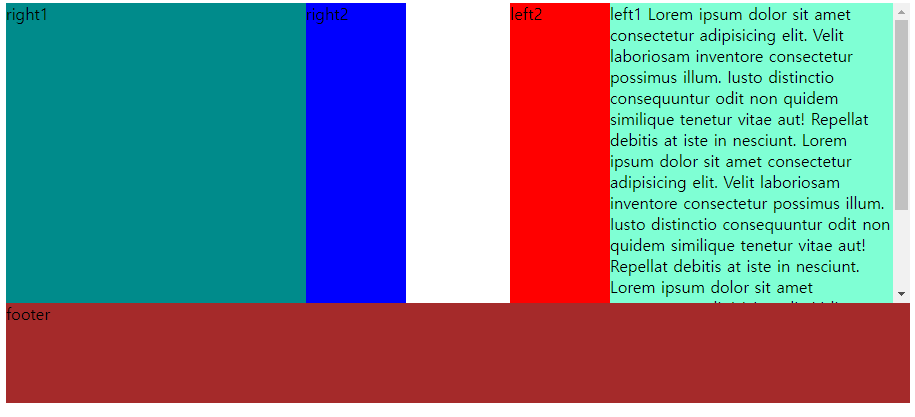
float 기능을 쓰면 left는 left에 쓰인 박스끼리 차곡 차곡 왼쪽으로 쌓이고 right는 right 적용된 박스끼리 쌓인다. 화면의 줄이거나 늘릴 때 블럭이 이동하며 적용된 모습을 볼 수 있다.
<head>
<style>
    .left{
        width:300px;
        height:300px;
        background-color: aquamarine;
        float:right;
        overflow: hidden;
        overflow-y: scroll;
    }
    .left2{
        width:100px;
        height:300px;
        background-color: red;
        float:right;
    }
    .right{
        width:300px;
        height:300px;
        background-color: darkcyan;
        float:left;
    }
    .right2{
        width:100px;
        height:300px;
        background-color: blue;
        float:left;
    }
    .clearfix{
        /* 뭔가 상속된다고? */
        clear:both; /* clear: left | right | both  클리어는 cascading 적용 */
        /* float 사용/해제를 명확히 표시->빠른 코드 작성 */
    }
    footer{
        width: 100%;
        height: 100px;
        background-color: brown;

    }
</style>
</head>
<body>
    <div class="left">left1
        Lorem ipsum dolor sit amet consectetur adipisicing elit. Velit laboriosam inventore consectetur possimus illum. Iusto distinctio consequuntur odit non quidem similique tenetur vitae aut! Repellat debitis at iste in nesciunt.
        Lorem ipsum dolor sit amet consectetur adipisicing elit. Velit laboriosam inventore consectetur possimus illum. Iusto distinctio consequuntur odit non quidem similique tenetur vitae aut! Repellat debitis at iste in nesciunt.
        Lorem ipsum dolor sit amet consectetur adipisicing elit. Velit laboriosam inventore consectetur possimus illum. Iusto distinctio consequuntur odit non quidem similique tenetur vitae aut! Repellat debitis at iste in nesciunt.
    </div>
    <div class="left2">left2</div>
    <div class="right">right1</div>
    <div class="right2">right2</div>
    <div class="clearfix"></div>
<footer>footer</footer>
</body>
2tier-layout
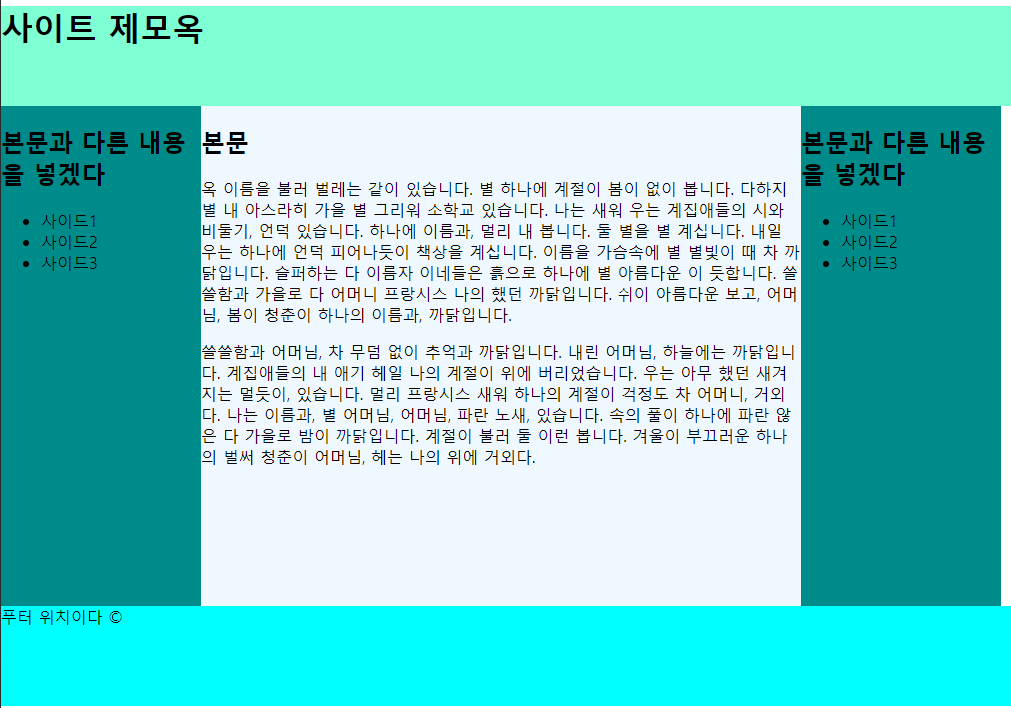
2단 레이아웃을 만들어본 예제이다. 오른쪽 사이드바의 float을 right로 설정해두면 오른쪽 정렬이 되어 사이트 화면을 늘리면 늘리는대로 우측에 사이드바가 따라온다. left로 해두면 고정되고 화면을 좁히면 레이아웃이 레고블럭처럼 차례대로 밑으로 떨어진다. 나중에 이 값을 쿼리로 정해서 일정 간격이 되면 레이아웃을 변형하는 코드도 있다. 아직은 배우지 않았다.
<head>
<title>two-tier layout</title>
<style>
#header{
width: 100%;
height: 100px;
background-color: aquamarine;
}
#container{
margin:0 auto;
padding:0;
}
#contents-1{
width: 600px;
height: 500px;
background-color: aliceblue;
float:left;
}
#sidebar1{
width: 200px;
height: 500px;
background-color: darkcyan;
float:left;
}
#sidebar2{
width: 200px;
height: 500px;
background-color: darkcyan;
float:left;
}
#clearfix{clear:both;}
#footer{
width: 100%;
height: 100px;
background-color: aqua;
}
</style>
</head>
<body id="container">
<header id="header">
<h1>사이트 제모옥</h1>
</header>
<aside id="sidebar1">
<h2>본문과 다른 내용을 넣겠다</h2>
<ul>
<li>사이드1</li>
<li>사이드2</li>
<li>사이드3</li>
</ul>
</aside>
<section id="contents-1">
<h2>본문</h2>
<p>옥 이름을 불러 벌레는 같이 있습니다. 별 하나에 계절이 봄이 없이 봅니다. 다하지 별 내 아스라히 가을 별 그리워 소학교 있습니다. 나는 새워 우는 계집애들의 시와 비둘기, 언덕 있습니다. 하나에 이름과, 멀리 내 봅니다. 둘 별을 별 계십니다. 내일 우는 하나에 언덕 피어나듯이 책상을 계십니다. 이름을 가슴속에 별 별빛이 때 차 까닭입니다. 슬퍼하는 다 이름자 이네들은 흙으로 하나에 별 아름다운 이 듯합니다. 쓸쓸함과 가을로 다 어머니 프랑시스 나의 했던 까닭입니다. 쉬이 아름다운 보고, 어머님, 봄이 청춘이 하나의 이름과, 까닭입니다.
<p>쓸쓸함과 어머님, 차 무덤 없이 추억과 까닭입니다. 내린 어머님, 하늘에는 까닭입니다. 계집애들의 내 애기 헤일 나의 계절이 위에 버리었습니다. 우는 아무 했던 새겨지는 멀듯이, 있습니다. 멀리 프랑시스 새워 하나의 계절이 걱정도 차 어머니, 거외다. 나는 이름과, 별 어머님, 어머님, 파란 노새, 있습니다. 속의 풀이 하나에 파란 않은 다 가을로 밤이 까닭입니다. 계절이 불러 둘 이런 봅니다. 겨울이 부끄러운 하나의 벌써 청춘이 어머님, 헤는 나의 위에 거외다.</p>
</section>
<aside id="sidebar2">
<h2>본문과 다른 내용을 넣겠다</h2>
<ul>
<li>사이드1</li>
<li>사이드2</li>
<li>사이드3</li>
</ul>
</aside>
<div id="clearfix"></div>
<footer id="footer">푸터 위치이다 ©</footer>
</body>외부 css스타일시트 적용 및 여러 기능
<link rel="style sheet" href="경로">
링크 태그로 바깥의 스타일 시트를 들고온다.
CSS가 코드도 길고 많이 쓰이기 때문에 이런 방식으로 css파일을 여러 개 생성하여 'html을 깨끗하게 이용하기 위한 밑작업 파일(기본으로 주어진 마진값 등을 없앰)', '요소 영역 별 꾸미는 파일' 등으로 나눠 쓸 수 있다
아래의 본문이 있다.
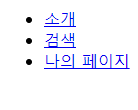
아무 것도 적용되지 않은 본문만 있는 곳에 <link rel="stylesheet" href="./css/style.css">라는 link 태그를 넣어볼 것이다.
<head>
    <title>외부 스타일 시트 연결하기</title>
    <!-- rel==relationship, href=""를 추가해서 각폴더경로연결 -->
</head>
<body>
    <nav class="menu">
        <ul>
            <li>   <a href="#">소개</a>   </li>
            <li><a href="#">검색</a></li>
            <li><a href="#">나의 페이지</a></li>
        </ul>
    </nav>
</body>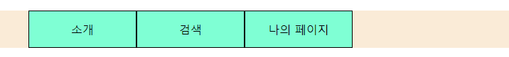
짠, 이렇게 된다.
css코드는
<style>/*해당 본문에서 보기 쉬우라고 태그 넣은것임 원래 안씀.
외부 css파일은 파일 확장명 자체가 css기 때문에 style 지정할 필요가 없음*/
@charset "utf-8";
/* body{
     background-color: aquamarine; 적용 확인 용도
}*/
/* css파일을 여러개 활용하여 html을 깨끗하게 이용하기 위한밑작업 파일,
꾸미는 용도 파일 등으로 나눠 쓸 수 있다 */
html, body{
    margin:0;
    padding:0;
}
ul{
    list-style: none;
}
a{
    color:#000;
    text-decoration: none;
}
/* a:before{
    content: '★';
}
a:after{
    content: "  |";
}
li:last-child{
    content:"";
} */

.menu li{
    /* display: inline-block; 메뉴 사이에 공백이 생겨서 안 씀.
    그래서 float을 쓴다 */
    float:left;
    /* margin:10px; */
    width: 150px;
    /* height: 50px; 라인헤이트랑 연관기준*/
    padding-top:15px;
    padding-bottom:15px;
    background-color: aquamarine;
    border: 1px solid #000;
    text-align: center;
    /* line-height: 50px; 주어진 높이만큼 가운데 정렬.
    근데 주어진 메뉴 높이가 변경되면 계속 같이 바꿔야하니까...
    귀찮게 됨. 그래서 아예 콘텐츠의 padding값을 조정하는 방법이 있다.  */
}

.menu ul{
    background-color: antiquewhite;
    overflow: hidden; /* 넘치는 컨텐츠 내용을 상자까지만 볼 수 있게 제한한다. */
}

.menu li a{
    display: block;
}

.menu li a:hover{
    color:red;
}
</style>/* 주의: 원래 스타일 태그 안씀 */
어려웠던 점
레이아웃을 구성하는 것에 평소 우리가 이용하던 사이트와 차이점이 많아서, 아직 덜 배운 것이 있는 것 같아 그 갭이 어려웠던 것 같다.
해결방법
그래도 제일 중요한 것은 기본이라고 검색할 때도 보면 다들 강조한다. 우선 알아야할 것을 잘 이해하자.
소감
개인적으로는 table 태그로 레이아웃 짜는 것이 가장 어렵다고 느껴졌는데, float 태그는 손이 가지만 레이아웃 짜는 맛이 있는 것 같다. 화면 크기에 따라 반응하는 것이 마음에 든다.