2022-05-17
레이아웃 만들기 실습 위주로 진행되었다.
전날 예제1에 이어 스타일 주기

<nav> 태그로 메뉴를 만들고, 친구 페이지와 뉴스페이지를 추가.
전반적으로 외관보다는 태그를 어떤 때에 쓰고 어떻게 적용되는지 파악하는 위주로 실습했던 것 같다.
예제1 home 본문
<!DOCTYPE html>
<html lang="en">
<head>
    <meta charset="UTF-8">
    <meta http-equiv="X-UA-Compatible" content="IE=edge">
    <meta name="viewport" content="width=device-width, initial-scale=1.0">
    <title>외부 스타일 시트 연결하기</title>
    <link rel="stylesheet" href="./css/style.css"> <!-- rel==relationship, href=""를 추가해서 각폴더경로연결 -->
</head>
<body>
    <nav class="menu">
        <ul>
            <li><a href="index.html">소개</a></li>
            <li><a href="list.html">친구리스트</a></li>
            <li><a href="news.html">뉴스</a></li>
        </ul>
    </nav>
</body>
</html>
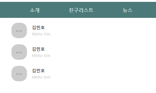
예제1 friend list 본문
<!DOCTYPE html>
<html lang="en">
<head>
<meta charset="UTF-8">
<meta http-equiv="X-UA-Compatible" content="IE=edge">
<meta name="viewport" content="width=device-width, initial-scale=1.0">
<title>외부 스타일 시트 연결하기</title>
<link rel="stylesheet" href="./css/style.css"> <!-- rel==relationship, href=""를 추가해서 각폴더경로연결 -->
</head>
<body>
<nav class="menu">
<ul>
<li><a href="index.html">소개</a></li>
<li><a href="list.html">친구리스트</a></li>
<li><a href="news.html">뉴스</a></li>
</ul>
</nav>
<ul class="friend-lists">
<li>
<a href="#">
<img src="http://via.placeholder.com/50">
<div class="info">
<h3>김민호</h3>
<span>Minho Kim</span>
</div>
</a>
</li>
</ul>
<ul class="friend-lists">
<li>
<a href="#">
<img src="http://via.placeholder.com/50">
<div class="info">
<h3>김민호</h3>
<span>Minho Kim</span>
</div>
</a>
</li>
</ul>
<ul class="friend-lists">
<li>
<a href="#">
<img src="http://via.placeholder.com/50">
<div class="info">
<h3>김민호</h3>
<span>Minho Kim</span>
</div>
</a>
</li>
</ul>
</body>
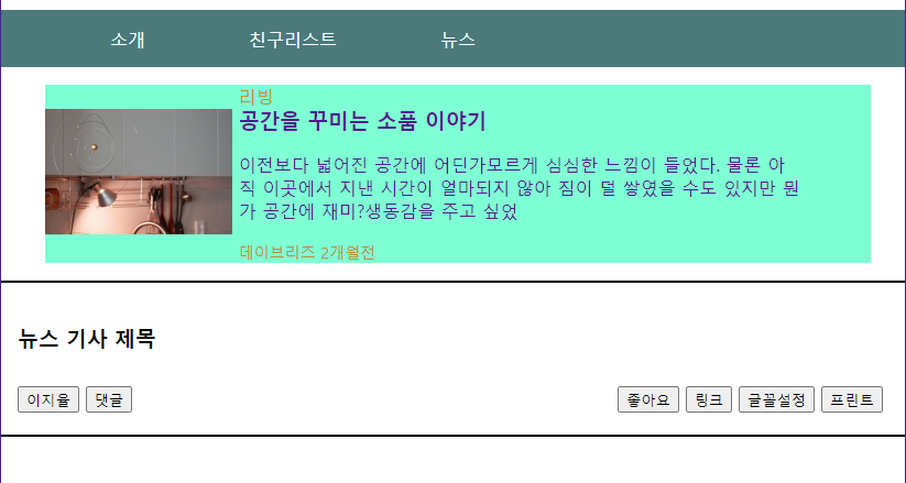
</html>예제1 news list 본문
<!DOCTYPE html>
<html lang="en">
<head>
<meta charset="UTF-8">
<meta http-equiv="X-UA-Compatible" content="IE=edge">
<meta name="viewport" content="width=device-width, initial-scale=1.0">
<title>외부 스타일 시트 연결하기</title>
<link rel="stylesheet" href="./css/style.css"> <!-- rel==relationship, href=""를 추가해서 각폴더경로연결 -->
</head>
<body>
<nav class="menu">
<ul>
<li><a href="index.html">소개</a></li>
<li><a href="list.html">친구리스트</a></li>
<li><a href="news.html">뉴스</a></li>
</ul>
</nav>
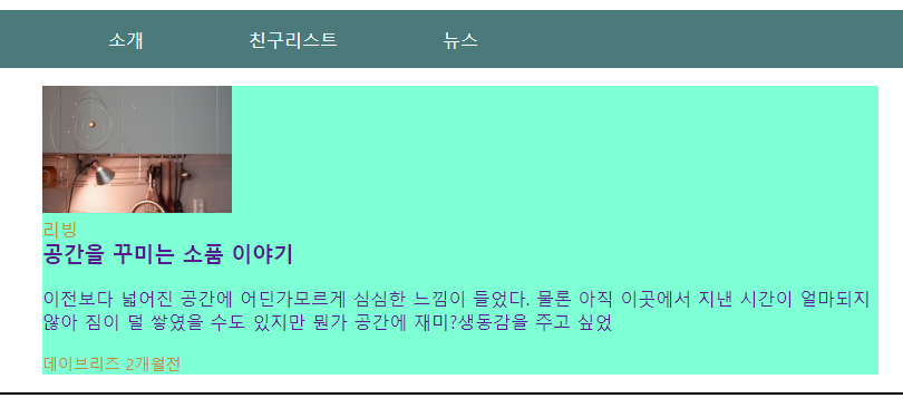
<ul class="living-lists">
<li>
<a href="#" class="image-link">
<img width="170px" height="114px" src="https://s.pstatic.net/dthumb.phinf/?src=%22https%3A%2F%2Fs.pstatic.net%2Fshop.phinf%2F20220516_237%2F1652711144942SeESv_JPEG%2F750_0.jpg%22&type=nf340_228">
</a>
<a href="#" class="info-link">
<div class="living-info">
<span>리빙</span>
<h3>공간을 꾸미는 소품 이야기</h3>
<p>이전보다 넓어진 공간에 어딘가모르게 심심한 느낌이 들었다. 물론 아직 이곳에서 지낸 시간이 얼마되지 않아 짐이 덜 쌓였을 수도 있지만 뭔가 공간에 재미?생동감을 주고 싶었</p>
<div class="date-wrap">
<span class="soure">데이브리즈 </span>
<span class="date">2개월전 </span>
</div>
</div>
</a>
</li>
</ul>
<div class="title-wrap">
<h3>뉴스 기사 제목</h3>
<div class="btn-wrap">
<div class="btn-left-wrap"> <!-- 왼쪽 버튼 묶음 -->
<button type="button">이지율</button>
<button type="button">댓글</button>
</div>
<div class="btn-right-wrap"> <!-- 오른쪽 버튼 묶음 -->
<button type="button">좋아요</button>
<button type="button">링크</button>
<button type="button">글꼴설정</button>
<button type="button">프린트</button>
</div>
</div>
</div>
</body>
</html>예제1 통합 CSS style sheet
원래는 각 구간 별로 css파일을 따로 둔다. 워낙 복잡하고 길어서...
<style>
@charset "utf-8";
/* body{
     background-color: aquamarine; 적용 확인 용도
}*/
/* css파일을 여러개 활용하여 html을 깨끗하게 이용하기 위한 밑작업 파일, 꾸미는 용도 파일 등으로 나눠 쓸 수 있다 */
html, body{
    margin:0;
    padding:0;
}
ul{
    list-style: none;
}
.menu a{
    color: azure;
}
a{
    text-decoration: none;
}

/* a:before{
    content: '★';
}
a:after{
    content: "  |";
}
li:last-child{
    content:"";
}
.menu li:last-child :after{
    content:"";
*/

.menu li{
    /* display: inline-block; 메뉴 사이에 공백이 생겨서 안 씀. 그래서 float을 쓴다 */
    float:left;
    /* margin:10px; */
    width: 150px;
    /* height: 50px; 라인헤이트랑 연관기준*/
    padding-top:15px;
    padding-bottom:15px;
    /* background-color: aquamarine; */
    /* border: 1px solid #000; */
    text-align: center;
    /* line-height: 50px; 주어진 높이만큼 가운데 정렬.  근데 주어진 메뉴 높이가 변경되면 계속 같이 바꿔야하니까... 귀찮게 됨.
    그래서 아예 콘텐츠의 padding값을 조정하는 방법이 있다.  */
    /* border-top: 1px solid red;
    border-right: 1px solid red;
    border-bottom: 1px solid red;*/
    border-top: 1px solid rgb(76, 122, 122);
}
/* .menu li:nth-child(1){
    .menu li:first-child{
    border-left: 1px solid red;
}*/

.menu li:hover{
    background-color: rgba(255,255,255,0.4);
    border-top: 1px solid red;

}

.menu ul{
    background-color: rgb(76, 122, 122);
    overflow: hidden; /* 넘치는 컨텐츠 내용을 상자까지만 볼 수 있게 제한한다. */
}

.menu li a{
    display: block;
}

.menu li a:hover{
    color:red;
}

/* menu2 친구리스트에 대한 스타일 */

.friend-lists li img {
    border-radius: 20px;
    margin-right: 10px;
}

.friend-lists li .info{
    display: inline-block;
}

.friend-lists li .info h3{
    color:rgb(30, 30, 30);
    font-size: 14px;
    margin:0;
}
.friend-lists li .info span{
    color:rgb(200, 200, 200);
    font-size: 12px;
}
.friend-lists li img,
.friend-lists li .info{
    vertical-align:middle;
}
/* li 전체에 링크걸기 */
.friend-lists li a{
    display: block;
}
.friend-lists li{
    margin-bottom: 20px;
}

/* menu3 뉴스 */
.living-lists li{
    width:750px;
    background-color: aquamarine;
}
.living-info{
    width:540px;
    margin-left: 15px;
}
.living-lists .image-link,
.living-lists .info-link{
    display: inline-block;
    vertical-align: middle;
}
/* .living-lists p{
    width:512px;
} */

.living-lists .living-info h3{
    margin:0;
}
.date-wrap span{
    font-size:14px;
}
.living-info span{
    color: #c08d31;
}

/* menu3 - 뉴스2  */
.title-wrap{
    border-top: 2px solid black;
    border-bottom: 2px solid black;
    /* padding-top: 20px;
    padding-right: 20px;
    padding-bottom : 20px;
    padding-left: 15px; */
    padding: 20px 20px 20px 15px;
}
.title-wrap h3{
    /* background-color: green; */
    margin-bottom: 30px;
}
.title-wrap .btn-wrap{
	display: flex;
	/* flex-wrap: nowrap; 줄바꿈할거냐 */
	justify-content: space-between;
}
</style>
2단 레이아웃 만들기 예제2
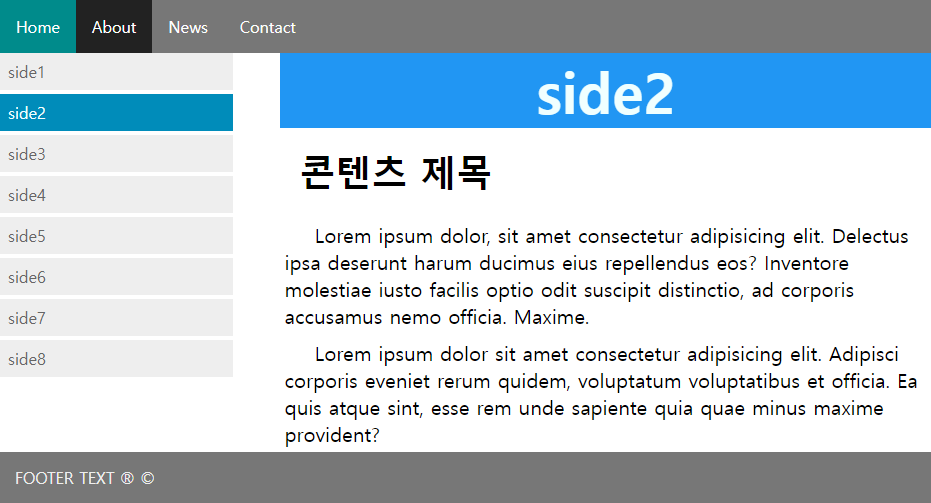
원하는 곳에 마우스를 올리면 색도 진해지고 텍스트 컬러도 변하는 레이아웃이고, 큰 틀을 이번에는 flexbox가 아니라 float으로 잡아보는 연습이다. width를 퍼센트로 주어서 화면을 좁히면 같이 줄어드는 유동 레이아웃. 여기도 외부 css파일을 링크해서 따로 작업했다.
예제2 본문
<!DOCTYPE html>
<html lang="en">
<head>
<meta charset="UTF-8">
<meta http-equiv="X-UA-Compatible" content="IE=edge">
<meta name="viewport" content="width=device-width, initial-scale=1.0">
<title>2단 레이아웃</title>
<link rel="stylesheet" href="./css/style.css">
</head>
<body>
<header>
<nav class="top-menu">
<ul>
<li><a href="index.html">Home</a></li>
<li><a href="#">About</a></li>
<li><a href="#">News</a></li>
<li><a href="#">Contact</a></li>
</ul>
</nav>
</header>
<section>
<aside>
<nav class="column side-menu">
<ul>
<li><a href="#">side1</a></li>
<li><a class="active" href="#">side2</a></li>
<li><a href="#">side3</a></li>
<li><a href="#">side4</a></li>
<li><a href="#">side5</a></li>
<li><a href="#">side6</a></li>
<li><a href="#">side7</a></li>
<li><a href="#">side8</a></li>
</ul>
</nav>
</aside>
<article class="column content">
<h1 class="header">side2</h1>
<h2>콘텐츠 제목</h2>
<p>Lorem ipsum dolor, sit amet consectetur adipisicing elit. Delectus ipsa deserunt harum ducimus eius repellendus eos? Inventore molestiae iusto facilis optio odit suscipit distinctio, ad corporis accusamus nemo officia. Maxime.</p>
<p>Lorem ipsum dolor sit amet consectetur adipisicing elit. Adipisci corporis eveniet rerum quidem, voluptatum voluptatibus et officia. Ea quis atque sint, esse rem unde sapiente quia quae minus maxime provident?</p>
</article>
</section>
<div class="clearfix"></div>
<footer>
<p>FOOTER TEXT ® ©</p>
</footer>
</body>
</html>예제2 Style sheet
<style>
@charset "urf-8";
*{
    margin:0;
    padding:0;
    box-sizing: border-box;
    text-decoration: none;
    list-style: none;
}
.top-menu{
    background-color:#777 ;
    overflow: hidden;
    color: azure;
}
.top-menu li{
    float: left;
}
.top-menu li a{
    display: inline-block;
    color: white;
    padding: 16px;
    text-align: center;
}
.top-menu li:first-child{
    background-color: darkcyan;
}
.top-menu li a:hover{
    background-color: #222;
}
.column {
    float:left;
}
/* fluid layout 유동레이아웃*/
.side-menu{
    width: 25%;
}
.content{
    width: 70%;
    margin-left:5%;
}
.side-menu li a{
    display: block;
    padding: 8px;
    background-color: #eee;
    color:#666;
    margin-bottom: 4px;
}
.side-menu li a:hover{
    background-color: #555;
    color:azure;
}
.side-menu li a.active{
    background-color: #008cba;
    color: azure;
}
.header{
    background-color: #2196F3;
    color:azure;
    text-align: center;
    font-size: 56px;
}
.content h2{
    padding: 20px;
    font-size: 36px;
}
.content p{
    padding: 5px;
    text-indent: 30px;
    font-size:  20px;
}
.clearfix{
    clear:both;
}
footer{
    background-color: #777;
    color: #eee;
    padding: 15px;
}
</style>
어려웠던 점
첫째 예제. 원래는 div 박스의 크기가 지정되어있기 때문에 텍스트 내용이 div박스 크기에 맞춰서 줄어들어야 맞는데 그대로 블럭으로 인식이 되어 한줄로 들어오지 않았다.
.living-lists p{
    width:512px;
}
임시 방편으로 <p>태그에 width를 주어서 줄였지만, 원래는 따로 지정하지 않아도 된다고 한다.
해결 방법
아무래도 강사님이 코드를 빼먹으신 듯 했다.
.living-info{
    width:540px;
    margin-left: 15px;
}
텍스트가 긴데, 가로 설정이 되어있질 않으니 부모태그의 박스 크기만큼 늘어났던 것 같다. 부모 태그인 li는 width가 750px 인데 이미지가 차지하는 공간이 width 170px이다. 근데 텍스트가 가로 750px을 넘는 길이를 차지하고 있으니 한줄 밖으로 내려왔던 것이다.
텍스트가 담긴 div 박스 자체의 크기를 이미지공간(가로 170px)을 제외하고 540px 정도 주고, 이미지와 텍스트 div 사이에 마진을 주었다!
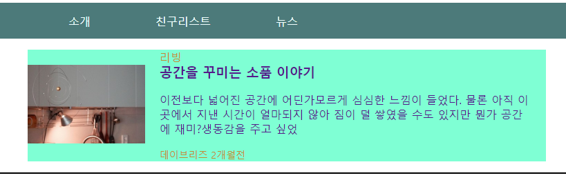
a는 inline level인데 텍스트가 쓰인 태그가 p여서 내려왔던 걸까 싶다. p는 block level이니까...
소감
처음엔 레이아웃 잡는 것도 어버버했는데 엉성하지만 이렇게 직접 잡아보니 그래도 감은 잡히는 것 같다.