2022-05-18
오늘도 레이아웃 연습 예제를 실습했다
여러 번 작업할수록 어디를 건드리면 좋을 지 찾는 눈이 생긴다. 아주 조금씩.
cafe homepage main
이번 홈페이지 컨셉은 카페 메인 화면이다. 복잡한 ui는 없지만 초심자 입장에선 충분히 난이도 있게 느껴졌다ㅎ
대락 이렇게 생김.
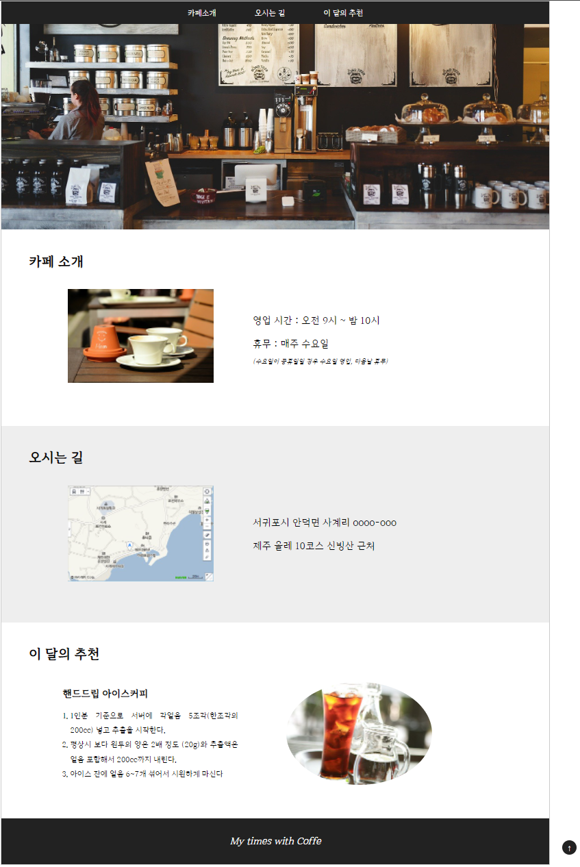
예제3 cafe html
<!DOCTYPE html>
<html lang="en">
<head>
    <meta charset="UTF-8">
    <meta http-equiv="X-UA-Compatible" content="IE=edge">
    <meta name="viewport" content="width=device-width, initial-scale=1.0">
    <link rel="stylesheet" href="./css/cafe-style.css">
    <title>my cafe</title>
</head>
<body>
    <header id="header">
        <nav>
            <ul id="main-nav">
                <li><a href="#intro">카페소개</a></li>
                <li><a href="#map">오시는 길</a></li>
                <li><a href="#choice">이 달의 추천</a></li>
            </ul>
        </nav>
    </header>
    <section id="intro">
        <div class="page-title">
            <h1>카페 소개</h1>
        </div>
        <div class="contents">
            <div class="photo">
                <img src="./images/coffee.jpg" alt="카페 소개, 커피 이미지">
            </div>
            <div class="text">
                <p>영업 시간 : 오전 9시 ~ 밤 10시</p>
                <p>휴무 : 매주 수요일</p>
                <i><small>(수요일이 공휴일일 경우 수요일 영업, 다음날 휴무)</small></i>
            </div>
        </div>
    </section>
    <section id="map">
        <div class="page-title">
            <h1>오시는 길</h1>
        </div>
        <div class="contents">
            <div class="photo">
                <img src="./images/map.jpg" alt="100m후 좌회전">
            </div>
            <div class="text">
                <p>서귀포시 안덕면 사계리 oooo-ooo</p>
                <p>제주 올레 10코스 신빙산 근처</p>
            </div>
        </div>
    </section>
    <section id="choice">
        <div class="page-title">
            <h1>이 달의 추천</h1>
        </div>
        <div class="contents">
            <div class="photo">
                <img src="./images/ice.jpg" alt="물병과 아이스 커피">
            </div>
            <div class="text">
                <h2>핸드드립 아이스커피</h2>
                <ol>
                    <li>1인분 기준으로 서버에 각얼음 5조각(한조각의 200cc) 넣고 추출을 시작한다.</li>
                    <li>평상시 보다 원두의 양은 2배 정도 (20g)와 추출액은 얼음 포함해서 200cc까지 내린다.</li>
                    <li>아이스 잔에 얼음 6~7개 섞어서 시원하게 마신다</li>
                </ol>
            </div>
        </div>
    </section>
    <footer id="footer">
        <p><em>My times with Coffe</em></p>
    </footer>
    <div id="top">
        <button type="button" class="btn-black round">
            <a href="#header">↑</a>
        </button>
    </div>
    <!-- <div id="bottom">
        <button type="button" class="btn-black round">
            <a href="#footer">↓</a>
        </button> -->
    </div>
</body>
</html>
예제3 cafe CSS style sheet
<style>
@charset "utf-8";

@font-face {
    font-family: 'HallymMjo-Regular';
    src: url('https://cdn.jsdelivr.net/gh/projectnoonnu/noonfonts_2204@1.0/HallymMjo-Regular.woff2') format('woff2');
    font-weight: 400;
    font-style: normal;
}

/* 기본적인 세팅 */
*{
    margin:0;
    padding:0;
}
a{
    text-decoration: none;
    display: block;
}
/* em : 1em == 16px */
h1{
    font-size: 1.8em; /* 28.8px */
}
h2{
    font-size: 1.3em; /* 16*1.3 == 20.8px */
}
p{
    font-size: 1.3em;
    line-height: 2.5; /* 1.3em의 2.5배 라는 뜻 */
}
li{
    font-size: 1em;
    line-height: 2;
    list-style: none;
}
body{
    width:1200px;
    margin: 0 auto; /* 가운데 정렬 */
    border: 1px solid #ccc;
    background-color: #fff;
    font-family: 'HallymMjo-Regular', 'sans-serif';
}

/* header, nav */

header{
    width:100%;
    height: 500px;
    background: url("../images/header.jpg") center no-repeat;
    background-size: cover;

}

nav{
    height: 50px;
    background-color: #222;
}

#main-nav{
    text-align: center;
    padding: 5px;
}

#main-nav li{
    display: inline-block;
    color:#fff;
    font-size: 1em;
    padding: 5px 40px;
    /* margin: 5px 40px; */
    /* background-color: aliceblue; */
}
/* a태그 속성: link(방문진) visited(방문 후) hover(마우스오버) active(클릭 중) ※순서대로 작성해야 스타일이 적용됨 */
nav a:link,
nav a:visited,
#top a:link,
#top a:visited{
    color: rgb(240, 240, 240);
}

nav a:hover{
    color: #a6e4c4;
}

nav a:active{
    color: rgb(212, 212, 112);
}

/* section - 본문 */
section{
    position:relative;
    width: 100%;
    /* border: 1px solid red; */
    padding: 15px 5% 10px 5%;
}
#intro, #map, #choice{
    /* -moz-box-sizing: border-box;
    -webkit-box-sizing: border-box; */
    box-sizing: border-box;
    height: 430px;
}
section:nth-child(2n+1){
    background-color: #eee;
}/* 짝수로 배경줄수있는데 왜 안될깡 */
.page-title{
    position:absolute;
    top:20px;
}
section h1{
    margin-top: 30px;
}
#intro .contents,
#map .contents,
#choice .contents{
        position: absolute;
        top: 130px;
        width: 80%;
        display: flex;
        flex-wrap: nowrap;
        justify-content: space-evenly;
        align-items: center;
    }
    .text{
        width: 40%;
    }
    .photo img{
        max-width: 320px;
        height: auto;
    }
    #intro .contents,
    #map .contents{
        flex-direction: row;
    }
    #choice .contents{
        flex-direction: row-reverse;
    }
    #choice .photo{
        margin-left: 30px;
    }
    #choice .text ol{
        text-align: justify;
        margin-top: 20px;
    }
    #choice .text li{
        list-style: decimal;
        margin-left: 16px;
    }
    #choice img{
        border: 1px solid #fff;
        border-radius: 50%;
    }
    footer{
        width: 100%;
        height: 100px;
        background: #222;
    }
    footer p{
        line-height: 100px;
        color: #fff;
        text-align: center;
    }
    #top{
        position: fixed;
        bottom: 100px;
        right: 12%;
    }
    /* #bottom{
        position: fixed;
        top: 10px;
        right: 12%;
    } */
    .btn-black{
        border-radius: 50%;
        color:#fff;
        background-color: #222;
        border: 1px solid #fff;
        width: 35px;
        height: 35px;
    }
</style>
코드의 bottom button 부분은 탑으로가는 버튼도 심심풀이로 한번 만들어 본 것이다.
shopping mall homepage main
그렇다. 4번째 예제는 존재하는 쇼핑몰 페이지를 그대로 따라 연습해보는 것이다. 그림 그릴 때의 모작과 같은 행위이다. 이미 완성된 구조물을 따라 만들어보기만 해도 숙련도가 엄청 올라간다.

예제 색만 봐도 알겠지만 모두가 아는 그 N 홈페이지의 쇼핑몰 부분이다 ㅎ. 이놈들의 쇼핑몰은 칸이 무슨... 어마무시하다.
오늘은 진도상 header 부분까지의 틀만 잡았다.
예제4 shopping mall html(header)
<!DOCTYPE html>
<html lang="en">
<head>
    <meta charset="UTF-8">
    <meta http-equiv="X-UA-Compatible" content="IE=edge">
    <meta name="viewport" content="width=device-width, initial-scale=1.0">
    <title>Shopping</title>
    <link rel="stylesheet" href="./css/style.css">
</head>
<body id="shop-body">
    <header id="shop-header">
        <div id="shop-header-gnb"></div>
        <div id="shop-header-middle"></div>
        <nav>
            <div class="shop-container">
                <ul>
                <li><a href="#">홈</a></li>
                <li><a href="#">백화점윈도</a></li>
                <li><a href="#">아울렛윈도</a></li>
                <li><a href="#">스타일윈도</a></li>
                </ul>
            </div>
        </nav>
    </header>
    <section id="shop-main">
        <div class="list-wrap">
            <div class="list-item"></div>
            <div class="list-item"></div>
            <div class="list-item"></div>
            <div class="list-item"></div>
        </div>
    </section>
</body>
</html>
예제4 shopping mall css style sheet(header)
<style>
@charset "utf-8";
*{
    margin: 0;
    padding: 0;
    text-decoration: none;
    list-style: none;
}
#shop-body{
    background-color: #e9ecef;
}
#shop-container{
    width: 1300px;
    margin: 0 auto;
}
/* 상단 gnb 영역 */
#shop-header #shop-header-gnb{
    width: 100%;
    height: 36px;
    background-color: #03c75a;
    border-bottom: 1px solid #e8e8e8;
}
#shop-header #shop-header-middle{
    width: 100%;
    height:66px;
    background-color: #03c75a;
}
#shop-header nav{
    width:100%;
    border-top: solid 1px #e8e8e8;
    border-bottom: solid 1px #e8e8e8;
    background-color: #fff;
}
/* nav 메뉴를 가로로 정렬 */
#shop-header nav ul{
    display: flex;
    flex-wrap:wrap;
    align-items: center;
    padding:13px 0px 8px 0px;
}
#shop-header nav ul li{
    margin-right: 16px;
}
</style>
어려웠던 것
레이아웃 구조가 어긋나면 어디서 틀렸는지 알기가 정말 쉽지 않다...
그리고 가장 기본적인!!! 문법에서 걸리는 것이 생각보다 너무 많다. 스펠링 오타 뿐만 아니라 ; 세미콜론이 빠져서 실행 자체가 안되는 것도 있었다
해결 방법
많은 숙달과 경험이 베스트
소감
느리게 타자를 써보려고.. 노력중이지만 아마 안될 것 같다. 타자의 정확성을 높이는 것에 신경써보려고 한다. 그래도 저번보다 급한 오탈자는 많이 없어졌고 여전히 정확하게 쓰려고 노력하고 있다.(수고로움 덜게...^^) 그리고 서두에도 써놓았지만 레이아웃 잡는 연습을 이어갈수록 이해도가 높아지는 게 느껴진다. 이전 예제들은 솔직히 내가 홈페이지를 만드는 건가 무슨 외계 행성 대문을 만드는 건가 싶었는데 이미지가 들어가니 허접하지만 그럴듯한 홈페이지에 나름 고개 끄덕이는 중.