2022-05-24
최신 웹 트렌드
- Flat Design
- Grid layout
- One page site
- Full Screen bg & Carousel
- Typography
타이포그래피는 늘 중요하다.
반응형 메뉴바 만들기
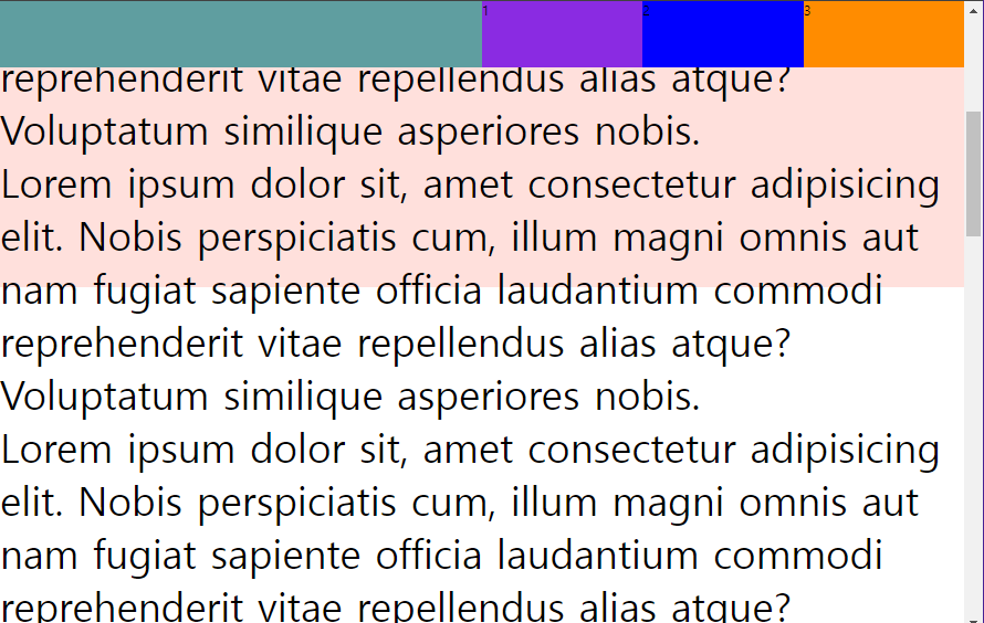
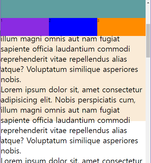
화면의 상단에 항상 고정되어있고, 화면이 일정 폭 이하로 좁아지면 메뉴바가 떨어지는 반응형 메뉴바를 만들어본다.
768px 이상 폭
768px미만 폭
예제1
html
<!DOCTYPE html>
<html lang="en">
<head>
    <meta charset="UTF-8">
    <meta http-equiv="X-UA-Compatible" content="IE=edge">
    <meta name="viewport" content="width=device-width, initial-scale=1.0">
    <link rel="stylesheet" href="./css/style.css">
    <title>Document</title>
</head>
<body>
    <header class="intro">
        <h1></h1>
        <nav>
            <ul>
                <li>1</li>
                <li>2</li>
                <li>3</li>
            </ul>
        </nav>
    </header>
    <section class="main">
        <p>Lorem ipsum dolor sit, amet consectetur adipisicing elit. Nobis perspiciatis cum, illum magni omnis aut nam fugiat sapiente officia laudantium commodi reprehenderit vitae repellendus alias atque? Voluptatum similique asperiores nobis.</p>
        <p>Lorem ipsum dolor sit, amet consectetur adipisicing elit. Nobis perspiciatis cum, illum magni omnis aut nam fugiat sapiente officia laudantium commodi reprehenderit vitae repellendus alias atque? Voluptatum similique asperiores nobis.</p>
        <p>Lorem ipsum dolor sit, amet consectetur adipisicing elit. Nobis perspiciatis cum, illum magni omnis aut nam fugiat sapiente officia laudantium commodi reprehenderit vitae repellendus alias atque? Voluptatum similique asperiores nobis.</p>
        <p>Lorem ipsum dolor sit, amet consectetur adipisicing elit. Nobis perspiciatis cum, illum magni omnis aut nam fugiat sapiente officia laudantium commodi reprehenderit vitae repellendus alias atque? Voluptatum similique asperiores nobis.</p>
        <p>Lorem ipsum dolor sit, amet consectetur adipisicing elit. Nobis perspiciatis cum, illum magni omnis aut nam fugiat sapiente officia laudantium commodi reprehenderit vitae repellendus alias atque? Voluptatum similique asperiores nobis.</p>
        <p>Lorem ipsum dolor sit, amet consectetur adipisicing elit. Nobis perspiciatis cum, illum magni omnis aut nam fugiat sapiente officia laudantium commodi reprehenderit vitae repellendus alias atque? Voluptatum similique asperiores nobis.</p>
        <p>Lorem ipsum dolor sit, amet consectetur adipisicing elit. Nobis perspiciatis cum, illum magni omnis aut nam fugiat sapiente officia laudantium commodi reprehenderit vitae repellendus alias atque? Voluptatum similique asperiores nobis.</p>
        <p>Lorem ipsum dolor sit, amet consectetur adipisicing elit. Nobis perspiciatis cum, illum magni omnis aut nam fugiat sapiente officia laudantium commodi reprehenderit vitae repellendus alias atque? Voluptatum similique asperiores nobis.</p>
        <p>Lorem ipsum dolor sit, amet consectetur adipisicing elit. Nobis perspiciatis cum, illum magni omnis aut nam fugiat sapiente officia laudantium commodi reprehenderit vitae repellendus alias atque? Voluptatum similique asperiores nobis.</p>
        <p>Lorem ipsum dolor sit, amet consectetur adipisicing elit. Nobis perspiciatis cum, illum magni omnis aut nam fugiat sapiente officia laudantium commodi reprehenderit vitae repellendus alias atque? Voluptatum similique asperiores nobis.</p>
        <p>Lorem ipsum dolor sit, amet consectetur adipisicing elit. Nobis perspiciatis cum, illum magni omnis aut nam fugiat sapiente officia laudantium commodi reprehenderit vitae repellendus alias atque? Voluptatum similique asperiores nobis.</p>

    </section>
</body>
</html>
CSS
<style>
@charset "utf-8";

body, h1, p{
    margin:0;
    padding:0;
}
/* position: static fixed */
p{
    font-size: 48px;
}
.intro {
    width: 100%;
    height: 80px;
    display: flex;
    position: fixed;
    /* border: 1px solid red; */
}
.intro h1{
    width: 50%;
    height: 100%;
    background-color: cadetblue;
}
.intro nav{
    width:50%;
    height: 100%;
    background-color: aquamarine;
}
.intro nav ul{
    list-style: none;
    display: flex;
    margin:0;
    padding:0;
}
.intro nav ul li{
    width: 33.3333%;
    height: 80px;
    margin:0;

}
.intro nav ul li:nth-child(1){
    background-color: blueviolet;
}
.intro nav ul li:nth-child(2){
    background-color: blue;
}
.intro nav ul li:nth-child(3){
    background-color: darkorange;
}
.main{
    width: 100%;
    height: 800px;
    background-color: rgb(255, 224, 220);
    padding-top:110px;
}

/* 768px 보다 작을 때  hedaer가 2단으로 바뀌도록 처리한다*/

@media (max-width:768px){
    .intro{
        height: 160px;
        flex-direction: column;
        position:static fixed;
    }
    .intro h1,
    .intro nav{
        width: 100%;
    }
    .main{
        padding-top:170px;
        background-color: antiquewhite;
    }
    p {
        font-size: 34px;
    }
}
</style>
관건은 flex와 position에 대한 높은 이해와,
media 쿼리로 조건문을 만들어 width 폭 별로 레이아웃할 부분을 조정해보는 것.
Grid Layout Design
디자인과에게 친숙한 단어가 매번 등장한다. 편집디자인이든, 디지털 디스플레이 디자인이든 그리드는 매우 중요하다.
Grid는 화면을 일관성, 통일성있게 정돈하기 위한 가이드 라인이다. 그리드를 지켜가며 콘텐츠를 배치하면 매우 깔끔하고 안정감 있어보인다. 이는 사용자의 가독성에 직결된다.
1) 시각적으로 안정적인 디자인
2) 단순한 웹 디자인
3) 원하는 대로 내용 배치 가능
Grid layout 디자인 방법
- 가변 그리드 레이아웃
-> 값을 고정하고 백분율과 같은 가변 값으로 지정 - float 속성
-> 가로로 배치 안되는 것들을 가로로 배치하는 것 - Flex box layout
- CSS 그리드 레이아웃
-> 2차원 배치(수평/수직으로 몇 개의 박스를 얼마 크기로 배치할 것인가) : CSS3이며 계속 갱신중.
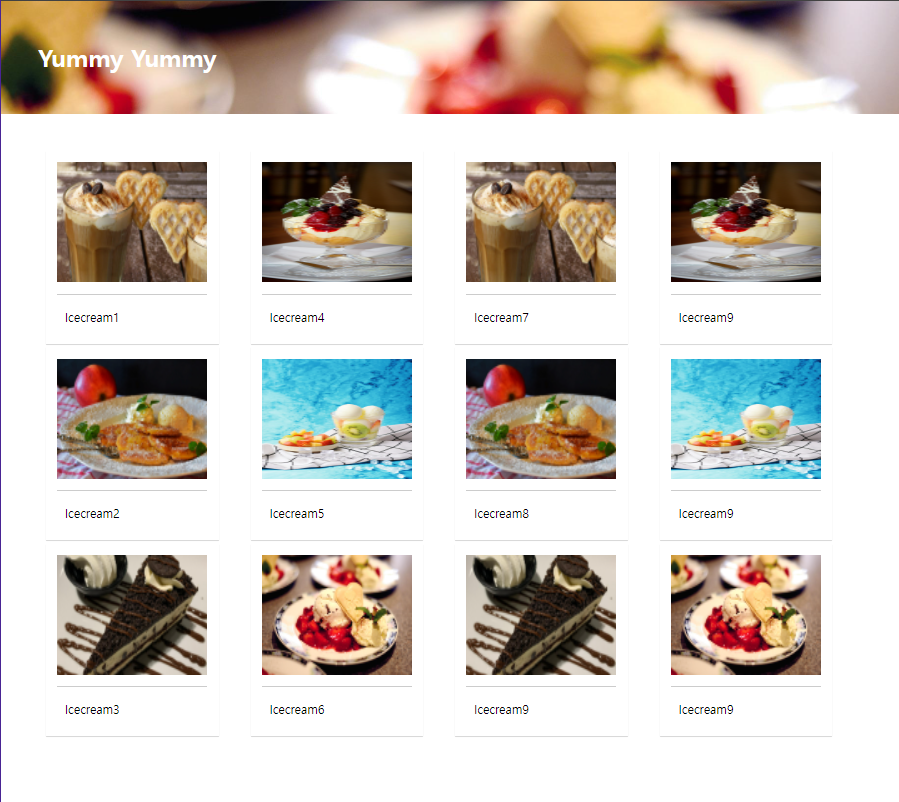
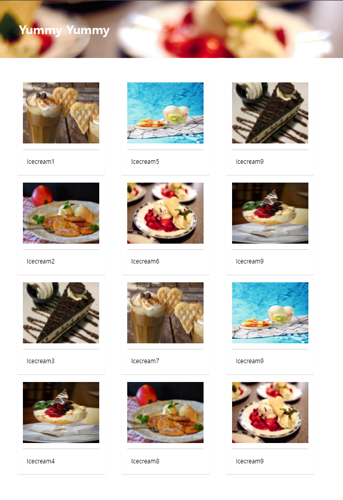
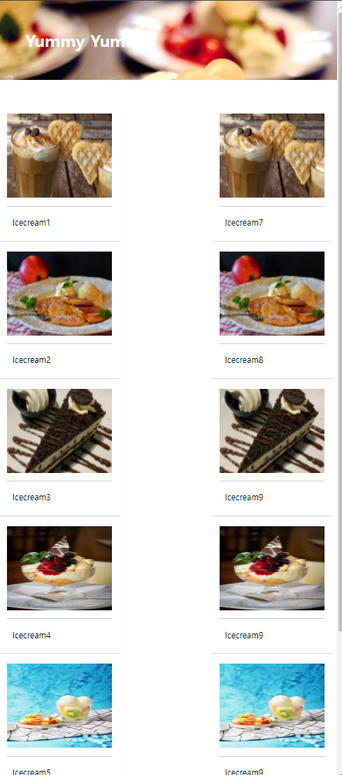
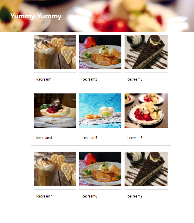
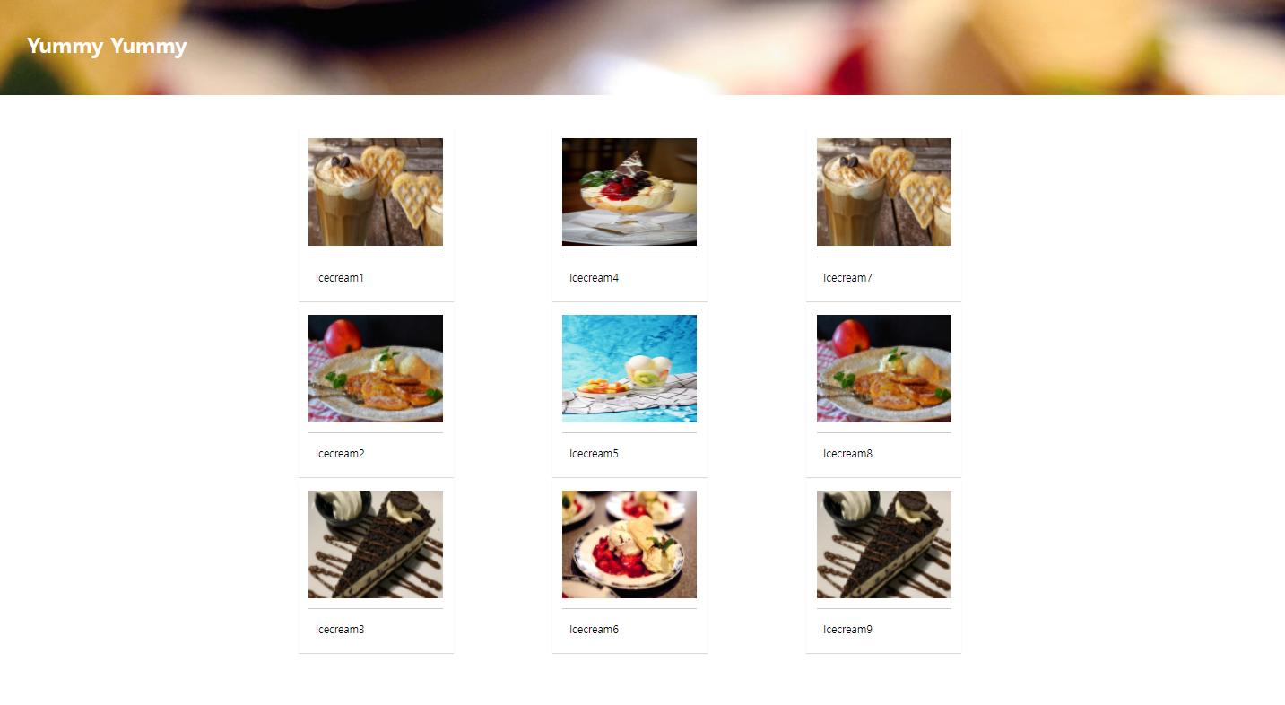
Grid layout 예제1
화면의 폭에 따라 칼럼 수가 4단->3단->2단으로 변형하는 웹페이지를 만들어본다.
html
<!DOCTYPE html>
<html lang="en">
<head>
    <meta charset="UTF-8">
    <meta http-equiv="X-UA-Compatible" content="IE=edge">
    <meta name="viewport" content="width=device-width, initial-scale=1.0">
    <link rel="stylesheet" href="./css/style2.css">
    <title>Document</title>
</head>
<body>
    <!-- 다단 컬럼 -->
    <h1>Yummy Yummy</h1>
<div id="wrapper">
    <div id="columns">
        <div class="card">
            <img src="./images/img1.jpg">
            <p>Icecream1</p>
        </div>
        <div class="card">
            <img src="./images/img2.jpg">
            <p>Icecream2</p>
        </div>
        <div class="card">
            <img src="./images/img3.jpg">
            <p>Icecream3</p>
        </div>
        <div class="card">
            <img src="./images/img4.jpg">
            <p>Icecream4</p>
        </div>
        <div class="card">
            <img src="./images/img5.jpg">
            <p>Icecream5</p>
        </div>
        <div class="card">
            <img src="./images/img6.jpg">
            <p>Icecream6</p>
        </div>
        <div class="card">
            <img src="./images/img1.jpg">
            <p>Icecream7</p>
        </div>
        <div class="card">
            <img src="./images/img2.jpg">
            <p>Icecream8</p>
        </div>
        <div class="card">
            <img src="./images/img3.jpg">
            <p>Icecream9</p>
        </div>
        <div class="card">
            <img src="./images/img4.jpg">
            <p>Icecream9</p>
        </div>
        <div class="card">
            <img src="./images/img5.jpg">
            <p>Icecream9</p>
        </div>
        <div class="card">
            <img src="./images/img6.jpg">
            <p>Icecream9</p>
        </div>
    </div>
</div>
</body>
</html>
CSS
<style>
@charset "utf-8";
*{
margin:0;
padding:0;
}
h1{
width: 100%;
height: 150px;
line-height: 150px;
padding-left: 50px;
background: url("../images/img6.jpg") no-repeat left top;
background-size: cover;
color: #fff;
}
#wrapper {
width: 90%;
max-width: 1500px;
min-width: 800px;
margin:50px auto; /* 놆이 50px 띄우고 가운데 정렬 */
}
/* 칼럼 수 지정, 칼럼 사이 간격 지정 */
#columns {
column-count: 2;
column-gap: 10px;
}
.card{
display: inline-block;
width: 200px;
background-color: #fff;
box-shadow: 0 1px 1px #ccc;
padding: 15px;
padding-bottom:15px;
margin-bottom:5px;
}
.card img{
width: 100%;
height: 160px;
border-bottom: 1px solid #ccc;
padding-bottom:15px;
margin-bottom:5px;
}
.card p{
padding: 10px;
}
@media (min-width:900px) {
#columns{
column-count: 3;
}
}
@media (min-width:1100px) {
#columns{
column-count: 4;
}
}
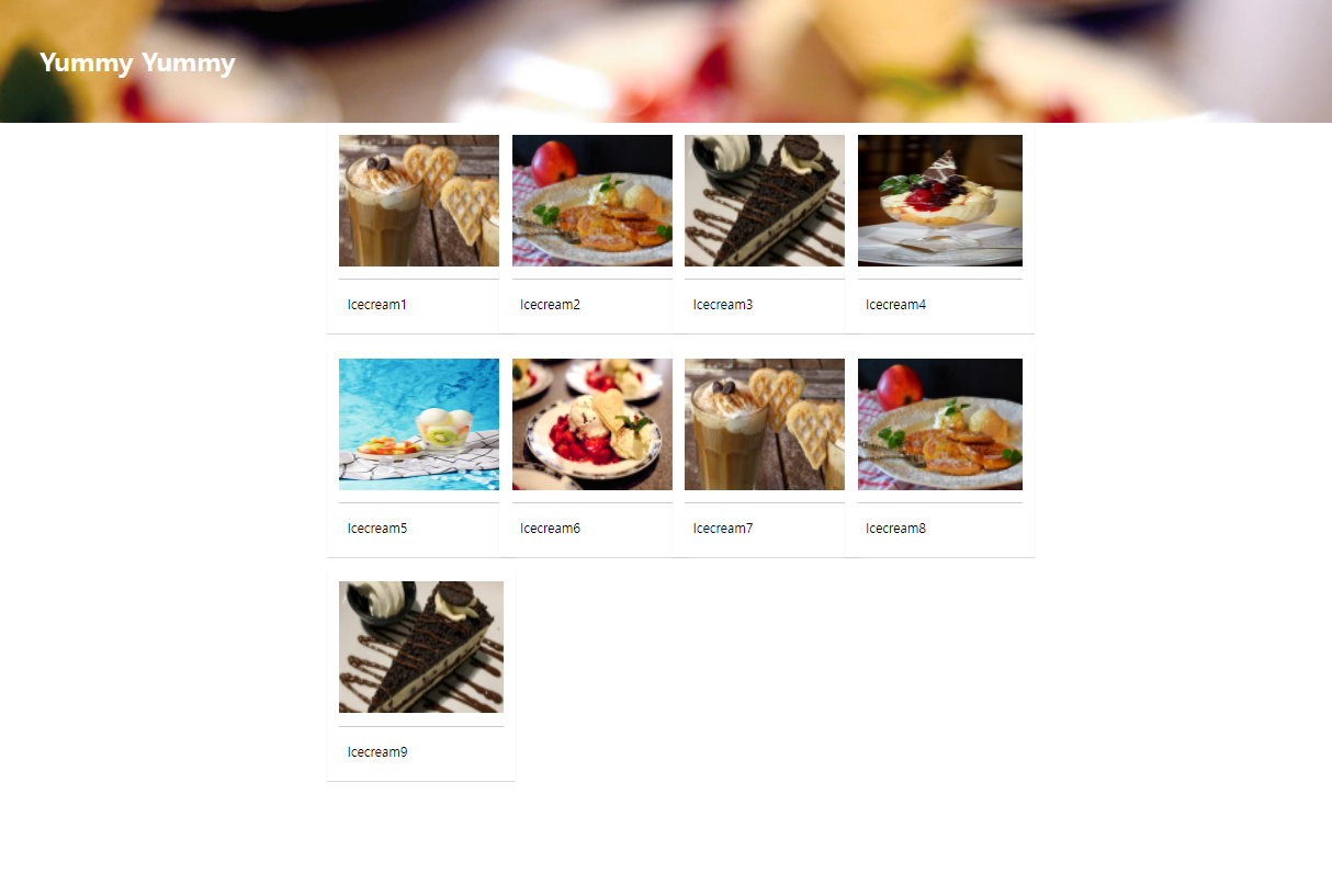
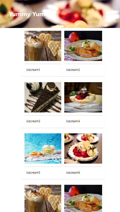
</style>Grid layout 예제2
html
<!DOCTYPE html>
<html lang="en">
<head>
    <meta charset="UTF-8">
    <meta http-equiv="X-UA-Compatible" content="IE=edge">
    <meta name="viewport" content="width=device-width, initial-scale=1.0">
    <link rel="stylesheet" href="./css/style3.css">
    <title>CSS grid layout</title>
</head>
<body>
    <!-- 다단 컬럼 -->
    <h1>Yummy Yummy</h1>

    <div id="wrapper">
        <div class="card">
            <img src="./images/img1.jpg">
            <p>Icecream1</p>
        </div>
        <div class="card">
            <img src="./images/img2.jpg">
            <p>Icecream2</p>
        </div>
        <div class="card">
            <img src="./images/img3.jpg">
            <p>Icecream3</p>
        </div>
        <div class="card">
            <img src="./images/img4.jpg">
            <p>Icecream4</p>
        </div>
        <div class="card">
            <img src="./images/img5.jpg">
            <p>Icecream5</p>
        </div>
        <div class="card">
            <img src="./images/img6.jpg">
            <p>Icecream6</p>
        </div>
        <div class="card">
            <img src="./images/img1.jpg">
            <p>Icecream7</p>
        </div>
        <div class="card">
            <img src="./images/img2.jpg">
            <p>Icecream8</p>
        </div>
        <div class="card">
            <img src="./images/img3.jpg">
            <p>Icecream9</p>
        </div>
    </div>

</body>
</html>
CSS
<style>
@charset "utf-8";
*{
margin:0;
padding:0;
}
h1{
width: 100%;
height: 150px;
line-height: 150px;
padding-left: 50px;
background: url("../images/img6.jpg") no-repeat left top;
background-size: cover;
color: #fff;
}
#wrapper {
/* grid, grid-inline이 잇다 */
display: grid;
grid-template-columns: 200px 200px;
grid-template-rows: minmax(220px auto);
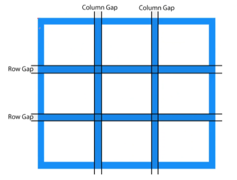
grid-gap: 10px 10px;
justify-content: center;
}
.card {
display: inline-block;
width: 200px;
background-color: #fff;
box-shadow: 0 1px 1px #ccc;
padding: 15px;
padding-bottom:15px;
margin-bottom:5px;
}
.card img{
width: 100%;
height: 160px;
border-bottom: 1px solid #ccc;
padding-bottom:15px;
margin-bottom:5px;
}
.card p{
padding:10px;
}
/* 900 이상 */
@media (min-width:900px) {
#wrapper{
justify-content: center;
grid-template-columns: repeat(3, 200px);
}
}
/* 1100이상 */
@media (min-width:1100px) {
#wrapper{
justify-content: center;
grid-template-columns: repeat(4, 200px);
}
}
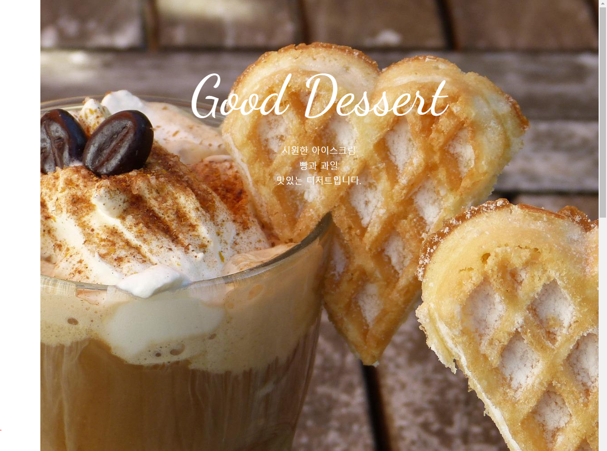
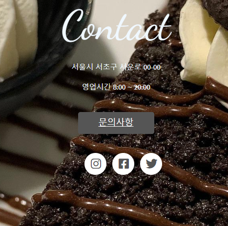
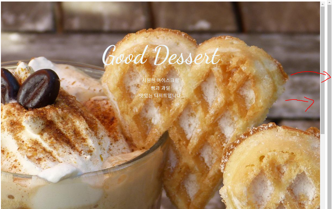
</style>One page site 예제
원페이지로 해당 사이트를 파악할 수 있음.
추가적으로 예제에 스크롤이 일정 세션 구간을 넘어갈때 페이지를 자동으로 내려서 포커스 해주는 스크롤 이벤트 기능이 포함되어 있다.
html
<!DOCTYPE html>
<html lang="en">
<head>
<meta charset="UTF-8">
<meta http-equiv="X-UA-Compatible" content="IE=edge">
<meta name="viewport" content="width=device-width, initial-scale=1.0">
<title>Document</title>
<link rel="stylesheet" href="./css/style.css">
<link href="https://fonts.googleapis.com/css2?family=Dancing+Script&display=swap" rel="stylesheet">
<!-- FontAwesome -->
<script src="https://kit.fontawesome.com/b8a7fea4d4.js" crossorigin="anonymous"></script>
</head>
<body>
<div class="container">
<section class="top">
<h1 class="title">Good Dessert</h1>
<p>시원한 아이스크림<br>
빵과 과일<br>
맛있는 디저트입니다. </p>
</section>
<section class="menu">
<h2 class="title">Menu</h2>
</section>
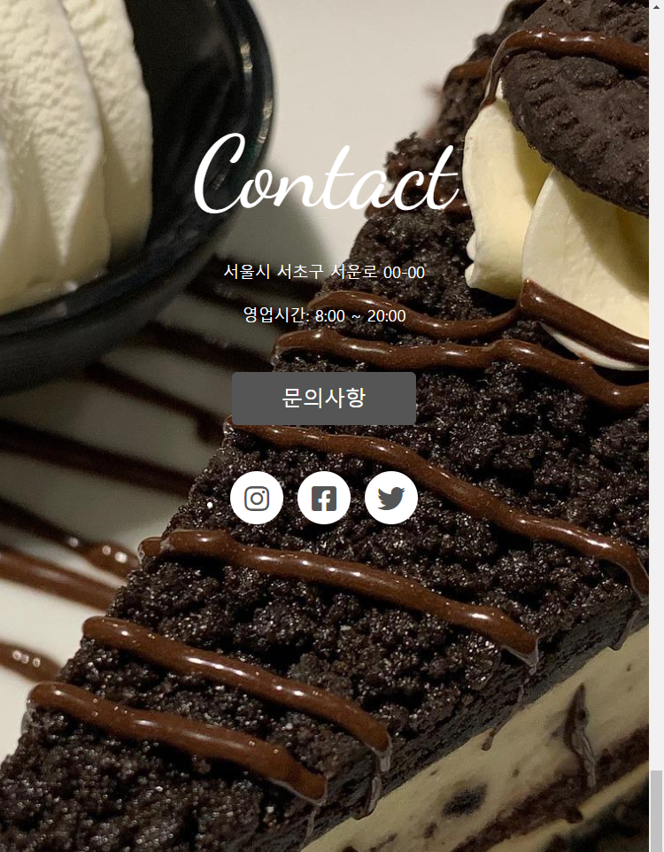
<section class="contact">
<h2 class="title">Contact</h2>
<p>서울시 서초구 서운로 00-00</p>
<p>영업시간: 8:00 ~ 20:00</p>
<a class="btn" href="#">문의사항</a>
<ul class="contact-sns">
<li><a href="#"><i class="fab fa-instagram"></i></a></li>
<li><a href="#"><i class="fab fa-facebook-square"></i></a></li>
<li><a href="#"><i class="fab fa-twitter"></i></a></li>
</ul>
</section>
</div>
</body>
</html>CSS
<style>
@charset "utf-8";

*{
    box-sizing:border-box;
    padding:0;
}
html{
    font-size:100%;
    line-height: 1.15;
}
body{
    font-family: sans-serif;
    margin:0;
    color:white;
}
a{
    background-color: transparent;
    text-decoration: none;
}
img{
    border-style:none;
    vertical-align: bottom;
}
h1, h2{
    font-weight: lighter;
    margin:0;
    /* color:white; */
}

/* title section */
.title{
    font-family: 'Dancing Script', cursive;
    font-size: 7rem; /*112px;*/
    margin-bottom: 2rem; /*32px;*/
    padding-top:10vh;
    /* text-align: center; */
}
p{
    line-height: 1.7;
    font-size:18px;
    /* color:white; */
    /* text-align: center; */
}
.container{
    height: 100vh;
    overflow: auto;
    scroll-snap-type: y mandatory;
}
.top{
    background-image: url("../images/img1.jpg");
    /* padding-top:10vh;
    text-align: center; */
}
section{
    height:100vh;
    background-size: cover;
    background-repeat: no-repeat;
    background-position: center;
    text-align: center;
    scroll-snap-align: start;
}
.menu{
    background-image: url("../images/img2.jpg");
}
.contact{
    background-image: url("../images/img3.jpg");
}

.btn{
    background-color: #555;
    font-size:24px;
    color:#fff;
    padding: 16px 56px;
    border-radius: 6px;
    display:inline-block;
    margin: 32px 0 36px;
}
.btn:hover{
    background-color: #777;
}
.contact-sns{
    display: flex;
    justify-content: center;
}
.contact-sns a{
    display: inline-block;
    background-color: #fff;
    color:#555;
    width: 60px;
    height:60px;
    margin: 0 8px;
    border-radius: 50%;
    font-size: 32px;
    /* padding: 12px 0 0 2px; */
    line-height: 60px;
}
.contact-sns a:hover{
    background-color: rgba(255, 255, 255, .5);
}

/* 창 넓이 700사이즈 이하일때*/

@media (max-width:700px){
    .title {
        font-size: 64px;
    }
}
</style>
어려웠던 점
- Grid Layout 은 CSS3에서 추가된 기능이라는데, 코드는 제대로 썼는데
column-count가 제대로 작동하지 않는 것을 발견했다.
<style>
@media (min-width:900px) {
    #columns{
        column-count: 3;
    }
}
@media (min-width:1100px) {
    #columns{
        column-count: 4;
    }
}
</style>
보면 분명 width 가 1100px은 한참 넣는데 칼럼이 3줄뿐.
- 아래처럼 이상하게 얘네들만 마진이 이상하다!! 아무리 값을 만져줘도 변하질 않는다. 마진에 문제는 없어 보이는데.
- 원페이지 스크롤 구간에서 스크롤이 중복으로 두개나 있으며, 이벤트가 발생하지 않는다.
해결 방법
-
칼럼 수를 채워주는 것으로 해결. 해당 레이아웃을 이루기 위한 충분한 콘텐츠들이 필요하다.
칼럼 컨텐츠가 부족하니까, CSS 그리드 코드에 내장된 프로그램으로 칼럼 수에 맞게 그리드를 자체적으로 정돈한 것으로 추정된다. -
헐. 알고보니 최상단 최초로 값 조정해둘때
<style>
*{
    box-sizing: border-box;
    padding:0l
}
</style>
이렇게 썼었다.
<style>
*{
    box-sizing: border-box;
    padding:0;
}
</style>
으로 고쳐줬더니 잘 된다.
- 이상하다. 갑자기 스크롤 이벤트가 잘만된다.
<style>
    text-align: center;
    scroll-snap-align: start;
</style>
섹션 선택자에 있던걸 콘테이너 선택자에 옮겼다가 다시 섹션칸에 옮겼더니 잘 된다...ㄱ-
문제는 두 개 생긴 스크롤 바 없애기다.
+4. 해결했다!
<style>
*{
    box-sizing: border-box;
    margin:0;
    padding:0;
}
</style>
마진 0 값을 추가 시켰더니 두 개 생긴 스크롤 바가 사라졌다. 마진 공간에도 스크롤바가 생기고, 바디에도 스크롤바가 더블로 생겼던 것이다.
<style>
body{
    margin:0;
}
</style>*는 all을 뜻하는 태그인데, 전체에 적용하면 처리해야할 것도 많아져서 가급적 html이나 body에 적용하는 게 좋다고 한다.
소감
CSS는 코드에 자체적인 기능이 많아서 파악하는게 아직 쉽지 않다.
이 차이가 경험치 차이인가 싶다.