2022-05-25
적응형 웹의 실습을 계속 해본다
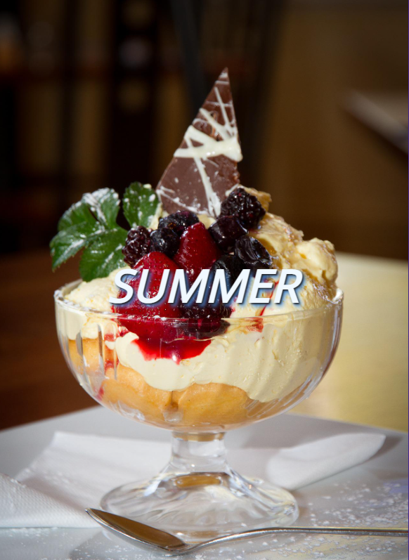
풀스크린 페이지 + 미디어 쿼리 예제1
풀 스크린 웹페이지의 width가 작아지면 미디어 쿼리로 배경과 폰트 내용물이 모두 작아지게 작업해본다. + 컨텐츠 중앙 정렬도 맞춰보자.
어제 One page 사이트를 과제를 하면서 정말 궁금했던 콘텐츠 중앙 정렬 내용을 드디어 알았다...
<style>
.selector {position: absolute;
    top: 50%;
    left: 50%;
    /* 사실 요렇게 만들 경우 콘텐츠가 정중앙에 오지 않는다. 그래서 아래 트랜스폼으로 중앙을 맞추는 게 팁^^ */
transform: translate(-50%, -50%);}
</style>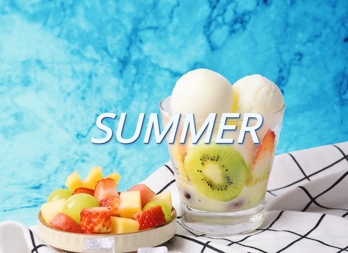
html
<!DOCTYPE html>
<html lang="en">
<head>
    <meta charset="UTF-8">
    <meta http-equiv="X-UA-Compatible" content="IE=edge">
    <meta name="viewport" content="width=device-width, initial-scale=1.0">
    <title>Document</title>
    <link href="https://fonts.googleapis.com/css?family=Open+Sans" rel="stylesheet">
    <link rel="stylesheet" href="./CSS/style.css">

</head>
<body>
<div id="content">
    <h1>SUMMER</h1>
</div>
</body>
</html>
CSS
<style>
@charset "utf-8";
html{
font-family: "Open Sans", sans-serif;
background: url("../dst-images/img5.jpg") no-repeat center center fixed;
background-size: cover;
/* background-position: x-position y-position
::left, center, right, % ::top, center, bottom, % */
}
#content{
position: absolute;
top: 50%;
left: 50%;
/* 사실 요렇게 만들 경우 콘텐츠가 정중앙에 오지 않는다. 그래서 아래 트랜스폼으로 중앙을 맞추는 게 팁^^ */
transform: translate(-50%, -50%);
}
h1 {
color:aliceblue;
font-size: 8em;
font-style: italic;
text-shadow: 2px 2px 3px #222, 4px 5px 6px rgb(74, 148, 233);
}
@media (max-width:700px){
html{
background: url("../dst-images/img4.jpg");
background-size: cover;
}
h1 {
font-size:4em;
}
}
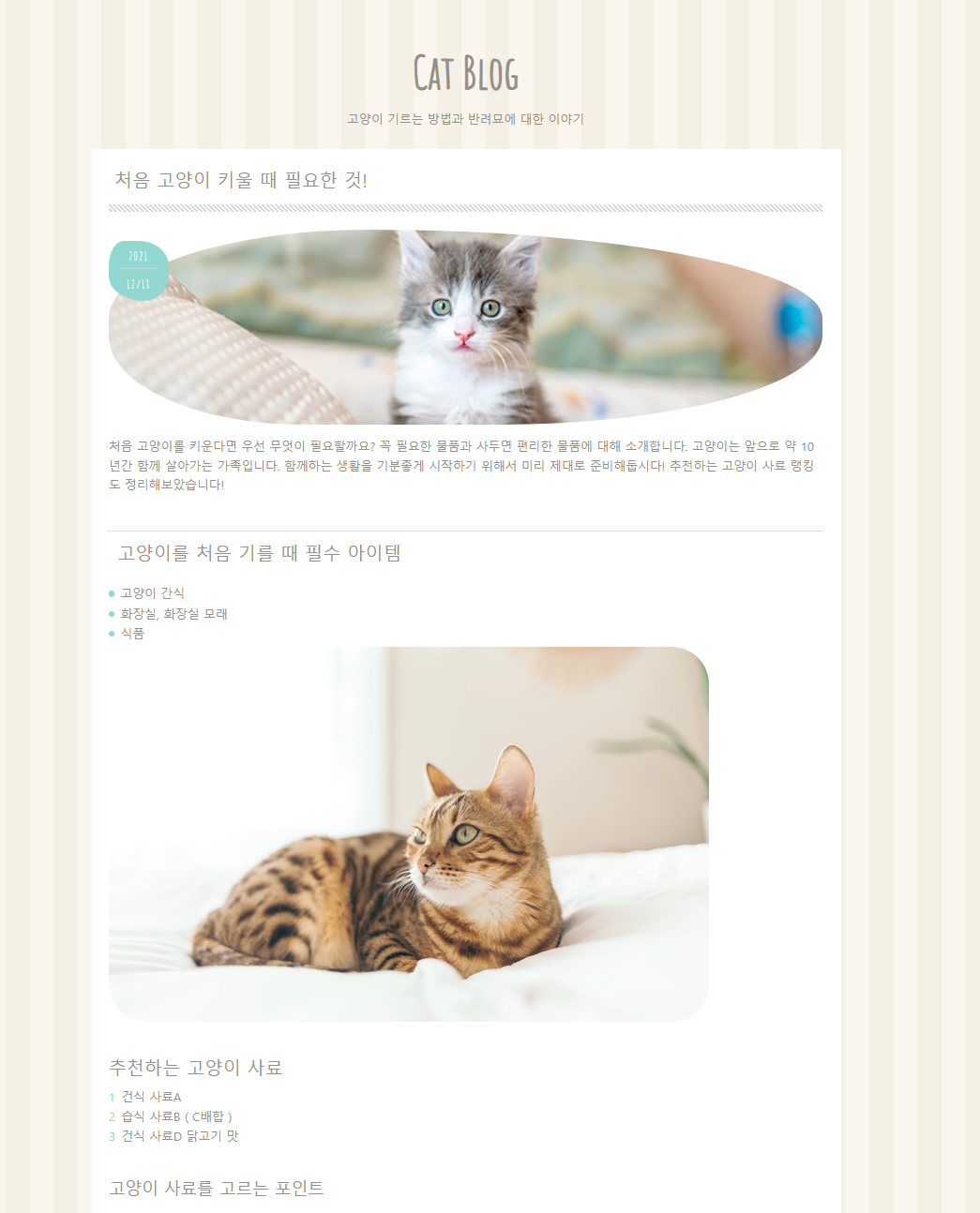
</style>블로그. 미디어 쿼리 예제2
이제 실제 블로그처럼 레이아웃한 뒤, 적응형 웹사이트로 구성 해본다. width가 줄어드면 카테고리 박스가 컨텐츠 아래로 자연스럽게 떨어지게 만든다.
(카테고리 구성 다음 날 할 예정)
예제2 블로그 html
<!DOCTYPE html>
<html lang="en">
<head>
<meta charset="UTF-8">
<meta http-equiv="X-UA-Compatible" content="IE=edge">
<meta name="viewport" content="width=device-width, initial-scale=1.0">
<title>고양이가 최고!!</title>
<link rel="shortcut icon" href="./images/favicon.png">
<link href="https://fonts.googleapis.com/css?family=Amatic+SC|M+PLUS+Rounded+1c:400,500&display=swap" rel="stylesheet">
<link rel="stylesheet" href="./css/style.css">
</head>
<body>
<header>
<h1 class="page-title">Cat Blog</h1>
<p class="page-desc">고양이 기르는 방법과 반려묘에 대한 이야기</p>
</header>
<div class="container">
<section>
<article>
<div class="post-title">
<h2><a href="#">처음 고양이 키울 때 필요한 것!</a></h2>
</div>
<div class="post-thumb">
<p class="post-date"><span>2021</span><span>12/18</span></p>
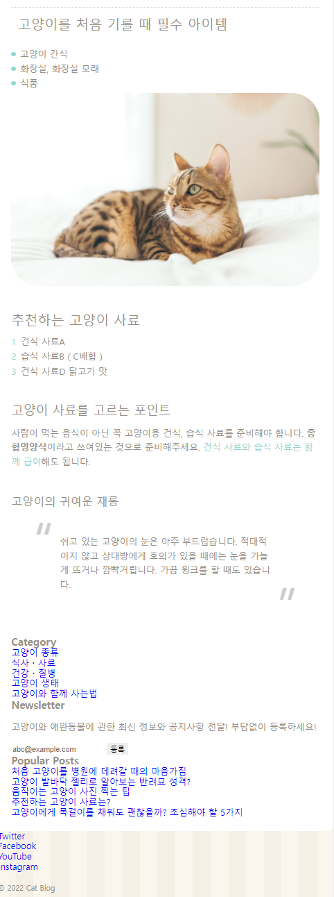
<img class="post-img" src="./images/cat1.jpg" alt="">
</div>
<p>
처음 고양이를 키운다면 우선 무엇이 필요할까요? 꼭 필요한 물품과 사두면 편리한 물품에 대해 소개합니다. 고양이는 앞으로 약 10년간 함께 살아가는 가족입니다. 함께하는 생활을 기분좋게 시작하기 위해서 미리 제대로 준비해둡시다! 추천하는 고양이 사료 랭킹도 정리해보았습니다!
</p>
<h3>고양이를 처음 기를 때 필수 아이템</h3>
<ul>
<li>고양이 간식</li>
<li>화장실, 화장실 모래</li>
<li>식품</li>
</ul>
<img src="./images/cat5.jpg" alt="">
<h4>추천하는 고양이 사료</h4>
<ol>
<li>건식 사료A</li>
<li>습식 사료B(C배합)</li>
<li>건식 사료D 닭고기 맛</li>
</ol>
<h5>고양이 사료를 고르는 포인트</h5>
<p>사람이 먹는 음식이 아닌 꼭 고양이용 건식, 습식 사료를 준비해야 합니다. <strong>종합영양식</strong>이라고 쓰여있는 것으로 준비해주세요.
<a href="#">건식 사료와 습식 사료는 함께 급여</a>해도 됩니다.
</p>
<h6>고양이의 귀여운 재롱</h6>
<blockquote>
<p>쉬고 있는 고양이의 눈은 아주 부드럽습니다. 적대적이지 않고 상대방에게 호의가 있을 때에는 눈을 가늘게 뜨거나 깜빡거립니다. 가끔 윙크를 할 때도 있습니다.
</p>
</blockquote>
</article>
</section>
<aside>
<div class="side-box">
<h3>Category</h3>
<ul>
<li><a href="#">고양이 종류</a></li>
<li><a href="#">식사・사료</a></li>
<li><a href="#">건강・질병</a></li>
<li><a href="#">고양이 생태</a></li>
<li><a href="#">고양이와 함께 사는법</a></li>
</ul>
</div>
<div class="side-box">
<h3>Newsletter</h3>
<p>고양이와 애완동물에 관한 최신 정보와 공지사항 전달! 부담없이 등록하세요!</p>
<form class="newsletter-form">
<input type="email" placeholder="abc@example.com">
<input type="submit" value="등록">
</form>
</div>
<div class="side-box popular-posts">
<h3>Popular Posts</h3>
<ul>
<li><a href="#">처음 고양이를 병원에 데려갈 때의 마음가짐</a></li>
<li><a href="#">고양이 발바닥 젤리로 알아보는 반려묘 성격?</a></li>
<li><a href="#">움직이는 고양이 사진 찍는 팁</a></li>
<li><a href="#">추천하는 고양이 사료는?</a></li>
<li><a href="#">고양이에게 목걸이를 채워도 괜찮을까? 조심해야 할 5가지</a></li>
</ul>
</div>
</aside>
</div>
<footer>
<ul class="footer-nav">
<li><a href="#">Twitter</a></li>
<li><a href="#">Facebook</a></li>
<li><a href="#">YouTube</a></li>
<li><a href="#">Instagram</a></li>
</ul>
<p><small>© 2022 Cat Blog</small></p>
</footer>
</body>
</html>예제2 블로그 CSS
<style>
@charset "utf-8";
*{
    box-sizing: border-box;
}
html{
    font-size: 100%; /* 16px*/
    line-height: 1.15; /*배수, %,px 가능*/
}
body{
    color:#949087;
    font-family: sans-serif;
    background: #faf6ed url("../images/bg.png");
    margin:0;
}
ul, ol{
    margin:0;
    padding:0;
    list-style: none;
}
a{
    background-color: transparent ;
    text-decoration: none;
}
button, input{
    border:0;
    outline:0;
}
p{
    line-height: 1.6;
}
.container{
    max-width: 1000px;
    margin:0 auto;
    padding: 1.5rem; /* 16px x 1.5*/
    background: #fff;
    border-radius: 0 0 10px 10px;
}
img{ border-style: none; vertical-align: bottom;}
h1, h2, h3, h4, h5, h6{margin:0;}
/****** Header ******/
header{
    max-width:1000px;
    margin:2.5rem auto 0;
    height: 170px;
}
.page-title{
    font-size:3.75rem;
    font-family: 'Amatic SC', cursive;
    margin: 1rem 0;
    padding-top:2rem;
}
.page-desc{
    font-size:1rem;
    margin-bottom: 0;
}
.page-title, .page-desc{
    text-align: center;
}

/****** Section ******/
section{
    margin-bottom: 3rem;
    display:block;
}
.post-title{
    padding-bottom:10px;
    background-image:linear-gradient(45deg, #fff 30%, #ccc 30%, #ccc 50%, #fff 50%, #fff 80%, #ccc 80%, #ccc 100%);
    background-size: 6px 6px;
    margin-bottom: 1.5rem;
}
.post-title h2{
    background-color: #fff;
    padding: 0 0.5rem 0.875rem;
    font-family: 'Noto Sans KR', sans-serif;
    font-weight: 500;
    line-height: 1.5;
}
.post-title a{
    color:#949087;
}
.post-title a:hover{
    color: #605c55;
}
.post-thumb{
    margin: 0 0 1rem 0;
    position: relative;
}
.post-date{
    position: absolute;
    left:0;
    top:-10px;
    font-size:1.5rem;
    letter-spacing: .1rem;
    font-family: 'Amatic SC', cursive;
    background: #93d8d0;
    width:80px;
    height:80px;
    text-align: center;
    color:#fff;
    border-radius: 30% 60% 50% 70% / 50%;
}
.post-date span{
    font-size:1rem;
    border-bottom: 2px rgba(255, 255, 255, .5) dotted;
    display: block;
    margin: 8px auto 0;  /*4px auto 0*/
    padding-bottom:2px;
    width:60%; /*width:100%;*/
    /* background-color: red; */
}
.post-date span:last-child{
    border-bottom: none;
}

.post-img{
    width: 100%;
    height:260px;
    object-fit: cover;
    border-radius: 40% 70% 50% 30%/50%;
}

article h3,article h4, article h5, article h6{
    font-family: 'Noto Sans KR', sans-serif;
    font-weight:500;
    margin: 3rem 0 1rem;
}
article h3{
    font-size: 1.5rem;
    border-top: 2px dotted #ccc ;
    padding: .75rem;
    line-height: 1.4;
}

article img{
    max-width:100%;
    border-radius: 50px;
}

/**** 목록 ****/
article li{
    margin: .5rem 0;
}
article ul li:before{
    content:'';
    width:8px;
    height:8px;
    background: #93d8d0;
    display: inline-block;
    margin: 0 8px 2px 0;
    border-radius: 50%;
}
article h4{
    font-size: 1.5rem;
}
article ol li{
    counter-increment: list;
}
article ol li:before{
    content:counter(list);
    color:#93d8d0;
    display: inline-block;
    margin-right: 8px;
}
article h5{
    font-size: 1.375rem;
}
article a{
    color: #93d8d0;
}
article a:hover{
    color:#7ac69f;
    text-decoration: underline;
}
article h6{
    font-size: 1.25rem;
}

/*** 인용문 ***/
article blockquote{
    position:relative;
    padding: 1rem 3rem;
    margin-bottom: 1rem;
    /* border: 1px solid red; */
}

article blockquote:before,
article blockquote:after{
    font-size:6rem;
    font-family: 'Noto Sans KR', sans-serif;
    color: #ccc;
    position: absolute;
    line-height: 0;
}
article blockquote:before{
    content:'\201C';
    top: 2.5rem;
    left:0;
}
article blockquote:after{
    content:'\201D';
    bottom: .5rem;
    right:0;
}
</style>
어려운 점
페이지를 만들 때 어떻게 그룹화하고 구체적으로 들어갈지 구성하는 점이 어려웠다. 콘텐츠 조금만 내용이 많아져도 class 와 id 태그등 역할을 부여하고 조정하는 것이 생각보다 계획이 많이 필요하다.
오늘 작업한 것은 대부분 텍스트만 얹어서 괜찮은 것 같다.
해결 방법
태그 연습만 하기보다는 실제처럼 복잡한 웹사이트가 아니더라도 예제2처럼 완성품을 하나 만들어보는 것이 도움이 많이 됐다.
소감
과제로 One page 홈페이지를 손수 하나 만들어보니 웹사이트 구성을 어떻게 더 효율적으로 작업할지 생각해보게 된다.
제로부터 시작하는 프로그래밍&코딩