Spinner 제작
첫번째 Spinner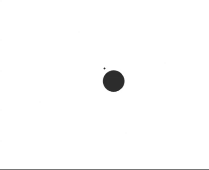
코드
import React from "react";
import styled, { css, keyframes } from "styled-components";

function Test() {
  return (
    <Container rotate>
      <Dot1 bounce />
      <Dot2 bounce />
    </Container>
  );
}

export default Test;

const Container = styled.div`
  margin: 100px auto;
  width: 40px;
  height: 40px;
  position: relative;
  text-align: center;
  ${props =>
    props.rotate &&
    css`
      animation: ${Rotate} 2s infinite linear;
    `};
`;

const Dot1 = styled.div`
  width: 60%;
  height: 60%;
  display: inline-block;
  position: absolute;
  top: 0;
  background-color: #333;
  border-radius: 100%;
  ${props =>
    props.bounce &&
    css`
      animation: ${Bounce} 2s infinite ease-in-out;
    `};
`;

const Dot2 = styled.div`
  width: 60%;
  height: 60%;
  display: inline-block;
  position: absolute;
  top: 0 auto;
  bottom: 0;
  background-color: #333;
  border-radius: 100%;
  ${props =>
    props.bounce &&
    css`
      animation: ${Bounce} 2s infinite ease-in-out;
    `};
  animation-delay: -1s;
`;

const Bounce = keyframes`
0%, 100% {
  transform: scale(0.0);
}
50% {
  transform: scale(1.0);
}
`;

const Rotate = keyframes`
100% {
  transform: rotate(360deg);
}
`;
두번째 Spinner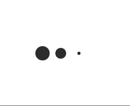
코드
import React from "react";
import styled, { css, keyframes } from "styled-components";

function Test2() {
  return (
    <Container>
      <SpinnerBox>
        <Dot1 bounce />
        <Dot2 bounce />
        <Dot3 bounce />
      </SpinnerBox>
    </Container>
  );
}

export default Test2;

const Container = styled.div`
  display: flex;
  flex-direction: row;
  justify-content: center;
  align-items: center;
`;

const SpinnerBox = styled.div`
  margin: 100px auto;
  width: 40px;
  height: 40px;
  position: relative;
  text-align: center;
`;

const Dot1 = styled.div`
  width: 60%;
  height: 60%;
  display: inline-block;
  position: absolute;
  top: 0;
  background-color: #333;
  border-radius: 100%;
  ${props =>
    props.bounce &&
    css`
      animation: ${Bounce} 2s infinite ease-in-out;
    `};
  animation-delay: 0.5s;
`;

const Dot2 = styled.div`
  width: 60%;
  height: 60%;
  display: inline-block;
  position: absolute;
  top: 0 auto;
  left: -10px;
  background-color: #333;
  border-radius: 100%;
  ${props =>
    props.bounce &&
    css`
      animation: ${Bounce} 2s infinite ease-in-out;
    `};
`;

const Dot3 = styled.div`
  width: 60%;
  height: 60%;
  display: inline-block;
  position: absolute;
  top: 0;
  left: 50px;
  background-color: #333;
  border-radius: 100%;
  ${props =>
    props.bounce &&
    css`
      animation: ${Bounce} 2s infinite ease-in-out;
    `};
  animation-delay: 1s;
`;

const Bounce = keyframes`
0%, 100% {
  transform: scale(0.2);
}
50% {
  transform: scale(1.0);
}

`;