html
header#hd.rel>.container.d-flex.jc-sb.ali-c>h1>a.d-block[href="#none"]>img.d-block^^ul#gnb.d-flex>li.rel4>a.d1+ul.d2.abs>li5>a
css
공통클래스
<style>
/* 공통클래스 */
* {margin: 0; padding: 0;}
a {color: black; text-decoration: none;}
li {list-style: none;}

.container {width: 1200px; margin: 0 auto;}
.rel {position: relative;}
.abs {position: absolute;}
.fixed {position: fixed;}

.d-flex {display: flex;}
.d-block {display: block;}
.jc-sb {justify-content: space-between;}
.ali-c {align-items: center;}
.txt-c {text-align: center;}
.txt-l {text-align: left;}
.txt-r {text-align: right;}
</style>
드롭다운 메뉴 만들기 1
layout
<style>
/* layout */
#hd {background-color: black; padding: 1rem 0;}

#hd h1 img {height: calc(100% - 1rem);}
</style>
수직 정렬 시에는 height값으로 조절하는 것이 좋다
svg 파일은 픽셀 개념이 아니므로 퍼센테이지(비율)를 적용해서 줄여야 함
그러므로 부모 넓이를 확실하게 주자
로고는 svg로 꼭 하기!!
<style>
#hd h1 img:nth-child(2),
#hd h1:hover img:nth-child(1) {display: none;}
#hd h1 img:nth-child(1),
#hd h1:hover img:nth-child(2) {display: block;}
</style>
hover는 안정적인 태그에다가 하는 것이 좋다
선택자는 상수화 시켜서 수정을 용이하게!
fitst, last는 웬만하면 지양하기
<style>
#gnb a {display: block;}
#gnb .d1 {
    color: white;
    font-size: 2em;
    line-height: 1;
    padding: 1rem 2rem;
}
#gnb .d2 {
    background-color: white;
    font-size: 1.2rem;
    line-height: 2;
    padding: 0 1.5rem;
    left: 0;
    right: 0;
    height: 0;
    overflow: hidden;
    transition: 0.5s;
    background-color: pink;
}
</style>
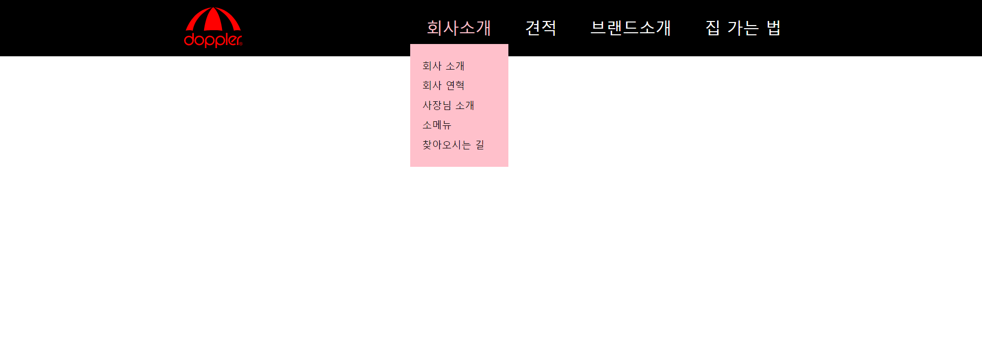
li에 hover 넣으면 li의 하위인 ul.d2까지 hover해도 계속 뜬다...
<style>
#gnb li:hover .d1 {
    color: pink;
}
</style>
:nth-child()가 hover보다 서열이 더 높음!
그래서 순서(nth)에 따라 길이 부여 > hover 여부 체크...의 순서로 움직임
#gnb li:nth-child(1):hover .d2 {
    /* 폰트사이즈 1.2rem의 2배 * 컨텐츠 수 + padding-top/bottom 각각 1.5rem씩 2개 */
	height: calc(2.4rem * 5 + 3rem);
}
#gnb li:nth-child(2):hover .d2 {
	height: calc(2.4rem * 2 + 3rem);
}
#gnb li:nth-child(3):hover .d2 {
	height: calc(2.4rem * 4 + 3rem);
}
#gnb li:nth-child(4):hover .d2 {
	height: calc(2.4rem * 5 + 3rem);
}
</style>calc(): calc와 괄호에 띄어쓰기x, 연산자 양쪽에 띄어쓰기 무조건o
<style>
#gnb .d2 li:first-child {padding-top: 1.5rem;}
#gnb .d2 li:last-child {padding-bottom: 1.5rem;}

</style>
첫 번째 객체에는 margin 상쇄효과 때문에 사용 불가하므로 padding을 쓴다
예외: display: inline-block;을 쓸 때에만 margin 가능 (display: block;을 포기하고...)
나중에 배울 가상선택자 ::after, ::before과도 관련이 있다고 함
검색에 걸리지 않는다는 특징이 있음
드롭다운 메뉴 만들기 2 (응용)
#gnb에 hover 시 메뉴 한 번에 등장
hover를 ul.d2에 해도 #gnb>li에 hover효과(폰트색변경)이 적용됨
(이 부분은 메뉴 만들기1에도 해당된다)
<style>
/* layout */
#hd {background-color: black; padding: 1rem 0;}

#hd h1 img {height: calc(100% - 1rem);}

#hd h1 img:nth-child(2),
#hd h1:hover img:nth-child(1) {display: none;}
#hd h1 img:nth-child(1),
#hd h1:hover img:nth-child(2) {display: block;}

#gnb a {display: block;}
#gnb .d1 {
    color: white;
    font-size: 2em;
    line-height: 1;
    padding: 1rem 2.5rem;
}
#gnb .d2 {
    background-color: white;
    font-size: 1.2rem;
    line-height: 2;
    text-align: center;
    padding: 0 1.5rem;
    left: 0;
    right: 0;
    height: 0;
    overflow: hidden;
    transition: 0.5s;
    background-color: pink;
}

#gnb li:hover .d1 {
    color: pink;
}
</style>
#gnb에다가 hover를 넣어주면 전체 메뉴에 해당이 된다!!
<style>
#gnb:hover .d2 {
    height: calc(2.4rem * 5 + 3rem);
    word-break: keep-all;
}

#gnb .d2 li:first-child {padding-top: 1.5rem;}
#gnb .d2 li:last-child {padding-bottom: 1.5rem;}

</style>
flex-wrap 사용해서 레이아웃 만들기
<!DOCTYPE html>
<html lang="ko">
<head>
    <meta charset="UTF-8">
    <meta http-equiv="X-UA-Compatible" content="IE=edge">
    <meta name="viewport" content="width=device-width, initial-scale=1.0">
    <title>Document</title>
    <style>
        * {margin: 0; padding: 0;}
        a {color: black; text-decoration: none;}
        li {list-style: none;}

        .container {width: 1200px; margin: 0 auto;}
        .d-flex {display: flex;}
        .jc-sb {justify-content: space-between;}
        .flex-wrap {flex-wrap: wrap;}
    </style>
넘은 컨텐츠양을 떨어뜨리고자 한다면
display: flex;로 나열해놓고 wrap해서 4개의 컨텐츠를 2*2로 나눠버린다
    <style>

        h2 img {display: block; margin: 0 auto;}
        li, li img, li strong {display: block; margin: 0 auto;}
        li {width: 50%}
        li strong{text-align: center;}
    </style>
</head>
<body>
    <!-- .container>h2>img^ul.d-flex>li*4>a>img+strong -->
    <!-- 4개 이미지를 2*2로 나누려면 width값을 50%로 해서 넘어가는 것은 아래로 떨어지도록!! -->
    <div class="container">
        <h2><img src="./img/logo.svg" alt=""></h2>
        <ul class="d-flex flex-wrap">
            <li><a href=""><img src="./img/logo.svg" alt=""><strong>집에가고싶어</strong></a></li>
            <li><a href=""><img src="./img/logo.svg" alt=""><strong>침대에눕고싶어요</strong></a></li>
            <li><a href=""><img src="./img/logo.svg" alt=""><strong>빵뜯어먹는생각</strong></a></li>
            <li><a href=""><img src="./img/logo.svg" alt=""><strong>니뭐하는데</strong></a></li>
        </ul>
    </div>
</body>
</html>
flex-wrap을 몰라서
정말 힘들었다...^__^
CSS flexbox 속성 배우기
여기서 연습 많이 하자...