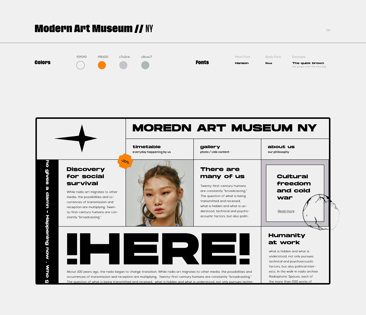
오늘의 과제
1. 분석하기
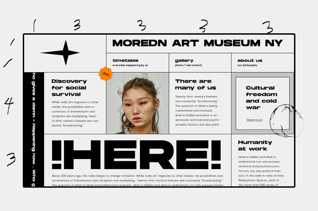
- 1 grid로 갈겨보자.
- 패치는 position을 이용해서 나중에 넣어보자.
2. 비교
-
칸 안에 잘리게 하려면,
width 를 max-content로 한 뒤, overflow : hidden을 하고
부모를 relative, 텍스트를 absolute로 하면 된다. -
rotate 애니메이션을 돌리면 애니메이션이 끝나는 지점에 글이 jump를 한다.
이건 calc()을 통해서 일부 해결한다.
@keyframes slide {
    0% {
        transform: translateY(-3000%) rotateZ(90deg);
    }
    100% {
        transform: translateY(calc(0%-45px)) rotateZ(90deg);
    }
}
3. 결과
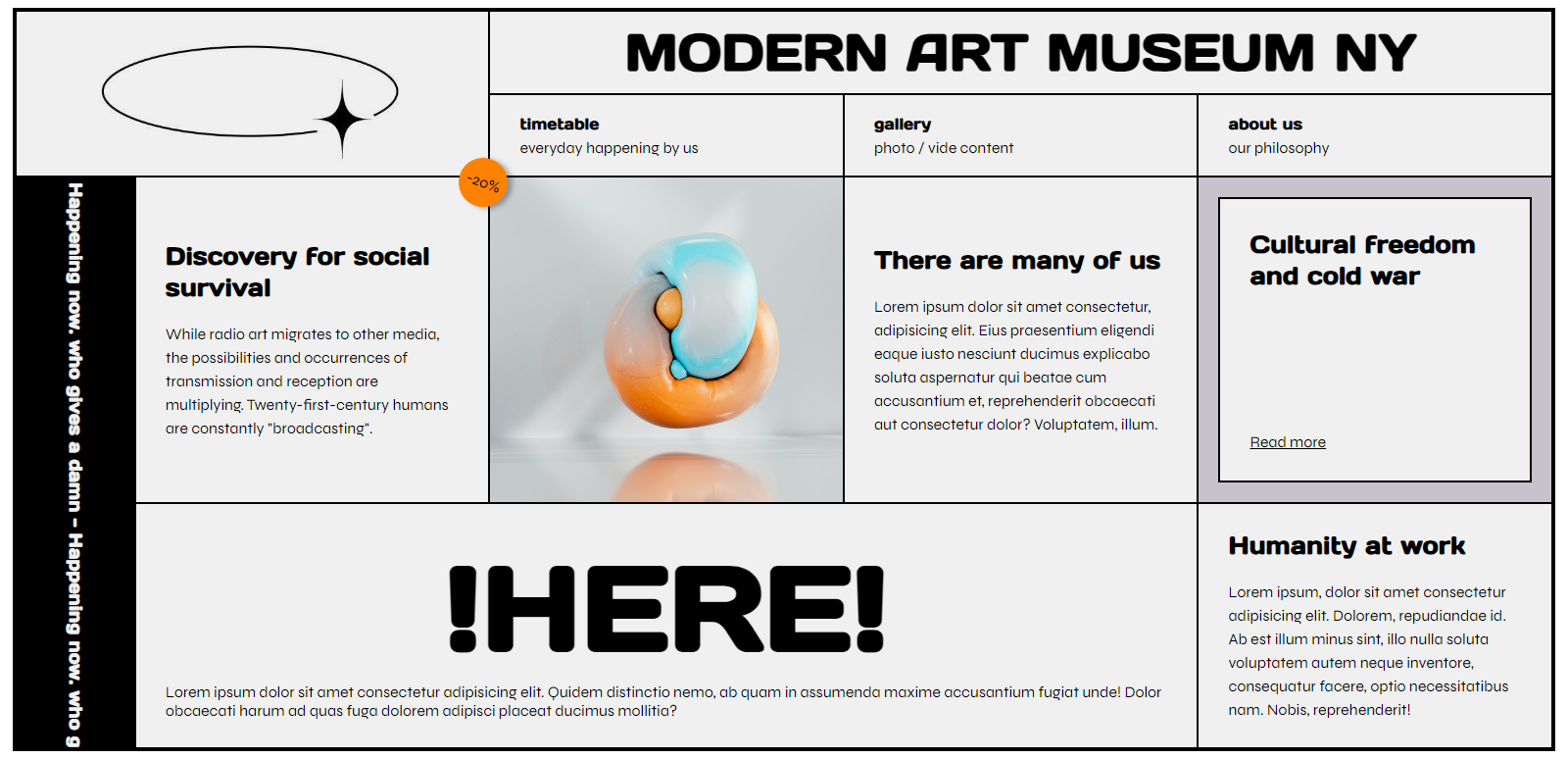
- 나름 야무지게 배지도 넣고 슬라이드도 했다.
1) HTML
<!DOCTYPE html>
<html lang="en">

<head>
    <meta charset="UTF-8">
    <meta name="viewport" content="width=device-width, initial-scale=1.0">
    <title>title</title>
    <link rel="stylesheet" href="css/style.css">
</head>

<body>
    <div class="wrapper">
        <div class="logo">
            <img src="1.png" alt="">
        </div>
        <div class="title">
            <h2>modern art museum ny</h2>
        </div>
        <div class="menu">
            <h4>timetable</h4>
            <span>everyday happening by us</span>
        </div>
        <div class="menu">
            <h4>gallery</h4>
            <span>photo / vide content</span>
        </div>
        <div class="menu">
            <h4>about us</h4>
            <span>our philosophy</span>
        </div>
        <div class="floating">
            <h4>who gives a damn - Happening now. who gives a damn - Happening now. who gives a damn - Happening now.
                who gives a damn - Happening now.
                who gives a damn - Happening now.
                who gives a damn - Happening now.
            </h4>
        </div>
        <div class="article">
            <div class="sale">
                <span>-20%</span>
            </div>
            <h3>Discovery for social survival</h3>
            <span>While radio art migrates to other media, the possibilities and occurrences of transmission and
                reception are multiplying. Twenty-first-century humans are constantly "broadcasting".</span>
        </div>
        <div class="img">
            <!-- <img src="https://source.unsplash.com/random" alt=""> -->
        </div>
        <div class="article">
            <h3>There are many of us</h3>
            <span>Lorem ipsum dolor sit amet consectetur, adipisicing elit. Eius praesentium eligendi eaque iusto
                nesciunt ducimus explicabo soluta aspernatur qui beatae cum accusantium et, reprehenderit obcaecati aut
                consectetur dolor? Voluptatem, illum.</span>
        </div>
        <div class="readmore">
            <div class="readmore__in">
                <h3>Cultural freedom and cold war</h3>
                <span>Read more</span>
            </div>
        </div>
        <div class="here">
            <h1>!here!</h1>
            <span>Lorem ipsum dolor sit amet consectetur adipisicing elit. Quidem distinctio nemo, ab quam in assumenda
                maxime accusantium fugiat unde! Dolor obcaecati harum ad quas fuga dolorem adipisci placeat ducimus
                mollitia?</span>
        </div>
        <div class="article">
            <h3>Humanity at work</h3>
            <span>Lorem ipsum, dolor sit amet consectetur adipisicing elit. Dolorem, repudiandae id. Ab est illum minus
                sint, illo nulla soluta voluptatem autem neque inventore, consequatur facere, optio necessitatibus nam.
                Nobis, reprehenderit!</span>
        </div>
    </div>
</body>

</html>
2) CSS
@import "css/reset.css";
@import url('https://fonts.googleapis.com/css2?family=Days+One&family=Syne:wght@400;500;600;700;800&display=swap');

$superbigfont : 120px;
$bigfont : 35px;
$middlefont : 25px;
$smallfont : 18px;
$upper : uppercase;
$white : #f0f0f0;
$orange : #ff8100;
$grey : #c7c2cb;
$green : #c8cac7;
$daysfont: 'Days One', sans-serif;
$syne : 'Syne', sans-serif;

@keyframes slide {
    0% {
        transform: translateY(-3000%) rotateZ(90deg);
    }
    100% {
        transform: translateY(calc(0%-45px)) rotateZ(90deg);
    }
}

.wrapper {
    height: 100vh;
    margin: 5px;
    box-sizing: border-box;
    display: grid;
    grid-template-columns: 1fr 3fr 3fr 3fr 3fr;
    grid-template-rows: 1fr 1fr 4fr 3fr;
    border: 4px solid black;
    background-color: black;
    gap: 2px;

    > * {
        background-color: $white;
        box-sizing: border-box;
    }

}

h1, h2, h3, h4, h5, h6 {
    font-family: $daysfont;
    padding: 0;
    margin: 0;
}

span {
    font-family: $syne;
}

.logo {
    grid-column: 1/3;
    grid-row: span 2;
    display: flex;
    justify-content: center;
    align-items: center;
    padding: 20px;

    img {
        width: 90%;
        object-fit: cover;
    }
}

.title {
    grid-column: 3/6;
    display: flex;
    justify-content: center;
    align-items: center;
    font-size: $bigfont;
    text-transform: $upper;
}

.menu {
    display: flex;
    flex-direction: column;
    justify-content: center;
    align-items: flex-start;
    padding-left: 30px;
    gap: 5px;
}

.floating {
    grid-row: 3 / 5;
    background-color: black;
    color: $white;
    display: flex;
    justify-content: center;
    align-items: center;
    overflow: hidden;
    position: relative;

    h4 {
        animation: slide 10s linear infinite;
        position: absolute;
        width: max-content;
        font-size: $smallfont;
    }
}

.here {
    grid-column: span 3;
    display: flex;
    flex-direction: column;
    align-items: center;
    justify-content: center;
    padding: 0px 30px 0px 30px;

    h1 {
        font-size: $superbigfont;
        text-transform: $upper;
    }
}

.article {
    display: flex;
    flex-direction: column;
    justify-content: center;
    align-items: flex-start;
    padding-left: 30px;
    padding-right: 30px;
    gap: 20px;
    position: relative;
    h3 {
        font-size: $middlefont;
    }
    span {
        line-height: 150%;
    }


    .sale {
        background-color: $orange;
        width: 50px;
        height: 50px;
        border-radius: 50%;
        display: flex;
        justify-content: center;
        align-items: center;
        position: absolute;
        top: -20px;
        right: -20px;
        rotate: 20deg;
        box-shadow: 5px 0px 5px rgba($color: black, $alpha: 0.3);
    }
}


.img {
    background-image: url("https://source.unsplash.com/random");
    background-size: cover;
}

.readmore {
    background-color: $grey;
    padding: 20px;

    .readmore__in {
        gap: 50px;
        box-sizing: border-box;
        background-color: $white;
        height: 100%;
        border: 2px solid black;
        display: flex;
        flex-direction: column;
        justify-content: space-between;
        align-items: flex-start;
        padding: 30px;
        h3 {
            font-size: $middlefont;
        }
        span {
            text-decoration: underline;
        }
    }
}
3) 리뷰
글 rotate 시키는 걸 제외하고 어려운 건 없었다.
rotate의 애니메이션 점프 막는 방법은 아직도 잘 모르겠다. px 계산이 정확히 안 됨...
이렇게 점프 시킬 수 밖에 없는 걸까?

까짓거 한 번 해보죠