Modal
많이 쓰이는 UI 이기 때문에 vue 로도 예제를 살펴보았다.
버튼을 클릭하면 어두운 화면과 모달이 뜨고, 모달 위 버튼을 클릭시 어두운 화면과 모달이 사라지는 로직으로 똑같다.
똑같은 로직이 안에서 새로운 vue 만의 빌트인 컴포넌트가 있어서 한번 정리해보고자 한다.
ModalExample.vue
모달도 부모 - 자식 컴포넌트가 필요하다. 부모 컴포넌트에서는 모달을 열 수 있게 하는 버튼이 존재해야하고, 자식 컴포넌트에서는 모달을 표현한다.
먼저, Teleport 에 대해 설명을 해보고자 한다.
<script setup>
import { ref } from 'vue'

const open = ref(false)
</script>

<template>
  <button @click="open = true">모달 열기</button>

  <div v-if="open" class="modal">
    <p>짜자잔~ 모달입니다!</p>
    <button @click="open = false">닫기</button>
  </div>
</template>

<style scoped>
.modal {
  position: fixed;
  z-index: 999;
  top: 20%;
  left: 50%;
  width: 300px;
  margin-left: -150px;
}
</style>
보통 모달의 열기를 트리거하는 <button> 과 .modal 클래스가 있는 <div> 가 포함되어 있고, 모달의 컨텐츠와 닫기 버튼이 포함된다.
하지만, 초기 HTML 구조 내에서 이 컴포넌트를 사용할 때 잠재적인 문제가 존재한다.
position: fixed는 부모 엘리먼트에transform,perspective또는filter속성이 설정되지 않는 경우에만 뷰포트를 기준으로 엘리먼트를 배치하여 애니메이션을 적용할 경우 모달 레이아웃이 깨질 위험이 존재한다.- 모달의
z-index는 모달을 포함하는 엘리먼트에 의해 제한된다.<div class="outer>와 겹치고z-index가 더 높은 또 다른 엘리먼트가 있으면 모달을 덮을 수 있다.
이런 문제를 해결할 수 있는 것이 바로 <Teleport> 이다.
<Teleport>는 중첩된 DOM 구조에서 벗어날 수 있도록 해준다.
그렇다면 위 코드를 <Teleport>를 사용해서 변경한다면 다음과 같을 것이다.
<button @click="open = true">모달 열기</button>
<Teleport to="body">
  <div v-if="open" class="modal">
    <p>짜자잔~ 모달입니다!</p>
    <button @click="open = false">닫기</button>
  </div>
</Teleport><Teleport>의 to 대상은 CSS 셀렉터 문자열 또는 실제 DOM 노드여하며, 여기서 Vue에게 이 템플릿 조각을 body 태그로 이동하도록 지시한다.
<script setup>
import { ref } from "vue";
import Modal from "./ModalView.vue";
const show = ref(false);
</script>

<template>
  <button @click="show = true">Show modal</button>
  <Teleport to="body">
    <Modal :show="show" @close="show = false">
      <template #header>
        <h3>custom header</h3>
      </template>
    </Modal>
  </Teleport>
</template>

<style></style>- 모달을 열고 닫고를 판별하는 Flag 로 show를 true 혹은 false 로, 초기값은 false 로 설정한다.
Show Modal이라는 버튼을 클릭하면 on 바인딩을 통해 show 값을 true 로 변경할 수 있다.<Teleport>를 이용하여 레이아웃이 깨짐없이 모달창을 열도록 자식 컴포넌트인Modal를 불러올 수 있다.
| 모달 버튼 클릭 전 | 모달 버튼 클릭 시 |
|---|---|
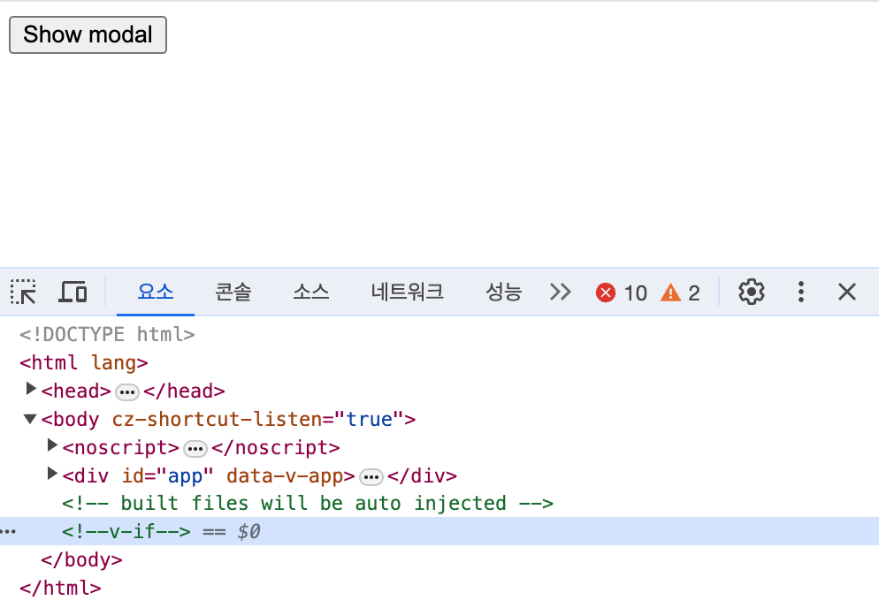 | 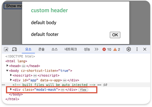 |
ModalView.vue
- 부모 컴포넌트에서 모달 열기 닫기의 여부를 확인할 수 있는 show 상태를 props 로 정의하여 받아온다.
	<script setup>
	import { defineProps } from "vue";

	const props = defineProps({
 	 show: Boolean,
	});
</script>-
받아온 props.show 가 true 일 경우에만 모달을 띄우면 되기 때문에 v-if 을 이용한다.
-
자식 컴포넌트는 모달을 나타낼 수 있는 어두운 바탕화면 div 과 컨텐츠를 나타내는 div 가 존재해야 한다. 이는 class명을 modal-mask 와 modal-container 로 구분하여 css 로 설정을 해준다.
<template>
  <Transition name="modal">
    <div v-if="props.show" class="modal-mask">
      <div class="modal-container">
        <div class="modal-header">
          <slot name="header">default header</slot>
        </div>

        <div class="modal-body">
          <slot name="body">default body</slot>
        </div>
        <div class="modal-footer">
          <slot name="footer"
            >default footer
            <button class="modal-default-button" @click="$emit('close')">
              OK
            </button>
          </slot>
        </div>
      </div>
    </div>
  </Transition>
</template>

<style>
.modal-mask {
  position: fixed;
  z-index: 9998;
  top: 0;
  left: 0;
  width: 100%;
  height: 100%;
  background-color: rgba(0, 0, 0, 0.5);
  display: flex;
  transition: opacity 0.3s ease;
}
.modal-container {
  width: 300px;
  margin: auto;
  padding: 20px 30px;
  background-color: #fff;
  border-radius: 2px;
  box-shadow: 0 2px 8px rgba(0, 0, 0, 0.33);
  transition: all 0.3s ease;
}
.modal-header h3 {
  margin-top: 0;
  color: #42b983;
}
.modal-body {
  margin: 20px 0;
}
</style>- 모달 컨텐츠 안 OK 버튼을 누르면 모달 창 닫기 기능을 emit 을 이용하여 부모 컴포넌트에서 선언한 이벤트를 자식 컴포넌트에서 실행될 수 있게 한다. 부모 컴포넌트에서 close 라는 바인딩을 실시하면 자식 컴포넌트에서도 close 에 맞는 메서드를 찾게 되어
show = false라는 로직을 실행하게 된다.
//ModalView.vue
<button class="modal-default-button" @click="$emit('close')"> OK </button>


//ModalExmaple.vue
 <Modal :show="show" @close="show = false">
      <template #header>
		<h3>custom header</h3>
      </template>
</Modal>- 모달 컨텐츠를 나타내는 부분에서
<Transition>을 이용해 모달을 애니메이션 효과과 함께 나타낼 수도 있다.
<Transition name="modal">
    <div v-if="props.show" class="modal-mask">
      <div class="modal-container">
      ...
      </div>
    </div>
</Transition>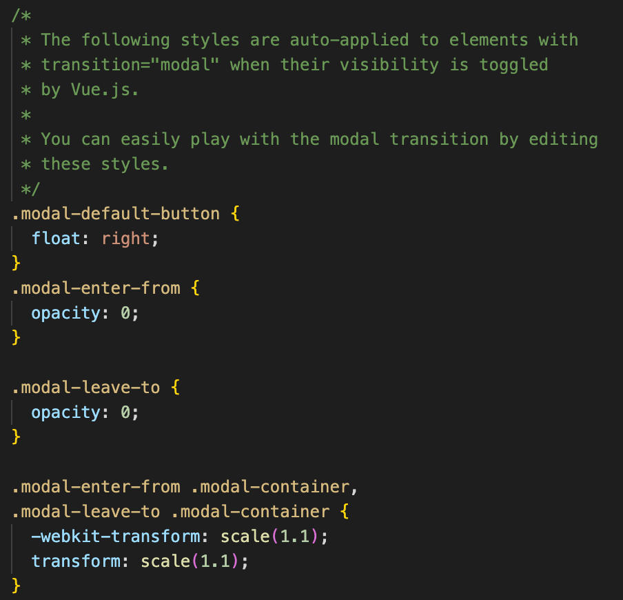
마치며
모달은 모달이겠거니 쉽게 보았는데, vue 에서는 특별히 Teleport 라는 특별한 컴포넌트와 애니메이션 효과를 쉽게 사용할 수 있는 Transition 컴포넌트가 있다는 것을 알게되었다.
특히, Teleport 는 렌더링된 DOM 구조만 변경하며 컴포넌트의 논리적 계층 구조에는 영향을 주지 않고 똑같이 Props 전달() 및 이벤트 발신(emit)은 계속 동일한 방식으로 작동해서 신기했다.
다음은 또 어떤 예제를 살펴볼까요!?