플렉스 박스 레이아웃 기본 속성들
1. display
: flex
- 부모 요소 적용
- 자식 요소의 배치
2. flex-direction
row : 좌 -> 우(기본값)
row-reverse : 우 -> 좌
column : 상 - > 하
column-reverse : 하 -> 상
3. flex-wrap
nowrap : 줄개행 X(기본값)
wrap : 줄개행 O
4. order
- 배치 순서 변경
- 자식 요소에 적용
- 숫자가 작을 수록 먼저 매치
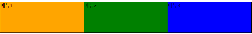
<!DOCTYPE html>
<html>
<head>
<meta charset="UTF-8">
</head>
<body>
<style>
ul{
list-style: none;
margin: 0;
padding: 0;
}
ul li:nth-of-type(3n+1){ /*수식을가져서 반복*/
background: orange;
}
ul li:nth-of-type(3n+2){ /*수식을가져서 반복*/
background: green;
}
ul li:nth-of-type(3n){ /*수식을가져서 반복*/
background: blue;
}
.flex1{
display: flex; /*플렉스설정, 좌->우정렬*/
flex-wrap: wrap; /*줄개행설정*/
}
.flex1 li{
width:300;
}
</style>
<ul class="flex1">
<li>메뉴1</li>
<li>메뉴2</li>
<li>메뉴3</li>
<li>메뉴1</li>
<li>메뉴2</li>
<li>메뉴3</li>
<li>메뉴1</li>
<li>메뉴2</li>
<li>메뉴3</li>
<li>메뉴1</li>
<li>메뉴2</li>
<li>메뉴3</li>
<li>메뉴1</li>
<li>메뉴2</li>
<li>메뉴3</li>
</ul>
</body>
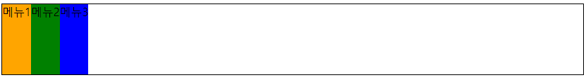
</html>5. flex-grow
- 여백을 비율별로 배분
- 자식요소에 적용
참고) 여백에 대한 비율별로 이기때문에 여백에 상관없이 배분하고 싶으면 넓이를 0으로설정
.flex1 li{ width:0; }
	.flex1 li{
                width:0; /*
            }
	 .flex1{
                display:flex;
            }
            .flex1 li:nth-of-type(1){
                flex-grow:1; /*여백을 비율별로 배분*/
            }
            .flex1 li:nth-of-type(2){
                flex-grow:1; /*여백을 비율별로 배분*/
            }
            .flex1 li:nth-of-type(3){
                flex-grow:1; /*여백을 비율별로 배분*/
            }
플렉스 박스 항목 배치를 위한 속성들
1. justify-content
좌우 정렬을 하기 위한 속성
flex-start: 왼쪽 정렬(기본)flex-end: 오른쪽 정렬center: 가운데 정렬
.flex1{
justify-content: flex-start;
}
.flex2{
justify-content: flex-end;
}
.flex3{
justify-content: center;
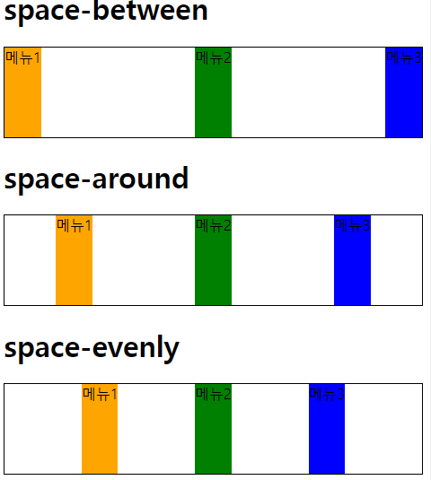
}여백
space-betweenspace-aroundspace-evenly
.flex4{
                justify-content: space-between;
            }
            .flex5{
                justify-content: space-around;
            }
            .flex6{
                justify-content: space-evenly;
            }
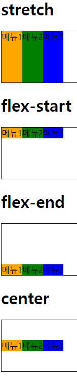
2. align-items
stretch: 부모 요소 높이에 자식 요소가 늘어난다.(기본값)flex-start: 상단 배치flex-end: 하단 배치center: 중앙 배치
3. align-self
플렉스 항목을 개별적으로 배치
align-items: stretch | flex-start | flex-end | center | baselinealign-self: auto | stretch | flex-start | flex-end | center | baseline
4. align-content
교차축 방향의 배치 방법을 지정
align-content: flex-start | flex-end | center | space-between | space-arounjustify-content와 동일 속성 - 하나의 행
여러행에 걸쳐있는 경우 적용

안녕하세요!