포지셔닝
브라우저 화면 안에 각 콘텐츠 영역을 어떻게 배치할지를 결정하는 것.
1. box-sizing : width, height 기준
content-box : 기본값, 내용물기준, 내부여백, 경계선 -> 전체크기가 증가
<!DOCTYPE html>
<html>
    <head>
        <meta charset="UTF-8">
    </head>
    <body>
        <style>
            .box{
                width: 200px;
                height : 200px;
                background: gray;
                margin-bottom: 30px
            }
            .box1{
                box-sizing : content-box;
                padding : 50px;
                border : 5px solid red;
            }
        </style>
        <div class = "box box1"></div>
        <div class = "box box2"></div>
    </body>
</html>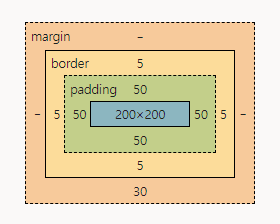
border-box : 경계선기준, 내부여백, 경계선 - 내용물의 크기 감소
<!DOCTYPE html>
<html>
    <head>
        <meta charset="UTF-8">
    </head>
    <body>
        <style>
            .box{
                width: 200px;
                height : 200px;
                background: gray;
                margin-bottom: 30px
            }
            .box2{
                box-sizing: border-box;
                padding: 50px;
                border : 5px solid red;
            }
        </style>
        <div class = "box box1"></div>
        <div class = "box box2"></div>
    </body>
</html>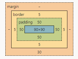
2. float
배치
left : 왼쪽배치
right : 오른쪽배치
none : 기본값
<!DOCTYPE html>
<html>
    <head>
        <meta charset="UTF-8">
    </head>
    <body>
        <style>
            ul{
                list-style-type: none;
                padding : 0;
            } /*리스트 기본스타일 제거*/
            li{
                float:left;
            }

        </style>
        <ul>
            <li>메뉴1</li>
            <li>메뉴2</li>
            <li>메뉴3</li>
        </ul>
    </body>
</html>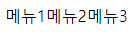
3. clear
clear시점 이후 float 적용 속성을 제거
공간이 있는 요소(bloack, inline-block)에서만 적용 가능
-float : 적용 속성을 제거
left : float:left 적용제거
right: float:right 적용제거
both :
4. after
가상클래스 선택자
content가 반드시 있어야한다.
<!DOCTYPE html>
<html>
    <head>
        <meta charset="UTF-8">
    </head>
    <body>
        <style>
            ul{
                list-style-type: none;
                padding : 0;
            } /*리스트 기본스타일 제거*/
            li{
                float:left;
            }

            ul::after{
                content:''; /*content가 있어야 활성화된다*/
                clear:left; /*가상클래스 선택자*/
            }
        </style>
        <ul>
            <li>메뉴1</li>
            <li>메뉴2</li>
            <li>메뉴3</li>
            ::after /*가상클래스 선택자*/
        </ul>
        <span class="clear"></span>
        <div>내용</div>
    </body>
</html>
5. position
static: 기본값
상대적인 배치
1) relative
현재 요소의 위치(왼쪽 상단 기준)
<!DOCTYPE html>
<html>
    <head>
        <meta charset="UTF-8">
    </head>
    <body>
        <style>
            .box{
                width: 100px;
                height: 100px;
            }
            .box1{
                background: orange;
                position: relative; /*현재위치기준*/
                left : 100px; /*왼쪽->오른쪽*/
                top : 100px; /*오른쪽->왼쪽*/
            }
            .box2{
                background: green;
                position : relative; /*현재위치기준*/
                left:100px; /*왼쪽->오른쪽*/
                top:100px; /*오른쪽->왼쪽*/
            }
        </style>
        <div class="box box1"></div>
        <div class="box box2"></div>
    </body>
</html>
absolute
문서 왼쪽 상단, 상위 요소에 상대배치속성(relative, absolute, fixed)이 적용된 경우, 상위 요소의 왼쪽 상단이 배치 기준
<!DOCTYPE html>
<html>
    <head>
        <meta charset="UTF-8">
    </head>
    <body>
        <style>
            .box{
                width: 100px;
                height: 100px;
            .box3{
                background: pink;
                position: absolute;
          /*상위요소 wrap가 position이 설정되어있기때문에
          wrap 기준으로 설정된다.*/
                left:100px;
                top: 100px;
            }
            .wrap{ /*상위요소*/
                width : 600px;
                height : 5000px;
                border : 1px solid red;
                position: relative;
                margin : 200px;
            }
        </style>
        <div class="wrap">//box3의 상위요소
            <div class="box box3"></div>
        </div>
    </body>
</html>
3) fixed
뷰포트가 배치의 기준
뷰포트 : 화면에 보이는
6. visibility
visible : 기본값
hiiden : 감추기(영역유지)
참고)
dispaly : none : 감치기(영역x)
7. z-index
층위를 나눌때 사용
상대 배치에서 적용 가능
숫자가 높을 수록 앞쪽에 배치, 숫자가 낮을 수록 뒤에 배치
.box{
	width: 300px;
	height: 300px;
	position: absolute;
}
.box1{
	background: red;
	z-index:2;
}
.box2{
	background: green;
	z-index:1;
}
.box3{
	background: blue;
	z-index:0;
}
8. 다단으로 편집하기
column-width : 컬럼너비
column-count : 나눠질 단수
column-width : 컬럼사이여백

안녕하세요!