Streamlit 특징
- 빠름 / Web Application / 공유 가능 / 상호작용(Interactive)
기본 elements
1. Text elements
- Streamlit은 text로 제목이나 마크다운, 수학적 표기 등이 가능하게 해준 text elements를 제공합니다.
- st.title > st.header > st.subheader > st.text 순으로 크기가 크다.
- st.markdown()
- # > ## > ### 순으로 크기가 크다.(텍스트 앞에 # 붙여서 사용)
- 강조하고 싶은 텍스트있으면 앞뒤로 '**'를 붙인다.
- 글자를 기울이고 싶다면 앞뒤로 '_'를 붙인다.
- st.divider() : 텍스트 구분, 선 그어줌
- st.caption() : 설명, 각주, 작은 메모, 설명문
- st.code(), st.latex(r''' ''') : 수학식 표현
- st.write() : String, data_frame, chart, graph, LaTex 등의 objects 출력
- streamlit은 이미지, 오디오, 비디오를 어플에 쉽게 포함되도록 한다.
- st.image(경로) --> caption=''을 이용하여 이미지 밑에 글을 적을 수 있다.
- st.audio(파일명)
- st.video(파일명)
3. Data Display elements
- Streamlit은 데이터를 여러 형태로 가치 있게 시각화 하는 기능을 제공합니다.
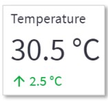
- st.metirc(타이틀,값,변동 값)
st.metric(label="Temperature", value="30.5 °C", delta="2.5 °C")
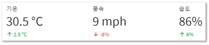
- st.columns() : 여러 metric을 같이 표시
- st.columns(1,1,1) --> metric 각각의 공간 크기를 설정할 수 있다.
col1, col2, col3 = st.columns(3)
col1.metric("기온", "30.5 °C", "2.5 °C")
col2.metric("풍속", "9 mph", "-8%")
col3.metric("습도", "86%", "4%")
- st.dataframe(), st.write() - 10개 행 기준 스크롤, 열 크기조정, 열 정렬, 테이블 확대
- st.table() - 고정 형태의 테이블
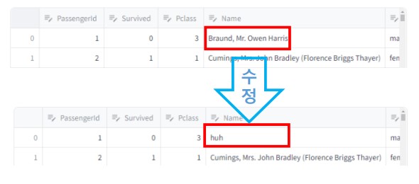
- st.data_editor() : 데이터 프레임을 직접 수정할 수 있다.
- Streamlit은 button, slider, widget, input 등의 widget을 통해 상호작용을 가능하게 합니다.
- 버튼 누르면 link_button안에 있는 해당 링크로 이동
st.link_button(“Widget Link", " https://docs.streamlit.io/library/api-reference/widgets ")

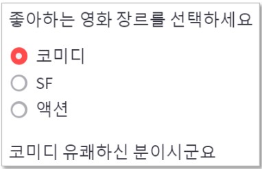
genre = st.radio('좋아하는 영화 장르를 선택하세요', ('코미디','SF','액션'))

if genre == '코미디':
 st.write('코미디 유쾌한 분이시군요.')
elif genre == 'SF':
 st.write('저도 SF 좋아합니다.')
else:
 st.write('멋지십니다.')
if st.button('Say hello'):
st.write('Hello')
else:
st.write('Goodbye')

checkbox
agree = st.checkbox('I agree')
if agree:
st.write(' '*10)

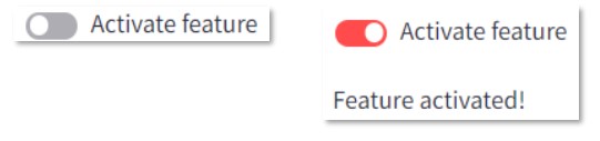
toggle
on = st.toggle('Activate feature')
if on:
st.write('Feature activated!')
select box
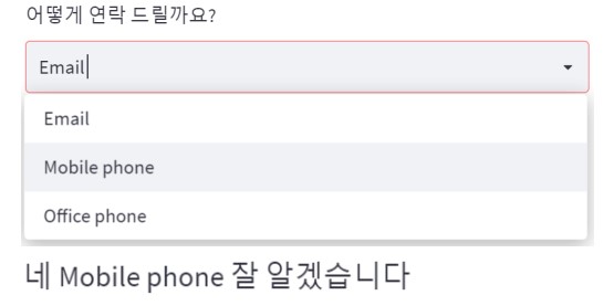
option = st.selectbox(
'어떻게 연락 드릴까요?',
('Email', 'Mobile phone', 'Office phone'))
st.write('네 ', option, ' 잘 알겠습니다’)
multi select
- st.multiselect(타이틀, 선택 가능한 값, default값)
options = st.multiselect(
'좋아하는 색을 모두 선택하세요',
['Green', 'Yellow', 'Red', 'Blue'],
['Yellow', 'Red'])
st.write('선호 색상:’, ', '.join(options))

text_input
title = st.text_input('최애 영화를 입력하세요 ‘,'Sound of Music’) # 최초 입력 값
st.write('당신이 가장 좋아하는 영화는 : ', title)

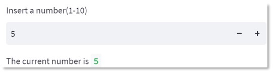
number = st.number_input('Insert a number(1-10)’,
min_value=1, max_value=10, value=5, step=1)
st.write('The current number is ', number)
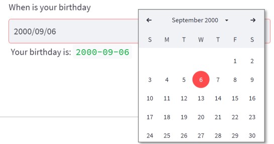
ymd = st.date_input(
'When is your birthday',
datetime(2000, 9, 6)) # 최초 입력 값
st.write('Your birthday is:’, ymd)
prompt = st.chat_input("Say something")
if prompt:
st.write(f"User has sent the following prompt: {prompt}")

slider
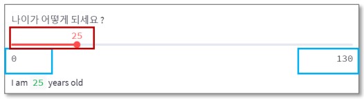
- st.slider(타이틀, 입력허용구간, 최초 세팅값)
age = st.slider('나이가 어떻게 되세요 ? ', 0, 130, 25)
st.write(‘I am ', age, ' years old’)
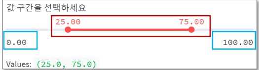
values = st.slider('값 구간을 선택하세요 ',
0.0, 100.0, (25.0, 75.0))
st.write('Values: ', values)
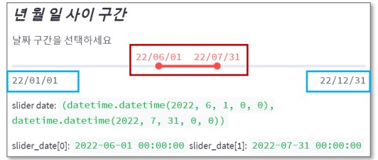
slider_date = st.slider( '날짜 구간을 선택하세요 ',
min_value=datetime(2022, 1, 1),
max_value=datetime(2022, 12, 31),
value=(datetime(2022, 6, 1), datetime(2022, 7, 31)),
format='YY/MM/DD')
st.write('slider date: ', slider_date)
st.write('slider_date[0]: ', slider_date[0], 'slider_date[1]: ', slider_date[1] )
5. Layout & containers
- streamlit은 여러 구성요소의 화면 상 위치 조정 기능 제공한다.
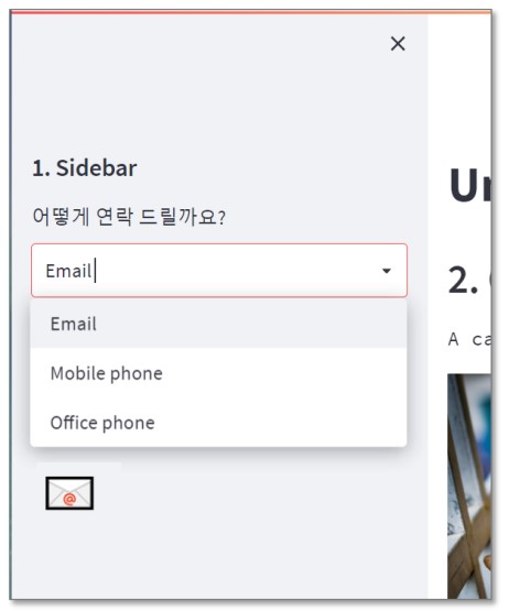
with st.sidebar:
    st.header('1. Sidebar')

add_selectbox = st.sidebar.selectbox('어떻게 연락 드릴까요?', ('Email','Mobile phone','Office phone'))

if add_selectbox == 'Email':
    st.sidebar.title('📧')
elif add_selectbox == 'Mobile phone':
    st.sidebar.title('📱')
else:
    st.sidebar.title('☎︎')
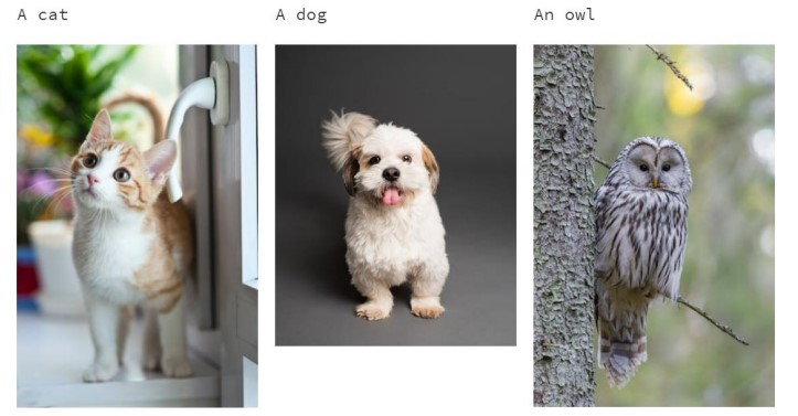
columns
col1, col2, col3 = st.columns(3)

with col1:
	st.text('A cat')
	st.image('https://cat.jpg’)
with col2:
	st.text('A dog’)
	st.image('https://dog.jpg’)
with col3:
	st.text('An owl')
	st.image('https://owl.jpg')
tabs
tab1, tab2, tab3 = st.tabs(['고양이', '개','올빼미'])

with tab1:
	st.caption('Cat')
	st.image('https://cat.jpg' , width=200)
with tab2:
	st.caption('Dog')
	st.image('https://dog.jpg' , width=200)
with tab3:
	st.caption('Owl')
	st.image('https://owl.jpg', width=200)

Chart element
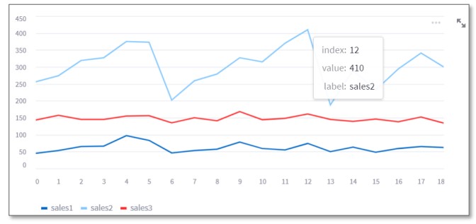
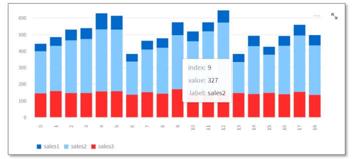
1. Streamlit Simple Chart
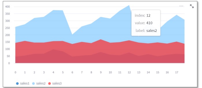
- Streamlit은 다양한 형태의 chart를 위한 library를 제공하고 추가하고 있습니다.
- Streamlit Simple chart 특징 : 그래프 크기 조정, 이동, 데이터 설명 표시
Simple Line chart
st.line_chart(chart_data)
Simple Bar chart
st.bar_chart(chart_data)
Simple Area chart
st.area_chart(chart_data)
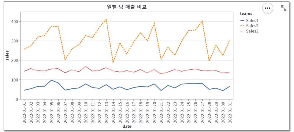
2. Altair chart
- Altair chart의 특징
- 데이터 컬럼과 x/y축, 색상, 크기 등 encoding channel간의 연결 정의
Altair Line chart
chart = alt.Chart(df_melted, title='일별 팀 매출 비교').mark_line().encode(x='date', y='sales', color='teams', strokeDash='teams').properties(width=650, height=350)
st.altair_chart(chart, use_container_width=True)
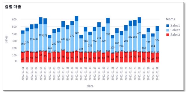
Altair Bar chart
chart = alt.Chart(df_melted, title='일별 매출').mark_bar().encode(x='date', y='sales', color='teams’)
text = alt.Chart(df_melted).mark_text(dx=0, dy=0, color='black').encode(x='date', y='sales', detail='teams’, text=alt.Text('sales:Q’) )
st.altair_chart(chart+text, use_container_width=True)
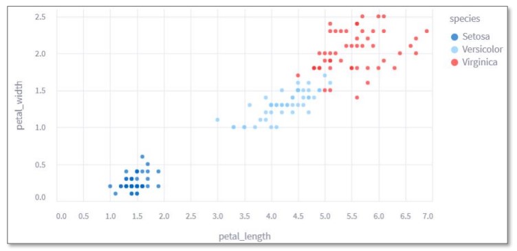
Altair Scatter plots
chart = alt.Chart(iris).mark_circle().encode(x='petal_length', y='petal_width', color = 'species')
st.altair_chart(chart, use_container_width=True)
3. Plotly Chart
- Plotly chart의 특증
- 범례 선택으로 그래프 모양 변경, 데이터 설명 표시
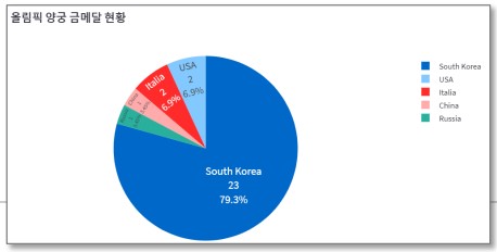
Plotly Pie(Donut) chart
medal = pd.read_csv('data_medal.csv’)
fig = px.pie(medal, names = "nation", values = "gold", title="올림픽 양궁 금메달 현황“, hole=.3 )
fig.update_traces(textposition='inside', textinfo = 'percent+label+value’)
fig.update_layout(font = dict(size = 14))
# 범례 표시 제거 : fig.update(layout_showlegend=False)
st.plotly_chart(fig)
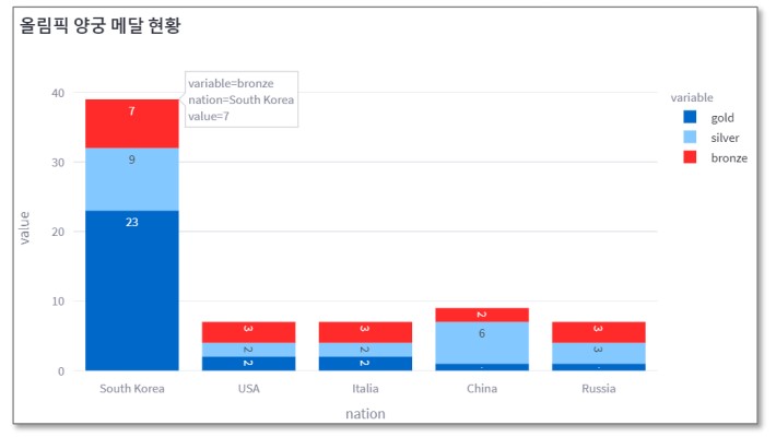
Plotly Bar chart
medal = pd.read_csv('data_medal.csv’)
fig = px.bar(medal, x="nation", y=["gold", "silver", "bronze"],text_auto=True, title="올림픽 양궁 메달 현황")
# text_auto=True 값 표시 여부
fig.update_layout(width=800, height=600 ) # 그래프 크기 조절
# fig.update_traces(textangle=0) # 그래프 안의 텍스트가 바로 씌여지게 설정
st.plotly_chart(fig)