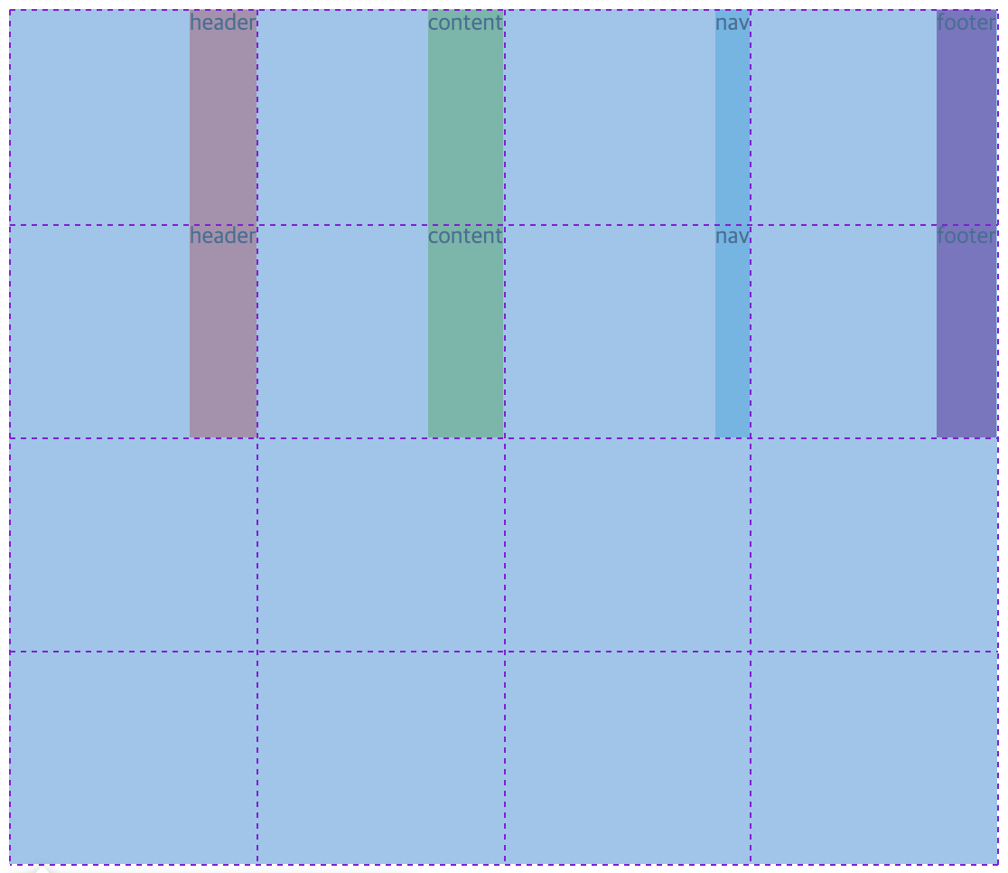
🔶 align-self , justify-self, place-self
: "자식요소"에 써야하는 property임.
-
align-self : grid요소 하나를 수직으로 움직일 때
-
justify-self : grid요소 하나를 수평으로 움직일 때
-
place-self: (수직),(수평);
.grid {
  height: 1000px;
  background-color: gray;
  display: grid;
  gap: 5px;
  grid-template-columns: repeat(4, 100px);
  grid-template-rows: repeat(4, 100px);
}

.header {
  background-color: tomato;
  /* align-self: end;
  justify-self: center; */
  place-self: end center;
}

.content {
  background-color: yellowgreen;
  /* align-self: start;
  justify-self: center; */
  place-self: start center;
}

.nav {
  background-color: skyblue;
  /* align-self: start;
  justify-self: center; */
  place-self: stretch center;
}

.footer {
  background-color: purple;
  /* align-self: center;
  justify-self: end; */
  place-self: center end;
}
🔶 justify-items, align-items, Place Items
: "부모요소"에서 각 item의 align-self 값을 한번에 설정하게 됨.
-
justify-items (수평) :stretch / start / center / end / right / left;
-
align-items (수직) : stretch / start / center / end / right / left;
-
place-items: (수직) (수평);
.grid {
  height: 50vh;
  display: grid;
  grid-template-columns: repeat(4, 1fr);
  grid-template-rows: repeat(4, 1fr);

  /* 방법1 */
  justify-items: end;
  align-items: stretch;

  /* 방법2 */
  place-items: stretch end;
}

.header {
  background-color: tomato;
}

.content {
  background-color: yellowgreen;
}

.nav {
  background-color: skyblue;
}

.footer {
  background-color: purple;
}
🔶 justify-content, align-content, place-content
-
justify-content : 모든 grid items를 수평으로 움직이는 것
-
align-content : 모든 grid items를 수직으로 움직이는 것
-
place-content : 수직, 수평
※ place-items와 place-content의 차이점
place-items는 : item "각각"에 대한 정렬
place-content는 : grid item "전체를" 모아 통채로 움직이게 됨.
.grid {
  height: 600px;
  background-color: gray;
  display: grid;
  gap: 5px;
  grid-template-columns: repeat(4, 100px);
  grid-template-rows: repeat(4, 100px);

  /* 방법1 */
  justify-content: center;
  align-content: space-between;
  /* 방법2 */
  place-content: space-between center;
}
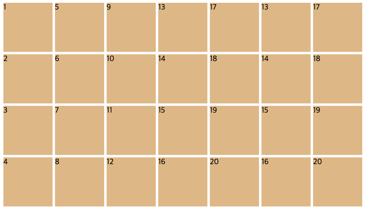
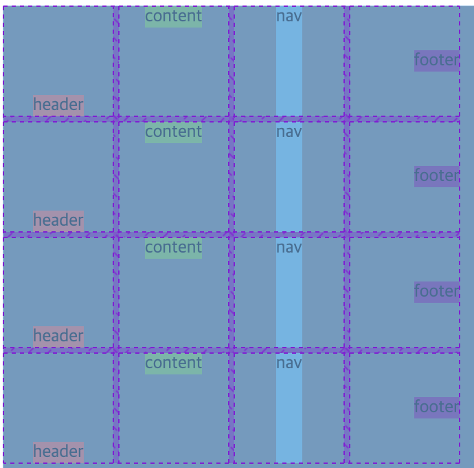
🔶 grid-auto-flow, grid-auto-rows, grid-auto-columns
-
grid-auto-flow: 방향;
: flex-direction과 비슷하다. (기본값: row)
: 처음에 지정해놓은 row,column 갯수보다 더 많은 줄이 있으면 새로운 row를 만들지, 새로운 column을 만들지 결정한다. -
grid-auto-rows: 크기;
: 만들어놓은 row보다 더 많은 row이 있으면, 자동으로 row를 만들어라.
: grid-auto-flow: row;일때 작동한다. -
grid-auto-columns: 크기;
: 만들어놓은 column보다 더 많은 column이 있으면, 자동으로 column를 만들어라.
: grid-auto-flow: column;일때 작동한다.
/* html */
<div class="grid">
	.item*20{$}
    <div class="item">1</div> x 20개
</div>

/* css */
.grid {
  display: grid;
  gap: 5px;
  /* 1.row 자동생성 */
  grid-template-columns: repeat(4, 100px);
  grid-auto-rows: 100px;
  grid-auto-flow: row;
  grid-template-rows: 100px;

  /* 2.column 자동생성 */
  grid-template-rows: repeat(4, 100px);
  grid-template-columns: 100px;
  grid-auto-flow: column;
  grid-auto-columns: 100px;
}

.item {
  background-color: burlywood;
}-
row 자동생성 결과

-
column 자동생성 결과