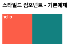
🔶 기본 사용
- 형태:
const Box = styled.html요소'css코드'
import styled from "styled-components";

const Box1 = styled.div`
  width: 100px;
  height: 100px;
  background-color: tomato;
`;

const Box2 = styled.div`
  width: 100px;
  height: 100px;
  background-color: teal;
`;

const Text = styled.span`
  color: white;
`;

function App() {
 return (
      <>
 		 <Box1>
         	 <Text>hello</Text>
         </Box1>
         <Box2/>
      </>
 );}
🔶 prop을 통해 요소의 속성을 변경
- styled component에서 props을 받는 법
import styled from "styled-components";

// 2.템플릿 안에 넣은 prop을 style컴포넌트에서 추출할 수 있게 됨.
 const Box3 = styled.div`
  width: 100px;
  height: 100px;
  background-color: ${(props) => props.bgcolor};
`;

function App() {
 return (
      <>
	// 1.props를 통해 컴포넌트에 데이터를 보냄
        <Box3 bgcolor="yellowgreen"> 1 </Box3>
        <Box3 bgcolor="skyblue"> 2 </Box3>
      </>
 );}
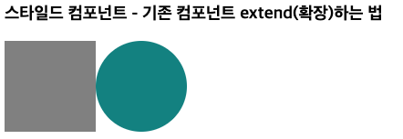
🔶 컴포넌트 확장 - 기존의 사용하던 스타일 컴포넌트에 속성을 추가 적용.
- 확장하려는 컴포넌트 이름을 괄호안에 넣으면 됨.
Circle컴포넌트는 기존 Box컴포넌트를 확장한 컴포넌트가 됨.
import styled from "styled-components";

const Box = styled.div`
  background-color: ${(props) => props.bgColor};
  width: 100px;
  height: 100px;
`;

const Circle = styled(Box)`
  border-radius: 50%;
`;

function practiceApp() {
  return (
    <>
      <Box bgColor="gray" />
      <Circle bgColor="teal" />
    </>
  );
}
🔶 기존 컴포넌트에서 html태그만 다른 요소로 교체.
- 기존 스타일 컴포넌트(Btn)에서 button태그를 a태그로만 바꿔 사용.
import styled from "styled-components";

const Btn = styled.button`
  color: wheat;
  border-radius: 20px;
  background-color: yellowgreen;
`;

function practiceApp() {
  return (
    <>
      <Btn>log in</Btn>
      <Btn as="a" href="http://www.google.com">log in</Btn> // as 이용
    </>
  );
}
🔶 컴포넌트에서 속성을 지정하는 법
1. 이렇게 각각에 속성을 지정하기 보단
const InputEl = styled.input`
  background-color: #f1dede;
`;


function practiceApp() {
  return (
      <>
        <InputEl required maxLength={3} />
        <InputEl required maxLength={3} />
        <InputEl required maxLength={3} />
      </>
      );
}
2. 컴포넌트에 한번에 속성을 지정해서 사용함.
const InputEl = styled.input.attrs({ required: true, maxLength: 3 })`
  background-color: #f1dede;
`;


function practiceApp() {
  return (
      <>
        <InputEl />
        <InputEl />
        <InputEl />
      </>
      );
}

~23.05 (🚌 이사갔어요👉👉https://journey-dev.tistory.com)