CSS-in-JS는 스타일 정의를 css나 scss 파일이 아닌 JavaScript로 작성된 컴포넌트에 바로 삽입하는 스타일 기법이다.
Styled Components
자바스크립트 파일 안에서 CSS를 작성하는 형태이다. 그렇기때문에 .css/.scss 파일을 만들지 않아도 된다.
npm install —save styled-components로 설치
기본 작성법
<Box>
 <Title fontSize='2rem' color='#d39'>스타일드 컴포넌트</Title>
<Box />- 디자인을 하기 위한 컴포넌트 css디자인을 주기 위해서는 태그 단위 아니고 컴포넌트 단위로 작성
const Box = styled.div`
    width : 500px;
    height : 300px;
    border : 5px solid red;
    margin : 3rem auto;
    text-align : center;
`
styled. 하고 마크업 할 태그 쓰기
스타일은 벡틱(``) 안에 작성하기
이 경우라면 소스에 div 태그로 나온다
1. as 사용
 <Box as ='ul'>
   <Text as='li' fontSize='16px' color='#962'>menu1</Text>
   <Text as='li' fontSize='16px' color='#962'>menu1</Text>
   <Text as='li' fontSize='16px' color='#962'>menu1</Text>
</Box>
마크업 태그 바꾸고 싶으면
as사용
이 경우라면 소스에 Box는 ul 태그로, Text는 li태그로 나온다
2. props 사용
<Box>
 <Title fontSize='2rem' color='#d39'>스타일드 컴포넌트</Title>
 <Title fontSize='1.5rem' color='#39630f'>CSS IN JS</Title>
 <Title color='#ee7124'>Fun And Easy</Title>
 </Box>//구조
const Title = styled.h2`
    font-size :${(props) => props.fontSize};
    color : ${(props)=>props.color};
    margin : 1rem 0;//스타일
이렇게
props를 받아서 스타일을 작성할 수 있다
위에 작성한 fontSize 나 color 속성을 구체적으로 조정 가능<Box as ='ul'> <Text as='li' fontSize='16px' color='#962'>menu1</Text> <Text as='li' fontSize='16px' color='#962'>menu1</Text> <Text as='li' fontSize='16px' color='#962'>menu1</Text> </Box> const Text = styled.p` color : ${(props)=>props.color}; font-size : ${(props)=>props.fontSize}; margin : 1rem ; `이 경우에 다른 Text 컴포넌트들은
p태그로 묶이지만 as 이용한 Box 안 Text 컴포넌트들은li태그로 묶이게 된다.
3.attrs 사용
attribute 다는 법
const Btn = styled.button.attrs(props => ({
    type : 'button',
    className : props.active ? 'btn on' : 'btn'
}))`
attrs를 이용해서 attribute를 달 수 있다 (JS에서 원래 쓰는 속성들만 가능)
4. 확장
const AniBtn = styled(Btn)`
    width : 400px;
    animation : ${colorChange} 1.5s alternate infinite ;
`
위에 있던 Btn의 속성을 가져오려고
styled(Btn)해준 것이다.
이렇게 되면 따로 지정하는 스타일값 말고는 Btn의 스타일을 받는다.
5. animation적용
import styled, { keyframes } from 'styled-components';
이렇게 import 하고 해야 애니메이션 적용 가능
animation 하려면const colorChange = keyframes하고 ``안에 키프레임 속성 쓴다. 적용하려면 css문법대로 적용하려는 컴포넌트 안에 넣어주면 된다<Box> <AniBtn>애니메이션버튼</AniBtn> </Box> const colorChange = keyframes` 0%{background:red} 100%{background:yellow} `
6.글로벌css
React와 Styled Components로 웹 개발을 하다보면 대부분의 경우 컴포넌트 레벨에서 스타일을 하게된다. 그러나 별 컴포넌트가 아닌 모든 컴포넌트에 동일한 스타일을 적용하는 편이 유리한 경우가 있다. (ex. font-family, reset속성 등)
import { createGlobalStyle } from 'styled-components';통해서 import하고const GlobalStyle = createGlobalStyle` (벡틱 안에는 스타일 속성) `이렇게
createGlobalStyle()함수로 생성한 전역 스타일 컴포넌트를 애플리케이션의 최상위 컴포넌트에 추가해주면 하위 모든 컴포넌트에 해당 스타일이 일괄 적용.
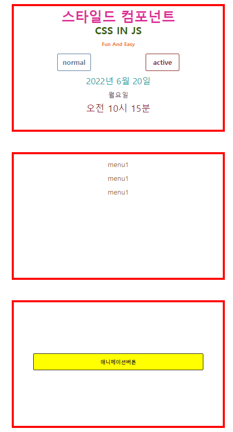
Styled Components 실습 코드 전체
import React from 'react';
import styled, { keyframes } from 'styled-components';

const Style = () => {
    return (
        <div>
            <Box>
                <Title fontSize='2rem' color='#d39'>스타일드 컴포넌트</Title>
                <Title fontSize='1.5rem' color='#39630f'>CSS IN JS</Title>
                <Title color='#ee7124'>Fun And Easy</Title>
                <Btn fontSize='1rem' color='#579' active>normal</Btn>
                <Btn display = 'none'>disable</Btn>
                <Btn fontSize='1rem' color='#822'>active</Btn>
                <Text fontSize='20px' color='#199'>2022년 6월 20일</Text>
                <Text fontSize='16px' color='#545'>월요일</Text>
                <Text fontSize='22px' color='#812'>오전 10시 15분</Text>
            </Box>
            <Box as ='ul'>
                <Text as='li' fontSize='16px' color='#962'>menu1</Text>
                <Text as='li' fontSize='16px' color='#962'>menu1</Text>
                <Text as='li' fontSize='16px' color='#962'>menu1</Text>
            </Box>
            <Box>
                <AniBtn>애니메이션버튼</AniBtn>
            </Box>
        </div>
    );
};

export default Style;

const Box = styled.div`
    width : 500px;
    height : 300px;
    border : 5px solid red;
    margin : 3rem auto;
    text-align : center;

`

const Title = styled.h2`
    font-size :${(props) => props.fontSize};
    color : ${(props)=>props.color};
    margin : 1rem 0;
`

const Btn = styled.button.attrs(props => ({
    type : 'button',
    className : props.active ? 'btn on' : 'btn'
}))`
    color : ${(props)=>props.color};
    font-size : ${(props)=>props.fontSize};
    border : 1px solid ${(props)=>props.color};
    width : 80px;
    height:40px;
    border-radius : 3px;
    display : ${(props)=>props.display};
    margin :  0 4rem;
    font-weight: bold;

`
const Text = styled.p`
    color : ${(props)=>props.color};
    font-size : ${(props)=>props.fontSize};
    margin : 1rem  ;
`
const colorChange = keyframes`
    0%{background:red}
    100%{background:yellow};

`

/* 확장시키고 애니메이션 적용 */
const AniBtn = styled(Btn)`
    width : 400px;
    animation : ${colorChange} 1.5s alternate infinite ;
    margin : 120px auto;
`