
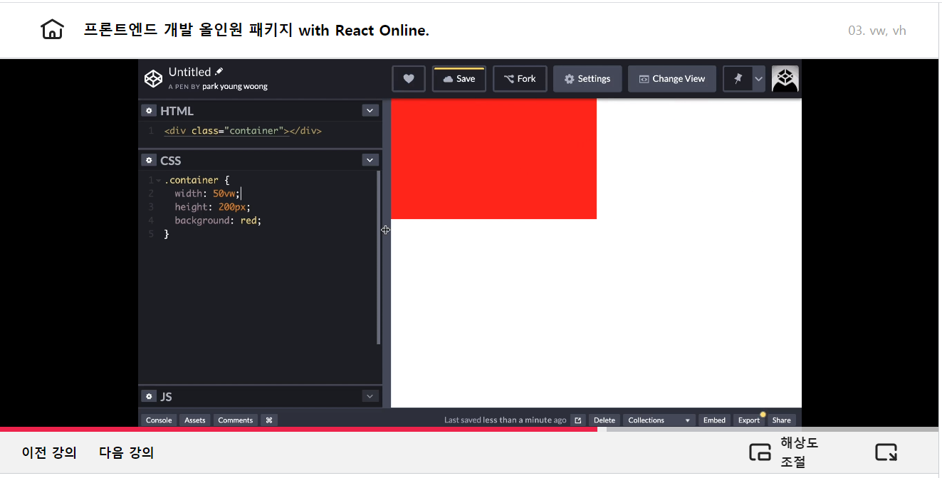
vw (view width), vh (view height)
- 백분율 (%)
<div class="container"></div>.container {
width: 50vw;
height: 50vh;
background: red;
}vmin, vmax
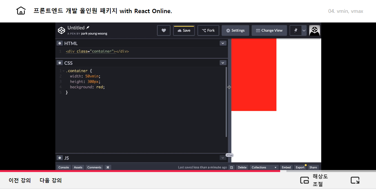
vmax: 더 긴 뷰포트 넒이를 단위로 사용vmin: 더 짧은 뷰포트 넓이를 단위로 사용
<div class="container"></div>.container {
width: 50vmax;
height: 300px;
background: red;
}박스 모델
width
-
요소의 너비를 지정
-
속성 값
- 값 :
auto- 의미 : 브라우저가 너비를 계산
- 기본값 :
auto(block : 100% / inline : 0px) - 단위 :
px,em,cm등 단위로 지정
- 값 :
height
- 요소의 높이를 지정
- 속성 값
- 값 :
auto- 의미 : 브라우저가 너비를 계산
- 기본값 :
auto(block : 0px / inline : 0px) - 단위 :
px,em,cm등 단위로 지정
- 값 :
<!-- block 요소 -->
<div></div>

<!-- inline 요소 -->
<span></span>
div {
width: auto; /* 100% */
height: auto; /* 0 */
background: tomato;
}
span {
width: auto; /* 0 */
height: auto; /* 0 */
}max-width
- 요소의 최대 가로너비를 지정
- 속성 값
- 단위 :
px,em,%등 단위로 지정 - 기본값 :
none
- 단위 :
min-width
- 요소의 최소 가로너비를 지정
- 속성 값
- 단위 :
px,em,%등 단위로 지정 - 기본값 : 0
- 단위 :
max-height
-
요소의 최대 세로너비를 지정
-
속성 값
- 단위 :
px,em,%등 단위로 지정 - 기본값 :
none
- 단위 :
min-height
- 요소의 최소 세로너비를 지정
- 속성 값
- 단위 :
px,em,%등 단위로 지정 - 기본값 :
none
- 단위 :
<div class="parent">
    <div class="child"></div>
</div>
.parent {
width: 200px;
heigth: 200px;
}
.child {
min-width: 400px; /* 400px 이하로 줄지 않는다 */
max-width: 600px; /* 600px 이상으로 늘어나지 않는다 */
height: 100px
}프론트엔드 올인원 패키지 바로가기 -> https://bit.ly/3m0t8GM

안녕하세요.