
🔥 Install
✨ styled-components
npm i styled-components✨ VS-Code extension
VS Code에서 styled-components에 대해서 자동완성 기능을 지원해주는 확장 프로그램!!
🔥 사용법
(생략된 코드가 많을 수 있습니다!!)
✨ basic
import styled from "styled-components";

const Container = styled.div`
 display: flex;
`;

const Item = styled.div`
 background-color: ${(props) => props.bgColor};
 width: 100px;
 height: 100px;
`;

function App() {
 return (
   <Container>
     <Item bgColor="teal" />
     <Item bgColor="tomato" />
   </Container>
 );
}

export default App;styled.{tag}에서 tag를 선택하고 ``안에 css 코드를 적어준다. props를 통해 입력인자들을 사용할 수 있다.
✨ 상속
const Item = styled.div`
 background-color: ${(props) => props.bgColor};
 width: 100px;
 height: 100px;
`;

const Circle = styled(Item)`
 border-radius: 50px;
`;styled(Item)을 통해 Circle은 Item을 상속할 수 있다. Item의 스타일을 그대로 상속받아 쓴다.
✨ "as"
const Item = styled.div`
background-color: ${(props) => props.bgColor};
width: 100px;
height: 100px;
`;
function App() {
return (
<Container>
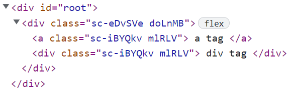
<Item as="a"> a tag </Item>
<Item as="a"> div tag </Item>
</Container>
);
}Item 컴포넌트는 styled.div로 div 태그를 선택했지만, as 값을 통해 다른 태그로 변환할 수 있다.
브라우저에서 소스코드를 살펴보면 실제로 <a>로 바뀌어 있는 것을 확인할 수 있다.
✨ "attrs"
const Input = styled.input.attrs({ required: true })`
  background-color: tomaot;
`;styled.input.attrs을 통해 default 속성값을 지정할 수있다.
✨ 하위 태그 선택, Pseudo Selector
const Box = styled.div`
  background-color: tomato;
  width: 100px;
  height: 100px;
  display: flex;
  justify-content: center;
  align-items: center;

  span {
    font-size: 36px;
    &:hover {
      transform: scale(1.3);
    }
    &:active {
      opacity: 0;
    }
  }
`;

function App() {
  return (
    <Box>
      <span>🛠</span>
    </Box>
  );
}
하위 태그 선택
<Box>의 하위 태그 <span>을 선택하기 위해서는 위와 같은 방법을 사용할 수 있다.
Pseudo Selector
&:hover, &:active와 같이 Pseudo Selector를 사용할 수있다. &는 자기자신(여기서는 span)을 의미한다.
특정 태그 의존
const Emoji = styled.span`
  font-size: 36px;
`;
const Box = styled.div`
  background-color: tomato;
  width: 100px;
  height: 100px;
  display: flex;
  justify-content: center;
  align-items: center;

  ${Emoji} {
    &:hover {
      transform: scale(1.3);
    }
    &:active {
      opacity: 0;
    }
  }
`;

function App() {
  return (
    <Box>
      <Emoji as="div">🛠</Emoji>
    </Box>
  );
}
<Box> style에서 <Emoji>를 지정하고 as="div" 값을 넘겨주게 되면, 특정 태그에 의존하지 않으면서 사용이 가능하다. 즉, 변환된 <div>에도 설정한 style이 적용된다.