
✅ Matplotlib
: 파이썬의 대표적인 데이터 시각화 라이브러리
plot 함수
예시
from matplotlib import pyplot as plt
plt.plot([1,2,3,4],[5,6,7,8],label = 'kg')
plt.title('Test Plot')
plt.xlabel('x')
plt.ylabel('y')
plt.legend(loc = 'upper left')
plt.xticks([1,2,3,4],[1,2,3,4]) # 이거 안하면 1, 1.5, 2, 2.5...
plt.yticks([5,6,7,8],[50,60,70,80])
# plt.savefig('First graph.png', dpi = 150, bbox_inches = 'tight')
# First graph.png': 저장 경로
# tight : 여백불포함
plt.show()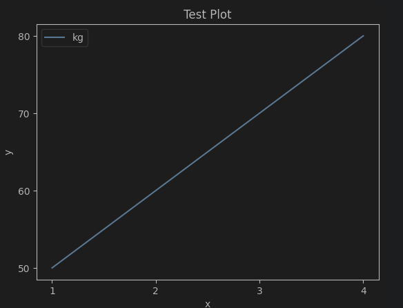
두 개의 선 그리기
from matplotlib import pyplot as plt
plt.plot([1,2,3,4],[1,2,3,4],label = 'kg')
plt.plot([1,2,3,4],[4,3,2,1],label = 'cm')
plt.legend(loc = 'upper right')
plt.show()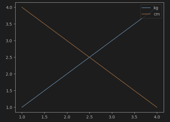
객체 지향 vs 상태 기반
- 객체 지향 : Figure, Axes 객체를 직접 생성
- Figure : 그래프를 그릴 전체 영역
- Axes : 그래프의 실제 내용
- 상태 기반 : Matplotlib의 pyplot 모듈을 사용해 상태를 유지
| 특징 | 객체 지향 | 상태기반 |
|---|---|---|
| 코드 구조 | 명확, 확장가능 | 간결, 빠르게 작성 가능 |
| 제어 수준 | 세부적 제어 가능 | 간단 설정에 적합 |
| 사용 대상 | 복잡 그래프, 다중 subplot | 단순 그래프 |
| 전역 상태 의존 여부 | X | O |
Figure, Axes 객체
fig, axes = plt.subplots(3,2, figsize=(10, 5))
fig.tight_layout()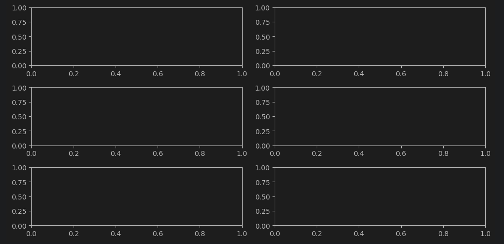
sin, cos 그래프 그리기
x = np.linspace(0, 2* np.pi, 100)

fig, axs = plt.subplots(1, 2, figsize=(10, 5), sharex = True)

axs[0].plot(x, np.sin(x), label='sin(X)')
axs[0].set_title('Sine')
axs[0].set_xlabel('x')
axs[0].set_ylabel('sin(x)')

axs[1].plot(x, np.cos(x), label='cos(X)')
axs[1].set_title('Cosine')
axs[1].set_xlabel('x')
axs[1].set_ylabel('cos(x)')

fig.tight_layout()
plt.show()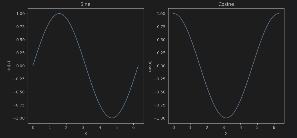
rc 함수
폰트 설정
from matplotlib import rc # 런타임 구성 옵션
rc('font',family='Malgun Gothic') # 윈도우
rc('font',family='AppleGothic') # 맥
rc('font',family='NanumGothic') # 리눅스
마이너스 부호 깨짐 방지
plt.rcParams['axes.unicode_minus'] = FalseMatplotlib 소개 및 실습 정리
1. Matplotlib이란?
- Python에서 가장 널리 사용되는 데이터 시각화 라이브러리
- 다양한 차트(막대, 선, 산점도, 파이, 히스토그램, 박스플롯, 바이올린, 히트맵 등) 지원
matplotlib.pyplot모듈을 중심으로 사용
import matplotlib.pyplot as plt2. 기본 데이터 준비
# Bar chart
categories = ['Category 1', 'Category 2', 'Category 3', 'Category 4']
values = [30, 50, 25, 40]

# Line chart
x_values = [1, 2, 3, 4, 5]
y_values = [10, 20, 15, 25, 30]
3. 기본 차트
(1) 막대 차트 (Bar Chart)
plt.bar(categories, values)
plt.xlabel('Categories')
plt.ylabel('Values')
plt.title('Bar Chart')
plt.show()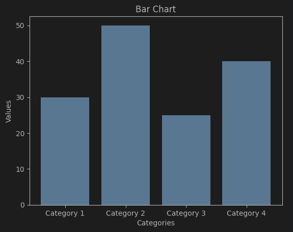
(2) 선 차트 (Line Chart)
plt.plot(x_values, y_values, marker='o', linestyle='-')
plt.xlabel('X Values')
plt.ylabel('Y Values')
plt.title('Line Chart')
plt.grid(True)
plt.show()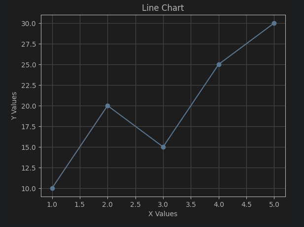
4. 산점도 & 파이 차트
import numpy as np

# Scatter data
x_scatter = np.random.rand(50)
y_scatter = np.random.rand(50)
colors_scatter = np.random.rand(50)
sizes_scatter = np.random.randint(10, 100, 50)

# Pie data
labels_pie = ['Category A', 'Category B', 'Category C', 'Category D']
sizes_pie = [30, 15, 25, 30]
(1) 산점도 (Scatter Plot)
plt.scatter(x_scatter, y_scatter, c=colors_scatter, s=sizes_scatter, alpha=0.7)
plt.xlabel('X Values')
plt.ylabel('Y Values')
plt.title('Scatter Plot')
plt.colorbar(label='Color Scale')
plt.show()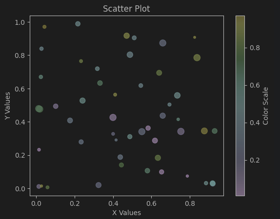
(2) 파이 차트 (Pie Chart)
plt.pie(sizes_pie, labels=labels_pie, autopct='%1.1f%%', startangle=90)
plt.axis('equal')
plt.title('Pie Chart')
plt.show()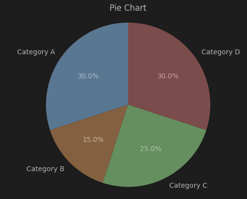
5. 분포 및 밀도 시각화
# Data
data_histogram = np.random.randn(1000)
data_boxplot = [np.random.normal(0, std, 100) for std in range(1, 5)]
data_violin = [np.random.normal(0, std, 100) for std in range(1, 5)]
data_heatmap = np.random.rand(5, 5)
(1) 히스토그램 (Histogram)
plt.hist(data_histogram, bins=20, edgecolor='black')
plt.xlabel('Value')
plt.ylabel('Frequency')
plt.title('Histogram')
plt.show()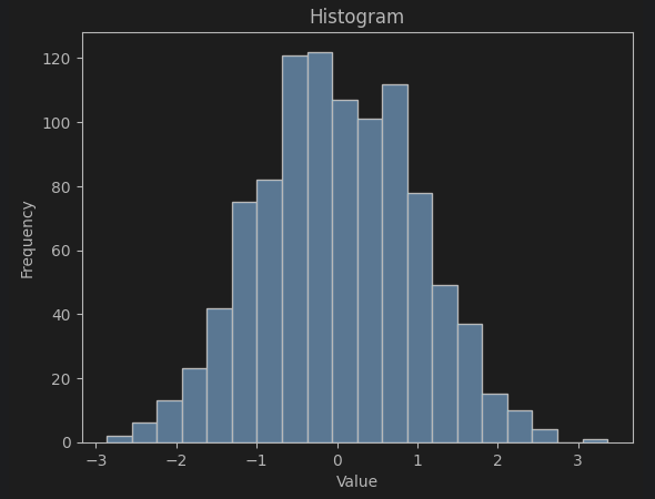
(2) 박스 플롯 (Box Plot)
plt.boxplot(data_boxplot, labels=['Box 1', 'Box 2', 'Box 3', 'Box 4'])
plt.xlabel('Box Number')
plt.ylabel('Values')
plt.title('Box Plot')
plt.show()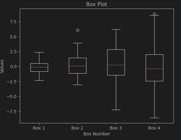
(3) 바이올린 플롯 (Violin Plot)
plt.violinplot(data_violin, showmedians=True)
plt.xlabel('Data Series')
plt.ylabel('Values')
plt.title('Violin Plot')
plt.xticks(np.arange(1, 5), ['Series 1', 'Series 2', 'Series 3', 'Series 4'])
plt.show()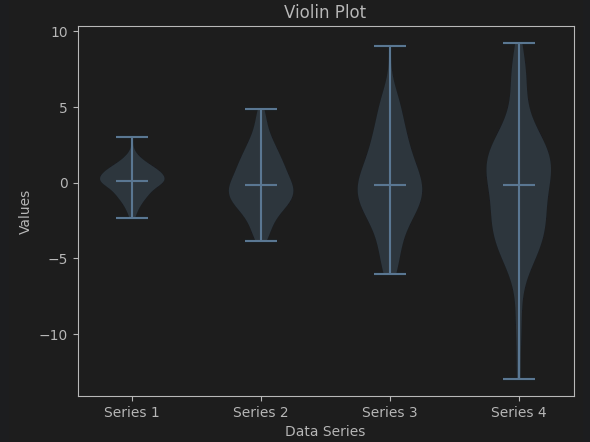
(4) 히트맵 (Heatmap)
plt.imshow(data_heatmap, cmap='coolwarm', interpolation='nearest')
plt.colorbar(label='Color Scale')
plt.title('Heatmap')
plt.show()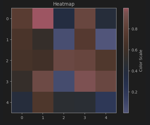
더 정교한 시각화는 Seaborn, Plotly 등과 함께 사용 가능

Hello. I'm jimin:)