
transition은 웹 요소가 한 상태에서 다른 상태로 부드럽게 전환되는 애니메이션 효과를 생성하는 기능입니다. 예를 들면, 요소에 마우스를 올리면 색상이 점진적으로 변하는 등의 시각적 효과를 만드는 데 유용합니다.
transition 속성
| 속성 | 의미 | 기본값 |
|---|---|---|
transition | 모든 transition 속성을 이용한 스타일을 한 줄에 설정 | |
transition-property | 전환 효과가 적용되는 CSS 속성을 설정 | all |
transition-duration | 전환 효과의 지속시간을 설정 | 0s |
transition-timimg-function | 전환 효과의 변화 속도를 설정 | ease |
transition-delay | 전환 효과가 몇 초 뒤에 시작할지 대기시간을 설정 | 0s |
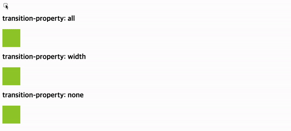
transition-property
transition-property은 CSS 트랜지션 효과가 적용되어야 하는 CSS 속성을 지정하는 속성입니다. 예를들어 width, background-color와 같이 특정 속성을 선택합니다. 속성이 명시적으로 지정되지 않는 경우 기본값은 사용할 수 있는 모든 CSS 속성에 트랜지션 효과를 적용하는 all입니다. 쉼표(,)로 구분하여 여러 속성을 선택할 수 있으며, transition-property는 상속됩니다.
<body>
  <input type="checkbox" />
  <h2>transition-property: all</h2>
  <div class="item p1"></div>
  <h2>transition-property: width</h2>
  <div class="item p2"></div>
  <h2>transition-property: none</h2>
  <div class="item p3"></div>
</body>
.item {
box-sizing: border-box;
width: 60px;
height: 60px;
margin: 10px 0px;
background-color: yellowgreen;
transition-duration: 4s;
}
input:checked ~ .item {
width: 100%;
border-radius: 20px;
background-color: tomato;
}
.p1 {
transition-property: all;
}
.p2 {
transition-property: width;
}
모든 CSS 속성에 트랜지션 효과를 적용할 수 있는 것은 아닙니다. 레이아웃 변경과 관련된 속성이나 일부 시각적 속성은 트랜지션 효과를 적용하기에 적합하지 않을 수 있습니다. all 키워드를 사용하면 전체 CSS 속성에 트랜지션 효과를 적용할 수 있지만, 지원하지 않는 속성에 대해서는 이 효과가 무시됩니다. 특정 속성에 대한 트랜지션 효과를 제외하려면 none 키워드를 사용합니다.
트랜지션 효과를 지원하는 속성
1. 크기 및 위치
width: 너비height: 높이top: 위쪽 위치left: 왼쪽 위치right: 오른쪽 위치bottom: 아래쪽 위치margin: 여백padding: 패딩
2. 색상 및 배경background-color: 배경색color: 글자색background-image: 배경 이미지background-position: 배경 이미지 위치background-size: 배경 이미지 크기
3. 기타opacity: 투명도border-width: 테두리 두께border-color: 테두리 색상border-style: 테두리 스타일text-align: 텍스트 정렬font-size: 글꼴 크기font-weight: 글꼴 굵기letter-spacing: 글자 간격line-height: 줄 간격transform: 변형 (회전, 이동, 확대/축소 등)
트랜지션 효과를 지원하지 않는 속성
1. 레이아웃 변경 관련 속성:
display: 요소의 표시 여부 (예:block,none)visibility: 요소의 가시성 (예:visible,hidden)float: 요소의 좌우 배치 (예:left,right)clear: 요소 주변의 떠 있는 요소 제거 (예:left,right,both)overflow: 요소 영역 밖의 내용 처리 (예:visible,hidden,scroll)z-index: 요소의 계층 순서position: 요소의 위치 (예:static,relative,absolute,fixed)
2. 시각적 속성:cursor: 마우스 커서 모양outline: 요소 테두리 강조 (예:none,dotted,solid)box-shadow: 요소 그림자 효과text-shadow: 글자 그림자 효과
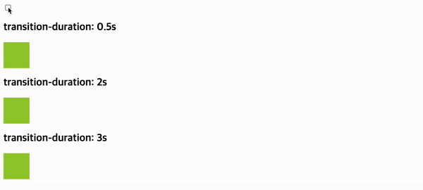
transition-duration
transition-duration속성은 CSS 트랜지션 효과의 지속 시간을 설정합니다. 즉, 요소의 속성 값이 변하는 데 걸리는 시간을 정의합니다.
| 속성 값 | 의미 | 기본값 |
|---|---|---|
0s | 트랜지션 효과 없이 즉각적으로 값이 변합니다. | 0s |
시간 | 초(s) 또는 밀리초(ms) 단위를 사용하여 지속 시간을 지정합니다. |
.item {
  box-sizing: border-box;
  width: 60px;
  height: 60px;
  margin: 10px 0px;
  background-color: yellowgreen;
}
input:checked ~ .item {
  width: 100%;
  border-radius: 20px;
  background-color: tomato;
}
.p1 {
  transition-duration: 0.5s;
}
.p2 {
  transition-duration: 2s;
}
.p3 {
  transition-duration: 3s;
}
.item {
box-sizing: border-box;
width: 60px;
height: 60px;
margin: 10px 0px;
background-color: yellowgreen;
}
input:checked ~ .item {
width: 100%;
border-radius: 20px;
background-color: tomato;
}
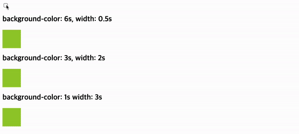
.p1 {
transition-property: background-color, width;
transition-duration: 6s, 0.5s; /* 배경색 6초, 너비 0.5초 지속 시간 */
}
.p2 {
transition-property: background-color, width;
transition-duration: 3s, 2s; /* 배경색 3초, 너비 2초 지속 시간 */
}
.p3 {
transition-property: background-color, width;
transition-duration: 1s, 3s; /* 배경색 1초, 너비 3초 지속 시간 */
}
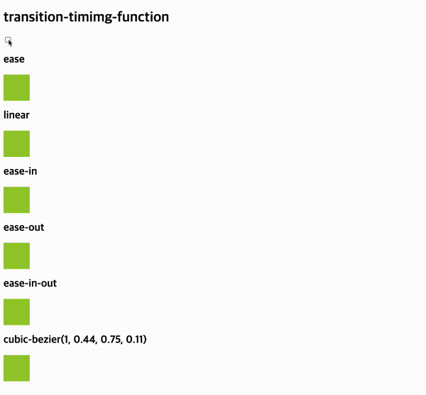
transition-timimg-function
transition-timimg-function속성은 CSS 트랜지션 효과의 진행 방식을 제어합니다. 즉, 요소 속성 값이 변하는 동안 속도가 어떻게 변하는지 정의합니다.
| 속성 값 | 의미 | 기본값 |
|---|---|---|
ease | 느리게 - 빠르게 - 느리게 | ease |
linear | 일정하게 | |
ease-in | 느리게 - 빠르게 | |
ease-out | 빠르게 - 느리게 | |
ease-in-out | 느리게 - 빠르게 - 느리게 | |
cubic-bezier(n, n, n, n) | 베지어 곡선을 사용하여 속도 변화 정의 |
.item {
  box-sizing: border-box;
  width: 60px;
  height: 60px;
  margin: 10px 0px;
  background-color: yellowgreen;
  transition-duration: 5s;
}
input:checked ~ .item {
  width: 100%;
  border-radius: 20px;
  background-color: tomato;
}
.p1 {
  transition-timing-function: ease;
}
.p2 {
  transition-timing-function: linear;
}
.p3 {
  transition-timing-function: ease-in;
}
.p4 {
  transition-timing-function: ease-out;
}
.p5 {
  transition-timing-function: ease-in-out;
}
.p6 {
  transition-timing-function: cubic-bezier(1, 0.44, 0.75, 0.11);
}
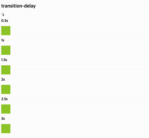
transition-delay
transition-delay 속성은 CSS 트랜지션 효과의 시작 지연 시간을 설정합니다. 즉, 요소 속성 값 변화가 시작 되기 전에 얼마나 기다릴지 정의합니다.
| 속성 값 | 의미 | 기본값 |
|---|---|---|
0s | 대기시간 없음 | 0s |
시간 | 대기시간(s)을 지정 |
.item {
  box-sizing: border-box;
  width: 60px;
  height: 60px;
  margin: 10px 0px;
  background-color: yellowgreen;
  transition-duration: 3s;
}
input:checked ~ .item {
  width: 100%;
  border-radius: 20px;
  background-color: tomato;
}
.p1 {
  transition-delay: 0.5s;
}
.p2 {
  transition-delay: 1s;
}
.p3 {
  transition-delay: 1.5s;
}
.p4 {
  transition-delay: 2s;
}
.p5 {
  transition-delay: 2.5s;
}
.p6 {
  transition-delay: 3s;
}
참고