grid를 활용하여 반응형 웹을 제작해보고자 할 때, 아래와 같은 코드 방식으로 작성했었다. 하지만 화면을 축소할 때, 그에 따라 container의 너비도 달라지지만 고정된 column의 갯수 때문에 grid의 item들이 범위를 벗어나게 되었다.
const container = props => css`
  width: 60vw; // 반응형 너비
  background: black;
`;

const grid = props => css`
  display: grid;
  grid-template-columns: repeat(3, minmax(250px,1fr));
  gap: 1rem;
`

const box = props => css`
  width: 250px;
  height: 250px;

  justify-self: center;

  display: flex;
  align-items: center;
  justify-content: center;

  &:nth-of-type(2n) {
    background: red;
  }

  &:nth-of-type(2n + 1) {
    background: orange;
  }
`;<div css={container}>
<div css={grid}>
<div css={box}>1</div>
<div css={box}>2</div>
<div css={box}>3</div>
<div css={box}>4</div>
</div>
</div>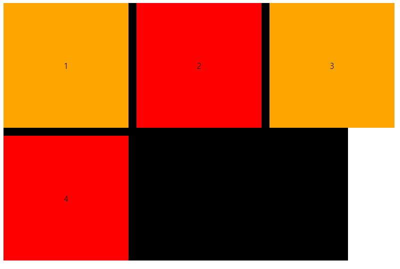
media query
이를 해결하기 위해 media query를 이용해서 범위를 넘어 갈 때쯤에 column의 갯수를 조절하는 방식으로 수정했었다.
const grid = props => css`
  / * 생략 */
  @media (max-width: 900px) {
    grid-template-columns: repeat(2, minmax(250px, 1fr));
  }
`
하지만 일일이 이렇게 바꿔주는 것보다 좋은 방법이 없을까 하고 구글링 하던 중에 더 좋은 방식을 알 수 있었다.
auto-fill, auto-fit
auto-fill과 auto-fit은 행 또는 열의 item 개수가 명확하지 않을 때 유용하게 쓸 수 있는 방식이다.
해당 경우에는 auto-fill을 이용해서 행 또는 열의 개수를 grid 크기에 맞게 자동적으로 조절할 수 있게 되었다.
const grid = props => css`
  display: grid;
  grid-template-columns: repeat(auto-fill, minmax(250px, 1fr));
  gap: 1rem;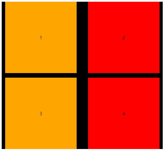
auto-fill, auto-fit 차이점
예를 들면 위의 상황에서 item이 2개밖에 없다고 가정했을 때,
아래의 모습처럼 auto-fit을 이용했을 때는 남는 여백을 grid가 꽉차게 가져간다.
반면에 auto-fill을 이용했을 때는 다음 item이 들어올 수 있는 여지를 준다.
grid-template-columns: repeat(auto-fit, minmax(250px, 1fr));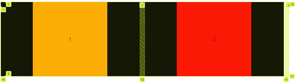
grid-template-columns: repeat(auto-fill, minmax(250px, 1fr));
내가 생각했을 때는 너비 안에서 가운데 정렬을 하고 싶다면
auto-fit방식을 이용하는 것이 좋다고 생각하고 왼쪽으로 치우치고 싶다면auto-fill방식을 사용하는 것이 좋을 것 같다.(
auto-fit방식을 이용했을 때 item이 가운데로 오게하고 싶다면, item에 justify-self: center; align-self: center; 를 적용해주면 된다.)
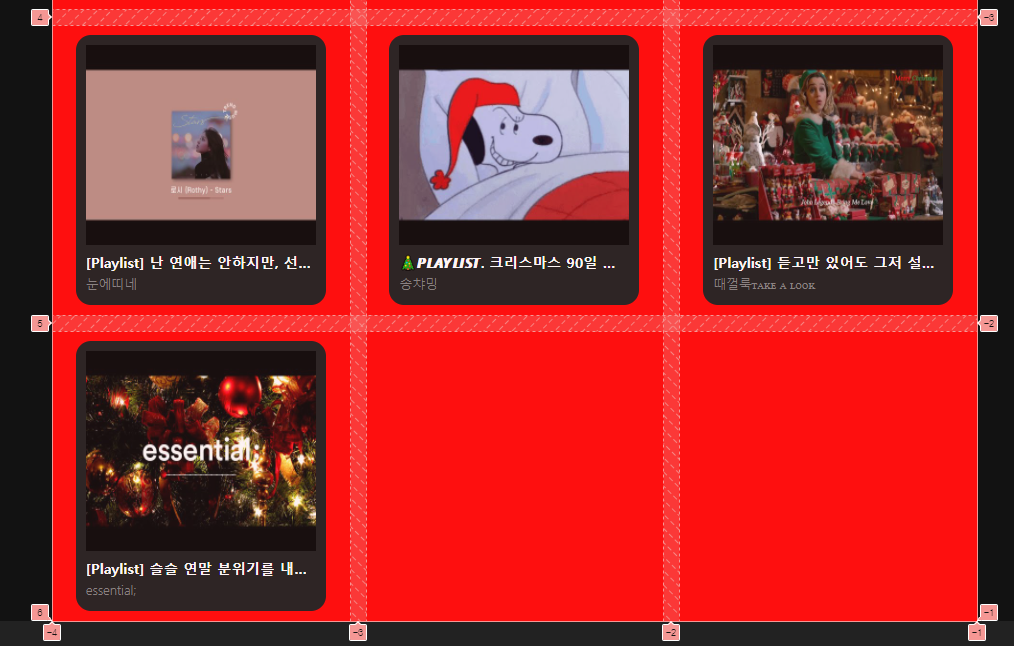
적용 결과

transform을 적용한 부모의 자식 요소의 position: fixed 공부