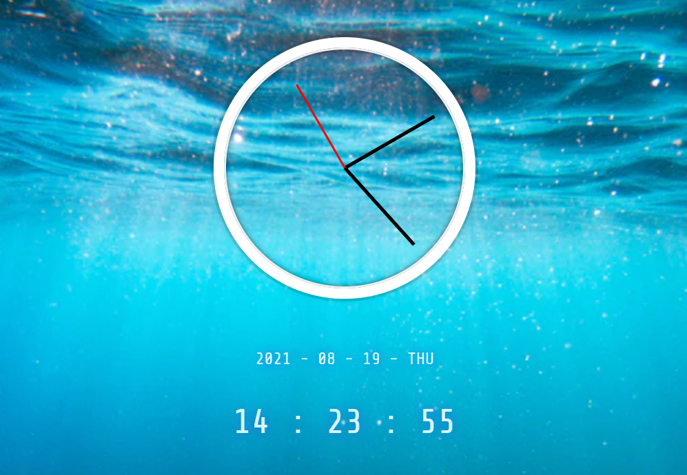
Day2 - JS and CSS Clock
🎯 기능 요구사항
- 현재 시간을 아날로그 시계로 구현한다.
- 실제 시계와 같이 틱틱 거리는 느낌을 구현한다.
+디지털 시계도 구현한다.
🚀 배운 점
사용자 정의 css속성 및 calc() css 함수
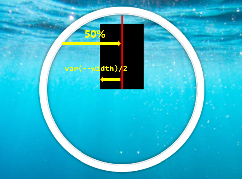
.hand {
    position: absolute;
    bottom: 50%;

    left: calc(50% - var(--width) / 2);
    width: var(--width);
    height: var(--height);
    background-color: var(--color);

    transform-origin: bottom center;

}

.hour-hand {
    --width: 7px;
    --height: 110px;
    --color: black;
}
.min-hand {
    --width: 7px;
    --height: 110px;
    --color: black;
}
.second-hand {
    --width: 5px;
    --height: 140px;
    --color: red;
}
기존의 css 방식으로는 초, 시, 분침의 사이즈를 다르게 해주면 정 가운데에서 시작하기가 어려웠다. 그래서 사용자 정의 css 속성와 calc() 함수를 이용하여 left: calc(50% - var(--width) / 2); 초, 시, 분침의 사이즈를 달리하여도 정 가운데에 위치하게 할 수 있었다.
추가적으로 setInterval로 인한 매초마다 리렌더링이 될 때 rotate값이 달리지게 될 때 회전 축을 transform-origin: bottom center;로 주어 정 가운데를 기준으로 회전 할 수 있었다.
cubic bezier curves
.hand {
    /* 기존 코드 생략 */

    transition: all 0.05s;
    transition-timing-function: cubic-bezier(0.1, 2.7, 0.58, 1);
}
css transition을 서서히 변화시키는 속성에는 아래와 같은 다양한 속성이 존재한다.
참고 사이트에서 눈으로 확인해 볼 수 있다.
transition-timing-function: ease;
transition-timing-function: ease-in;
transition-timing-function: ease-out;
transition-timing-function: ease-in-out;
transition-timing-function: linear;
transition-timing-function: step-start;
transition-timing-function: step-end;
transition-timing-function: cubic-bezier(0.1, 0.7, 1.0, 0.1);
slice(-2)를 활용한 두자리수 맞추기
slice(-2)는 배열의 마지막 2개의 요소를 추출하기 때문에 두 자리수를 맞출 수 있었다.
let hour = 5;
console.log(`${("0"+hour).slice(-2)}`) // 05

hour = 15;
console.log(`${("0"+hour).slice(-2)}`) // 15;
demo:
https://danji-ya.github.io/JS_javascript30/02-JSandCSSClock/