z-index : z 축에 영향을 미치는 속성
(1:33:42 - 1:45:15)
1)
html)
<div class="z-one"></div>
<div class="z-two"></div>

css)
.z-one {width:200px;
        height: 200px;
        background-color: yellow;}
.z-two {width:200px;
        height: 200px;
        background-color: blute;}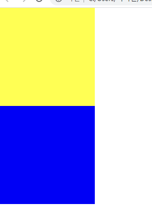
.z-one {width:200px;
	**position:  absolute;width:200px;**  << 추가하면
        height: 200px;
        background-color: yellow;}
파란색 박스가 보이지 않게 되는데, 사라진 게 아니라 레이어가 겹쳐져 있는 상태
(높이값 조정해서 튀어나온 값으로 확인 가능)
2)
.z-one {
	position:  absolute;width:200px;

        height: 200px;
        background-color: yellow;
    }
.z-two {
	position:  absolute; << 이번엔 파란색에 absolute 추가
	width:200px;
    height: 200px;
    background-color: blue;
    }
파란색 박스 뒤에 노란박스가 겹쳐져 있는 상태
-> 형제관계의 absolute가 3차원 성격의 position 을 갖고있는 속성값 absolute나 pixed를 사용하게 되면 레이어가 겹치게 되는 현상.
1)에서 노란색 위치 끌어올리기를 하고싶을때 쓰는 것이 z-index
속성값은 숫자값만 적용하면 되고, 숫자에는 단위가 생략됨
ex)
.z-one {
	position:  absolute;width:200px;

        height: 200px;
        background-color: yellow;
        z-index: 10; <<<<< 이렇게
    }
z-ndex가 최초 0인 상태로 기억. 0과 10을 비교했을때 10이 더 높기 때문에
yellow가 위로 올라오는 것.
.z-one {
	position:  absolute;
	    width:200px;

        height: 200px;
        background-color: yellow;
        z-index: 10;
    }
.z-two {
	position:  absolute;
	width:200px;
    height: 200px;
    background-color: blue;

    z-index: 20;} <<< 10과 20중 20이 더 높기 때문에 블루가 위쪾으로 올라옴
z-index를 사용하면 자유롭게 z축 위치를 조정 가능
**사용 시 주의점) z-index 는 z축에 있다. = 3차원적인 특징
즉 z축에 있는 3차원 영역에서만 사용 가능
= 3차원적인 특징을 갖고 있는 포지션 속성값에서만 적용이 가능하다!
3차원 특징을 갖고있는 포지션?
absolute, pixed, relative(2.3차원 속성 모두 갖고있음)
position-static은 2차원, 애초에 z축이라는 개념이 없음-> z-index 사용불가
2) 형제값에 따른 포지션 속성값에 따라서 어떻게 결과가 나타나는지
.z-one {
	    width:200px;

        height: 400px;
        background-color: yellow;
        /*z-index: 10;*/
    }
.z-two {
	position: absolute;
	width:200px;
    height: 300px;
    background-color: blue;

    /*z-index: 20;*/
}
: 첫번째 형제에게다가 순수 3차원 포지션 속성값(순수 3차원 : absolute, pixed)
사용하게 되면 layer가 겹치고, 다음 나오는 layer에 포지션 absolute 사용 하면
layer가 겹치는 현상은 일어나지 않는다.
즉, 첫번째(가장 먼저 나오는)형제의 포지션이 2차원이냐, 3차원이냐에 따라서
layer가 겹칠지 안겹칠지 결정, 큰 공간 만들때는 2차원을 주로 사용
(큰 공간의 양쪽 모두가 3차원일때 layer 겹치는 현상 때문)
@ bootstrap agency
float과 clear
Float : 선택한 영역을 x축으로 나란히 정렬 / 특정 object를 브라우저 기준 왼쪽 끝 오른쪽끝으로 배치하고자 할때 쓰는 css 속성
<div class="left-1"></div>
<div class="right-1"></div>
</body>
</html>

.left-1{
 width: 100px;
 height: 150px;
 background-color: blue;
}

.right-1 {
	width: 100px;
	height: 150px;
	background-color: green;
}
둘다 2차원, block 속성이기 때문에 y축 정렬로 확인
.left-1{
	float: left; <<< 추가
 width: 100px;
 height: 150px;
 background-color: blue;
}

.right-1 {
	float: right; <<< 추가
	width: 100px;
	height: 150px;
	background-color: green;
}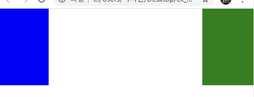
브라우저 크기 줄여도 늘려도 크기에 맞춰서 양쪽 정렬. 이러한 layout 구조 만들때 쓰는 것이 float
float 활용해서 전통적인 layout구조 만들기!
※ 공간을 만들때 쓰는 태그는 block 요소
float 사용했을 때 clear 따라옴(clear: both;)
float : 같은 선상의 block을 배치하고자하는 기능을 킬때
float 주의점 : 레이어가 틀어질 수 있다.
static이거나 relative를 사용해야 함 (순수 3차원과만 사용)
팁 :
- float을 사용한 부모 값이 고정값이 아니면 안됨->레이어 틀어지는 현상 방지
- 3차원 속성 가지게 됨: float 사용한 자식의 높이값이 부모 높이값에 영향주지 않음
- position은 static이나 relative 를 사용해야 한다. 순수 3차원 position은 float과 함께 사용할 수 없다.
clear
:float 을 끄고자 할 때 사용
float을 마지막으로 사용한 태그 바로 아래에 적어야 함
both : left, right 둘 다 꺼야 함
overflow
요소 안에 content (text, 요소 등)이 요소의 크기를 넘어 넘칠 때 사용하는 옵션
overflow: 요소 밖으로 넘치는 부분 처리
visible: 넘치는 부분 그대로 보임. default
hidden: 넘치는 부분 잘라버림
overflow-y:scroll: y축 기준으로 스크롤 만들어줌
overflow-x:scroll: x축 기준으로 스크롤 만들어줌
flex
부모 태그 안 여러 자식태그들을 정렬할 때 쓰는 display 속성
float보다 제약사항 적어서 웹사이트 레이아웃 배치 시 효율
부모 요소에 display: flex쓰면 자식요소들이 x축 기준으로 left 정렬
<div class="container">
    <div class="item one"></div>
    <div class="item two"></div>
    <div class="item three"></div>
</div>
.container {
    display: flex;
    /* flex-direction: row;
    flex-wrap: wrap; */
    flex-flow: row nowrap;
    justify-content: space-between;
    align-items: baseline;
    width: 1000px;
    border: solid 10px red;
    height: 500px;
}
.item {
    width: 200px;
    height: 300px;
}
.one {
    background-color: yellow;
    height: 100px;
}
.two {
    background-color: blue;
    height: 200px;
}
.three {
    background-color: orange;
    height: 300px;
    /* width: 900px; */
}- 사용법
-
flex-direction 정렬 변경: row (default, x축 정렬), column(y축정렬), row-reverse(x축 right부터 정렬), colume-reverse(y축 아래부터 정렬)
-
flex-wrap 자식 요소 넓이 조정 여부 : nowrap(부모영역에 맞게 자식 리사이즈), wrap(넓이 초과 시 자동 줄바꿈)
-
flex-flow:flex-direction, flex-wrap 한 번에 지정
-
justify-content x축 정렬 : flex-start(왼쪽 정렬, default), flex-end, center, space-between(개체 간 공백), space-around(처음, 끝에도 공백)
-
align-items y축 정렬:flex-start (윗쪽 정렬), flex-end, center, baseline(가장 height 큰 요소 기준 아래 정렬)
<div class="container">
    <div class="item one"></div>
    <div class="item two"></div>
    <div class="item three"></div>
</div>
.container {
    display: flex;
    /* flex-direction: row;
    flex-wrap: wrap; */
    flex-flow: row nowrap;
    justify-content: space-between;
    align-items: baseline;
    width: 1000px;
    border: solid 10px red;
    height: 500px;
}
.item {
    width: 200px;
    height: 300px;
}
.one {
    background-color: yellow;
    height: 100px;
}
.two {
    background-color: blue;
    height: 200px;
}
.three {
    background-color: orange;
    height: 300px;
    /* width: 900px; */
}
중앙정렬 하는 방법
- margin: 0 auto
(상하마진, 좌우마진) block요소에서 사용
.   center-1 {
    width: 300px;
    height: 300px;
    background-color: yellow;
margin: 0 auto;}- position: relative, left:50%, margin-left:-1/2 width
.   center-2 {
    position: relative;
    left: 50%;
    margin-left: -150px;
    width: 300px;
    height: 300px;
    background-color: blue;
}
참고주의 )) https://css-tricks.com/centering-in-css/
- position: relative, left:50%, margin-left:-1/2 width
    .center-2 {
    position: relative;
    left: 50%;
    margin-left: -150px;
    width: 300px;
    height: 300px;
    background-color: blue;
}
html, body {
margin: 0;
padding: 0;
}
ul {
list-style: none;
margin: 0;
padding:0;
}
a {
color: #000000;
text-decoration: none;
}.menu li {
float: left;
width: 100px;
height: 50px;
background-color: yellow;
text-align: center;
line-height: 50px;
}.menu li {
float: left;
width: 100px;
height: 50px;
background-color: yellow;
/* border: solid 1px red; */
border-top: solid 1px red;
border-bottom: solid 1px red;
border-left: solid 1px red;
}
.menu li:last-child {
border-right: solid 1px red;.kakao-lists li .kakao-info {
display: inline-block;
}
.kakao-lists li img,
.kakao-lists li .kakao-info {
vertical-align: middle;
}July, 5
7월의 2주차 월요일이다. 2차원 3차원의 여러가지 경우의 수를 정확히 파악하여 무리 없게 하고자 여러 실무를 돌려보고있다. 점점 쌓아가는 기록은 늘어가는데 어떻게 잘 쓸 수 있을지 구체적인 구조와 디자인을 생각해 봐야 겠다는 생각이 든다.
