July, 7 #애니메이션
- css 애니메이션 : 웹사이트에서 인터랙션한 효과를 구현하고자 할 때 사용
과거엔 java script로 사용가능했으나 css 언어의 발전으로 간단한 애니메이션은 css로도 가능
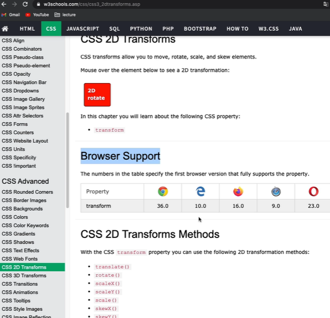
트랜스폼 (transforms) :
선택한 오브젝트 크기를 확대 및 축소, 각도회전, 위치변경**
html)

<!DOCTYPE html>
<html>
<head>
	<meta charset="utf-8">
	<link rel="stylesheet" type="text/css" href="css/style.css">

</head>
<body>
 <div class="transform"></div>

</body>
</html>
css)
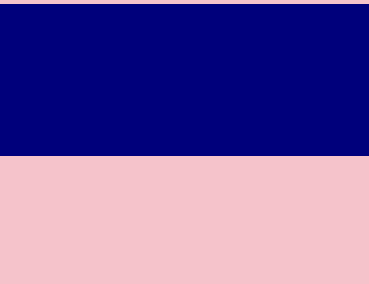
body {
background-color: pink;
}
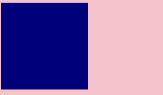
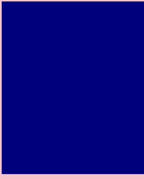
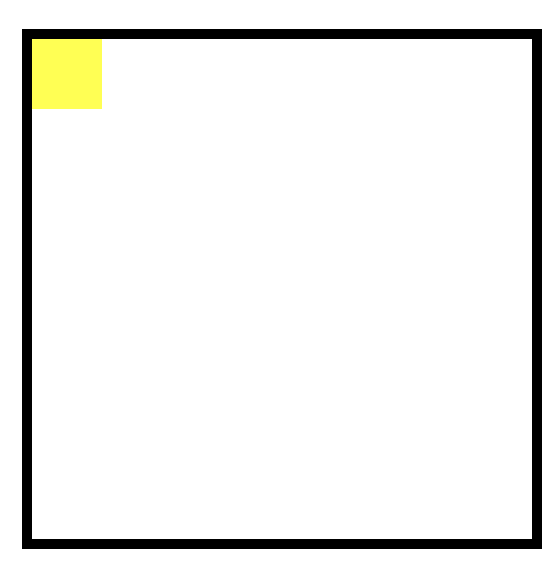
.transform {
width: :300px;
height: 300px;
background-color: navy;
}
rotate : 평면회전 // transform: rotate(45deg);
※ rotate 안에 전달되는 숫자는 음수(왼쪽 회전), 양수(오른쪽 회전)
ex) transform: rotate(-10deg); 왼쪽으로 10도 회전
body {
	background-color: pink;
}

.transform {
	width: :300px;
	height: 300px;
	background-color: navy;
	transform: rotate(45deg);
	}
-
scale : 선택한 영역의 가로 세로 크기를 비율로써 확대
transform: scale(2,3) : width값을 2배(x축), height 값을 3배(y축)
※ 비율 줄일 때는 소수점 단위로 입력 transform: scale(0.5,0.5);
0.5 -> 150x150 -
skew : rotate처럼 선택한 영역의 각도에 영향을 미치는 속성 but, 3차원적인 회전, 음수 양수 적용
transform: skew(10deg, 20deg); // (x축회전, y축회전)
-
translate : 선택한 영역의 오브젝트 위치를 변경할 때
transform: translate(100px,300px); // (x축, y축)
트랜스폼 (transform) 사용 시 주의점
익스플로러 10.0에서 사용, 익스플로러 9.0에서 사용해야 할 경우 프리픽스 입력
-webkit-transform: rotate(10deg); <<< 크롬과 사파리 브라우저 의미
-moz-transform: rotate(10deg); <<< 파이어폭스
-ms-transform:  rotate(10deg);  <<< 익스플로러 9.0까지 포함해서 transform 적용(이하버전 불가)
-o-transform: rotate(10deg);  <<< 오페라 브라우저 적용

transform: rotate(10deg);   <<<< 디폴트값으로 넣어줄 것
}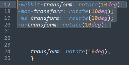
-webkit- / -moz- 등은 transform의 접두사
transition
: 마우스 올렸을 때 자연스러운 효과
ex) 메뉴버튼 마우스 올렸을 때 자연스러운 색상 변화효과 등에서 적용
- width값 효과
<!DOCTYPE html>
<html>
<head>
<meta charset="utf-8">
<link rel="stylesheet" type="text/css" href="css/style.css">
</head>
<body>
<!--
<div class="transform"></div>
-->
<div class="transition"></div>
</body>
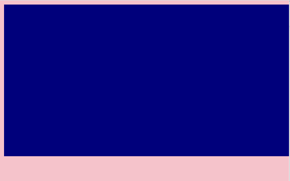
</html>.transition {
width: 300px;
height: 300px;
background-color: navy;
}
.transition:hover { <<<< (가상선택자)마우스 올렸을 때 효과
width: 600px;
}
마우스 뗏을 때
마우스 올렸을 때
사용자 입장에서는 움직임이 부자연스러운 애니메이션 효과
-> 변화하는 과정 을 보여주고싶다 할때 쓰는 효과가 transition
.transition {
width: 300px;
height: 300px;
background-color: navy;
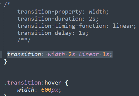
transition-property: width; <<< 변화를 주고자 하는 영역이 지금은 width
transition-duration: 2s; <<< 애니메이션 진행시간 : 2초 (300에서 600으로 바뀌는 시간 설정)
transition-timing-function: linear; <<<< 속도성격지정: linear 일정한 속도유지
transition-delay: 1s; <<<< 마우스 올리고 1초뒤에
}
.transition:hover {
width: 600px;
}
이렇게 줄여서 사용가능. css 용량 줄어들면 로딩속도 줄어들어서 사용자도 편리
※ 주의점
단, duration과 delay의 순서에 신경 쓸 것!
숫자 두개나오는 경우, 가장 먼저 나오는 숫자가 duration, 이후 숫자가 delay
transition: width 2s linear 1s; -> 2가 duration, 1이 delay
- 마우스 올렸을 때 높이값 바꾸는 효과
 transition: width 2s linear, height 2s linear;   <<<<쉼표주의
}


.transition:hover {
	width: 600px;
	height: 600px;
}
애니메이션 속성
keyframes와 연동
<div class="animation"></div>
</body>

</html>
css)
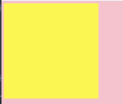
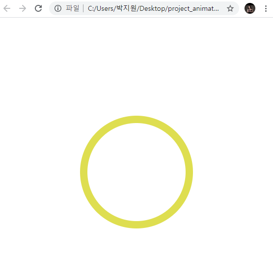
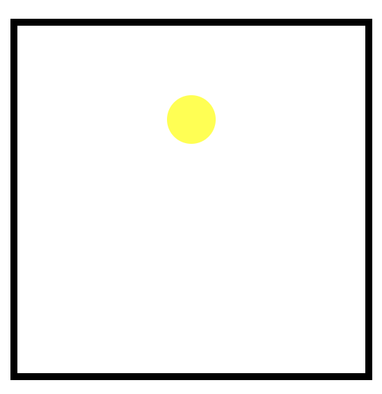
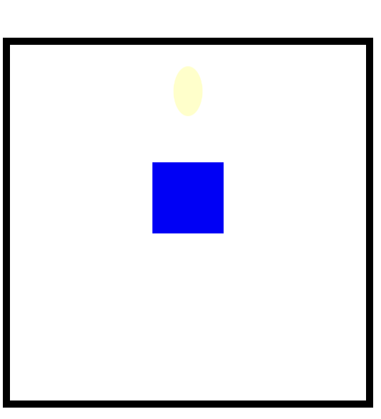
.animation {
width: 300px;
height: 300px;
background-color: yellow;
animation-name: changeWidth;
animation-duration: 3s;
animation-timing-function: linear;
animation-delay: 1s;
animation-iteration-count: 6; <<반복횟수 (왔다갔다 : 3회) / infinie쓰면 무한대
animation-direction:alternate; << 반복효과
}
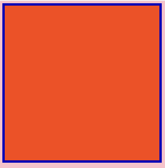
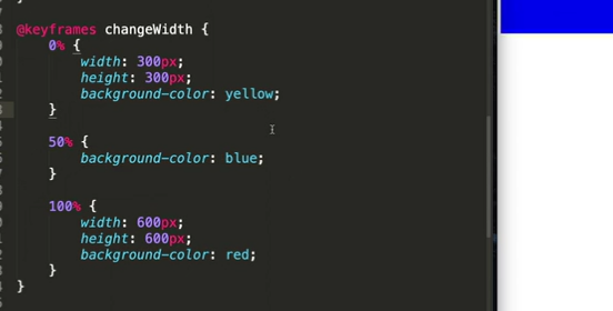
@keyframes changeWidth {
from{
width: 300px;
}
to {
width: 600px;
}
}@keyframes changeWidth {
from{
width: 300px;
height: 300px;
background-color: yellow;
}
to {
width: 600px;
height: 600px;
background-color: red;
}
}: yellow로 커지기 시작해서 red로 끝나고 돌아옴,,


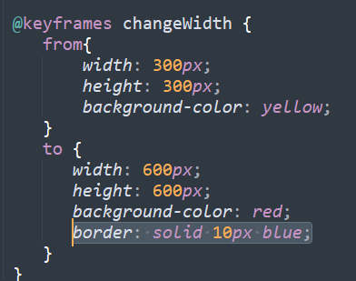
border가 to 영역에서 등장
숫자를 사용해서도 애니메이션의 시작과 끝을 표현 가능
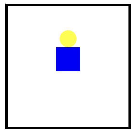
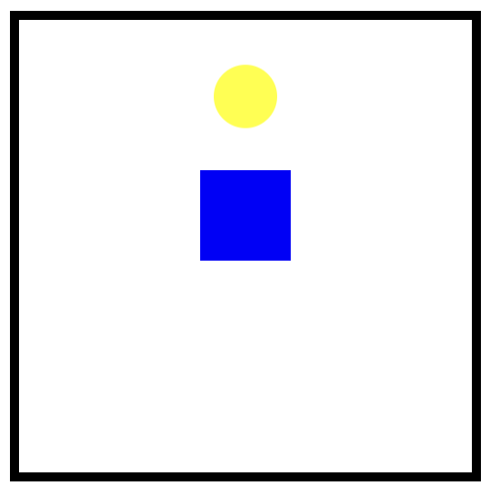
<div class="spin-lion"></div>
</body>
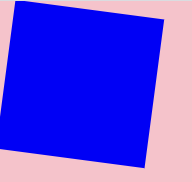
</html>.spin-lion {
width: 150px;
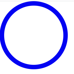
height: 150px;
background-color: blue;
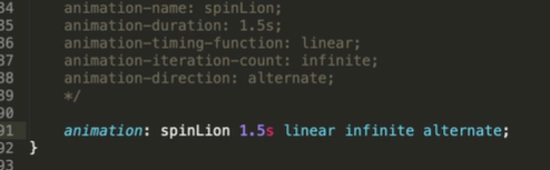
animation-name: spinLion;
animation-duration: 1.5s; <<<<<<< 1000ms 1초, 1500ms 1.5초=1.5s
animation-timing-function: linear;
animation-iteration-count: infinite;
animation-direction: alternate;
}
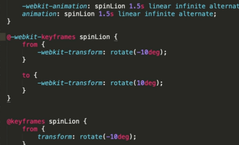
@keyframes spinLion {
from{
transform: rotate(-10deg);
}
to{
transform: rotate(10deg);
}
}
from{transform: rotate(-10deg);}
to{transform: rotate(10deg);
: 총 20도의 각도를 자체 회전
주의점)
- 숫자로도 가능
-
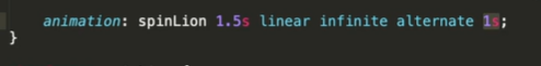
다음과 같이 숫자 1.5s 1s 일 때 먼저 나오는 숫자가 항상 duration, 그 다음이 delay , 숫자가 하나 있을 때는 dutation
-
webkit 사용시 webkt에 맞는 keyframes 등...
각각에 맞는 keyframes를 적용해줘야 한다.
참고 사이트 / stylie 애니메이션 만드는 온라인 툴
jeremyckahn.github.io/stylie/
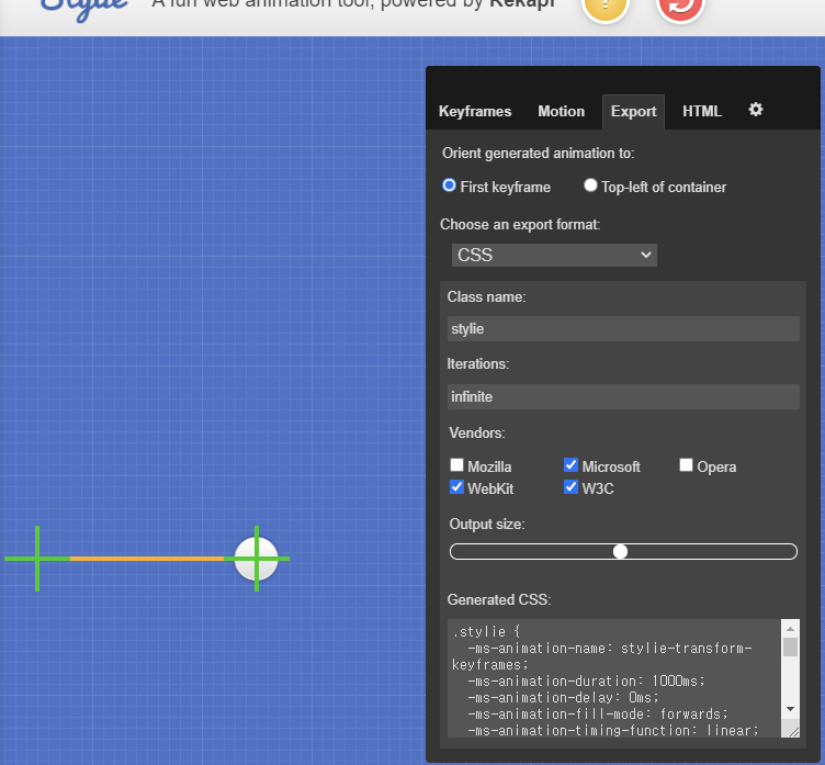
w3c는 디폴트로 넣어줘야 함! output size 복붙
실무에서 활용할 수 있는 애니메이션 구현
<!DOCTYPE html>
<html>
<head>
<meta charset="utf-8">
<link rel="stylesheet" type="text/css"
href="css/style.css">
</head>
<body>
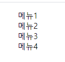
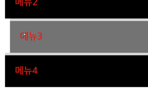
<nav class="mouse-animation">
<ul>
<li><a href="#">메뉴1</a></li>
<li><a href="#">메뉴2</a></li>
<li><a href="#">메뉴3</a></li>
<li><a href="#">메뉴4</a></li>
</ul>
</nav>
</body>
</html>html, body {
margin: 0;
padding: 0;
}
ul {
list-style: none;
}
a{
text-decoration: none;
color: #000000;
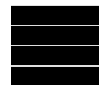
}- 메뉴버튼 생성
- border 들어가있는 버튼 생성
.mouse-animation li {
	width: 250px;
	background-color: #000000;
	padding: 20px;

	border-top: solid 5px #dfdfdf;
}
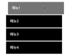
- 1. 메뉴버튼 효과/ 자연스럽게 효과
1) 반투명으로 글자 및 애니메이션
.mouse-animation li {
	width: 250px;
	background-color: #000000;
	padding: 20px;

	border-top: solid 5px #dfdfdf;
}


.mouse-animation li:hover {  <<<마우스 올렸을 때 투명도 적용 <<<<<<
	opacity: 0.5;            <<<<<<< 1은 안투명, 0.5는 반투명
	margin-left: 10px;
}


.mouse-animation li a {
	color: #ffffff;
	font-size: 20px;
}
2) 자연스럽게 움직이는 효과 (나 이거 좋아)
.mouse-animation li {
	width: 250px;
	background-color: #000000;
	padding: 20px;

	border-top: solid 5px #dfdfdf;
	transition:  opacity 0.2s, margin-left 0.5s; <<<<  자연스러운효과 나 이거 맘에 들엉!! <<<<<<
}


.mouse-animation li:hover {
	opacity: 0.5;
	margin-left: 10px;
}


.mouse-animation li a {
	color: #ffffff;
	font-size: 20px;
}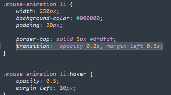
맘에 드니까 한번 더 >.<...!!...
단, opacity는 메뉴버튼 안 글자까지 투명/반투명 영향.
버튼 배경만 바꾸고 싶을 때는 rgba 코드 로 속성 지정
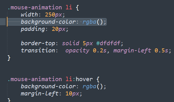
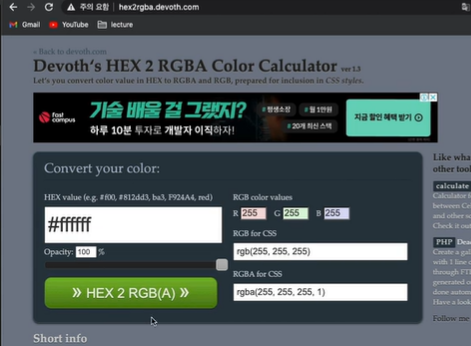
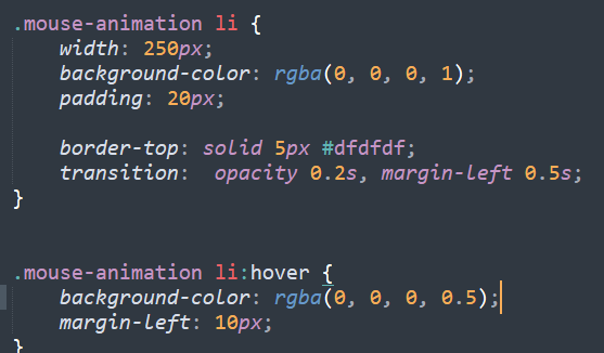
rgba(0, 0, 0, 1); 에서 마지막 숫자 1은, 투명도를 의미(완벽히 보이는 상태)
참고 : #000000 = rgba(0, 0, 0, 1) 의 색상은 검정색
위와 같이 버튼 배경만 투명해지고, 글자는 불투명하게 설정 가능!
- 2. 박스가 움직일때마다 색상과 형태가 바뀌는 애니메이션
<div class="move-box"></div>
</body>
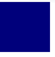
</html>.move-box {
position: relative;
width: 200px;
height: 200px;
background-color: navy;
}
자동 색상 변화 효과 (무한)
<div class="move-box"></div>


</body>
</html>
.move-box {
position: relative;
width: 200px;
height: 200px;
background-color: navy;
animation-name: moveBox;
animation-duration: 4s;
animation-timing-function: linear;
animation-delay: 1s;
animation-iteration-count: infinite;
animation-direction: alternate;
}
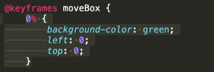
@keyframes moveBox {
0% {
background-color: red;
}
25% {
background-color: yellow;
}
50% {
background-color: gray;
}
75% {
background-color: blue;
}
100% {
background-color: red;
}
}자동색상 변화 상태에서 자동으로 움직이는 효과
.move-box {
	position: relative;
	width: 200px;
	height: 200px;
	background-color: navy;

	animation-name: moveBox;
	animation-duration: 4s;
	animation-timing-function: linear;
	animation-delay: 1s;
	animation-iteration-count: infinite;
	animation-direction: alternate;
}

@keyframes moveBox {
    0% {
       background-color: red;
       left: 0;
       top: 0;
    }
    25% {
       background-color: yellow;
       left: 500px;
       top: 0px;
    }
    50% {
       background-color: gray;
       left: 500px;
       top :500px;
    }
    75% {
       background-color: blue;
       left: 0px;
       top: 500px;
    }
    100% {
       background-color: red;
       left: 0;
       top: 0;
    }
}
원형효과 추가
    50% {
       background-color: gray;
       left: 500px;
       top :500px;
border-radius: 50%; <<<<<<< 50% !!! 추가 <<<<<- 애니메이션에서 사용할 수 있는 추가 속성
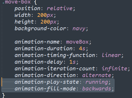
1) animation-play-state
- running; // 브라우저에 접속할 때 바로 동작 시키겠다는 의미
- pused; // 동작을 멈추겠다는 의미
2) animation-fill-mode
- backwards; // 최초 0%에 입력된 기준에 의해서 최초 화면을 사용자에게 보여주겠다.
위의 0%에 지정된 속성값을 가지고 최초 상태를 표현해 준다! 자주사용됨
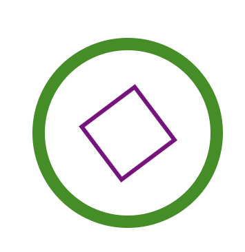
- 3. 원형의 크기가 바뀌면서 원형안의 네모난 박스의 크기로
시간이 지나면서 변화하는 효과
<div class="outer-border">
	<div class="inner-border"></div>

</div>

</body>
</html>
.outer-border {
display: flex;
width: 200px;
height: 200px;
border: solid 15px red;
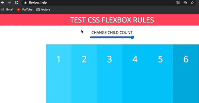
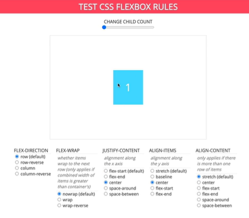
}참고사이트 flexbox.help
<div class="outer-border">
	<div class="inner-border"></div>

</div>


</body>
</html>
.outer-border {
display: flex;
justify-content: center;
align-items: center;
width: 200px;
height: 200px;
border: solid 15px red;
border-radius: 50%;
animation: outerBorder 2s infinite;
}
@keyframes outerBorder {
0% { border-color: red; }
25% { border-color: yellow;}
50% { border-color: blue }
75% {border-color: green;}
100% {border-color:pink;}
}
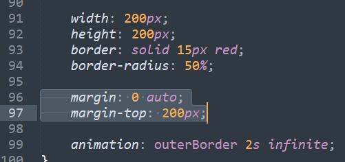
중앙 정렬
/ margin: 0 auto; // 0상하 auto 좌우
margin-top: 200px; 윗쪽부분 공간
커졌다 작아졌다하면서 색상 변화하는 효과
@keyframes outerBorder {
	0% { border-color: red; transform: scale(1);}
	25% { border-color: yellow;transform: scale(1.2)}
	50% { border-color: blue transform: scale(1.3)}
	75% {border-color: green;transform: scale(1.2)}
	100% {border-color:pinktransform: scale(1);}
}
ex) 키즈가오에서 커졌다 작아졌다하는 별 구름 효과에서 적용 가능

커졌다 작아졌다 하는 원 안에 사각형 넣기
.inner-border {
	width: 75px;
	height: 75px;
	border: 5px solid purple;
}
원의 수축과 확장에 따라 사각형도 함께 움직임
: scale은 scale을 적용한 영역과 자식영역까지 영향을 미친다.
이 상태에서 박스가 회전하는 효과 + 회전할때마다 border 테두리가 달라지는 기능
.inner-border { <<<<< 위에서 outer-border 사용해서 inner <<<
width: 75px;
height: 75px;
border: 5px solid purple;
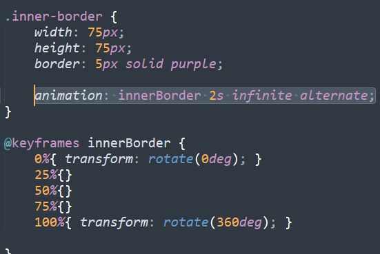
animation: innerBorder 2s infinite;
}
@keyframes innerBorder {
0%{ transform: rotate(0deg); } <<< 평면회전 <<<
0%{}
0%{}
0%{ transform: rotate(360deg); }
}
(신기.......................)
여기서 조금 더 역동적으로
회전을 했다가 역회전하는 기능..............(신기)
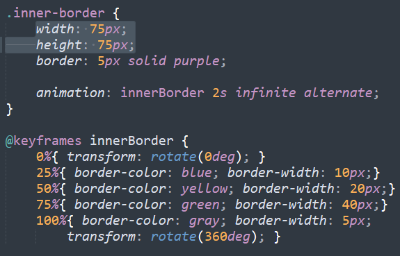
위 처럼 animation: innerBorder 2s infinite alternate; 추가
border 크기와 색깔 변경 : 회전하면서 원 안쪽 사각형 크기 및 굵기 변화
.inner-border {
	width: 75px;
	height: 75px;
	border: 5px solid purple;

	animation: innerBorder 2s infinite alternate;
}

@keyframes innerBorder {
	0%{ transform: rotate(0deg); }
	25%{ border-color: blue; border-width: 10px;}
 	50%{ border-color: yellow; border-width: 20px;}
 	75%{ border-color: green; border-width: 40px;}
 	100%{ border-color: gray; border-width: 5px;
 		transform: rotate(360deg); }

}
원보다 사각형이 조금 더 튀어나오는 것 수정 (아래의 width, height 75 안에 넣고 싶다.)
이럴 때, box-sizing: border-box; 사용. 원래 만들어진 width, height 75에 의해서
border가 안쪽으로 형성되는 것
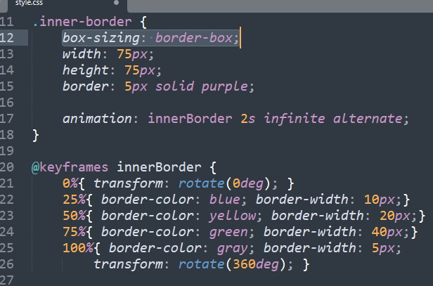
이렇게, 안쪽 생성

- 실습 내용 :
outer-border에서 바깥쪽 border 애니메이션 설정,
inner-border에서 안쪽 border 굵기 변화 애니메이션
둘다 공통 색상변화 하는 효과 및 회전효과
- 4) 슈퍼마리오 동전 효과
<div class="mario-container">
	<div class="mario-coin"></div>
    <div class="mario-box"></div>
</div>


</body>
</html>
.mario-container {
width: 500px;
height: 500px;
border: solid 10px black;
margin: 0 auto;
margin-top: 200px;
}
.mario-container {
    position: relative;
	width: 500px;
	height: 500px;
	border: solid 10px black;

	margin: 0 auto;
	margin-top: 200px;
}

.mario-container .mario-coin {
	position: relative;
	width: 70px;
	height: 70px;
	background-color: yellow;

}
.mario-container .mario-coin{
	position: relative;
	width: 70px;
	height: 70px;
	background-color: yellow;
	border-radius: 50%;

	margin: 0 auto;
	margin-top: 100px;
}
.mario-container .mario-box {
	width: 100px;
	height: 100px;
	background-color: blue;

	margin: 0 auto;  <<<< 파란색 박스 가운데 정렬
}
이상태에서 박스가 위 아래 움직이는 효과
@keyframes jumpBox {
	0% { transform: translateY(0px); }
	50% {transform: translateY(-10px)}
	100% {transform: translateY(0px)}
}
동전도 따라서 움직이는 효과
.mario-container .mario-coin{
	position: relative;
	width: 70px;
	height: 70px;
	background-color: yellow;
	border-radius: 50%;

	margin: 0 auto;
	margin-top: 100px;

	animation: jumpCoin 0.8s linear infinite alternate ;
}


@keyframes jumpCoin {
	0%{
transform: translateY(0);
	}
	50%{
transform: translateY(-100px);
	}
	100%{
transform: translateY(0);
	}
}
.mario-container .mario-coin{
	position: relative;
	width: 70px;
	height: 70px;
	background-color: yellow;
	border-radius: 50%;

	margin: 0 auto;
	margin-top: 100px;

	animation: jumpCoin 0.8s linear infinite ; <<<< infinite는 계속 올라갔다 내려왔다
}


@keyframes jumpCoin {
	0%{
transform: translateY(0);
opacity: 1;
	}
	50%{
transform: translateY(-100px);
opacity: 0;
	}
	100%{
transform: translateY(-100px);
opacity: 0;

	}
}
코인효과처럼 적용
.mario-container .mario-box {
	width: 100px;
	height: 100px;
	background-color: blue;

	margin: 0 auto;

	animation: jumpBox 0.5s linear infinite alternate; <<<<여기 수정
}


@keyframes jumpBox {
	0% { transform: translateY(0px); }
	50% {transform: translateY(-10px)}  <<수정
	100% {transform: translateY(0px)}   <<수정
}
@keyframes jumpCoin {
0%{
transform: translateY(0);
opacity: 1;
}
50%{
transform: translateY(-100px) rotateY(180deg);
opacity: 0;
}
100%{
transform: translateY(-100px) rotate(360deg);
opacity: 0;
}
}
}
이미지 영역에 마우스 올렸을 때 이미지 확대되는 효과
<div class="hover-image">
	<img src="https://previews.123rf.com/images/supathral/supathral1505/supathral150500110/40825048-%EB%B0%94%EB%8B%A4-%EB%B0%B0%EA%B2%BD-%ED%85%8D%EC%8A%A4%EC%B2%98.jpg">  <<<<google에서 png 검색 해서 이미지 링크복사로 가져옴

	<div class="image-info"></div>
	<h2>Title</h2>
	<p>Paragragh</p>
</div>

</body>
</html>
.hover-image {
width: 400px;
border: solid 10px #000000 ;
}
.hover-image img {
width: 100%;
vertical-align: middle;
}
.hover-image .image-info {
background-color: rgba(0, 0, 0, 0.5);
padding: 20px;
}
.hover-image .image-info h2,
.hover-image .image-info p{
margin: 0;
padding: 0;
color: #ffffff;
}
.hover-image .image-info h2 {
font-size: 20px;
}
.hover-image .image-info p {
font-size: 15px;
}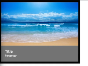
이미지 위에 글자정보 올리기
.hover-image {
	position: relative;
	width: 400px;
	border: solid 10px #000000 ;
}


.hover-image img {

	width: 100%;
	vertical-align: middle;

}
.hover-image .image-info {
	box-sizing: border-box;
    position: absolute;
    width: 100%;

	background-color: rgba(0, 0, 0, 0.5);
	padding: 20px;

	left: 0;
	bottom: 0;
}
.hover-image .image-info h2,
.hover-image .image-info p{
	margin: 0;
	padding: 0;
	color: #ffffff;
}

.hover-image .image-info h2 {
	font-size: 20px;
}
.hover-image .image-info p {
	font-size: 15px;
}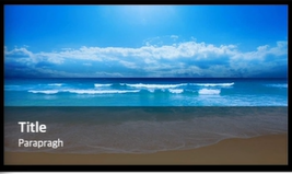
(짠)
그리고 마우스 올리면
.hover-image {
	position: relative;
	width: 400px;
	border: solid 10px #000000 ;
}


.hover-image img {

	width: 100%;
	vertical-align: middle;
}

.hover-image:hover img {
	transform: scale(1.3);
}


.hover-image .image-info {
	box-sizing: border-box;
    position: absolute;
    width: 100%;

	background-color: rgba(0, 0, 0, 0.5);
	padding: 20px;

	left: 0;
	bottom: 0;
}
.hover-image .image-info h2,
.hover-image .image-info p{
	margin: 0;
	padding: 0;
	color: #ffffff;
}

.hover-image .image-info h2 {
	font-size: 20px;
}
.hover-image .image-info p {
	font-size: 15px;
}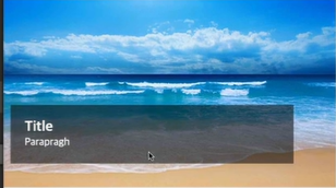
( ㅋ ㅓ ㅈ ㅕ)
여기서, 자연스럽게 커지고 싶으면!
.hover-image {
	position: relative;
	width: 400px;
	border: solid 10px #000000 ;
}


.hover-image img {

	width: 100%;
	vertical-align: middle;
	transition: transform 1s linear;
}

.hover-image:hover img {
	transform: scale(1.3);
}


.hover-image .image-info {
	box-sizing: border-box;
    position: absolute;
    width: 100%;

	background-color: rgba(0, 0, 0, 0.5);
	padding: 20px;

	left: 0;
	bottom: 0;
}
.hover-image .image-info h2,
.hover-image .image-info p{
	margin: 0;
	padding: 0;
	color: #ffffff;
}

.hover-image .image-info h2 {
	font-size: 20px;
}
.hover-image .image-info p {
	font-size: 15px;
}
위 코드로 입력하면 영역 밖으로 이미지 튀어나가는데
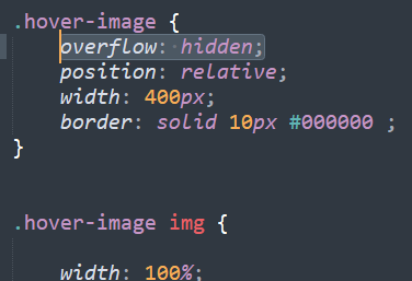
.hover-image {
	overflow: hidden;  <<<<<< 추가하면 <<<<<<<
	position: relative;
	width: 400px;
	border: solid 10px #000000 ;
}


.hover-image img {

	width: 100%;
	vertical-align: middle;
	transition: transform 1s linear;
}

.hover-image:hover img {
	transform: scale(1.3);
}


.hover-image .image-info {
	box-sizing: border-box;
    position: absolute;
    width: 100%;

	background-color: rgba(0, 0, 0, 0.5);
	padding: 20px;

	left: 0;
	bottom: 0;
}
.hover-image .image-info h2,
.hover-image .image-info p{
	margin: 0;
	padding: 0;
	color: #ffffff;
}

.hover-image .image-info h2 {
	font-size: 20px;
}
.hover-image .image-info p {
	font-size: 15px;
}
영역 내에서 이미지가 커짐.!
특정 영역을 벗어났을 때 감춤효과!
overflow 기억!
- 마우스 올렸을 때 손가락 모양으로 바뀌는 효과
cursor: pointer;
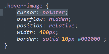
.hover-image {
	cursor: pointer;
	overflow: hidden;
	position: relative;
	width: 400px;
	border: solid 10px #000000 ;
}


.hover-image img {

	width: 100%;
	vertical-align: middle;
	transition: transform 1s linear;
}

.hover-image:hover img {
	transform: scale(1.3);
}


.hover-image .image-info {
	box-sizing: border-box;
    position: absolute;
    width: 100%;

	background-color: rgba(0, 0, 0, 0.5);
	padding: 20px;

	left: 0;
	bottom: 0;
}
.hover-image .image-info h2,
.hover-image .image-info p{
	margin: 0;
	padding: 0;
	color: #ffffff;
}

.hover-image .image-info h2 {
	font-size: 20px;
}
.hover-image .image-info p {
	font-size: 15px;
}
하단 정보가 사라지고 자연스럽게 구현, 프레임 내에서 사진 확대되는 효과
<div class="hover-image">
	<img src="https://previews.123rf.com/images/supathral/supathral1505/supathral150500110/40825048-%EB%B0%94%EB%8B%A4-%EB%B0%B0%EA%B2%BD-%ED%85%8D%EC%8A%A4%EC%B2%98.jpg">

	<div class="image-info"></div>
	<h2>Title</h2>
	<p>Paragragh</p>
</div>

</body>
</html>
.hover-image {
cursor: pointer;
overflow: hidden;
position: relative;
width: 400px;
border: solid 10px #000000 ;
}
.hover-image img {
width: 100%;
vertical-align: middle;
transition: transform 0.3s linear;
}
.hover-image:hover img {
transform: scale(1.3);
}
.hover-image .image-info {
box-sizing: border-box;
position: absolute;
width: 100%;
background-color: rgba(0, 0, 0, 0.5);
padding: 20px;
left: 0;
bottom: -85;
transition: bottom 0.3s linear;
}
.hover-image:hover .image-info {
bottom: 0;
}
.hover-image .image-info h2,
.hover-image .image-info p{
margin: 0;
padding: 0;
color: #ffffff;
}
.hover-image .image-info h2 {
font-size: 20px;
}
.hover-image .image-info p {
font-size: 15px;
}
July, 7
속도가 점점 빨라진다. 오타에 주의하자. 분량이 많아서 걱정했는데 그동안 배웠던 것들을
꾸준히 사용해보니 익숙해져가고 있는 것 같아서 뿌우듯하다. 3차원 2차원, 부모자식관계에 대한 이해도는 조금 더 신경 써야할 것 같다.
