📌 학습한 내용
Helbak 덴마크 쇼핑몰 실습
<head> 작업
<!DOCTYPE html>
<html>
<head>
	<meta charset="utf-8">
	<meta name="viewport" content="width=device-width, initial-scale=1.0">

	<meta name="description" content="덴마크 쇼핑몰 카피캐 연습">
	<meta name="author" content="정지윤">
	<meta name="keywords" content="html, css, tutorial">
	<!-- 구글 검색 엔진에 걸릴 수 있도록 하는 작업 -->

	<title>Helbak</title>

	<link rel="stylesheet" type="text/css" href="css/style.css">
</head>
초기화 작업
* {
	margin: 0;
	padding: 0;

	box-sizing: border-box;
}

html, body {
	width: 100%;
	height: 100%;
    /* 웹사이트 제작시 디폴트 값으로 넣어주면 좋음 */
}

body {
	overflow-x: hidden;

	font-family: sans-serif;
	color: #585858;
}

h1, h2, h3, h4, h5, h6, p {
	font-weight: 400;
    /* 폰트 굵기는 100단위로 올라감 100 ~ 900 */
}

li {
	list-style: none;
}

a {
	text-decoration: none;
}

img	{
	vertical-align: middle;
    /* 이미지 하단의 미세한 공백 제거 */
}

span {
	display: block;
}*: (asterisk) 모든 html 태그<span>: inline 요소
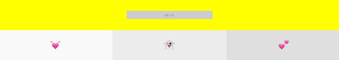
<header> 작업
Mobile.ver
<body>
	<header id="header">
		<h1>
			<a href="#" class="logo">
				<img src="https://via.placeholder.com/186x18">
			</a>
		</h1>

		<nav class="buttons">
			<ul>
				<li>
					<a href="#" class="menu-button">
						<img src="img/heart.png">
					</a>
				</li>
				<li>
					<a href="#" class="menu-button">
						<img src="img/ghost.png">
					</a>
				</li>
				<li>
					<a href="#" class="menu-button">
						<img src="img/two_hearts.png">
					</a>
				</li>
			</ul>
		</nav>
	</header>
</body>
#header h1 {
background-color: #ffffff;
}
#header h1 .logo {
position: relative;
display: block;
width: 100%;
height: 65px;
background-color: yellow;
}
#header .logo img {
position: absolute;
top: 0;
margin-top: 23px;
left: 50%;
margin-left: -93px;
}
#header .buttons ul {
overflow: hidden;
}
#header .buttons li {
position: relative;
float: left;
width: 33.3333%;
height: 65px;
}
#header .buttons .menu-button {
display: block;
width: 100%;
height: 100%;
text-align: center;
}
#header .buttons li:nth-child(1) .menu-button {
background-color: #f9f9f9;
}
#header .buttons li:nth-child(2) .menu-button {
background-color: #ececec;
}
#header .buttons li:nth-child(3) .menu-button {
background-color: #dfdfdf;
}
#header .buttons li .menu-button img {
position: relative; /* top을 사용하기 위해 */
height: 20px;
width: 22px;
/* y축 정중앙정렬 공식*/
top: 50%;
transform: translateY(-50%);
}<img>: inline-block 요소
->text-align: center;적용 가능<a>: inline 요소
👉 <y축 중앙정렬 공식>
top: 50%;
transform: translateY(-50%);PC.ver

@media (min-width: 47em) {
	/* 1em = 16px */
	#header {
		position: fixed;
		width: 100%;
		height: 80px;

		top: 0;
		left: 0;

		z-index: 99999;
	}

	#header h1 {
		width: 50%;
	}

	#header h1 .logo {
		width: 280px;
		height: 80px; /* 모바일에서는 터치할 수 있는 부분이 협소하기 때문에 늘려줌 */
	}

	#header	.logo img {
		margin-top: 30px;
	}

	#header .buttons {
		position: absolute;
		width: 50%;   /* width 50%를 기준으로 33.33%가 적용됨 */
		/* position: absolute;를 사용하면 width값을 정확하게 인식하지 못함 */

		left: 50%;
		top: 0;
	}

	#header .buttons li {
		height: 80px;
	}
}
👉 position: absolute;를 사용하면 width값을 정확하게 인식하지 못함.
-> width 값을 함께 지정해주어야 함.
<main> 영역
Mobile.ver
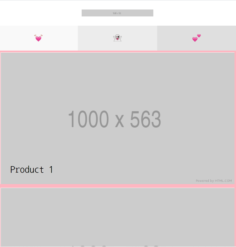
<main role="main" class="main-content">
	<ul class="product-group">
		<li>
			<a href="#" class="product-group-link">
				<article>
					<h2 class="link-text">Product 1</h2>
					<img src="https://via.placeholder.com/1000x563">
				</article>
			</a>
		</li>
		<li>
			<a href="#" class="product-group-link">
				<article>
					<h2 class="link-text">Product 2</h2>
					<img src="https://via.placeholder.com/1000x563">
				</article>
			</a>
		</li>
		<li>
			<a href="#" class="product-group-link">
				<article>
					<h2 class="link-text">Product 3</h2>
					<img src="https://via.placeholder.com/1000x563">
				</article>
			</a>
		</li>
		<li>
			<a href="#" class="product-group-link">
				<article>
					<h2 class="link-text">Product 4</h2>
					<img src="https://via.placeholder.com/1000x563">
				</article>
			</a>
		</li>
		<li>
			<a href="#" class="product-group-link">
				<article>
					<h2 class="link-text">Product 5</h2>
					<img src="https://via.placeholder.com/1000x563">
				</article>
			</a>
		</li>
		<li>
			<a href="#" class="product-group-link">
				<article>
					<h2 class="link-text">Product 6</h2>
					<img src="https://via.placeholder.com/1000x563">
				</article>
			</a>
		</li>
	</ul>
</main>
.main-content .product-group-link {
position: relative;
display: block;
/*float: left;*/ /* 왼쪽에서부터 정렬 */
width: 100%;
height: 56.25%; /* 공간의 크기를 삽입된 이미지의 크기와 거의 유사하게 맞춰줌 */
border: solid 5px lightpink;
overflow: hidden;
}
.main-content .product-group-link img{
width: 100%;
height: 100%;
}
.main-content .product-group .link-text {
position: absolute;
left: 25px;
bottom: 25px;
color: black;
font-size: 25px;
}PC.ver
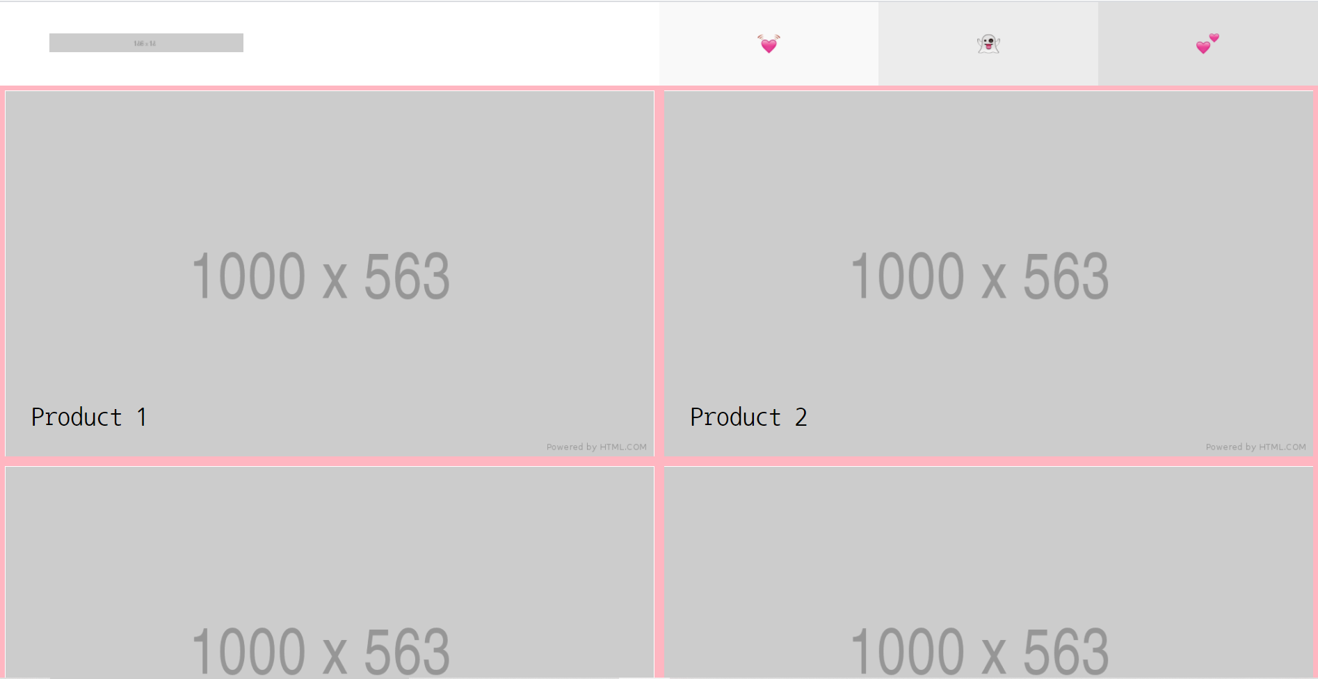
@media (min-width: 47em) {
	.main-content {
		padding-top: 80px;
	}
}

@media	(min-width: 60em) {
	.main-content {
		overflow: hidden;
	}
	.main-content .product-group-link {
		float: left;

		width: 50%;
		height: 28.125%;
		 /* 원래 비율을 유지시키기 위해 모바일 버전에서 작성한 값의 절반 값을 넣어준다 */
	}
}
<footer> 영역
Mobile.ver

<footer id="footer">
	<nav class="left-nav">
		<ul>
			<li><a href="#">Terms and conditions</a></li>
			<li><a href="#">Cookies</a></li>
		</ul>
	</nav>

	<nav class="right-methods">
		<h3>Payment Methods</h3>
		<ul>
			<li><span class="payment-icon one"></span></li>
			<li><span class="payment-icon two"></span></li>
			<li><span class="payment-icon three"></span></li>
			<li><span class="payment-icon four"></span></li>
			<li><span class="payment-icon five"></span></li>
		</ul>
	</nav>

	<a href="#" class="to-top-button"></a>
</footer>class를 여러 개 기입해, 각 class 별로 역할을 구분하면 더 명확하게 html 설계 도면 작업을 진행 가능#footer .right-methods .payment-icon .one
: payment-icon 안에 있는 one이라는 클래스를 선택#footer .right-methods .payment-icon.one
: 여러 개의 payment-icon들 중에서 one이라는 클래스를 가지고 있는 payment-icon을 선택
#footer {
	position: relative;
	background-color: yellow;

	padding-bottom: 66px;    /* to-top-button을 위한 공간을 만들어 준 것 */
}

#footer .left-nav {
	padding-top: 20px;
	text-align: center;
}

#footer .left-nav li {
	padding: 5px 0;
}

#footer	.right-methods {
	text-align: center;

	margin-bottom: 20px;
	margin-top: 30px;
}

#footer .right-methods li {
	display: inline-block;
	padding: 7px 4px;
}

#footer .right-methods .payment-icon {
	display: inline-block;

	width: 30px;
	height: 20px;
}

#footer .right-methods .payment-icon.one {
	background-color: black;
}

#footer .right-methods .payment-icon.two {
	background-color: red;
}

#footer .right-methods .payment-icon.three {
	background-color: pink;
}

#footer .right-methods .payment-icon.four {
	background-color: blue;
}

#footer .right-methods .payment-icon.five {
	background-color: gray;
}

#footer .to-top-button {
	position: absolute;
	display: block;

	width: 66px;
	height: 66px;
	background-color: greenyellow;

	bottom: 0;
	left: 50%;
	margin-left: -33px;
}
PC.ver

@media (min-width: 60em) {
	/*#footer {
    	height: 66px;
     }*/

	#footer .left-nav {
		float: left;

		width: 50%;
		background-color: yellow;
		text-align: left;  /* 왼쪽에서 부터 정렬 */

		padding-top: 32px;
		padding-left: 40px;
	}

	#footer	.right-methods {
		float: right;

		width: 50%;
		background-color: skyblue;

		margin: 0;
		padding-top: 32px;
		padding-right: 40px;

		text-align: right;
	}

	#footer	ul, #footer li, #footer h3 {
		display: inline-block;
		vertical-align: middle;
	}

	#footer .left-nav a {
		font-size: 14px;
		padding: 0 5px;
	}

	#footer	.right-methods li {
		padding: 0 4px;
	}

	#footer h3 {
		padding-right: 10px;
	}
👉 공간에 대한 크기를 미리 지정해놓고 시작할 것.
#footer { height: 66px; }실무 tip
-
하나의 파일 내에서 동일한
id값이 존재할 수 없는 이유
: 둘 이상의 중복된 id 속성값이 존재하면 가장 먼저 나오는 id 속성값만 인식되고, 뒤의 id 속성값은 좌표의 역할을 수행하지 못한다. -
<a href=“ ”>의 속성값으로 url주소, 외부의 다른 html 문서, id 속성값이 들어갈 수 있음
	<li><a href="https://www.naver.com/">one</a></li>
	<li><a href="contacnt.html">two</a></li>
	<li><a href="#three">three</a></li>
<!-- id 속성값의 최상단으로 이동 -->class는<a>에 결합할 수 없음
white-space: nowrap;
: 설정된 공간을 벗어나는 텍스트에 줄바꿈 현상을 없애는 속성 (디폴트 값으로 줄바꿈 현상이 있음, 이 속성을 적용하면 가로 스크롤이 생성되기도 함)
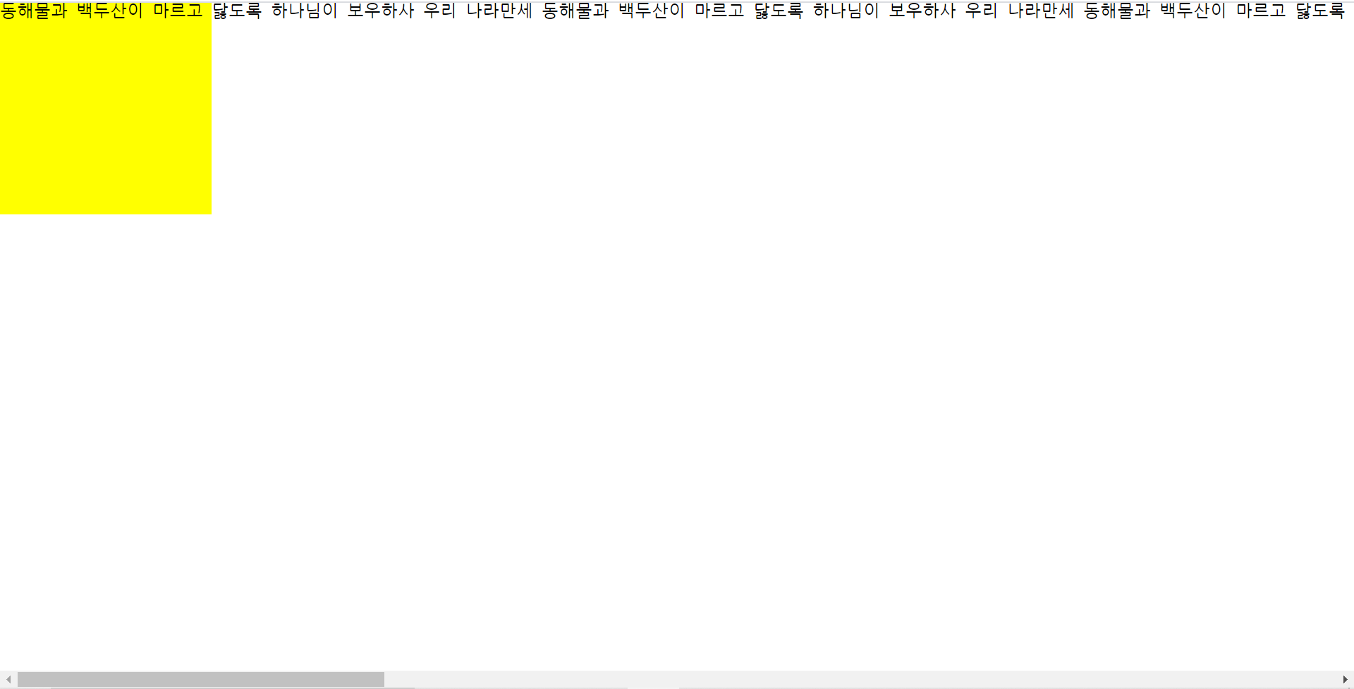
overflow: hidden;
: 설정된 영역을 벗어나는 텍스트를 자름
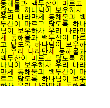
text-overflow: ellipsis;
: 설정된 영역을 벗어나는 텍스트를 말줄임 표시로 표시
- 한 줄 말줄임 표시를 간단하게 설정하는 방법 (코드 간소화) -> 해당 기능을 담당하는 클래스를 csss에서 미리 만들어, html 태그에서 클래스를 적용
.ellipsis {
	white-space: nowrap;
	overflow: hidden;
	text-overflow: ellipsis;
}<h1 class="ellipsis">
동해물과 백두산이 마르고 닳도록 하나님이 보우하사 우리 나라만세
동해물과 백두산이 마르고 닳도록 하나님이 보우하사 우리 나라만세
동해물과 백두산이 마르고 닳도록 하나님이 보우하사 우리 나라만세
</h1>
<h2 class="ellipsis">
동해물과 백두산이 마르고 닳도록 하나님이 보우하사 우리 나라만세
동해물과 백두산이 마르고 닳도록 하나님이 보우하사 우리 나라만세
동해물과 백두산이 마르고 닳도록 하나님이 보우하사 우리 나라만세
</h2>
- 특정 역할만을 담당하는 class를 미리 css에 만들어 두면, html에 삽입만 하면 적용이 됨 -> 배치작업시 유용
.m-b-100 { margin-bottom: 100px; }<h1 class="ellipsis m-b-100">
동해물과 백두산이 마르고 닳도록 하나님이 보우하사 우리 나라만세
동해물과 백두산이 마르고 닳도록 하나님이 보우하사 우리 나라만세
동해물과 백두산이 마르고 닳도록 하나님이 보우하사 우리 나라만세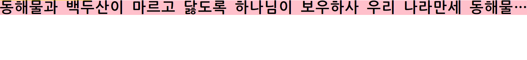
📌 학습내용 중 어려웠던 점
text-overflow: ellipsis;속성은white-space: nowrap;,overflow: hidden;과 무조건 함께 써야 작동하는가?
📌 해결방법
📌 학습소감
Helbak의 PC.ver 헤더영역은 앞에서도 만들어 봤기 때문에 혼자 힘으로 해보려고 했지만, position은 넣는 부분에서 아직까지 어려움이 있었고 시간도 꽤 소모되었다. 또한 placeholder의 이미지가 아닌 내가 원하는 이미지를 삽입하고 싶었는데, 사이즈를 지정하는 데 있어서 문제가 많았다. 각기 다른 사이즈의 사진을 초기값 1000x563으로 적용했다가, 이를 다시 모바일 버전의 100%로 지정하는데 부터 문제가 생겼다. 시간상 바로 기본 이미지로 바꾸어 진행했지만 다시 한번 원하는 이미지로 제작해볼 계획이다. 😵

늘 새로운 배움을 추구하는 개린이 🌱