Visualizing Data
plotly의 그래프 라이브러리는 50개 이상의 차트 타입으로 그래프를 표현할 수 있습니다.
예로, histogram chart를 만들어 보겠습니다.
# Import packages
from dash import Dash, html, dash_table, dcc
import pandas as pd
import plotly.express as px

# Incorporate data
df = pd.read_csv('https://raw.githubusercontent.com/plotly/datasets/master/gapminder2007.csv')

# Initialize the app
app = Dash(__name__)

# App layout
app.layout = html.Div([
    html.Div(children='My First App with Data and a Graph'),
    dash_table.DataTable(data=df.to_dict('records'), page_size=10),
    dcc.Graph(figure=px.histogram(df, x='continent', y='lifeExp', histfunc='avg'))
])

# Run the app
if __name__ == '__main__':
    app.run(debug=True)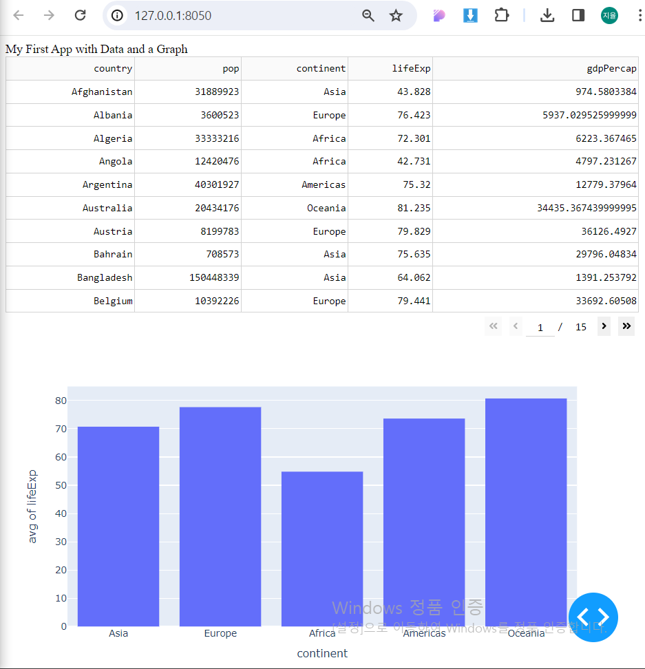
Visualize Data: Code Breakdown
# Import packages
from dash import Dash, html, dash_table, dcc
import pandas as pd
import plotly.express as px
- dcc(dash core components) 모듈은 dcc.Graph라는 요소를 포함하고 그래프와 상호작용할 수 있습니다.
- plotly.express 라이브러리는 상호작용하는 그래프를 만들기 위해 import 합니다.
# App layout
app.layout = html.Div([
    html.Div(children='My First App with Data and a Graph'),
    dash_table.DataTable(data=df.to_dict('records'), page_size=10),
    dcc.Graph(figure=px.histogram(df, x='continent', y='lifeExp', histfunc='avg'))
])
plotly.express 라이브러리로 histogram chart를 만들고 dcc.Graph의 figure 옵션에 등록합니다.
Controls and Callbacks
유저와 상호작용할 수 있는 Dash app을 위해 callback 함수를 사용합니다.
# Import packages
from dash import Dash, html, dash_table, dcc, callback, Output, Input
import pandas as pd
import plotly.express as px

# Incorporate data
df = pd.read_csv('https://raw.githubusercontent.com/plotly/datasets/master/gapminder2007.csv')

# Initialize the app
app = Dash(__name__)

# App layout
app.layout = html.Div([
    html.Div(children='My First App with Data, Graph, and Controls'),
    html.Hr(),
    dcc.RadioItems(options=['pop', 'lifeExp', 'gdpPercap'], value='lifeExp', id='controls-and-radio-item'),
    dash_table.DataTable(data=df.to_dict('records'), page_size=6),
    dcc.Graph(figure={}, id='controls-and-graph')
])

# Add controls to build the interaction
@callback(
    Output(component_id='controls-and-graph', component_property='figure'),
    Input(component_id='controls-and-radio-item', component_property='value')
)
def update_graph(col_chosen):
    fig = px.histogram(df, x='continent', y=col_chosen, histfunc='avg')
    return fig

# Run the app
if __name__ == '__main__':
    app.run(debug=True)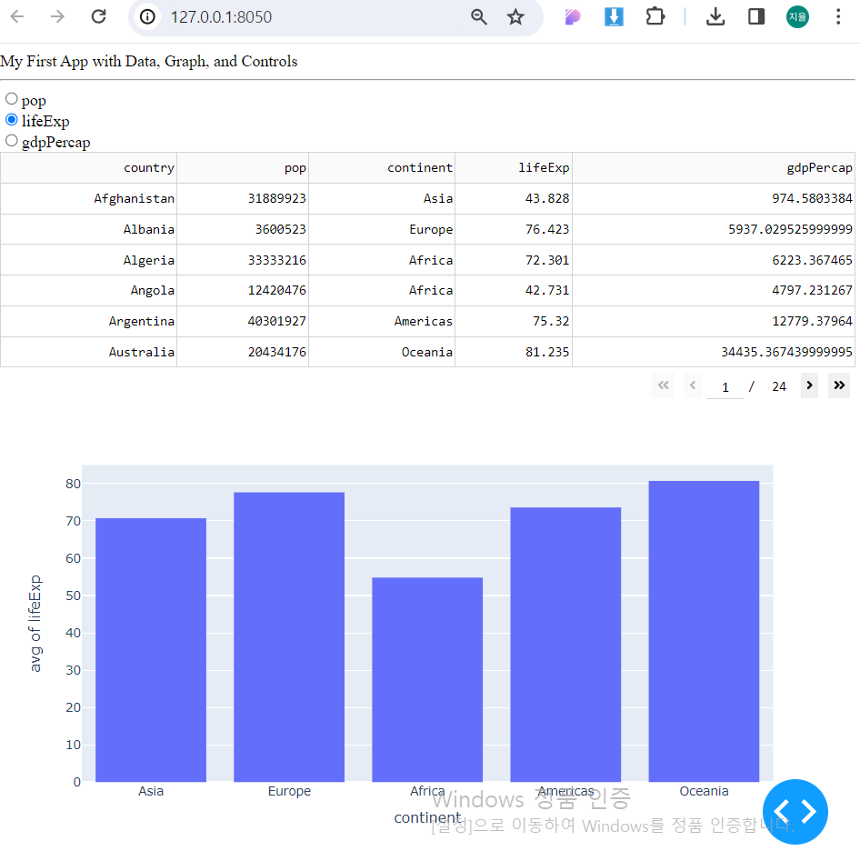
Controls: Code Breakdown
# Import packages
from dash import Dash, html, dash_table, dcc, callback, Output, Input
- 이번에는 radio buttons을 위해 dcc.RadioItems를 활용합니다.
- callback 기능을 위해 callback 모듈을 import하고 변수로 Output과 Input을 사용합니다.
# App layout
app.layout = html.Div([
    html.Div(children='My First App with Data, Graph, and Controls'),
    html.Hr(),
    dcc.RadioItems(options=['pop', 'lifeExp', 'gdpPercap'], value='lifeExp', id='controls-and-radio-item'),
    dash_table.DataTable(data=df.to_dict('records'), page_size=6),
    dcc.Graph(figure={}, id='controls-and-graph')
])
- html.Hr() : 수평 가로선 긋기
- DataTabel 위에 RadioItems를 추가하고 3개의 옵션을 표시합니다. 현재 옵션은 lifeExp와 대응값으로 설정합니다.
- RadioItems와 Graph의 요소들은 id의 이름으로 주어지고 이것은 callback 기능이 요소들을 식별하는데 사용됩니다.
# Add controls to build the interaction
@callback(
    Output(component_id='controls-and-graph', component_property='figure'),
    Input(component_id='controls-and-radio-item', component_property='value')
)
def update_graph(col_chosen):
    fig = px.histogram(df, x='continent', y=col_chosen, histfunc='avg')
    return fig
- callback 함수가 layout 코드에서 id를 Input받고 id에 맞는 요소을 figure 자원으로 Output합니다. (현재 id=lifeExp)
- col_chosen 변수는 Input 받은 id를 참조합니다.
- callback 함수 내에서 histogram이 만들어지는데, 선택된 radio item을 y-axis에 할당하므로 유저가 선택할 때마다 figure이 업데이트됩니다.
- histogram을 figure로 리턴하고 Output을 통해 dcc.Graph의 자원에 할당되고 그래프가 표시됩니다.

Let's take the lead