Python 데이터 시각화
1.Seaborn
Seaborn Matplotlib을 기반으로 고급화된 시각화 기능을 제공하는 패키지 실습 사이트 https://www.kaggle.com/learn/data-visualization Setup 실습에 필요한 라이브러리 import and configure Load the data 파일을 불러올 때, 날짜를 인덱스로 설정 data = pd.readcs...
2.Seaborn - Line Charts
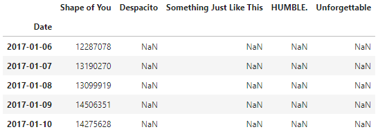
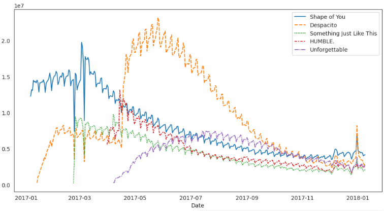
Line charts Set up the notebook Select a dataset the music streaming service 'Spotify' 에서 2017~2018년도의 five popular songs 의 스트림 횟수 데이터 Load the data Examine the data Plot the data 
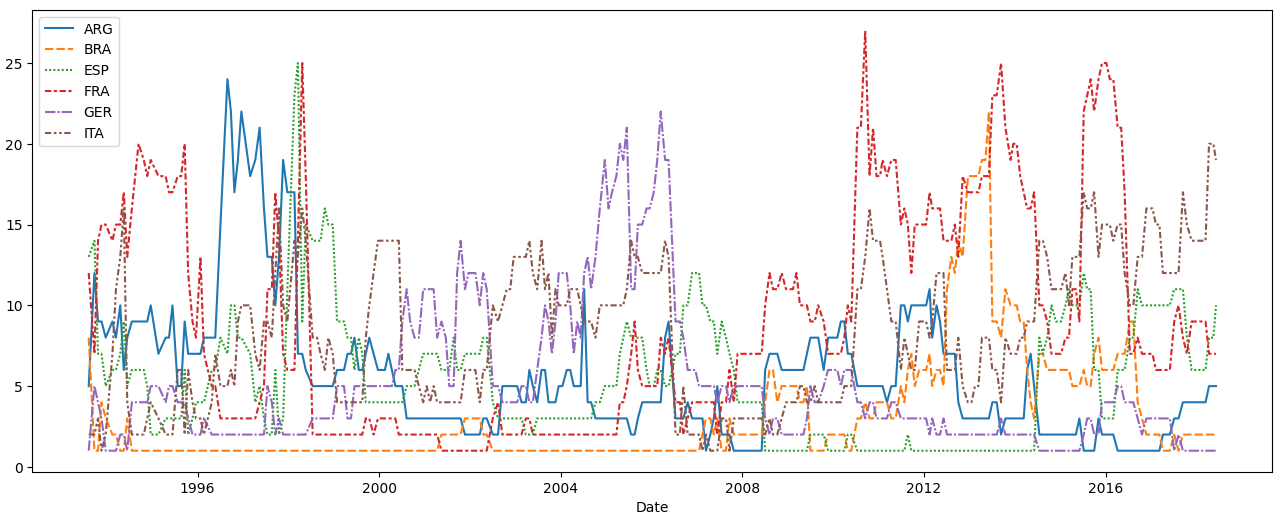
Set up the notebook Select a dataset Dataset from the US Department of Transportation that tracks flight delays. (in minutes) Row for each month in 2015 Column for each airline code. Load the data ...
4.Seaborn - Scatter Plots
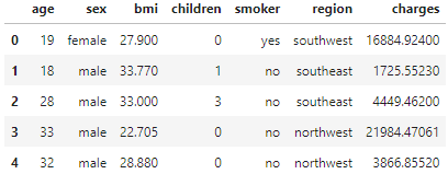
Set up the notebook Load and examine the data Scatter plots To create a simple scatter plot, we use the sns.scatterplot command. BMI and insurance charges are positively correlated, where customers...
5.Seaborn - Distributions
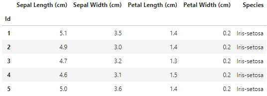
Set up the notebook Select a dataset We'll work with a dataset of 150 different flowers, or 50 each from three different species of iris (Iris setosa, Iris versicolor, and Iris virginica). Load and ...
6.Seaborn - 그래프 타입 고르는 법

그래프 타입 고르는 법 Trends - 경향, 변화의 패턴, 어떤 방향으로, 어떤 흐름으로 가는지 알고 싶을 때 sns.lineplot - Line charts가 시간에 따른 변화를 보여주기에 가장 좋습니다. 그리고 하나의 그룹 이상의 변화를 보여줄때 여러 라인을 사용합니다. Relationship - 데이터를 구성하는 변수들 사이의 관계를 파악하고 ...
7.Seaborn - 그래프 스타일
기본 코드 스타일 지정 sns.set_style("white") sns.set_style("dark") sns.set_style("whitegrid") sns.set_style("darkgrid") 
Dash Dash(plotly) : https://dash.plotly.com/ 가상환경에 dash 설치 아나콘다 프롬프트 실행 conda activate {가상환경이름} pip install dash conda list # 설치 확인 VS Code 가상환경 선택 단축키 : Ctrl + Shift + P -> Python: Select interpre...
9.Dash 기본적인 사용법

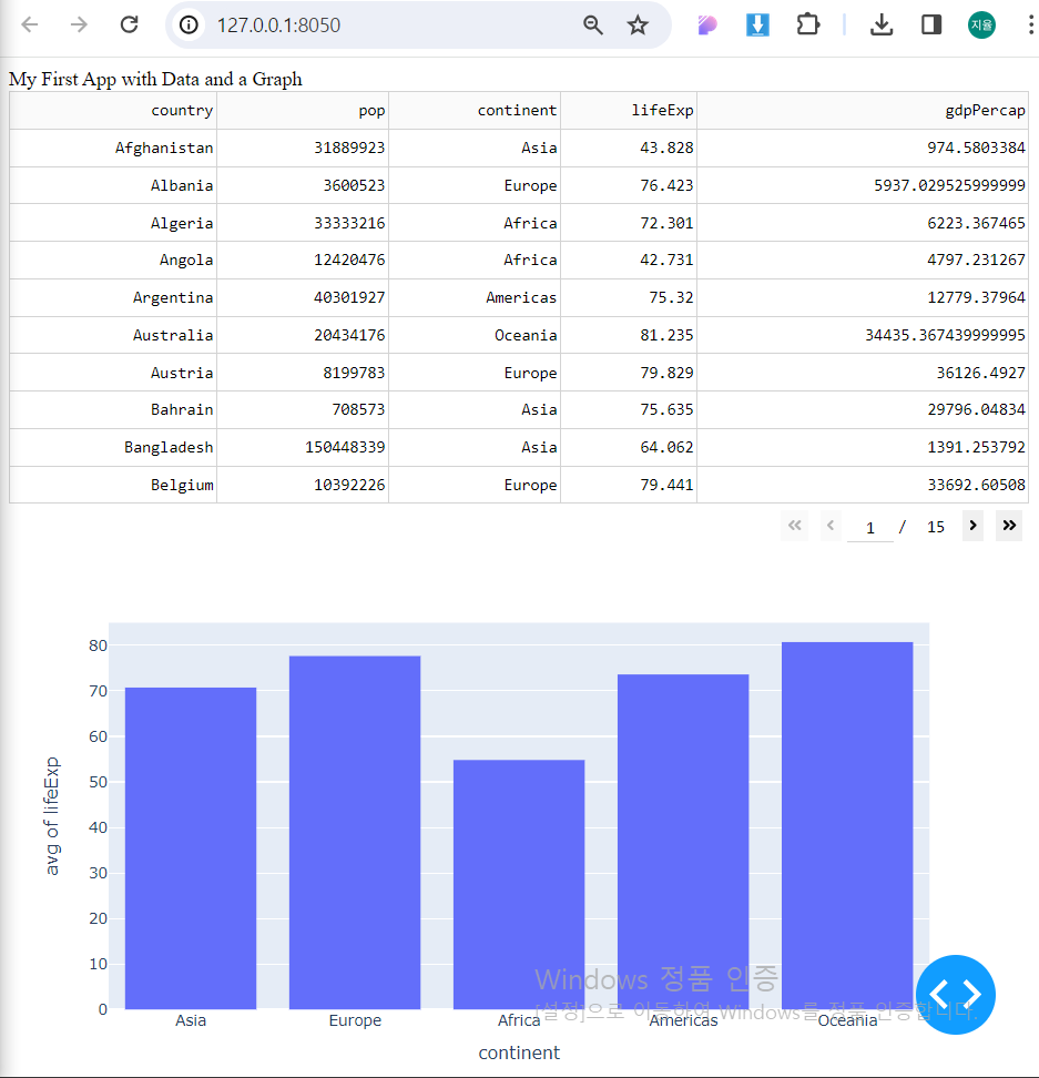
Dash란? Dash는 html을 사용하여 화면을 구성함 html에서 사용하는 태그들을 대부분 활용할 수 있음 Dash()라는 객체를 통해 프로그램이 실행됨 데이터는 pandas의 DataFrame으로 컨트롤함 Hello World 파이썬 IDLE 환경에서 app.py를 만들고 코드를 작성해 실행 http://127.0.0.1:8050 에 접속하면 He...
10.Dash 기본적인 사용법2
Visualizing Data plotly의 그래프 라이브러리는 50개 이상의 차트 타입으로 그래프를 표현할 수 있습니다. 예로, histogram chart를 만들어 보겠습니다. Visualize Data: Code Breakdown >- dcc(dash core components) 모듈은 dcc.Graph라는 요소를 포함하고 그래프와 상호작용할 수...