4. 반응형적용
- 크기 축소 시 레이아웃이 망가짐
- 화면 크기에 맞춰 반응형 적용 추가
1) meta 설정
- 메타 태그 : 웹 사이트 설정 가능
-meta 태그 내 name="viewport" 명시 필요 : 반응형 웹 사이트 제작 가능- content : 모든 크기는 디바이스와 동일하게 가겠다고 설정
- 최소, 최댓값 : 1로 설정
- index.html
    <head>
        <meta charset="UTP-8">
<meta name=""viewport" content="width=device-width, user-scalable=no, initial-scale=1.0, maximum-scale=1.0, minimum-scale=1.0"- style.css
@media screen and (max-width:1000px){
    #header .inner{
        width: 97.5%;
    }

    #main_container .inner{
        width: 93.5%;
    }

	.contents_box{
        display: flex;
        flex-direction: column; /*세로 배치 받도록 함*/
        align-items: center; /*왼쪽으로 치우치는 것 방지*/
    }

    .side_box{
        display: none;
    }
}

@media screen and (max-width:650px){
    #header .search_box{
        display: none;
    }
}- 화면 크기 < 650px : 헤더의 검색창 안보임
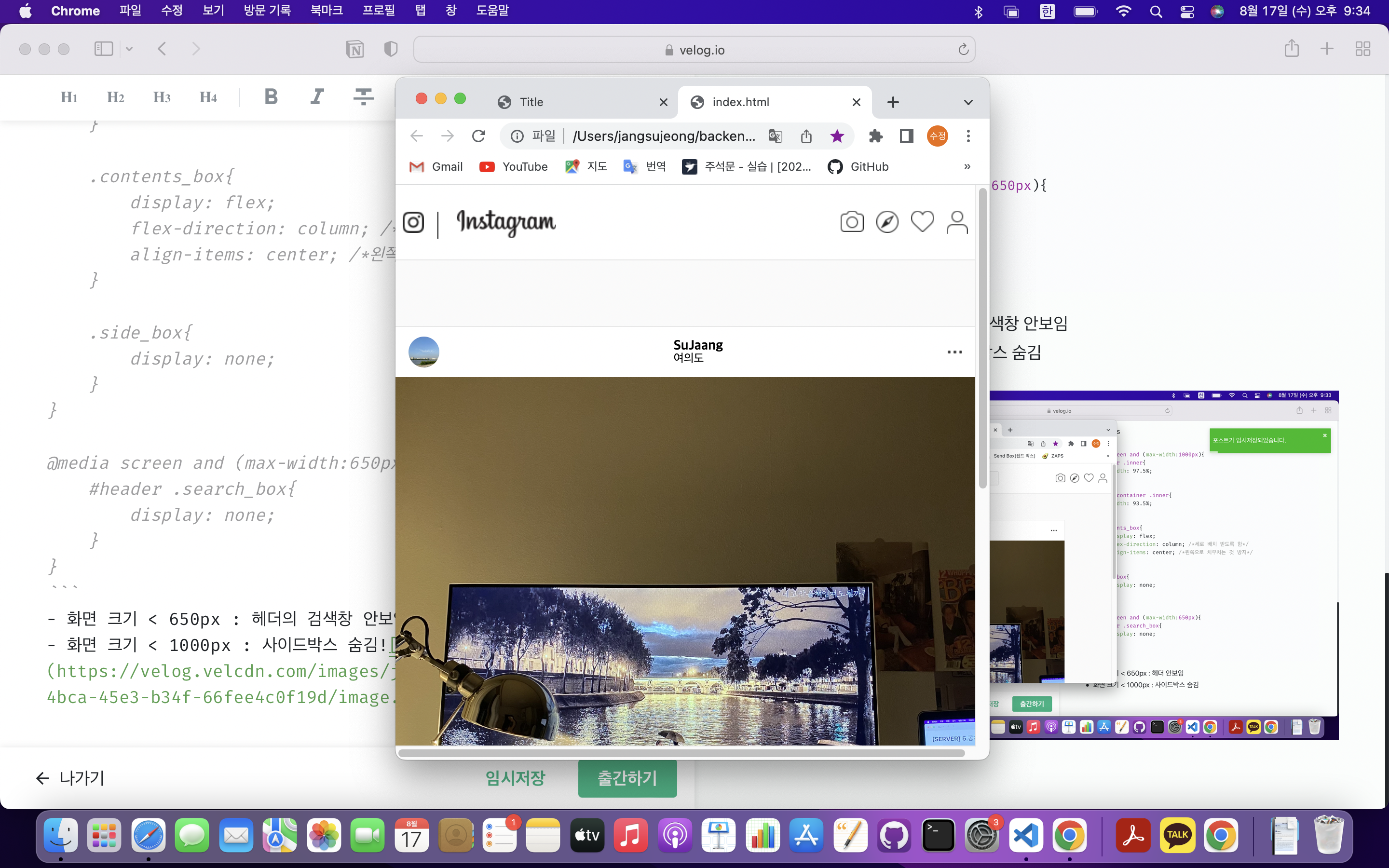
- 화면 크기 < 1000px : 사이드박스 숨김
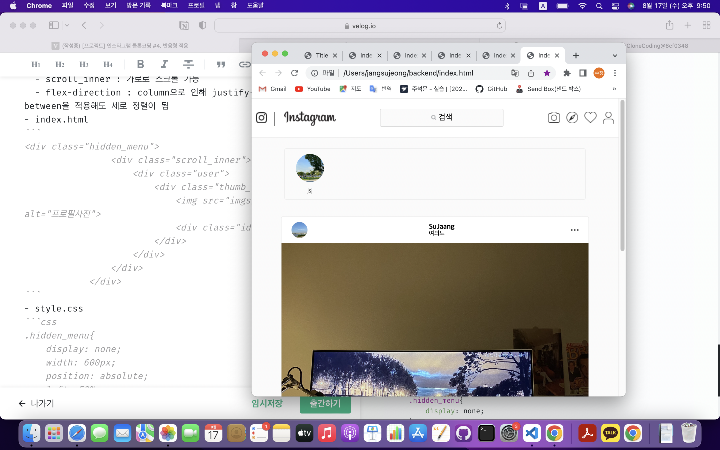
2) 히든메뉴
- header와 main_container 사이 위치
- scroll_inner : 가로로 스크롤 가능
- flex-direction : column으로 인해 justify-content:space-between을 적용해도 세로 정렬이 됨
- index.html
<div class="hidden_menu">
                <div class="scroll_inner">
                    <div class="user">
                        <div class="thumb_img">
                            <img src="imgs/thumb03.jpeg" alt="프로필사진">
                             </div>
                            <div class="id">jsj</div>
                    </div>
                </div>
</div>- style.css
.hidden_menu{
    display: none;
    width: 600px;
    position: absolute;
    left: 50%;
    transform: translateX(-50%);
    top: 100px;
    overflow: hidden;
    border: 1px solid rgba(0, 0, 0, 0.09);
    border-radius: 3px;
}

.hidden_menu .scroll_inner{
    height: 100px;
    width: auto;
    overflow-x: auto;/*항목수 늘어나면 스크롤 자동생성*/
    overflow-y: hidden;
    display: flex;./*가로배치*/
    align-items: center;
    padding: 0 10px;

}

.hidden_menu .scroll_inner .user{
    width: 80px;
    height: 80px;/*높이값은 자식에서 결정*/
    display: flex;
    flex-direction: column;/*세로중앙정렬로 변경*/
    align-items: center;
    margin-right: 15px;
    justify-content: space-between;/*이미지는 위, 아이디는 아래로 설정*/
}

.hidden_menu .scroll_inner .user .id{
    font-size: 12px;
    color:#262626;
}
.hidden_menu .thumb_img{
    width: 56px;
    height: 56px;
    border-radius: 50%;
    overflow: hidden;
}

.hidden_menu .thumb_img img{
    width: 100%;
    height: 100%;
}

@media screen and (max-width:1000px){ /*1000px인 경우*/
    #header .inner{
        width: 97.5%;
    }

    #main_container{
        padding-top : 220px;
    }

    #main_container .inner{
        width: 93.5%;
    }

    .contents_box{
        display: flex;
        flex-direction: column; /*세로 배치 받도록 함*/
        align-items: center; /*왼쪽으로 치우치는 것 방지*/
    }
    .side_box{
        display: none;/*사이드 박스 숨기기*/
    }

    .hidden_menu{
        display: none;
    }
}

@media screen and (max-width:650px){
    #header .search_box{
        display: none;
    }

    .hidden_menu{
        width: 95%;
    }
}

hello world!