One Size Fits All? Definaitely not in task-oriented design for Mobile&Ubiquitous UX
Ubiquitous computing : is a model where each person owns and uses many computers or even where many computers share many users.
Good UX design depends on understanding not just what the users want to do but also the devices that they have available to them
Choosing adaptive or responsive UI strategies with Task-Oriented Design
Task Oriented Design (TAD)
designing system so it can best accommodate the tasks that leed to accomplishing these goals.
The process of breaking down a user's goal into tasks is call Task Analysis
"In responsive design, the content is liquid"
The concept of adaptive design builds on this principle but doesn't only doncern itself with laying out interface elements diffferently.
Designing for users, devices and use context
모바일을 사용할 때랑 데스크톱을 사용할 때랑 둘을 구분해서 봐야한다.
모바일을 이요하게 되면 사용자는 쉽게 방해받을 수 있다. (뉴스를 보다 전철을 타야하는지 등)
사용자가 모바일을 사용하면서 집중하는 시간은 대략 4~8초
Larry Marine 이 말하는 다양한 디바이스에서의 사용
1. Stationary computer
complex task+ spends a lot of time
large interface can fit a lot of information.
ability to use keyboards and mouse - creation and management of large volumes of information are much easier.
2.Tablets
large - informations can be viewd in large volumes like stationary computer
but, not for creating large volumes of information (because there are no keyboards)
3. Smartphones
장치와의 상호작용이 자발적이고 산발적이다 (finding nearest cafes and etc)
Use for short periods of time- to accomplish simple and very focused information
small amout of information can be displayed
also means input is largely frustrating(no virtual keyboard and small interface)
information sequence have to be very short and simple.
4.Internet of Things device (small devices)
works autonomously to make our lives a little more comfortable.
eg. 삼성 홈, 애플 홈키트
Responsive vs Adaptive Design
goals, simpliticty
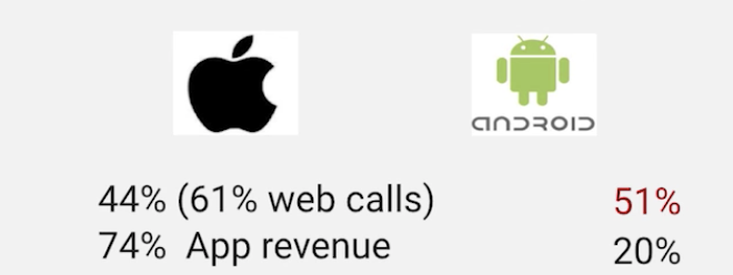
app revenue: 수입
mobile is driver
also jumps in social
Responsive design.
사용자가 사용하는 환경...디바이스에 따라 달라지는 것.
가령, 웹페이지를 폰으로 보면, 앱페이지 처럼 보이는 것.
-default 로 제공해야한다. (왜냐, 모두가 그러고 있거든.)
Adaptive design.
접근성을 높인다
go beyond how user is using in context.
사용자가 사고자하면 더 큰 버튼을 제공하거나,
사용자가 스벅 근처면 스벅 사가라고 알림을 주거나.
사용자의 context 에 따라 유연하게 바뀌는것 또한 adpative design
Behaviors.
adapting to the context of use!
-Creation. how to enhance users experience
Responsive Design - Let the device do the work
The three major principle of Responsive Design
-Fluid Grid System
-Fluid Image Use
-Media Queries
Fluid Grid Systems
960*1280 을 계산을 통해서 각 사이즈로 바꾸는 것.
Fluid Images
Media Queries