HTML
<!DOCTYPE html>
<html>
<head>
<meta charset="UTF-8">
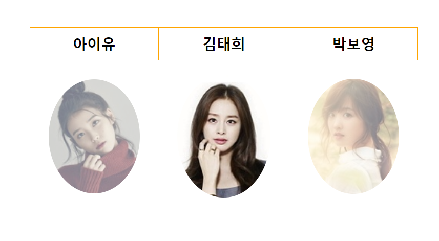
<title>이미지를 테이블속에 넣어주면서 이미지를 둥글게 보여지도록 합니다.</title>
<link rel="stylesheet" href="css/03_image.css">
</head>
<body>
<div id="container">
<table>
<thead>
<tr>
<th>아이유</th>
<th>김태희</th>
<th>박보영</th>
</tr>
</thead>
<tbody>
<tr>
<td><img src="images/iu.jpg"/></td>
<td><img src="images/kimth.jpg"/></td>
<td><img src="images/parkby.jpg"/></td>
</tr>
</tbody>
</table>
</div>
</body>
</html>
CSS
@charset "UTF-8";
div#container {
border: solid 0px gray;
width: 80%;
margin: 4% auto;
}
div#container > table {
border: solid 0px red;
width: 50%;
margin: 0 auto;
border-collapse: collapse;
}
div#container > table th{
border: solid 1px orange;
}
div#container > table th{
height: 40px;
font-size: 14pt;
}
div#container > table th:hover{
background-color: navy;
color:white;
cursor:pointer;
}
div#container > table td{
text-align: center;
height: 200px;
}
div#container > table td > img{
border: solid 0px red;
border-radius: 50%;
opacity: 0.5;
}
div#container > table td > img:hover {
opacity: 1;
}
정리
- ch07_image -> 03_image.html, 03_image.css

