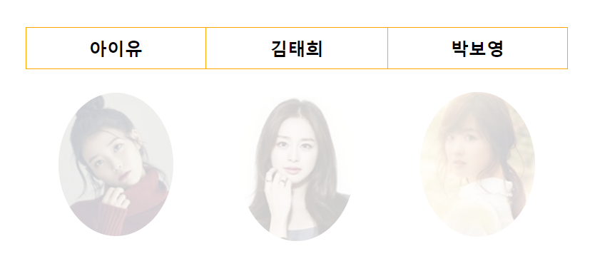

- 마우스를 김태희가 적힌 버튼 위에 올릴 경우
HTML
<!DOCTYPE html>
<html>
<head>
<meta charset="UTF-8">
<title>이미지를 테이블속에 넣어주면서 이미지를 둥글게 보여지도록 합니다.</title>

<link rel="stylesheet" href="css/image.css">
<script type="text/javascript" src="js/image.js"></script>
</head>
<body>
	<div id="container">
      <table>
         <thead>
            <tr>
               <th>아이유</th>
               <th>김태희</th>
               <th>박보영</th>
            </tr>
         </thead>

         <tbody>
            <tr>
               <td><img class="face" src="images/iyou.jpg"/></td>
               <td><img class="face" src="images/kimth.jpg"/></td>
               <td><img class="face" src="images/parkby.jpg"/></td>
            </tr>
         </tbody>
      </table>
      <!-- 모든 th 안잡히는 것 확인하기 용도
      <table style="margin: 50px 0">
         <thead>
            <tr>
               <th>아이유</th>
               <th>김태희</th>
               <th>박보영</th>
            </tr>
         </thead>

         <tbody>
            <tr>
               <td><img src="images/iyou.jpg"/></td>
               <td><img src="images/kimth.jpg"/></td>
               <td><img src="images/parkby.jpg"/></td>
            </tr>
         </tbody>
      </table>
      -->
   </div>
</body>
</html>
JS
window.onload = function(){

   /*
    const thList = document.getElementsByTagName("th");
    const imgList = document.getElementsByTagName("img");
   */

   const thList = document.querySelectorAll("body > div#container > table:first-child  th");
   const imgList = document.querySelectorAll("body > div#container > table:first-child img.face ");

    for(let i=0; i<thList.length; i++){

         // === 엘리먼트(객체)에 마우스가 올라가면 발생하는 이벤트 핸들러 생성하기 === //
         thList[i].onmouseover = function(){
            this.style.backgroundColor = "navy";    // this = thList[i]
            this.style.color = "white";
            this.style.cursor = "pointer";
            this.style.transition = "3s";

            imgList[i].style.transition = "2s";
            imgList[i].style.opacity = "1.0";

         }

         // === 엘리먼트(객체)에 마우스가 올라갔다가 빠지면 발생하는 이벤트 핸들러 생성하기 === //
         thList[i].onmouseout = function(){
            this.style.backgroundColor = "";    // this = thList[i]
            this.style.color = "";
            this.style.cursor = "";
            this.style.transition = "3s";       // CSS 에 준 것이 없으므로 적용하기

            imgList[i].style.transition = "2s";
            imgList[i].style.opacity = "";      // CSS 에 0.2 를 주었다.
         }

    }   // end of for----------------------


}   // end of window.onload = function--------------------------
CSS
@charset "UTF-8";

div#container {
   border: solid 0px gray;
   width: 80%;
   margin: 4% auto;
}

div#container > table {
	border: solid 0px red;
	width: 50%;		/* 여기서 width 는 80%의 50%(부모의 50%) */
	margin: 0 auto;
	border-collapse: collapse;
}

/* 완성하기 전(확인하면서 하기)
 div#container > table th
, div#container > table td {
	border: solid 1px orange;
}
*/
div#container > table th{
	border: solid 1px orange;
}

div#container > table th{
	height: 40px;
	font-size: 14pt;
}

div#container > table td{
	text-align: center;
	height: 200px;
}

div#container > table td > img{
	border: solid 0px red;
	/* border-radius 는 테두리를 둥글게 만드는 속성이다. */
	/* border-radius: 20px 20px 20px 20px / 20px 20px 20px 20px; */ /* 시계방향 */
	/* border-radius: top-left-x top-right-x bottom-right-x bottom-left-x / top-left-y top-right-y bottom-right-y bottom-left-y */
	/* border-radius: 50% 50% 50% 50% / 50% 50% 50% 50%;  절반씩 깍는다. */
	/* 또는 아래처럼 같은 것이다. */
	border-radius: 50%;
	opacity: 0.2;
	/* 광도  0.0 ~ 1.0  숫자가 적을수록 희미해진다.  0.0 은 투명, 1.0 은 원래 광도이다. */
}
정리
- 08_getElement_querySelectorAll
-> image.html, image.js, image.css
