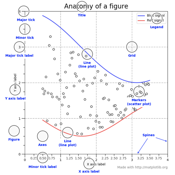
시각화
시각화는 데이터를 파악하는 데 매우 중요한 도구이다. 파이썬은 Pandas, Matplotlib, Seaborn 등 여러 가지 시각화 라이브러리를 제공한다. Matplotlib와 Seaborn 역시 Pandas와 동일하게 pip을 이용해 설치한다.
간단한 그래프를 그려보자.
import matplotlib.pyplot as plt
%matplotlib inline

# 그래프 데이터
subject = ['English', 'Math', 'Korean', 'Science', 'Computer']
points = [40, 90, 50, 60, 100]

# 축 그리기
fig = plt.figure()
ax1 = fig.add_subplot(1,1,1)

# 그래프 그리기
ax1.bar(subject, points)

# 라벨, 타이틀 달기
plt.xlabel('Subject')
plt.ylabel('Points')
plt.title("Test Result")

# 보여주기
plt.savefig('./barplot.png')  # 그래프를 이미지로 출력
plt.show()                    # 그래프를 화면으로 출력
/------------------------------------------------------------/
# 출력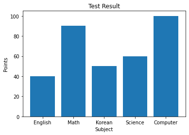
막대그래프 그려보기
1) 데이터 정의
import matplotlib.pyplot as plt
%matplotlib inline

# 그래프 데이터
subject = ['English', 'Math', 'Korean', 'Science', 'Computer']
points = [40, 90, 50, 60, 100]
2) 축 그리기
fig = plt.figure() #도화지(그래프) 객체 생성
ax1 = fig.add_subplot(1,1,1) #figure()객체에 add_subplot 메서드를 이용해 축을 그려준다.
/--------------------------------------------------------------------------------/
# 출력
그래프 크기 지정이 가능하다.
fig = plt.figure(figsize=(5,2))
ax1 = fig.add_subplot(1,1,1)
/-----------------------------/
# 출력
그렇다면 add_subplot 안의 (1, 1, 1)은 무엇을 의미할까? 링크에 자세한 설명이 있다. 차례로 nrows, ncols, index에 해당하는 것을 알 수 있다.
fig = plt.figure()
ax1 = fig.add_subplot(2,2,1)
ax2 = fig.add_subplot(2,2,2)
ax3 = fig.add_subplot(2,2,4)
/--------------------------/
# 출력
3) 그래프 그리기
이제 그래프를 그리기 위한 준비는 모두 끝났다. 막대그래프를 한 번 그려보자. 막대그래프는 bar() 메서드를 이용해 그릴 수 있다.
# 그래프 데이터
subject = ['English', 'Math', 'Korean', 'Science', 'Computer']
points = [40, 90, 50, 60, 100]

# 축 그리기
fig = plt.figure()
ax1 = fig.add_subplot(1,1,1)

# 그래프 그리기
ax1.bar(subject,points)
/------------------------------------------------------------/
# 출력
4) 그래프 요소 추가
x라벨, y라벨, 제목을 추가하기 위해서는 xlabel() 메서드와 ylabel() 메서드 title() 메서드를 이용한다.
# 그래프 데이터
subject = ['English', 'Math', 'Korean', 'Science', 'Computer']
points = [40, 90, 50, 60, 100]

# 축 그리기
fig = plt.figure()
ax1 = fig.add_subplot(1,1,1)

# 그래프 그리기
ax1.bar(subject, points)

# 라벨, 타이틀 달기
plt.xlabel('Subject')
plt.ylabel('Points')
plt.title("Test Result")
/------------------------------------------------------------/
# 출력
더 자세한 명령어는 아래 공식문서를 참조하면 된다.
Matplotlib 공식 문서
선 그래프 그려보기
1) 데이터 정의
이번에 사용할 데이터는 과거 아마존 주가 데이터이다.
from datetime import datetime
import pandas as pd
import os

# 그래프 데이터
csv_path = "./data/AMZN.csv"
data = pd.read_csv(csv_path ,index_col=0, parse_dates=True)
price = data['Close']

# 축 그리기 및 좌표축 설정
fig = plt.figure()
ax = fig.add_subplot(1,1,1)
price.plot(ax=ax, style='black')
plt.ylim([1600,2200])
plt.xlim(['2019-05-01','2020-03-01'])

# 주석달기
important_data = [(datetime(2019, 6, 3), "Low Price"),(datetime(2020, 2, 19), "Peak Price")]
for d, label in important_data:
    ax.annotate(label, xy=(d, price.asof(d)+10), # 주석을 달 좌표(x,y)
                xytext=(d,price.asof(d)+100), # 주석 텍스트가 위차할 좌표(x,y)
                arrowprops=dict(facecolor='red')) # 화살표 추가 및 색 설정

# 그리드, 타이틀 달기
plt.grid()
ax.set_title('StockPrice')

# 보여주기
plt.show()
/------------------------------------------------------------------------------------------/
# 출력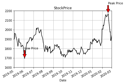
- 좌표축 설정 :
plt.xlim(),plt.ylim()을 통해 x, y 좌표축의 적당한 범위를 설정해 줄 수 있다. - 주석 : 그래프 안에 추가적으로 글자나 화살표 등 주석을 그릴 때는
annotate()메서드를 이용한다. - 그리드 :
grid()메서드를 이용하면 그리드(격자눈금)를 추가할 수 있다.
plot 사용하기
위에서 figure() 객체를 생성하고 add_subplot()으로 서브플롯을 생성하며 plot을 그린다고 했다. plt.plot() 명령으로 그래프를 그리면 두 가지 과정을 생략할 수 있다. plt.plot()은 가장 최근의 figure 객체와 그 서브플롯을 그린다.
plt.plot()의 인자로 x 데이터, y 데이터, 마커 옵션, 색상 등의 인자를 이용할 수 있고, 서브플롯도 plt.subplot을 이용해 추가할 수 있다.
import numpy as np
x = np.linspace(0, 10, 100) #0에서 10까지 균등한 간격으로  100개의 숫자를 만들라는 뜻이다.
plt.plot(x, np.sin(x),'o')
plt.plot(x, np.cos(x),'--', color='black')
plt.show()
/--------------------------------------------------------------------------------/
# 출력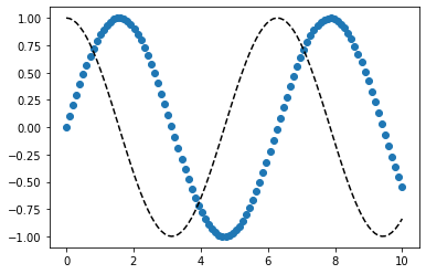
x = np.linspace(0, 10, 100)

plt.subplot(2,1,1)
plt.plot(x, np.sin(x),'orange','o')

plt.subplot(2,1,2)
plt.plot(x, np.cos(x), 'orange')
plt.show()
/--------------------------------/
# 출력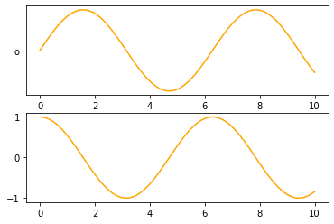
linestyle, marker 옵션
라인 스타일은 plot()의 인자로 들어가는데요 아래와 같이 다양한 방법으로 표기할 수 있다.
x = np.linspace(0, 10, 100)

plt.plot(x, x + 0, linestyle='solid')
plt.plot(x, x + 1, linestyle='dashed')
plt.plot(x, x + 2, linestyle='dashdot')
plt.plot(x, x + 3, linestyle='dotted')
plt.plot(x, x + 0, '-g') # solid green
plt.plot(x, x + 1, '--c') # dashed cyan
plt.plot(x, x + 2, '-.k') # dashdot black
plt.plot(x, x + 3, ':r'); # dotted red
plt.plot(x, x + 4, linestyle='-') # solid
plt.plot(x, x + 5, linestyle='--') # dashed
plt.plot(x, x + 6, linestyle='-.') # dashdot
plt.plot(x, x + 7, linestyle=':'); # dotted
/------------------------------------------/
# 출력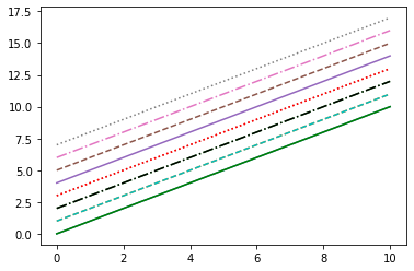
pandas.plot 메서드 인자
- label : 그래프의 범례 이름.
- ax : 그래프를 그릴 matplotlib의 서브플롯 객체.
- style : matplotlib에 전달할 'ko--'같은 스타일의 문자열
- alpha : 투명도 (0 ~1)
- kind : 그래프의 종류: line, bar, barh, kde
- logy : Y축에 대한 로그 스케일
- use_index : 객체의 색인을 눈금 이름으로 사용할지의 여부
- rot : 눈금 이름을 로테이션(0 ~ 360)
- xticks, yticks : x축, y축으로 사용할 값
- xlim, ylim : x축, y축 한계
- grid : 축의 그리드 표시할지 여부
pandas의 data가 DataFrame 일 때 plot 메서드 인자
- subplots : 각 DataFrame의 칼럼을 독립된 서브플롯에 그린다.
- sharex : subplots=True 면 같은 X 축을 공유하고 눈금과 한계를 연결한다.
- sharey : subplots=True 면 같은 Y 축을 공유한다.
- figsize : 그래프의 크기, 튜플로 지정
- title : 그래프의 제목을 문자열로 지정
- sort_columns : 칼럼을 알파벳 순서로 그린다.
fig, axes = plt.subplots(2, 1)
data = pd.Series(np.random.rand(5), index=list('abcde'))
data.plot(kind='bar', ax=axes[0], color='blue', alpha=1)
data.plot(kind='barh', ax=axes[1], color='red', alpha=0.3)
/--------------------------------------------------------/
# 출력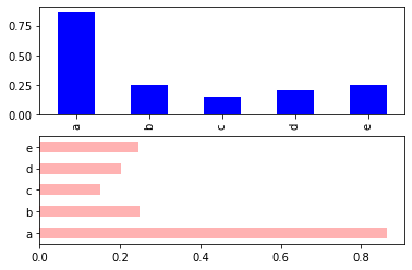
df = pd.DataFrame(np.random.rand(6,4), columns=pd.Index(['A','B','C','D']))
df.plot(kind='line')
/-------------------------------------------------------------------------/
# 출력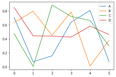
정리
1) fig = plt.figure() : figure 객체를 선언해 '도화지를 펼쳐' 준다.
2) ax1 = fig.add_subplot(1,1,1) : 축을 그립니다.
3) ax1.bar(x, y) 축안에 어떤 그래프를 그릴지 메서드를 선택한 다음, 인자로 데이터를 넣어준다.
4) 그래프 타이틀 축의 레이블 등을 plt의 여러 메서드 grid, xlabel, ylabel 을 이용해서 추가해 주고
5) plt.savefig 메서드를 이용해 저장해준다.