브라우저 창 사이즈 변경에 대응
해당 코드는 ⭐️ 구역만 수정된 부분으로 해당 구역만 집중해서 보면 된다!
<script>
// html에 캔버스 미리 조립
    const canvas = document.querySelector('#three-canvas');

    // const renderer = new THREE.WebGLRenderer({canvas: canvas });
    // 축약형
    const renderer = new THREE.WebGLRenderer({
        canvas,
        antialias: true
    });
    renderer.setSize(window.innerWidth, window.innerHeight);
    // ⭐️ 기종별 웹 픽셀 확인 ⭐️
    console.log(window.devicePixelRatio);
    renderer.setPixelRatio(window.devicePixelRatio > 1 ? 2 : 1);

    // Scene
    const scene = new THREE.Scene();

    // Camera
    const camera= new THREE.PerspectiveCamera(
        75, //시야각
        window.innerWidth / window.innerHeight, //종횡비
        0.1, //near
        1000 //far
    );
    camera.position.x = 1;
    camera.position.y = 2;
    camera.position.z = 5; // 5m라고 가정
    scene.add(camera);

    // Mesh
    const geometry = new THREE.BoxGeometry(1,1,1); // 1m * 1m * 1m를 의미
    const material = new THREE.MeshBasicMaterial({
        // color:'red',
        color:'#f00000'
    });

    const mesh = new THREE.Mesh(geometry,material);
    scene.add(mesh);

    // 그리기
    renderer.render(scene,camera);

    // ⭐️ 리사이징 함수 ⭐️
    function setSize(){
        //카메라
        camera.aspect = window.innerWidth / window.innerHeight;
        //카메라 투영에 관련해서 변화가 있을 경우 실행해야 함
        camera.updateProjectionMatrix();
        renderer.setSize(window.innerWidth, window.innerHeight);
        renderer.render(scene,camera);
    }

    // ⭐️ 이벤트 ⭐️
    window.addEventListener('resize',setSize);
</script>
1. 리사이징
⭐️ 이벤트 ⭐️
우선적으로 addEventListener로 리사이징 이벤트가 진행될 때
setSize 함수가 실행되도록 설정한다!
⭐️ 리사이징 함수 ⭐️
setSize 함수가 실행할 때 카메라의 aspect(종횡비)가
window innerWidth와 innerHeight의 값을 새로 받아오도록 설정!
그리고 카메라가 투영되는 작업에서 변화가 생길 경우에는
해당 메서드를 무조건 실행해주어야 하는데
바로 그것이! updateProjectionMatrix이다.
💡
updateProjectionMatrix를 적용하지 않는다면
카메라의 aspect가 변경되어 적용되지 않는다!
그 후에는 renderer의 사이즈도 새로 다시 불러와주고
renderer에 scene과 camera를 새로 render 해준다!
2. 리사이징
⭐️ 기종별 웹 픽셀 확인 ⭐️
작업전에 콘솔창으로 한 CSS 픽셀이 실제 디바이스에서 몇 개의 물리 픽셀로 표현되는지 확인을 한다!
<script>
	console.log(window.devicePixelRatio);
</script>
💡 해당 값을 확인해 주는 이유는 디바이스에 이미지가 깨지지 않으려면 기본적으로 이미지의 크기가 2배는 커야지 깨지지 않는데 그 부분 때문이니 설명은 이렇게 간략하게 정리!
현재 나의 값으로는 콘솔값이 '2'로 노출이 되는것이 확인되었다!
하지만! 각각 개인 디바이스에서는 값이 다르게 나타나게 되는데!
그래서 renderer에 setPixelRatio 기능을 사용하여
window.devicePixelRatio의 값을 셋팅해주려고 하는 것이다!
그렇다면 기본으로 잡혀져있는 window의 width, height값이 값에 맞춰서
캔버스가 뻥튀기 처리가 될 것이기 때문이다!
<script>
console.log(window.devicePixelRatio);
renderer.setPixelRatio(window.devicePixelRatio);
</script>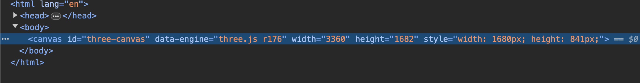 위의 이미지처럼 canvas의 기본 style은 width: 1680px, height는 842px로 되어있지만
 window.devicePixelRatio 의 값인 2배로 뻥튀기 된 값이 width와 height값으로 재설정 되어있다.
하지만!
다른 디바이스에서는 값이 다르게 나타나는데간혹 2.5나 3과 같이 노출되는 상황이 나타나는데
성능면에서 유리하기 위해서 이 부분을 따로 잡아주는것이 좋은데~ 그 방법은!
삼항연산자로 window.devicePixelRatio 의 값이 1보다 크다면 2로 적용되도록 하고 아니라면 1이 되도록 설정을 해주는게 성능면에서 좋다고 한다!
<script>
	console.log(window.devicePixelRatio);
    renderer.setPixelRatio(window.devicePixelRatio > 1 ? 2 : 1);
</script>