1. 데이터 불러오기
import pandas as pd

df = pd.read_csv("/content/sample_data/california_housing_train.csv")
df.head()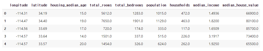
2. 데이터 가공
# [Python] Pandas groupby

# longitude 그룹별로 확인
df_group = df.groupby('longitude')

# 연산 결과를 저장할 데이터 프레임
df_agg = pd.DataFrame()

# longitude 그룹별 평균 households, population 값
df_agg['mean_households'] = df_group['households'].mean()
df_agg['mean_population'] = df_group['population'].mean()

df_agg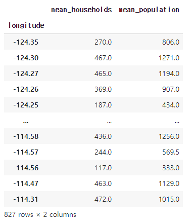
3. 다양한 유형의 그래프 출력 (kind=''으로 설정 가능)
- 'line' : line plot (default)
- 'bar' : vertical bar plot
- 'barh' : horizontal bar plot
- 'hist' : histogram
- 'box' : boxplot
- 'kde' : Kernel Density Estimation plot
- 'density' : same as 'kde'
- 'area' : area plot
- 'pie' : pie plot
- 'scatter' : scatter plot
- 'hexbin' : hexbin plot
3-1. 꺾은선 그래프 출력
# matplotlib 기반 plot
df_agg.plot()
# df_agg.plot(kind='line')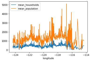
3-2. 막대 그래프 출력
- 세로 막대
df_agg.plot(kind='bar')
- 가로 막대
df_agg.plot(kind='barh')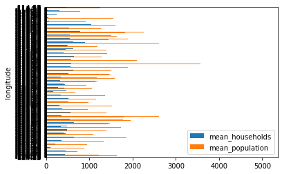
3-3. 히스토그램 출력
df_agg.plot(kind='hist')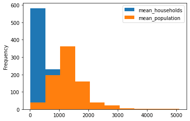
3-4. 산점도 출력
df_agg.plot(x='mean_households',y='mean_population', kind = 'scatter')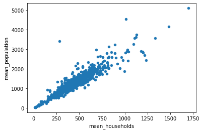
3-4. 박스형 그래프 출력
df_agg[['mean_households','mean_population']].plot(kind='box')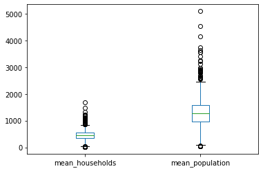
도토리 다 Pandas~

호앙조옹스우