
Google Compose Camp에서 배운 내용을 기록합니다!
Compose Camp 진행하면서 실습한 코드는 REPO로!
Pathway 1-1. Compose 기본사항
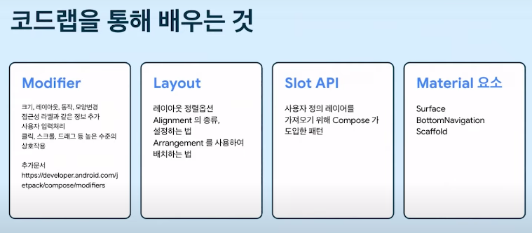 첫 번째 코드랩에서는 다음과 같은 주제로 Compose 기본사항에 대해 알아본다.
Jetpack Compose 시작 튜토리얼
0. Jetpack Compose overview
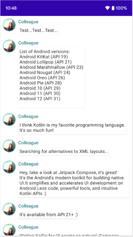
- 네이티브 Android UI를 빌드하기 위한 최신 도구 키트이다.
- XML 레이아웃을 수정하거나 Layout Editor를 사용하지 않고 더 적은 수의 코드, 강력한 도구, 직관적인 Kotlin API로 Android에서의 UI 개발을 간소화하고 가속화한다.
- Composable 함수를 호출하여 원하는 요소를 정의하면 Compose 컴파일러가 나머지 작업을 알아서 처리해준다.
1. Composable functions
- Jetpack Compose는 composable functions 중심으로 빌드된다.
- Composable functions을 통해 UI의 contruction(e.g. initializing an element, attaching it to a paent etc)에 집중하는 대신 앱이 어떻게 보일지 설명하고 data dependencies를 제공하여 앱의 UI를 정의할 수 있다.
- 함수 이름에 @Composable 주석을 추가하여 만들어준다!
텍스트 요소 추가
'Hello world!' 텍스트를 display 해보자!
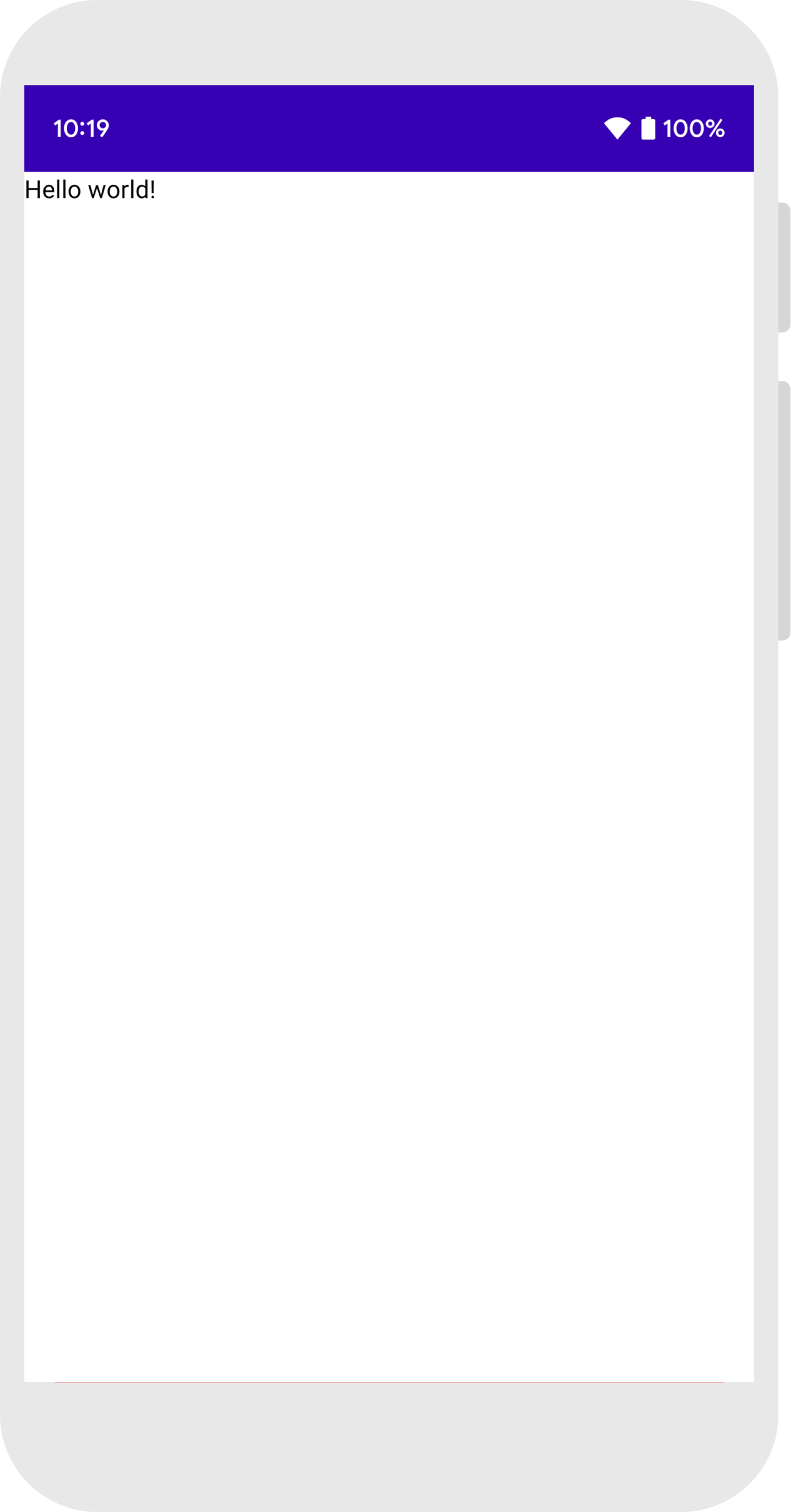
import android.os.Bundle
import androidx.activity.ComponentActivity
import androidx.activity.compose.setContent
import androidx.compose.material3.Text

class MainActivity : ComponentActivity() {
    override fun onCreate(savedInstanceState: Bundle?) {
        super.onCreate(savedInstanceState)
        setContent {
            Text("Hello world!")
        }
    }
}- 먼저, onCreate 메소드 안의 setContent 블록 안에 Text Composable function을 call하여 text element를 추가한다.
- setcontent 블록 : activity의 layout을 정의하는 곳으로, composable functions을 call한다. (xml + java 코드면 setContentView(layout) 메소드!!)
❗ 여기서 잠깐 ❗
: Composable functions은 오직 다른 composable functions으로부터 호출될 수 있다!!
: Jetpack Compose는 Kotlin 컴파일러 플러그인을 사용하여 Composable functions를 앱의 UI element로 변환한다.
EX) Text() == text label을 display
Composable function 정의
composable function을 만들려면 @Composabe annotation을 추가하면 된다.
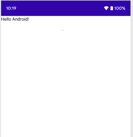
// ...
import androidx.compose.runtime.Composable

class MainActivity : ComponentActivity() {
    override fun onCreate(savedInstanceState: Bundle?) {
        super.onCreate(savedInstanceState)
        setContent {
            MessageCard("Android")
        }
    }
}

@Composable
fun MessageCard(name: String) {
    Text(text = "Hello $name!")
}- 위의 코드는 MessageCard function을 정의한 것이다. name을 전달하면 name을 text element로 보여지게 하는 함수이다.
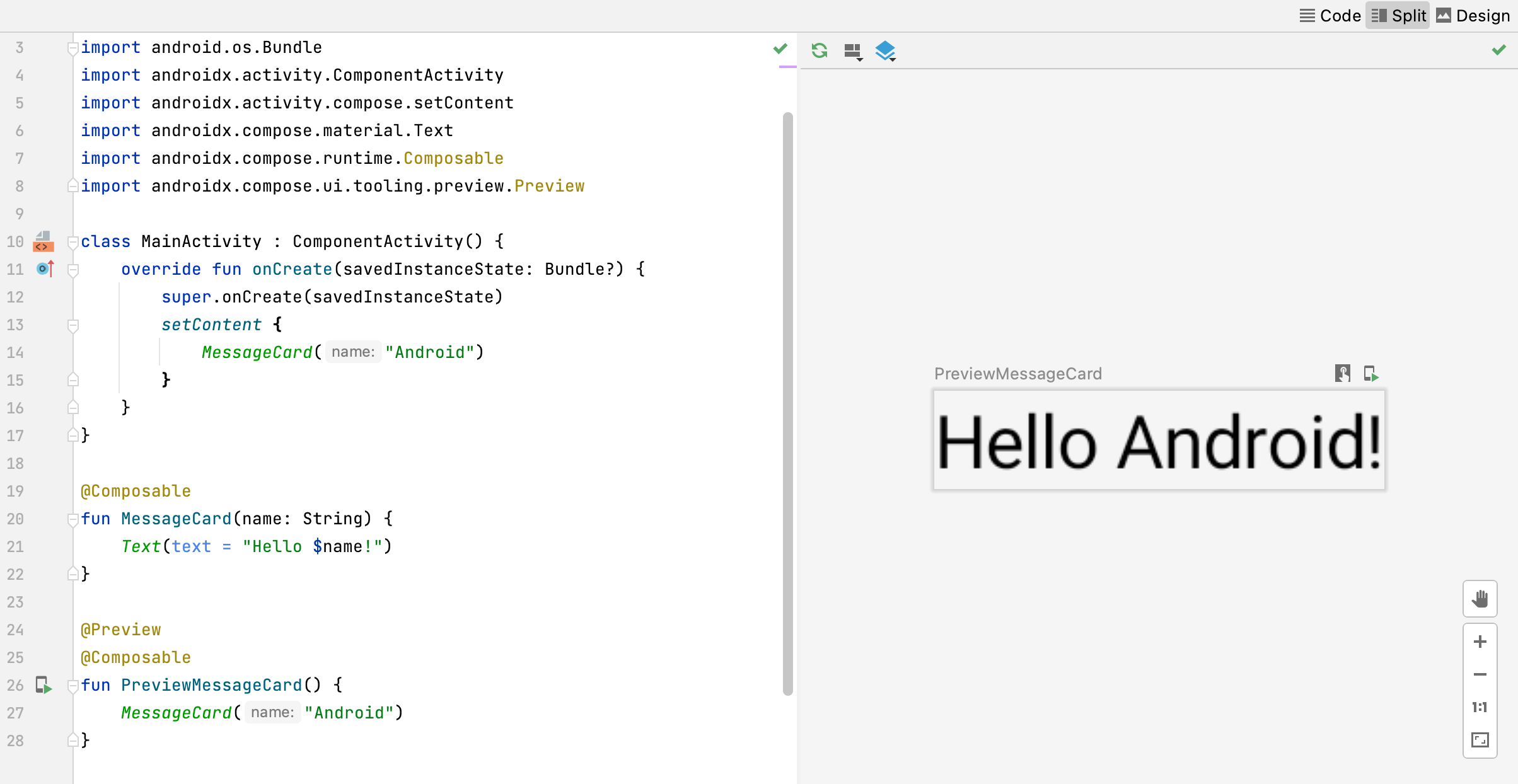
Android에서 해당 함수 preview 하기
- @Preview annotation은 composable functions을 preview하게 해준다. 이때, build나 Android device 혹은 emulator를 설치하지 않아도 된다.
- 그러나 해당 annotation은 반드시 parameter를 갖지 않는 composable function에만 사용할 수 있다.
// ...
import androidx.compose.ui.tooling.preview.Preview

@Composable
fun MessageCard(name: String) {
    Text(text = "Hello $name!")
}

@Preview
@Composable
fun PreviewMessageCard() {
    MessageCard("Android")
} -
따라서 MessageCard function은 파라미터가 있으므로 바로 preview할 수 없다.
-
대신 PreviewMessageCard라는 이름의 두 번째 function을 만들고 적절한 parameter와 MessageCard를 호출하게 한다.
-
Project를 rebuild 해보면 app 자체는 변화하지 않는다. PreviewMessageCard function은 아무데도 호출되지 않기 때문이다. 하지만 Android Studio는 preview window를 추가한다.
-
이 window는 @Peview annotion이 표시된 composable functions에 의해 생성되는 UI elements의 preview를 보여준다. 언제든 previews를 업데이트하려면 preview window 창 위쪽의 refesh button을 클릭하면 된다.
2. Layouts
UI elements는 계층적(hierarchical)이며, elements들은 다른 elements에 포함될 수 있다. Compose에서는 다른 composable 함수로 부터 composable 함수를 호출해서 UI 계층을 build 할 수 있다.
mutiple text 추가하기
더 많은 Jetpack Compose의 기능(capabilities)를 알아보기 위해, 우리는 간단한 messaging screen을 만들어 볼 것이다! 근데.. 약간의 애니메이션 확장이 가능한 메세지의 리스트를 곁들인..
먼저 메세지의 author 이름과 message content를 보여주면서 메세지 구성을 풍부하게 만들어봅시다
// ...
class MainActivity : ComponentActivity() {
override fun onCreate(savedInstanceState: Bundle?) {
super.onCreate(savedInstanceState)
setContent {
MessageCard(Message("Android", "Jetpack Compose"))
}
}
}
data class Message(val author: String, val body: String)
@Composable
fun MessageCard(msg: Message) {
Text(text = msg.author)
Text(text = msg.body)
}
@Preview
@Composable
fun PreviewMessageCard() {
MessageCard(
msg = Message("Lexi", "Hey, take a look at Jetpack Compose, it's great!")
)
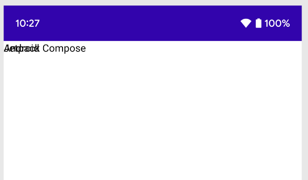
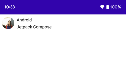
}- MessageCard의 composable parameter를 String이 아닌 Message object를 사용한다.
- 다른 Text composable을 MessageCard composable 안에 추가한다.
- 이 코드는 두 개의 text elements를 content view에 둔다. 이때 우리가 정렬하는 방법에 관한 아무런 information을 제공하지 않아서 text element들이 서로 위에 표시되어 읽을 수 없다.
Column 사용하기
// ...
import androidx.compose.foundation.layout.Column

@Composable
fun MessageCard(msg: Message) {
    Column {
        Text(text = msg.author)
        Text(text = msg.body)
    }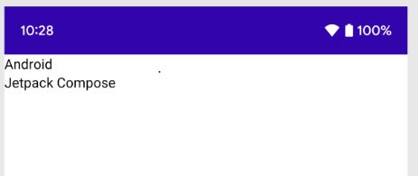
}- Column function은 elements를 vertical하게 정렬하게 한다.
- 위의 코드는 MessageCard function 안에 Column을 추가한 것이다.
- Row는 items을 horizontal하게 정렬하고, Box는 stack elements 처럼 정렬한다.
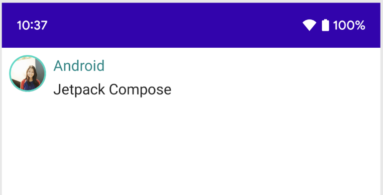
Image element 추가하기
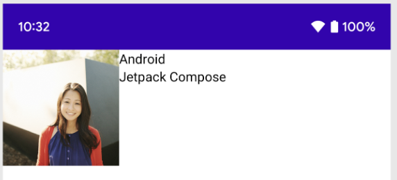
sender의 profile 사진을 추가하여 message card를 보완해보자
// ...
import androidx.compose.foundation.Image
import androidx.compose.foundation.layout.Row
import androidx.compose.ui.res.painterResource

@Composable
fun MessageCard(msg: Message) {
    Row {
        Image(
            painter = painterResource(R.drawable.profile_picture),
            contentDescription = "Contact profile picture",
        )

       Column {
            Text(text = msg.author)
            Text(text = msg.body)
        }

    }

}- Resource Manager를 사용해서 갤러리에서 image를 import 한다.
- Row composable을 추가해서 좋은 structured design을 만들고 Image composable을 그 안에 추가한다.
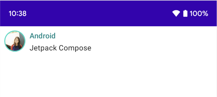
레이아웃 구성
- message layout structure는 올바르지만 elements들이 너무 붙어있고 image가 너무 크다...
- composable을 꾸미거나 구성하기 위해 Compose는 modifiers를 사용한다!!
❗ 여기서 잠깐 ❗
: Moifiers는 composable의 크기, 레이아웃, 모양(appearance)를 바꾸거나 high-level interactions를 추가할 수 있다(e.g. element가 clickable하게 만드는 거!)
: 이러한 modifiers들을 연결해서 더 복잡한 composables를 만들 수 있다.
// ...
import androidx.compose.foundation.layout.Spacer
import androidx.compose.foundation.layout.height
import androidx.compose.foundation.layout.padding
import androidx.compose.foundation.layout.size
import androidx.compose.foundation.layout.width
import androidx.compose.foundation.shape.CircleShape
import androidx.compose.ui.Modifier
import androidx.compose.ui.draw.clip
import androidx.compose.ui.unit.dp
@Composable
fun MessageCard(msg: Message) {
// Add padding around our message
Row(modifier = Modifier.padding(all = 8.dp)) {
Image(
painter = painterResource(R.drawable.profile_picture),
contentDescription = "Contact profile picture",
modifier = Modifier
// Set image size to 40 dp
.size(40.dp)
// Clip image to be shaped as a circle
.clip(CircleShape)
)
// Add a horizontal space between the image and the column
Spacer(modifier = Modifier.width(8.dp))
Column {
Text(text = msg.author)
// Add a vertical space between the author and message texts
Spacer(modifier = Modifier.height(4.dp))
Text(text = msg.body)
}
}
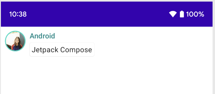
}3. Material Design
Compose는 Material Design 원칙을 지원하도록 빌드되었다. 많은 compose UI elements는 Metrial Design을 즉시 사용하도록 구현되었다. Material Design widgets으로 style을 적용해보자!
Material Design 사용
이제 메시지 디자인에 레이아웃이 생겼지만, 아직 디자인은 그렇게 좋아 보이지 않는다!!
Material Design styling을 사용하여 MessageCard composable의 디자인을 개선해 보겠다!!

// ...

class MainActivity : ComponentActivity() {
    override fun onCreate(savedInstanceState: Bundle?) {
        super.onCreate(savedInstanceState)
        setContent {
            ComposeTutorialTheme {
                Surface(modifier = Modifier.fillMaxSize()) {
                    MessageCard(Message("Android", "Jetpack Compose"))
                }
            }
        }
    }
}

@Preview
@Composable
fun PreviewMessageCard() {
    ComposeTutorialTheme {
        Surface {
            MessageCard(
                msg = Message("Lexi", "Take a look at Jetpack Compose, it's great!")
            )
        }
    }
} - 먼저, MessageCard function을 Material theme으로 감싸준다! 이때 Material theme는 우리가 project를 위해 만든 theme로 ComposeTutorialTheme과 Surface이다!
- @Preview 와 setContent function에도 똑같이 적용해주자!
- 이렇게 하면 우리의 composable이 앱 테마에 정의된 스타일을 상속하여 앱 전체에서 일관성이 보장된다.
❗ 여기서 잠깐 ❗
: Material Design은 Color, Typography, Shape의 세 가지 핵심 요소를 중심으로 이루어진다.
: Empty Compose Activity template은 MeterialTheme을 customize할 수 있도록 default theme을 생성한다.
: 만약 프로젝트 이름을 ComposeTutorial이 아닌 다른 이름으로 지었다면, ui.theme subpackage 안의 Themme.kt file에서 우리의 custom theme를 찾을 수 있다.
이제 하나씩 추가해보자!
Color
// ...
import androidx.compose.foundation.border
import androidx.compose.material3.MaterialTheme

@Composable
fun MessageCard(msg: Message) {
   Row(modifier = Modifier.padding(all = 8.dp)) {
       Image(
           painter = painterResource(R.drawable.profile_picture),
           contentDescription = null,
           modifier = Modifier
               .size(40.dp)
               .clip(CircleShape)
               .border(1.5.dp, MaterialTheme.colorScheme.primary, CircleShape)
       )

       Spacer(modifier = Modifier.width(8.dp))

       Column {
           Text(
               text = msg.author,
               color = MaterialTheme.colorScheme.secondary
           )

           Spacer(modifier = Modifier.height(4.dp))
           Text(text = msg.body)
       }
   }
}- MaterialTheme.colors : wrapp된 theme에 color를 지정해준다.
- color가 필요한 어느 theme든, 이 값을 사용할 수 있다.
- 위의 코드는 title과 image border에 color를 추가했다.
서체(Typography)
// ...

@Composable
fun MessageCard(msg: Message) {
   Row(modifier = Modifier.padding(all = 8.dp)) {
       Image(
           painter = painterResource(R.drawable.profile_picture),
           contentDescription = null,
           modifier = Modifier
               .size(40.dp)
               .clip(CircleShape)
               .border(1.5.dp, MaterialTheme.colorScheme.primary, CircleShape)
       )
       Spacer(modifier = Modifier.width(8.dp))

       Column {
           Text(
               text = msg.author,
               color = MaterialTheme.colorScheme.secondary,
               style = MaterialTheme.typography.titleSmall
           )

           Spacer(modifier = Modifier.height(4.dp))

           Text(
               text = msg.body,
               style = MaterialTheme.typography.bodyMedium
           )
       }
   }
}- Material Typography styles은 MaterialTheme에서 사용할 수 있다. Text composables에 추가하면 된다.
도형(Shape)
Shape를 마지막으로 추가해보자!!
// ...
import androidx.compose.material3.Surface

@Composable
fun MessageCard(msg: Message) {
   Row(modifier = Modifier.padding(all = 8.dp)) {
       Image(
           painter = painterResource(R.drawable.profile_picture),
           contentDescription = null,
           modifier = Modifier
               .size(40.dp)
               .clip(CircleShape)
               .border(1.5.dp, MaterialTheme.colorScheme.primary, CircleShape)
       )
       Spacer(modifier = Modifier.width(8.dp))

       Column {
           Text(
               text = msg.author,
               color = MaterialTheme.colorScheme.secondary,
               style = MaterialTheme.typography.titleSmall
           )

           Spacer(modifier = Modifier.height(4.dp))

           Surface(shape = MaterialTheme.shapes.medium, shadowElevation = 1.dp) {
               Text(
                   text = msg.body,
                   modifier = Modifier.padding(all = 4.dp),
                   style = MaterialTheme.typography.bodyMedium
               )
           }
       }
   }
}- 먼저 message body text 주위를 Surface composable로 감싼다.
- 이렇게 되면 message body의 모양과 shape과 elevation을 맞춤설정이 가능하다.
- 더 나은 레이아웃을 위해 메시지에 패딩도 추가한다.
4. Lists and animations
어떻게 Compose로 lists를 쉽게 생성하고 애니메이션을 추가하여 재밌게 만들 수 있는지 배워보자!
Create a list of messages
Chat에 메세지 하나 이상을 추가하여 대화하는 것으로 만들어보자! 우리는 nultiple messages를 보여줄 수 있는 Conversation function이 필요할 것이다!
이 경우 Compose의 LazyColumn과 LazyRow를 사용해볼 것이다.
이 composable들은 화면에 표시되는 elements들만 rendering하므로, 긴 list에 매우 효율적으로 설계되었다.
// ...
import androidx.compose.foundation.lazy.LazyColumn
import androidx.compose.foundation.lazy.items

@Composable
fun Conversation(messages: List<Message>) {
    LazyColumn {
        items(messages) { message ->
            MessageCard(message)
        }
    }
}

@Preview
@Composable
fun PreviewConversation() {
    ComposeTutorialTheme {
        Conversation(SampleData.conversationSample)
    }
}- LazyColumn은 items child를 가진다. items child는 List를 파라미터로 가져와서, lambda는 Message의 인스턴스인 message(원하는 대로 이름 지정 가능!)라는 매개변수를 받는다.
- 간단히 말해 lambda는 제공된 List의 각 item마다 호출된다.
- SampleData 세트를 프로젝트에 복사하여 대화를 빠르게 부트스트랩할 수 있다.
Animate messages while expanding
이제 애니메이션을 적용해보자!! 우리는 긴 message를 확장하는 기능을 추가하고 콘텐츠 크기와 배경 색상 모두에 애니메이션 효과를 적용하는 기능을 추가해 볼 것이다.
이 로컬 UI 상태를 저장하려면 메시지가 확장되었는지 추적해야 한다. 이 상태 변경을 추적하려면 remember와 mutableStateOf 함수를 사용해야 한다.
❗ 여기서 잠깐 ❗
: Composable 함수는 remember를 사용해서 메모리에 local state를 저장하고 mutableStateOf에 전달 된 값의 변화를 추적한다.
: state를 이용하는 Composables은 값이 업데이트될 때마다 자동으로 그려준다. 이를 recomposition(재구성)이라고 부른다.
: Compose의 상태 API인 remember와 mutableStateOf를 사용함으로서, 어떤 state의 변화를 자동으로 UI로 update한다.
// ...
import androidx.compose.foundation.clickable
import androidx.compose.runtime.getValue
import androidx.compose.runtime.mutableStateOf
import androidx.compose.runtime.remember
import androidx.compose.runtime.setValue

class MainActivity : ComponentActivity() {
   override fun onCreate(savedInstanceState: Bundle?) {
       super.onCreate(savedInstanceState)
       setContent {
           ComposeTutorialTheme {
               Conversation(SampleData.conversationSample)
           }
       }
   }
}

@Composable
fun MessageCard(msg: Message) {
    Row(modifier = Modifier.padding(all = 8.dp)) {
        Image(
            painter = painterResource(R.drawable.profile_picture),
            contentDescription = null,
            modifier = Modifier
                .size(40.dp)
                .clip(CircleShape)
                .border(1.5.dp, MaterialTheme.colorScheme.primary, CircleShape)
        )
        Spacer(modifier = Modifier.width(8.dp))

        // We keep track if the message is expanded or not in this
        // variable
        var isExpanded by remember { mutableStateOf(false) }

        // We toggle the isExpanded variable when we click on this Column
        Column(modifier = Modifier.clickable { isExpanded = !isExpanded }) {
            Text(
                text = msg.author,
                color = MaterialTheme.colorScheme.secondary,
                style = MaterialTheme.typography.titleSmall
            )

            Spacer(modifier = Modifier.height(4.dp))

            Surface(
                shape = MaterialTheme.shapes.medium,
                shadowElevation = 1.dp,
            ) {
                Text(
                    text = msg.body,
                    modifier = Modifier.padding(all = 4.dp),
                    // If the message is expanded, we display all its content
                    // otherwise we only display the first line
                    maxLines = if (isExpanded) Int.MAX_VALUE else 1,
                    style = MaterialTheme.typography.bodyMedium
                )
            }
        }
    }
}
- isExpanded에 따라 메시지 콘텐츠의 배경을 변경할 수 있다
- clickable modifier를 사용하여 컴포저블의 클릭 이벤트를 처리한다.
// ...
import androidx.compose.animation.animateColorAsState
import androidx.compose.animation.animateContentSize

@Composable
fun MessageCard(msg: Message) {
    Row(modifier = Modifier.padding(all = 8.dp)) {
        Image(
            painter = painterResource(R.drawable.profile_picture),
            contentDescription = null,
            modifier = Modifier
                .size(40.dp)
                .clip(CircleShape)
                .border(1.5.dp, MaterialTheme.colorScheme.secondary, CircleShape)
        )
        Spacer(modifier = Modifier.width(8.dp))

        // We keep track if the message is expanded or not in this
        // variable
        var isExpanded by remember { mutableStateOf(false) }
        // surfaceColor will be updated gradually from one color to the other
        val surfaceColor by animateColorAsState(
            if (isExpanded) MaterialTheme.colorScheme.primary else MaterialTheme.colorScheme.surface,
        )

        // We toggle the isExpanded variable when we click on this Column
        Column(modifier = Modifier.clickable { isExpanded = !isExpanded }) {
            Text(
                text = msg.author,
                color = MaterialTheme.colorScheme.secondary,
                style = MaterialTheme.typography.titleSmall
            )

            Spacer(modifier = Modifier.height(4.dp))

            Surface(
                shape = MaterialTheme.shapes.medium,
                shadowElevation = 1.dp,
                // surfaceColor color will be changing gradually from primary to surface
                color = surfaceColor,
                // animateContentSize will change the Surface size gradually
                modifier = Modifier.animateContentSize().padding(1.dp)
            ) {
                Text(
                    text = msg.body,
                    modifier = Modifier.padding(all = 4.dp),
                    // If the message is expanded, we display all its content
                    // otherwise we only display the first line
                    maxLines = if (isExpanded) Int.MAX_VALUE else 1,
                    style = MaterialTheme.typography.bodyMedium
                )
            }
        }
    }
}- Surface의 배경색을 전환하는 대신 MaterialTheme.colorScheme.surface에서 MaterialTheme.colorScheme.primary로 또는 그 반대로 값을 점진적으로 수정하여 배경색에 애니메이션을 적용할 수 있다. 이를 위해 animateColorAsState 함수를 사용한다.
- 마지막으로 animateContentSize modifier를 사용하여 메시지 컨테이너 크기에 부드럽게 애니메이션을 적용한다.
번역본이 있긴 하지만!! 찬찬히 기록하며 복습하려고 원문 보면서 기록했다!! 끄ㅡ으으읕!!!