상관관계 분석 (Correlation Analysis)
- 회귀분석에서 변수들 간의 인과관계를 분석하기 전에 각 변수들 간에 관련성을 분석하는 선행자료로 이용된다.
- 데이터 간의 밀도는 상관계수의 수치를 사용하여 관계의 정도를 파악할 수 있다.
- 변수 간 관련성 분석, 관계의 친밀함을 수치로 표현할 수 있다.
예) 광고비와 매출액 사이의 관련성 분석, 광고량과 브랜드 인지도의 관련성 분석
상관계수 r
두 변수간에 어떤 선형적 관계를 가지는지 분석하는 기법.
- 상관계수는 밀도를 숫자로 표현한다. 밀도를 가지고 상관관계를 정확하게 표현하기 힘들다.
- 이에 따라 숫자화가 필요한데, 이 것을 정도에 따라 구분한 것 중 하나가 피어슨 상관계수다. 이는 두 변수 간의 관련성을 알기 위해 이용된다.
- 일반적으로
r이 -1.0과 -0.7 사이이면, 강한 음적 선형관계,
r이 -0.7과 -0.3 사이이면, 뚜렷한 음적 선형관계,
r이 -0.3과 -0.1 사이이면, 약한 음적 선형관계,
r이 -0.1과 +0.1 사이이면, 거의 무시될 수 있는 선형관계,
r이 +0.1과 +0.3 사이이면, 약한 양적 선형관계,
r이 +0.3과 +0.7 사이이면, 뚜렷한 양적 선형관계,
r이 +0.7과 +1.0 사이이면, 강한 양적 선형관계
로 해석한다.
공분산 / 상관계수
- 2개의 확률변수의 선형 관계를 나타내는 값.
- 두 변수간의 우상향,하향관계는 알 수 있으나 얼마나 관계 있는지는 알수 없다.
#두 자료의 공분산 / 상관계수 구하기
x = [8,3,6,6,5,9,3,9,3,4]
y=[60,20,40,60,90,50,10,80,40,50]-
공분산
- numpy :
np.cov(x,y) - pandas:
data.cov()
- numpy :
-
상관계수
- numpy :
np.corrcoef(x,y) - pandas :
data.corr(method='pearson')
- numpy :
-
두 자료의 단위가 다르면 공분산은 함께 변한다.
하지만 상관계수는 변하지 않고 일정하다 -
상관계수는 1,-1에 가까울수록 깊은 상관관계를 가진다.
이상적인 수치는 ±0.3~±1 이다. -
주의: 공분산 / 상관계수는 선형적인 데이터에 대해서만 유의하다.
상관계수의 종류
data.corr(method='pearson')-
Pearson(피어슨)
- 상관 분석에서 기본적으로 사용되는 피어슨 상관계수
- 연속형 변수의 상관관계 측정 (신장, 몸무게)
- 모수 검정 (parametric test)
-
Kendall(켄달)
- 변수가 서열척도일때,
- 비모수 검정 (non-parametric test)
- 샘플사이즈가 적거나, 데이터의 동률이 많을 떄 유용
-
Spearman(스피어만)
- 변수가 서열척도일때,
- 비모수 검정 (non-parametric test)
- 데이터 내 편차와 에러에 민감하며, 일반적으로 켄달 상관계수보다 높은 값을 가짐
✔️예제
data.go.kr의 자료를 사용
국내 유료 관광지에 대해 외국인(일본,중국,미국) 관광객이 선호하는 관광지 관계분석
사용된 데이터 :  관광지 입장정보.json / 중국인방문객.json / 일본인방문객.json / 미국인 방문객.json
1. 데이터가공
    fname = '../testdata/서울특별시_관광지입장정보_2011_2016.json'
    #stirng -> dict (decode)
    jsonTP = json.loads(open(fname,'r',encoding='utf-8').read())
    #연월 / 관광지명 / 입장객수
    tour_table = pd.DataFrame(jsonTP,columns=('yyyymm','resNm','ForNum'))
    tour_table = tour_table.set_index('yyyymm')

    resNm = tour_table.resNm.unique() #관광지명 5개 얻음
    print(resNm[:5])

    #중국인
    cdf = '../testdata/중국인방문객.json'
    jdata = json.loads(open(cdf,'r',encoding='utf-8').read())
    china_table = pd.DataFrame(jdata)
    print(china_table.head())

    #일본인
    jdf = '../testdata/일본인방문객.json'
    jdata = json.loads(open(jdf,'r',encoding='utf-8').read())
    japan_table = pd.DataFrame(jdata,columns=('yyyymm','visit_cnt'))
    japan_table.rename(columns={'visit_cnt':'japan'},inplace=True)
    japan_table.set_index('yyyymm',inplace=True)

    #미국인
    udf = '../testdata/미국인방문객.json'
    jdata = json.loads(open(udf,'r',encoding='utf-8').read())
    usa_table = pd.DataFrame(jdata,columns=('yyyymm','visit_cnt'))
    usa_table.rename(columns={'visit_cnt':'USA'},inplace=True)
    usa_table.set_index('yyyymm',inplace=True)

    #full join
    all_table = pd.merge(china_table,japan_table, \
                         left_index=True, right_index=True)
    all_table = pd.merge(all_table,usa_table,left_index=True,right_index=True)

    r_list = []
    #사용자정의 그래프함수. 5개 관광지별 방문객수
    for tp in resNm[:5]:
        r_list.append(setScatterChart(tour_table,all_table,tp))

    r_df = pd.DataFrame(r_list,columns=('고궁명','중국','일본','미국'))
    r_df = r_df.set_index('고궁명')

    print(r_df)
    r_df.plot(kind='bar',rot=50)
    plt.show()

#         china   japan    USA
# yyyymm
# 201101   91252  209184  43065
# 201102  140571  230362  41077
# 201103 141457 306126 54610- 한국관광지정보에서 연월 / 관광지명 / 입장객수 컬럼을 추출.
- 3개국의 방문객수와 날짜 컬럼을 읽어 모두 년월컬럼(yyyymm) 을 인덱스로 지정했다.
- 그 후 3개국 Dataframe을 모두 merge
tp: for 루프로 인해 관광지명이 순차적으로 전달된다.

사용자정의 함수 setScatterChart 에서 그래프를 그린다.
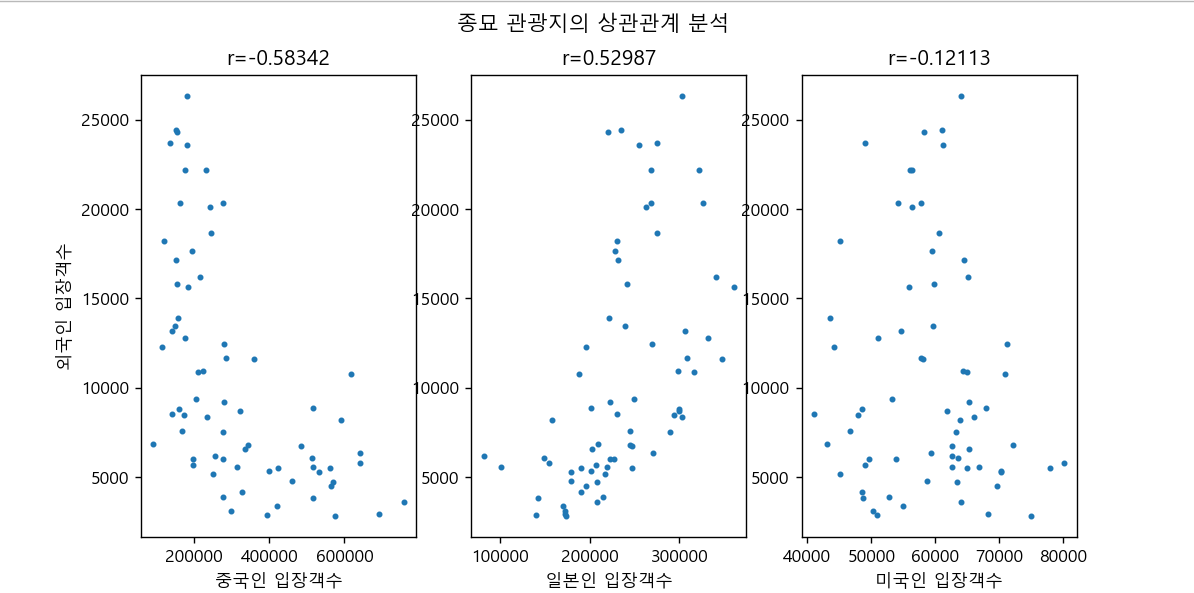
def setScatterChart(tour_table,all_table,tourpoint):
    # 순차적으로 전달되어 오는 각 관광지 5개를 필터링
    tour = tour_table[tour_table['resNm']==tourpoint]
    # 필터링된 관광지DF와 해외방문객수 데이터DF를 날짜기준 merge
    merge_table = pd.merge(tour,all_table,left_index=True,right_index=True)

    #상관관계 분석
    fig = plt.figure()
    fig.suptitle(tourpoint + ' 관광지의 상관관계 분석')

    plt.subplot(1,3,1)
    plt.xlabel('중국인 입장객수')
    plt.ylabel(('외국인 입장객수'))
    lamb1 = lambda p:merge_table['china'].corr(merge_table['ForNum'])
    r1 = lamb1(merge_table)
    print('r1 :',r1)
    plt.title('r={:.5f}'.format(r1))
    plt.scatter(merge_table['china'],merge_table['ForNum'],s=6)

    #이후 2개국 반복

plt.show()- 각 국가별 3개의 그래프, 5개의 관광지를 그리기 위해
subplot으로 구획을 나누었다. - lambda 함수에서 국가별 방문객수(china/jap/usa..) / 전체 외국인 방문객수 (ForNum) 두 변수를 상관관계분석 함수
.corr()을 이용하여 분석했다.
⛔ 참고
분석시 상관분석에서 가장 많이하는 실수가
상관분석 그림을 보며 원인-결과로 설명하는 것이다.
A와 B가 positive correlation이란 사실은
A가 증가하는게 원인이 되서 B가 증가하는지,
B가 증가하는게 원인이 되서 A가 증가하는지 알 수 없다.
ex)
날씨가 더워질수록 아이스크림이 잘 팔린다.
날씨가 더워질수록 날파리가 늘어난다.
"아이스크림 판매가 늘어나니 날파리도 증가한다" 라고 판단할 수는 없다.
원인-결과 분석을 하고싶다면, 상관분석이 아니라
Y(결과)=aX(원인)+b의 회귀분석 을 수행하자.