1. Matplotlib
데이터 시각화
pyplot 객체 사용
show()를 입력하면 데이터가 화면에 찍어지게 된다.(flush)
&& 동시에 pyplot figure은 비워진다.
pyplot 객체 사용하면 모판인 figure에 그래프가 그려진다.
import matplotlib.pyplot as plt
x = range(100)
y = [value**2 for value in x]
plt.plot(x,y)
plt.show()
2. set
- Set color
plt.plot(x,y, color="r") plt.show() - Set linestyle
plt.plot(x,y, c="r", linestyle="dashed") plt.plot(x,y, c="r", ls="dotted") plt.show() - Set title
- Set legend
Legend 함수로 범례를 표시한다.plt.plot (x,y, color="b" label='line_1') plt.plot (x,y, color="r" label='line_2') plt.legend(shadow=True, fancybox=True, loc="lower right")
3. Graph
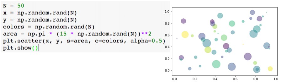
- Scatter

#marker: scatter 모양을 지정한다.
plt.scatter(data_1[:,0], data_1[:,1], c="b", marker="x")
plt.scatter(data_2[:,0], data_2[:,1], c="r", marker="o")
plt.show()
s: 데이터의 크기를 지정, 데이터의 크기 비교가 가능.
s의 크기에 맞게 원의 넓이가 커진다.
-
Bar chart
 x축이 0,1,2,3 .. 인덱스 순
y축에 data가 입력된다.
data[0]의 bar width=0~0.25 → data[1]의 bar width=0.25~0.5 -
histogram
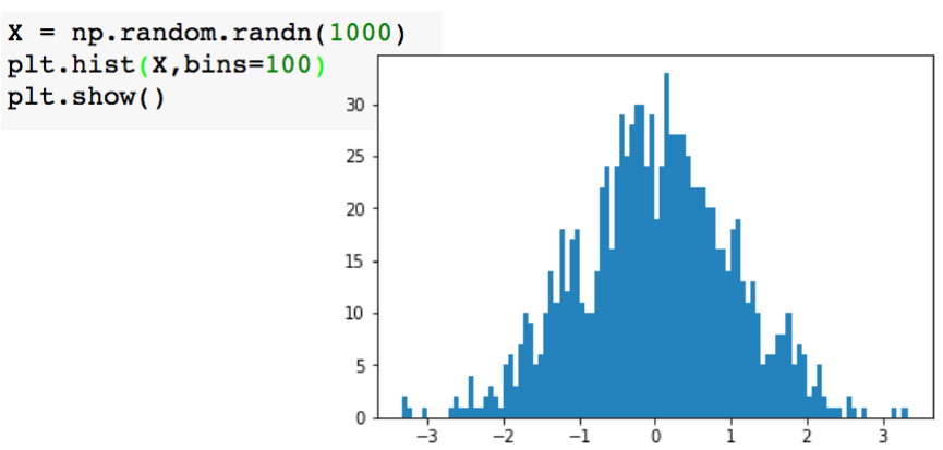 1000개의 random data중 100개로 나눠서 표현(bins)

Data Engineer