grid를 사용하게 된 배경
flexbox로 그리드 형태를 만들기 힘들어서 Grid를 사용한다.
.father{
	display: flex;
    flex-wrap: wrap;
    justify-content: space-between;
}

.child{
	flex-basis: 30%;
    background: peru;
    color: white;
    font-size: 50px;
    display: flex;
    justify-content: center;
    align-items: center;
}

.child:nth-child(4){
	margin-top:10px;
}
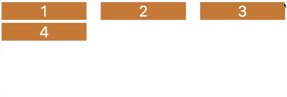
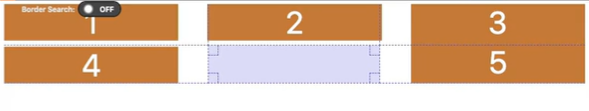
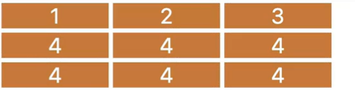
다음 5번 box를 생성하게되면 4번과 5번 사이에 공간이 생긴다.
grid 사용하기
.father{
	display: grid;
}
grid-template-columns: 원하는 column 개수
.father{
	display: grid;
    grid-template-columns: 20px 55px 89px 100px;
}
column-gap: 10px : column 간의 공간을 만들어줌
.father{
	display: grid;
    grid-template-columns: 250px 250px 250px;
    column-gap: 10px;
}
row-gap: 10px : row 간의 공간을 만들어줌
.father{
	display: grid;
    grid-template-columns: 250px 250px 250px;
    column-gap: 10px;
    row-gap: 10px;
}
repeat
<body>
	<div class="grid">
    	<div class="header"></div>
        <div class="content"></div>
    	<div class="nav"></div>
    	<div class="footer"></div>
    </div>
</body>
.grid{
display: grid;
grid-template-columns: repeat(4, 200px);
grid-template-rows: reapeat(4, 300px);
}
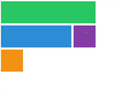
.header{
background-color: #2ecc71;
}
.content{
background-color: #3498db;
}
.nav{
background-color: #8e44ad;
}
.footer{
background-color: peru;
}
grid-template-areas
.grid{
display: grid;
grid-template-columns: repeat(4, 200px);
grid-template-rows: 100px repeat(2, 200px) 100px;
grid-template-areas:
"header header header header"
"content content content nav"
"content content content nav"
"footer footer footer footer"
}
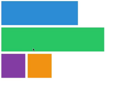
.header{
background-color: #2ecc71;
grid-area: header;
}
.content{
background-color: #3498db;
grid-area: content;
}
.nav{
background-color: #8e44ad;
grid-area: nav;
}
.footer{
background-color: peru;
grid-area: footer;
}

Rows and Columns
.header{
	background-color: #2ecc71;
    grid-column-start: 1;
    grid-column-end: 5;
}

.content{
	background-color: #3498db;
    grid-column-start: 1;
    grid-column-end: 4;
}
.content{
	background-color: #3498db;
    grid-column-start: 1;
    grid-column-end: 4;
    gird-row-start: 1;
}
.content{
	background-color: #3498db;
    grid-column-start: 1;
    grid-column-end: 4;
    gird-row-start: 2;
    gird-row-end: 4;
}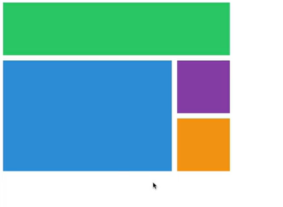
.nav{
	background-color: #8e44ad;
    gird-row-start: 2;
    gird-row-end: 4;
}
.footer{
	background-color: peru;
    grid-column-start: 1;
    grid-column-end: 5;
}
